Our UX Design Process & Deliverables

Scroll down to read our UX design process and deliverables guide. Find out how we do things and see why we’re paving the way in innovative and practical UX design.

UX Design Process

“The difference between ordinary and extraordinary is that little extra.”

– Jimmy Johnson

As a UX design agency, our initial goal is to gain understanding and knowledge. We go above and beyond to learn everything that will help us develop a better design solution.

But first, what is UX design and why is it important?

Briefly, UX design is the process used to design a product that is useful, easy to use, and valuable. The purpose of UX design is to enhance user satisfaction and ensure a seamless interaction between the product and the user.

And why is it important? Well, UX design is important because it puts the user first. Specifically, a positive user experience encourages users to stay loyal to a particular product or brand. Additionally, a rich user experience allows a more precise definition of customer journeys that are conducive to business success.

UX Process on Film

If videos catch your fancy better than written content, then look no further than the video we've shot on the UX process. The video in question talks about the same points outlined here.

UX Design Stages

These processes and their sequence are subject to change based on what you’ve already done and your needs.

0

Phase 1:

Understand & Audit

Goal: Review the product to learn more about business goals, user needs, and technical limitations.

A rule of thumb of UX design is getting to know your client. Who are they? What do they do? Where are they going? How are they connecting with users? So it’s no surprise that we like to kick things off with a UX audit.

But what is a UX audit?

One definition of a UX audit is that it is a method used to pinpoint the less-than-perfect areas of a digital product, revealing which parts of a site or app are red flags.

During a UX audit, we use a range of methods, tools, and metrics to identify areas where a product is drifting away from pre-established standards or goals.

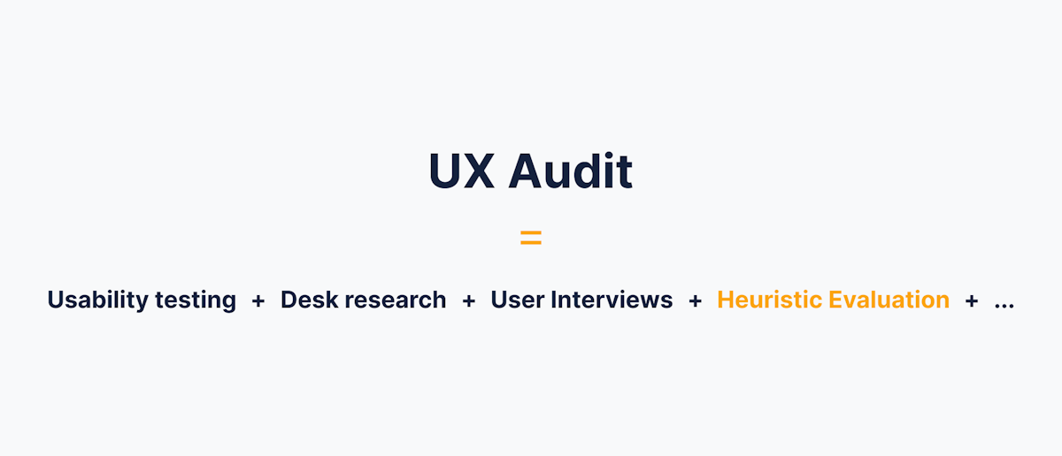
Typically, a UX audit includes activities like usability testing, desk research, user interviews, etc.

UX Audit

Business Goals and Requirements

Before we start analyzing any digital product, we first need to find out more about your business goals and brand vision.

To do this, we gather and document information via desk research or stakeholder interviews. These activities result in team alignment on things vital to the product’s success.

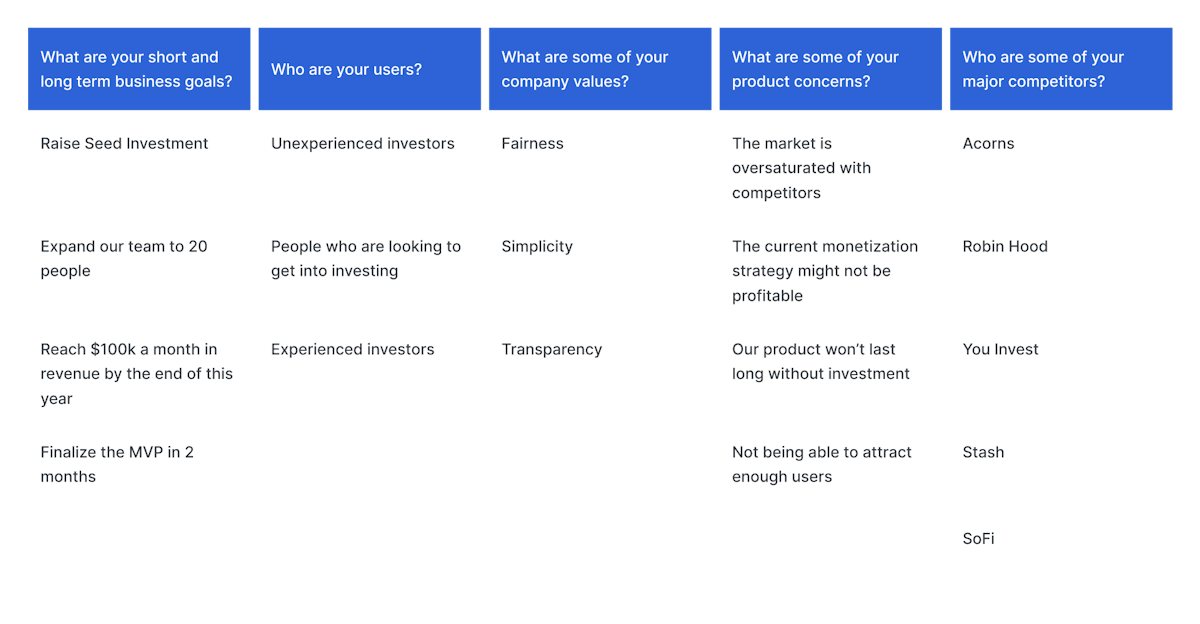
Some example questions from our stakeholder interviews:

  • What are your short and long-term business goals?
  • Who are your users?
  • What are some of your company values?
  • What are some of your product concerns?
  • Who are some of your major competitors?
  • What are your primary sales channels?
  • What is your definition of product success?
Business Goals and Requirements
Part of a business goal and requirements gathering document

One of our preferred ways to collect requirements and understand your goals is conducting a discovery workshop. This way, we’ll be able to rephrase problems into opportunities, select a focus area, generate ideas, and possible solutions.


Analytics Data

Once we have a clear idea of what your business objectives are, we want to see how they are holding up in reality. At this stage, we want to delve into data to find out exactly where your product is on the progress meter.

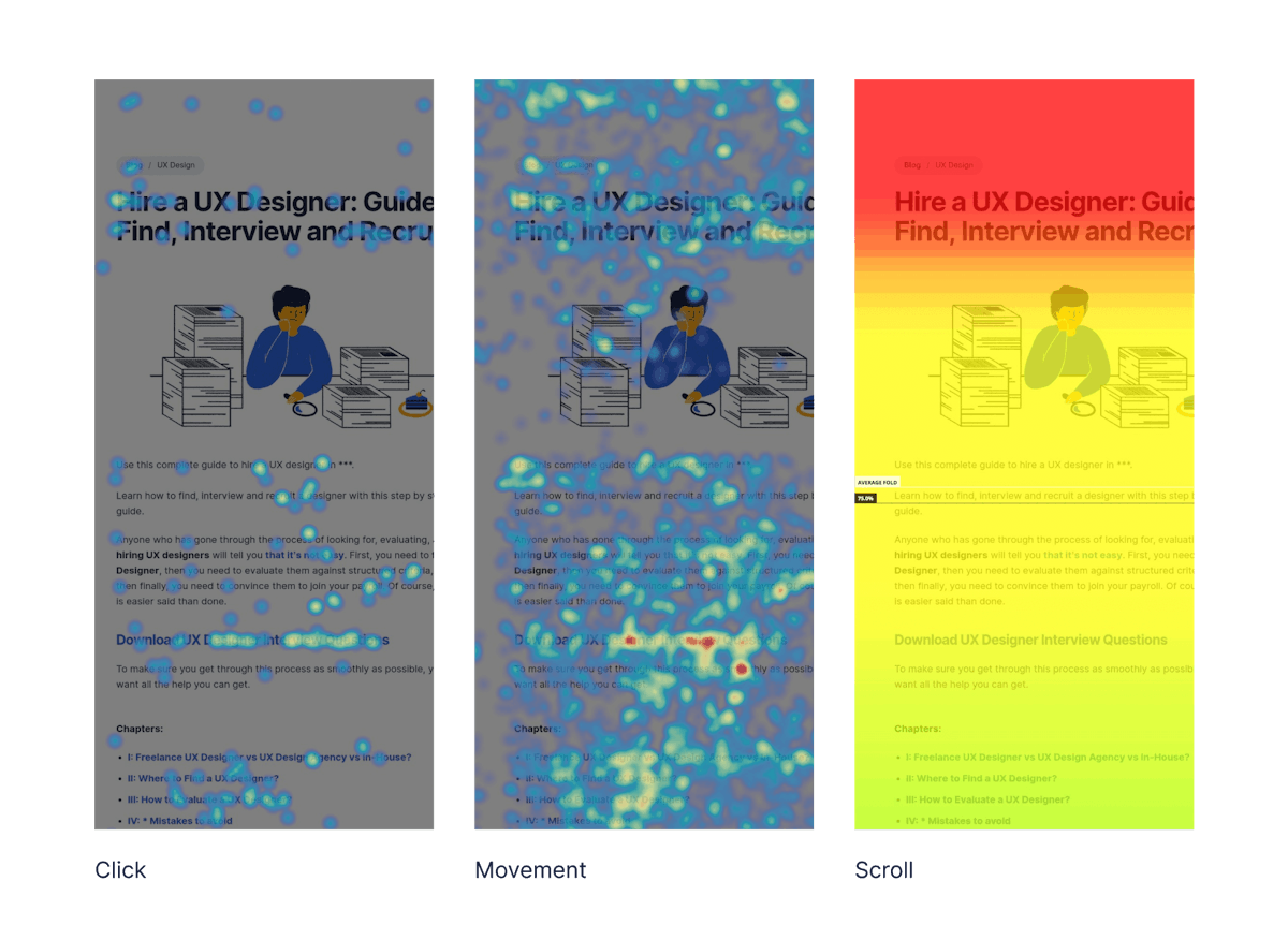
Heatmap Analytic
Different Types of Heatmaps

Specifically, we want conclusive answers to questions like:

What are your users searching for? Where are they coming from? At what point in the sales funnel are they jumping ship?

We use a variety of UX analytic tools, such as Google Analytics, Hotjar, Kissmetrics, and Omniture, to turn data into valuable insights about:

  • User demographics
  • Conversion metrics
  • Sales data
  • Traffic flow and engagement
  • Customer care data
  • Heatmaps
  • Scrollmaps
  • Form analytics
  • Poll/form results
  • User testing results

All of this data is taken and used to create personas and user journeys which will help us and stakeholders better engage with and target users.


Heuristic Evaluation

The last step of the audit phase is to conduct a heuristic evaluation. Heuristic evaluation is a method used to identify any usability issues with the design interface. In simple terms, it tests how user-friendly the user interface is.

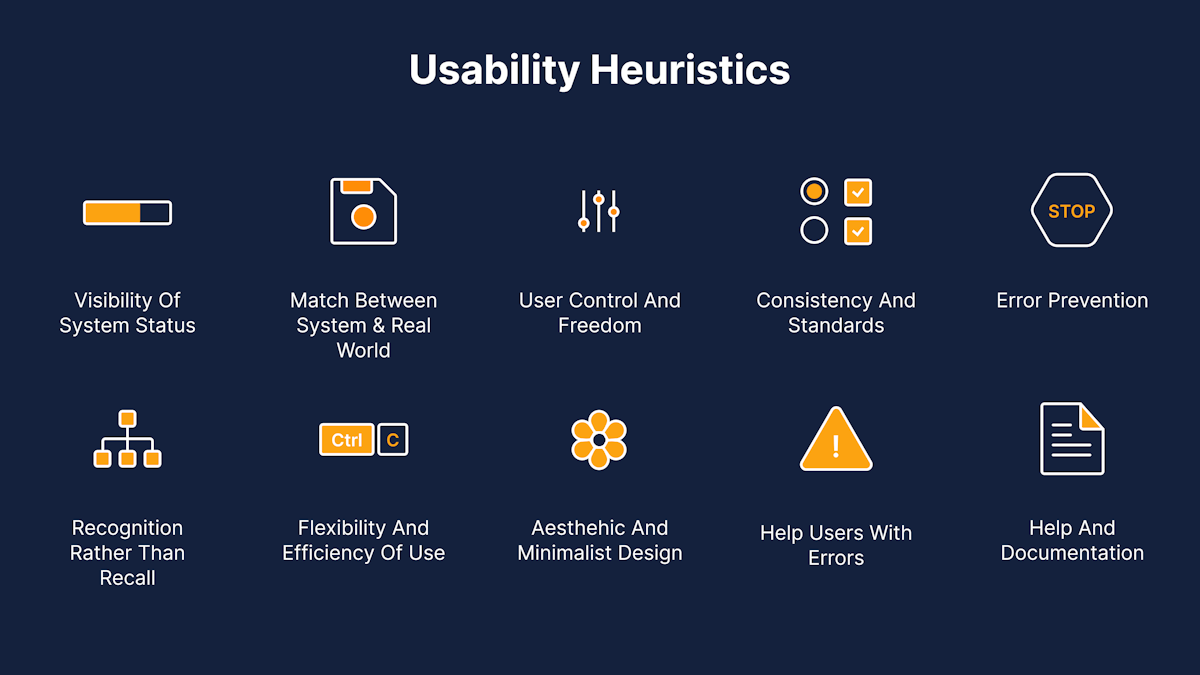
Unlike user-testing where users test the product, in a heuristic evaluation, the product is evaluated by usability experts. Though there are plenty of criteria by which a digital product can be evaluated, the majority of heuristic evaluations utilize Jacob Nielsen’s 10 Usability Heuristics for User Interface Design or a variation of these heuristics adapted to the project, platform or interface:

  1. Visibility of system status.
  2. Match between system and the real world.
  3. User control and freedom.
  4. Consistency and standards.
  5. Error prevention.
  6. Recognition rather than recall.
  7. Flexibility and efficiency of use.
  8. Aesthetic and minimalist design.
  9. Help users recognize, diagnose, and recover from errors.
  10. Help and documentation.
Heuristic Evaluation
10 usability heuristics

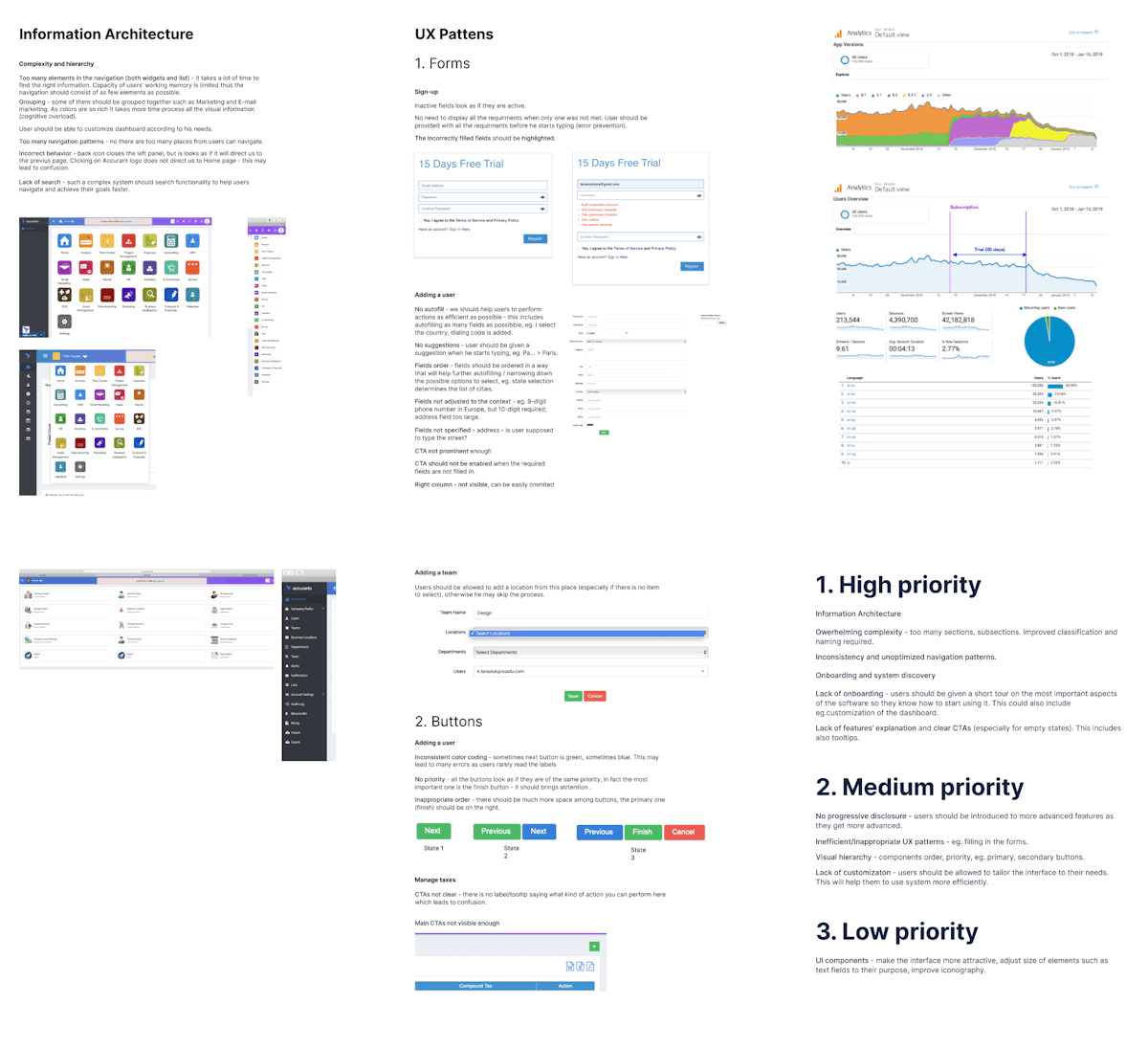
All issues that are uncovered during the audit phase are documented. We compile and synthesize findings for our clients, sort the list by impact and severity, and make suggestions that will result in the best ROI based on client budget and timeline.

UX Audit Report
Example of a UX Audit Report
0

Phase 2:

UX Research

Goal: Dive deep into the market and most importantly – the mind of our users to eliminate uncertainty and guesswork.

With the business objectives in mind, the next step of our design process is to conduct research. As you’re well aware, research is an integral part of any design undertaking. In fact, the research phase is the heart and soul of a project.

By implementing various UX research methods, like competitive analysis, user research, contextual inquiry, we are able to gain valuable insights into users’ needs, behavior, and motivations.

It’s important to note that the information revealed during this stage will determine the entire flow of a project. It’s kind of like setting the foundations to a building. This is why we take extra care to ensure our research methodologies run smoothly so that your building stays standing.

Let’s look at all the stages covered in the research phase:

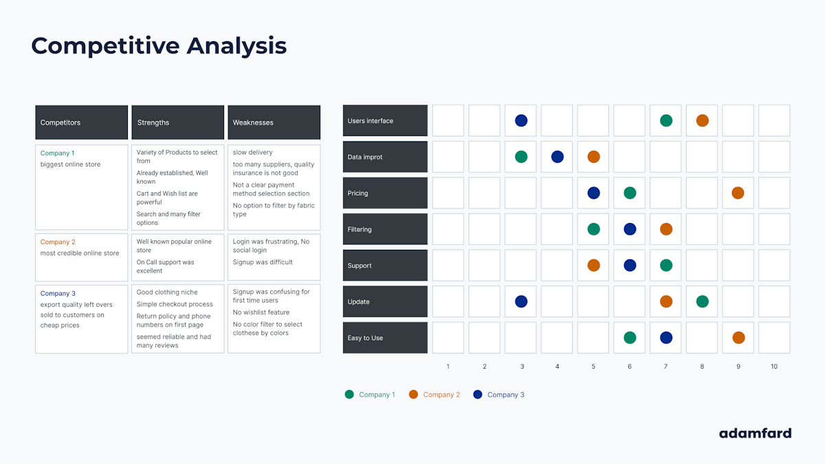
Competitive Analysis

The saying goes, “Keep your friends close and your enemies closer”. As far as digital products are concerned, this pretty much hits the nail on the head.

Competitive Analysis
Example of a competitive analysis

In order for a product to succeed, it’s essential that we keep tabs on competitors. This means monitoring what your competitors are doing and how successful they are in doing it.

And it’s our job to help you analyze your competitors and their products or services.

There are two key principles of a successful competitive analysis:

  1. Knowing what information to look for.
  2. Synthesizing that information into actionable insight.

It’s our aim to adhere to these principles so that you have full access to the benefits of competitive analysis:

  • Identify ways to solve usability problems.
  • Understand where your product stands in the market.
  • Recognize market gaps that can be utilized.
  • Acknowledge competitors’ weaknesses and strengths.
  • Validate your design decisions.

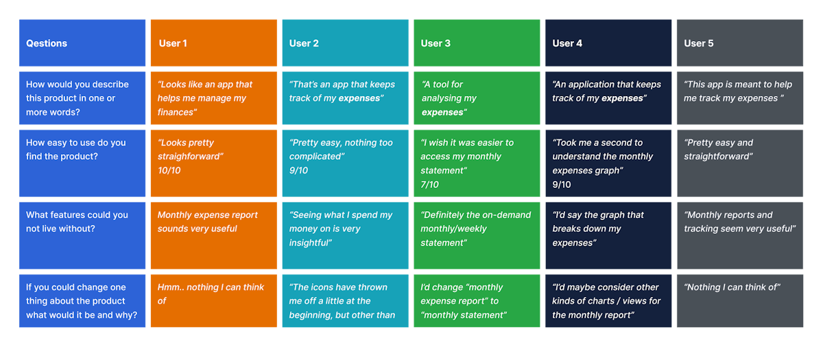
User Research Takeaways

At this point of our UX design process, we want to connect with users to understand their decision-making process. What drives them to continue using your product – or stop using it? What do they consider a deal breaker when interacting with your product – or a similar one for that matter? Is there a pattern in user behavior that is worth looking into? 

This is what we set out to find out and communicate our findings to you. User research lets us learn more about your users and their behavior. To carry out user research we employ diverse user research techniques. Here you find two examples: surveys and personas.


User Surveys

Surveys are user research tools used to collect a large set of data about your users. Though they are mainly used to accumulate quantitative data, surveys can also be used to validate qualitative findings.

User Survey
Example of a user survey

What we find great about surveys is that they can generate a lot of feedback quickly and efficiently. The secret to creating a successful survey, however, is knowing what questions to ask, how to formulate them, and who to ask them to.

In our experience, the most effective surveys are short, topic-specific, and have a combination of closed and open-ended questions. For this reason, we make sure we utilize both closed and open-ended questions so that we are able to gather enough context, while keeping participants interested.


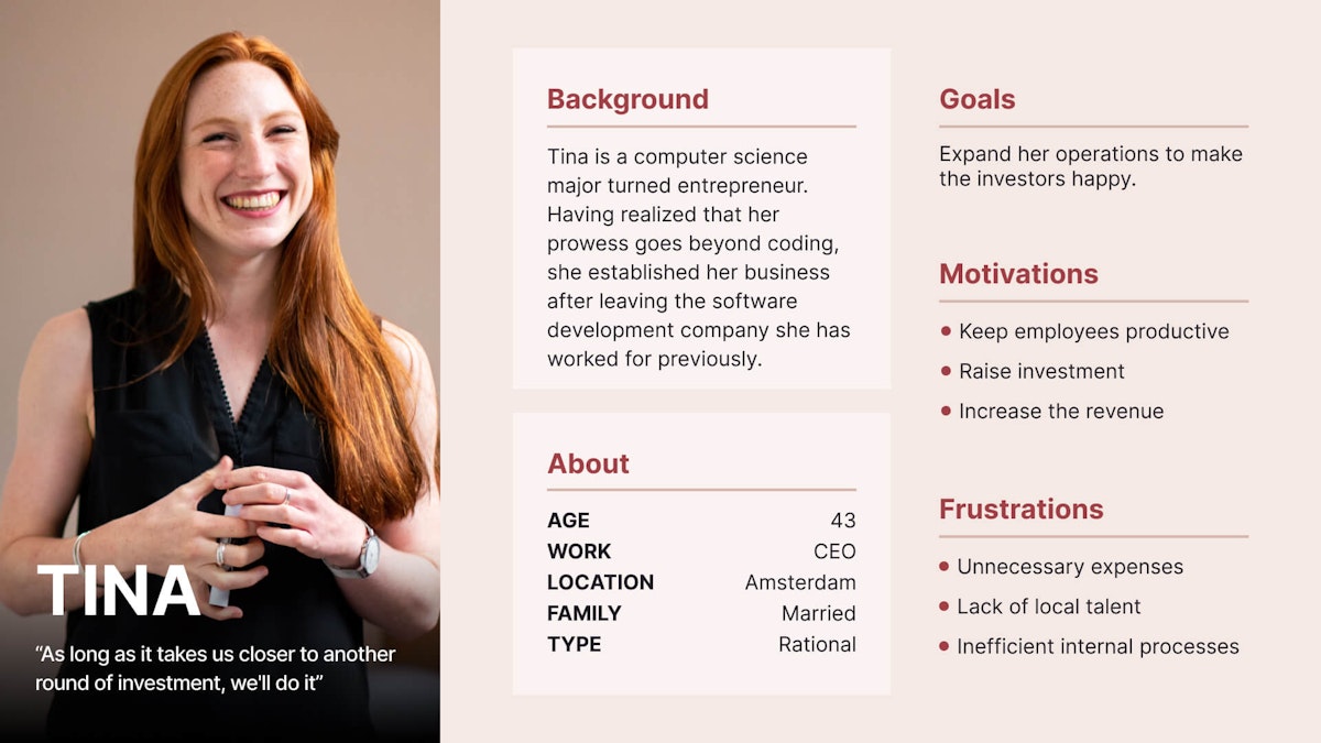
User Personas

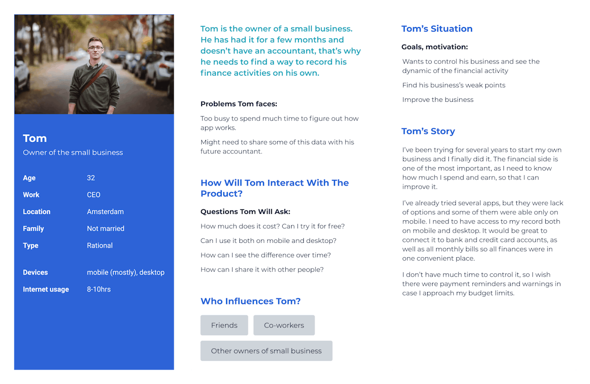
User personas are fictional characters that are created using research material and represent the different types of users that interact with your product, service, or brand. Generally, the persona is presented as a 1-2 page description of an archetypal user.

User personas typically contain the following bits of information:

  • Demographics
  • Background.
  • Needs.
  • Goals.
  • Frustrations.
  • Motivation.
User Persona
User Persona

The purpose of user personas is to relay how users experience the same environment differently. Additionally, they’re a vital tool to the UX design process and provide a deeper understanding of the target audience and guide the ideation process.

We utilize personas as an effective user research tool to help pinpoint which groups of users you should target and how to approach these user types.


User Story / Jobs-to-be-done

A user story is a brief – yet specific - scenario stating what the user wants to accomplish by using the product. It describes the most basic goal of a user, such as signing up for a new account, finding the checkout, contacting support, etc
Because they are short and specific, it takes a number of user stories in order to align the design with users’ goals. Nevertheless, they are an effective way to organize and prioritize design tasks.

Implementing user stories during our design process helps us accomplish three things:

  • User stories ensure design is user-focused.
  • User stories clarify design process to avoid feature creeps.
  • User stories coordinate various stages of the design process.

We share our user stories through a collaborative spreadsheet where the client and various stakeholders can add any stories they feel are missing.

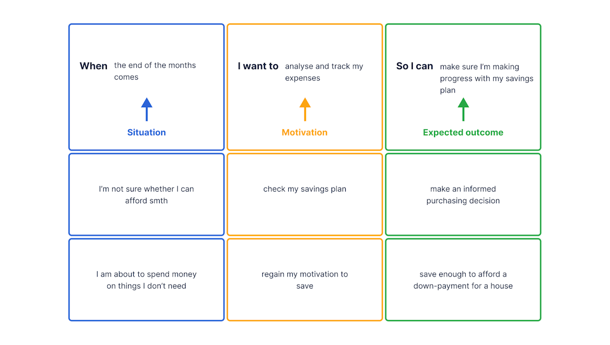
We also utilize job stories to help us define user tasks in product design. In short, a job story focuses on the ‘jobs that need to be done’ with an emphasis on context, causality, and motivation, as opposed to assumptions and personas.

Jobs-to-be-done
Example of jobs-to-be-done

Use Case

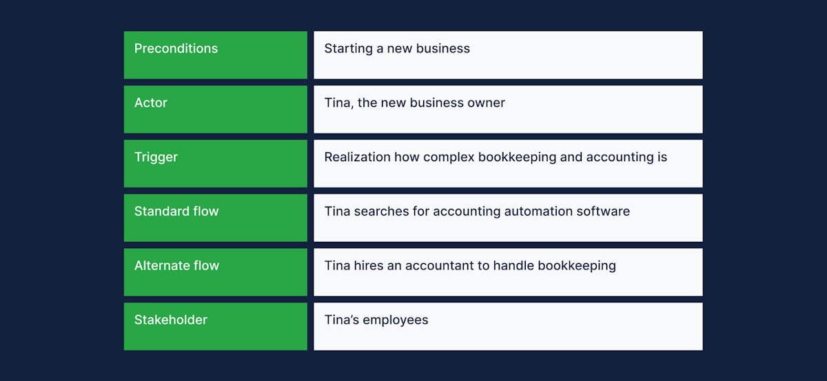
A use case is a written account explaining how users will perform different tasks. Think along the lines of a design instruction manual. Each use case is written as a sequence of steps depicting how the system should behave when triggered by a user.

The goal of the use case is to define the correct sequence of actions that users need to complete in order to accomplish the task at hand. A use case is made up of the following elements:

  • Preconditions. Conditions that have to be met beforehand.
  • Actor. Anyone who is using the system.
  • Trigger. An event that causes an action to take place.
  • Standard flow. The typical pathway a user takes to achieve a goal.
  • Alternate flow. A secondary pathway in the event a problem occurs.
  • Stakeholder. Anyone with a vested interest in the behavior of the system.
Use Case
Use Case

This part of the research phase is particularly important as it explains to stakeholders how the system will work and allows room for them to brainstorm additional functionalities or flag possible problems.


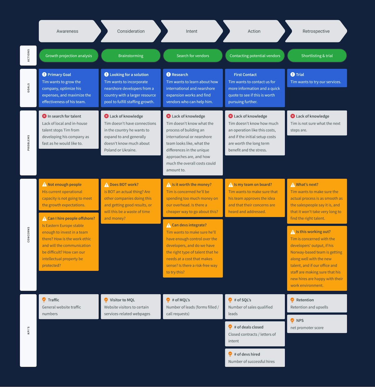
Experience Map

An experience map is a design tool used to observe the experience a user has with a product or service. It is the visualization of an entire end-to-end experience that a user goes through in order to accomplish a goal.

By creating an experience map, stakeholders become more adept to recognize strategic opportunities, face user pain points, and optimize conversion funnels.

Experience Map
Experience Map

Mapping the user experience lets us forecast any friction in the UX before it’s too late. By doing this our clients can organize and prioritize their activities related to user experience.


Storyboards

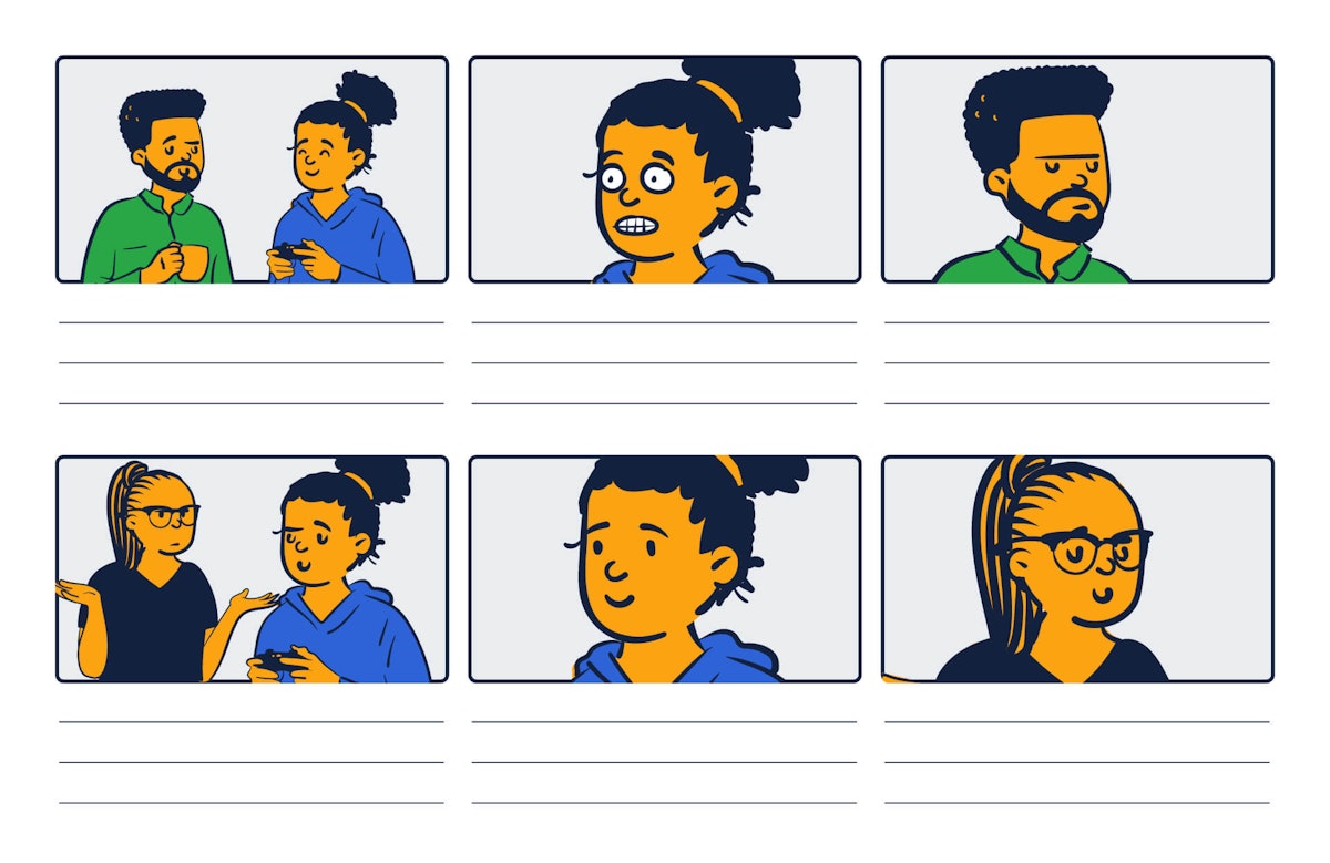
Stories are one of the most effective delivery tools for information. And using images to map the user experience is an even more powerful way to capture, relate, and explore experiences in the design process. This is why we integrate storyboards as part of our research phase.

A storyboard is a chronological sequence of images that visually narrate the user’s ‘story’.

There are three main storyboard elements:

  1. Scenario
  2. Visuals
  3. Captions

In our experience, having a storyboard provides additional context to both our design teams and stakeholders.

Storyboard
UX Storyboard

User Scenarios

A user scenario is an extension of a user story. Its aim is to describe a fictitious story of a user accomplishing a goal by interacting with a product. Focusing on the user’s motivations, a user scenario documents the process by which the user might use a design in their persona’s context.
User scenarios are ideal research tools to predict the different ways a user could use the product. We like to implement user scenarios during the research phase of our design process to generate design ideas. They also help determine the most important areas to test during usability testing later on.
User Scenario
User Scenario

We provide a key takeaways document that lists major research findings. Apart from this document we provide all source materials used during the research phase, such as interview scripts, research templates, recordings, notes, and a competitive analysis matrix. These documents help get stakeholder buy-in regarding user goals and design features.

0

Phase 3:

UX Strategy

Goal: Draft a foolproof UX strategy by combining research data.

at this stage, of our UX design process, we combine the data collected from the previous phases and define a set of KPIs and a clear UX strategy.

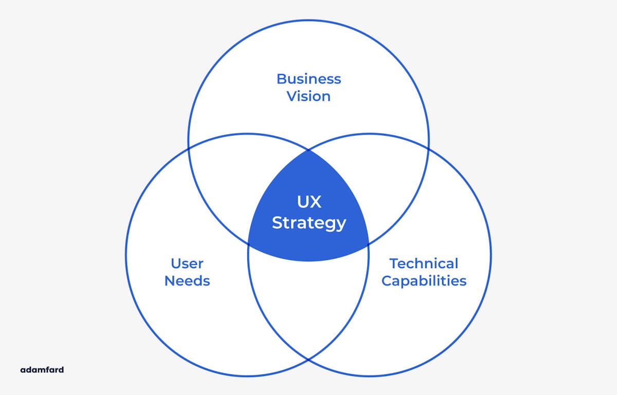
A UX strategy is the plan for the digital product. It should articulate the brand, offer guiding principles, and support the long-term vision of the business. It is different from a customer experience strategy which focuses on different aspects of the brand, such as customer service, sales processes, brand consistency, pricing, and product delivery.

A well-defined UX strategy is made up of four components:

  • Business strategy.
  • Value innovation.
  • Validated user research.
  • Flawless user experience.
UX Strategy

The UX strategy has one main purpose – to solve specific problems. For this reason, we take extra care to ensure that the business vision, user needs, and technical capabilities are aligned.

0

Phase 4:

User Experience Design

Goal: Define a design concept to align interaction patterns, user paths, and interfaces.

at this stage, of our design process we use a variety of methodologies to define a concept that will shape the entire design elements: interactions, the relationship between elements, tone of voice and copy, transitions, animations, etc. Basically, everything that is necessary to align product vision to reality. Here is how we do it:

  • Information Architecture
  • User Flow
  • Low-fi Wireframes
  • Hi-fi Wireframes
  • Interactive Prototype
  • User Testing Report

Information Architecture

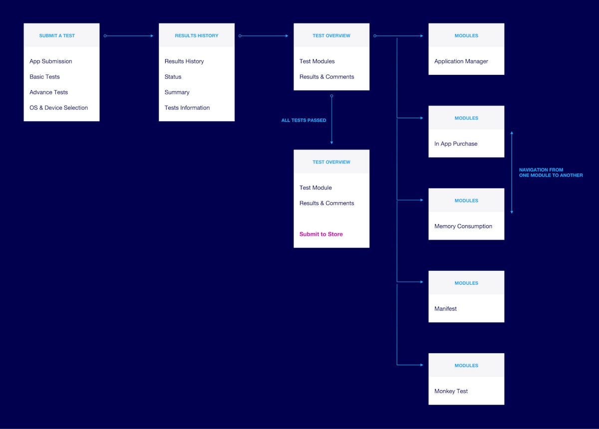
We take all the collected data from the research phase to build an information architecture for the product. As the name suggests, information architecture is all about organizing information in a clear and logical way.

We generally present the IA using a mind map that gives a bird’s eye view of the system and shows the relationship between parts, thus helping users navigate complex sets of information. In our experience, this mind mapping process is particularly effective when performed in collaboration with stakeholders.

User Flow
Part of an information architecture

By visualizing the overall project structure, it is easier to understand the scope of the project and define feature priorities. The aim here is to make sure users will find the product more usable and intuitive.


User Flow

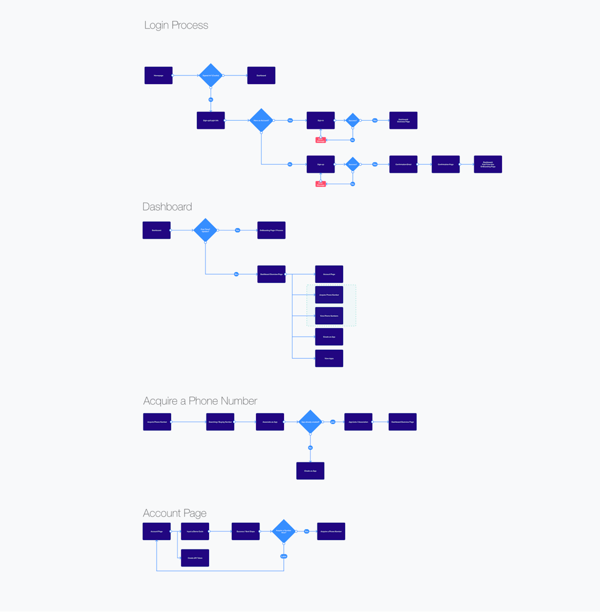
User flows are a visualization of the steps a user needs to take in order to complete a specific task. The aim of user flows is to show the pages, logic, and action necessary to reach the goal. At the same time, it provides developers with a description of all possible user flows, alternate triggers, and errors.

We provide stakeholders with a user flow document created in a design-specification format that merges screen layout designs with flowchart-like representations of user interactions within the system.

User Flow
Example of a user flow

As the design progresses, we continue to update this document over the course of a project’s lifespan. This allows us to iterate on the user flows more efficiently and identify any problems early on in the design process.


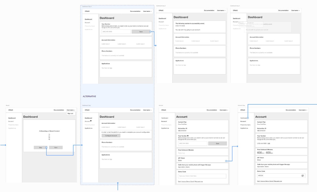
Low-Fidelity Wireframes

Low fidelity wireframes are the most basic visual representations of the design layout and features of the product. They are typically static and their role is to map out the skeleton of the interface its screens, user flows, and information architecture.

Low-Fidelity Wireframes

Low-fi wireframes allow us to communicate visual ideas to stakeholders so that the design concept is easier to understand and we can quickly act on feedback from stakeholders and users. This lets us make changes before further design and development take place.


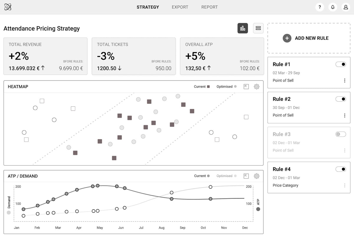
High-Fidelity Wireframes

High fidelity wireframes are much more realistic depictions of the final design than low fidelity wireframes. They are built in the advanced stages of the UX design process and are usually interactive, mimicking authentic interface interaction.

High-Fidelity Wireframe

Final iterations are made at this stage, with a focus on refining layout, graphics, and spacing. Based on our experience, high fidelity wireframes are useful to showcase a more accurate depiction of what the final product will look and feel like before it is finalized.


Interactive Prototype

To give our stakeholders an even more realistic visualization of the product in progress, we create interactive prototypes as part of the wireframing and design processes. We do this using a variety of tools, depending on whether we want to test simpler or more complex functionalities.

An interactive prototype is beneficial to the overall design process in a number of ways, such as:

  • Brings the design to life.
  • Generates feedback from proper context.
  • Reduces overall development time.
  • Acts as a reference tool for developers.
  • Confirms shared vision among users and stakeholders.
  • Validates assumptions and tests hypotheses.

User Testing Report

We find it constructive to take a step back from time to time and validate our assumptions and design decisions by conducting a series of user tests using an interactive prototype.

After the usability testing is complete, we develop a user testing report which contains a summary of our findings, as well as suggestions for improving the design. This document provides insight into users’ expectations and is important in evaluating a product’s success.

The user testing report also provides context to the testing, as it outlines testing goals, test setup, and user demographics.

0

Phase 5:

Visual and UI Design

Goal: Develop and standardize the graphical interface of the product.

at this stage, of our design process we begin to develop the graphical interface of the product. Here we apply everything we have learned from users and stakeholders, and proceed with exploring ways to design interfaces that are consistent and scalable.

All decisions regarding the visual design of the user interface are documented in a UI style guide. A UI style guide standardizes the grid system, layout, color palette, typography, iconography, logos, and imagery.

Here are all the stages we cover in the visual and UI design phase:

  • Moodboards
  • Visual Design Mockups
  • UI Animations
  • Design System & UI Library
  • Design Specification For Developers

Moodboards

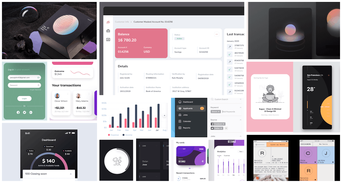
Once we have a solid understanding of how the user flow works, it’s time to think about how we want the product to look and feel like. A great way to start with that is by compiling a moodboard which is a diverse compilation of design inspiration to help us lay out our options in front of us. Based on these options, we come up with the very feel that’s consistent with the brand, practical and delightful.

Moodboard
Moodboard

Visual Design Mockups

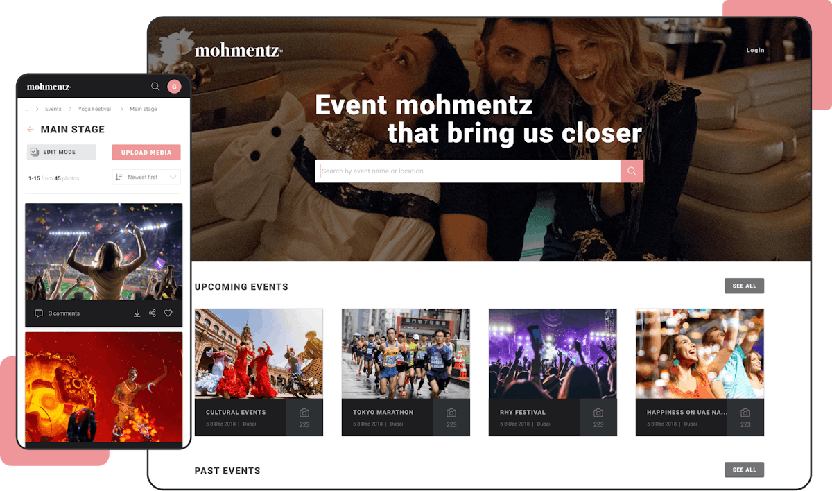
Mockups are a visual depiction of how the user interface will look like. They can be low or high fidelity, static or interactive, single or multi-page. We create our visual style based on branding guidelines provided by stakeholders or come up with a style from scratch.

Responsive UI Design
Responsive UI design

The great thing about mockups is that they allow us to experiment with color schemes, typography, and styles to see what looks best. Also, they permit us to make changes to the design quickly and efficiently.

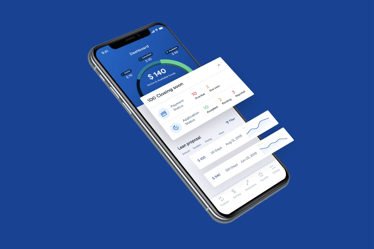
Example of a mockup
Example of a mockup

UI Animations

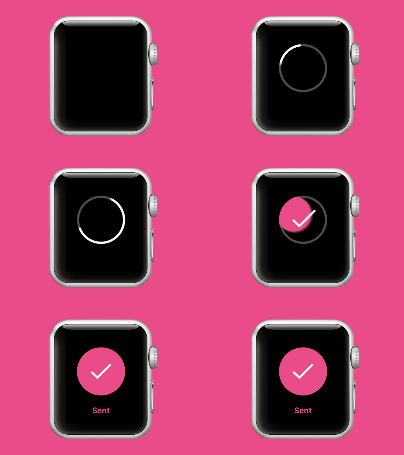
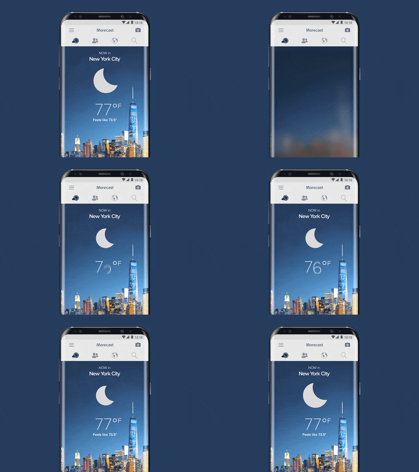
We also deliver short animations as part of our UX design in order to enhance the overall presentation and interactivity of a product. UI animations show the main interactions, transitions, and flows within the system.

UI Animation
UI Animation
Examples of UI Animations

When used in the right context, UI animations make the design stand out and steer users towards their goal. Not only that, but such elements as animations and illustrations help delight users which boosts retention and general enjoyability of the product.


Design System & UI Library

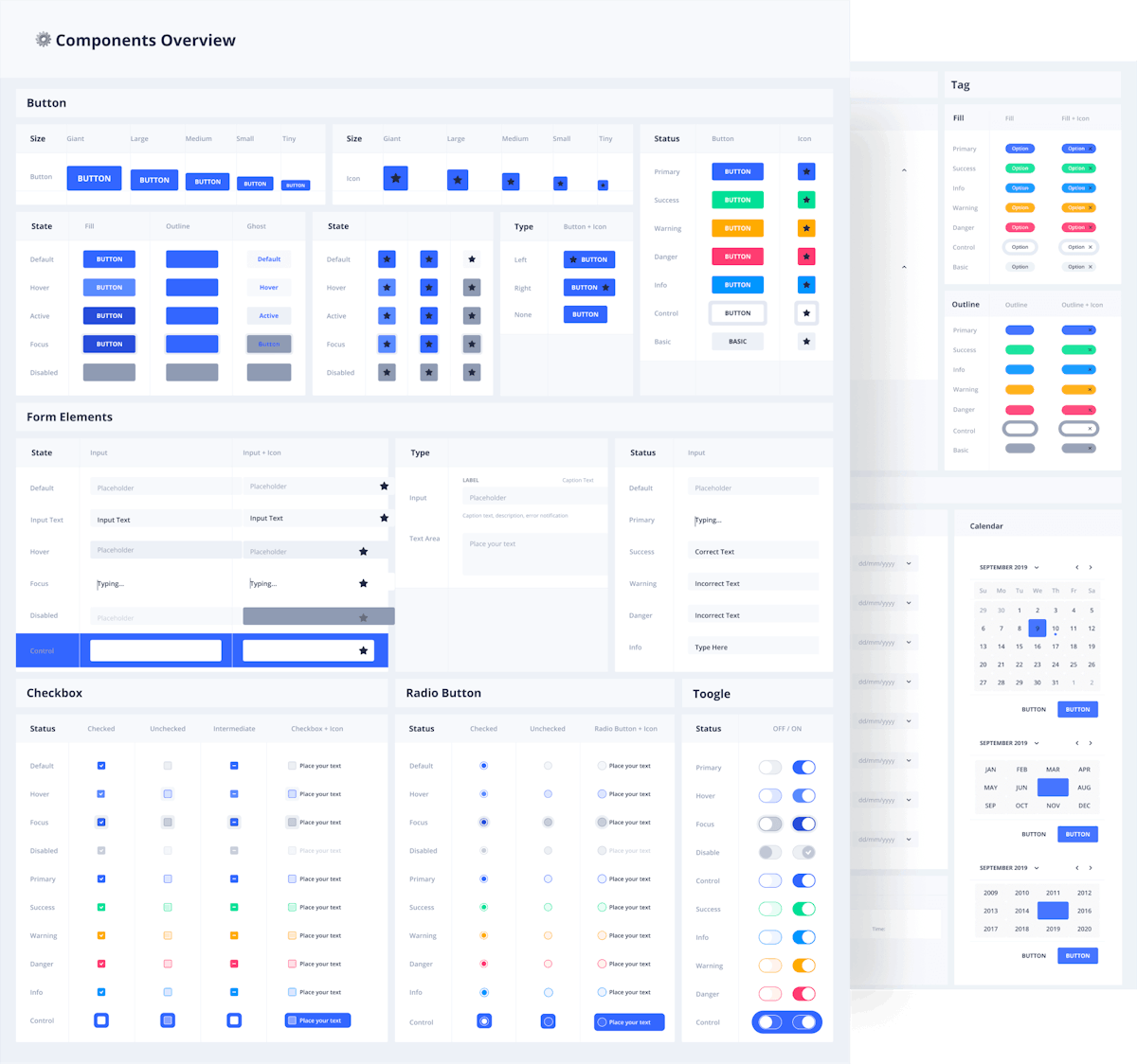
A UI design system is a collection of iterative components and guidelines that explain how these components work. Or more simply, it’s a set of standards for design and code that reinforce design consistency.

A design system features the following components:

Design system
Part of a Design System
  • Style and design guidelines - icons, typography, colors, spacing, and illustrations.
  • UI libraries - form design elements, images, navigation, and overlays.
  • Content style guide - voice, tone, language, principles and objectives.

Having a design system document is a powerful toolkit for our clients’ internal design teams. It enables them to maintain consistency and scalability when building new pages and adding new functionalities.

One methodology used to develop design systems is atomic design. This methodology is made of five stages that work together to create interface design systems in a more hierarchical manner. The five stages of atomic design are:

  1. Atoms. Basic elements such as form labels, inputs and buttons.
  2. Molecules. Simple groups of design elements that function together as a unit.
  3. Organisms. Relatively complex components that form distinct sections of an interface.
  4. Templates. Groups of organisms that function together and demonstrate the page’s underlying content structure.
  5. Pages. The highest level of fidelity that shows what the interface will look like with real representative content in place.

One of the greatest advantages of atomic design is that it allows a more critical approach to the UX design process and lets us look at each component on its own and as a part of a larger whole. In turn, this encourages a more consistent and scalable design.


Design Specification for Developers

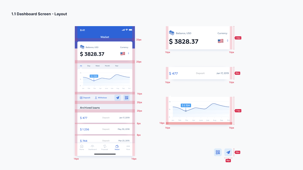
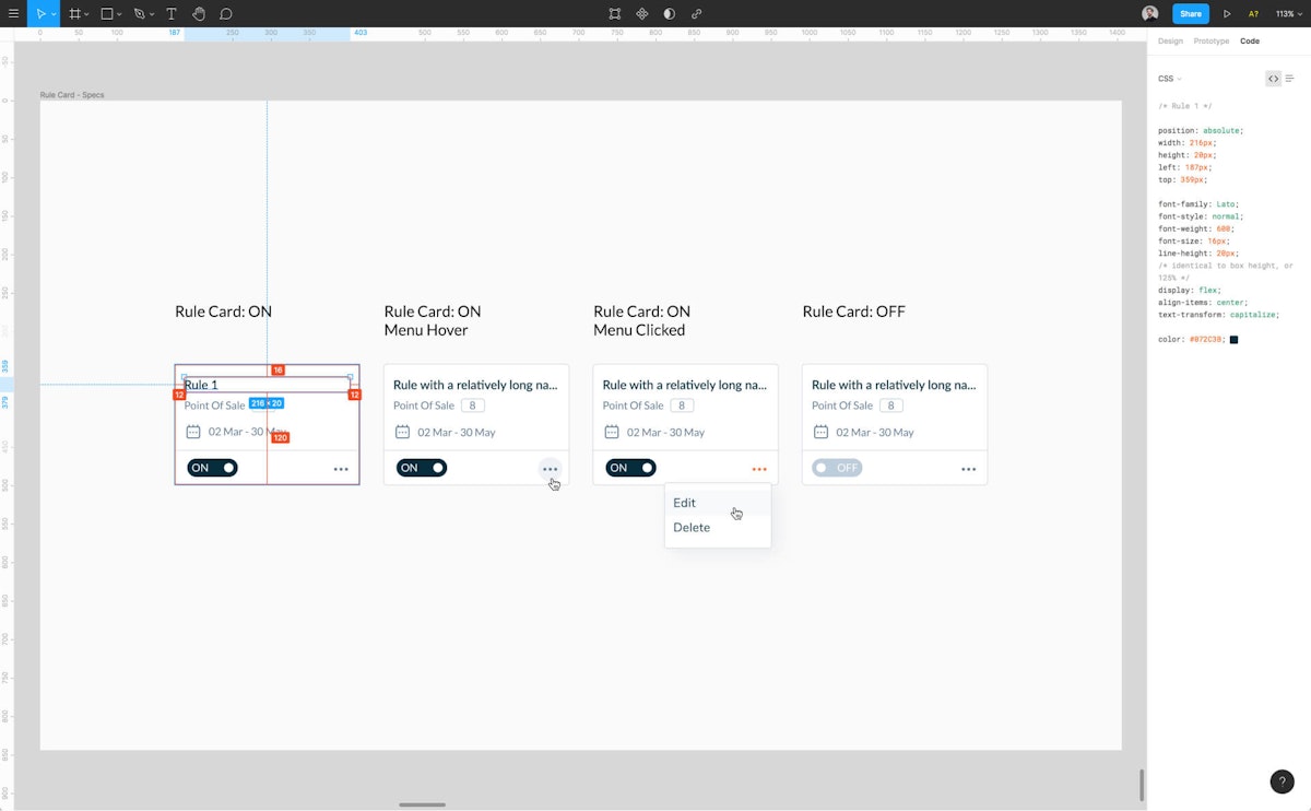
Design specifications are developed at the end of the design phase and are intended to be used by developers. These documents communicate details about the UI – such as colors, typography, and measurements – and information about the product – such as user flow, behavior, and functionality. Developers use this document to build the product to the designer’s specifications.

Developer handoff
Example of a static handoff document

In our experience, we find that design specifications for developers are crucial to the success of the final product. Though various aesthetic choices – like fonts – might not seem like a big deal to developers, the design specs explain why this design choice was made. Essentially, it makes sure everyone is on the same page and developers correctly implement the design as envisioned.

Developer handoff - using Figma
Example of a dynamic handoff using Figma

0

Phase 6:

QA, After Launch & Implementation

Goal: Find out if the product is producing the desired result.

Once the product is launched it’s time to measure the results. Have the desired KPIs been achieved? Have metrics shifted? Are users interacting with the product as intended and is the product producing the desired result? This is what we seek to find out at this stage.

To find this out, we provide clients with a correction document for developers and a usage analytics report:

  • UI Polishing & Correction Document For Developers
  • Usage Analytics Reports

UI Polishing & Correction Document for Developers

At some point after the implementation of a design, it’s very likely that some changes will need to be made. Usually, these are minor corrections that can have a great impact on the design and user experience.

We go over the user interface again to spot any inconsistencies or design flaws and take notes. When we validate the design, we craft a correction document for developers. This document depicts specific parts of the design that need to be corrected with an explanation for each one.


Usage Analytics Report

A usage analytics report contains insights into how to improve the design and enhance the user experience. But it’s not just data and visuals. The report contains explanations and recommendations on where design improvements can be made and why.

Usage analytics
Usage analytics - Behavior Flow

We use a variety of tools to collect new usage data and feedback from users. Our aim is to provide you with a full overview of interactions. Specifically, which features are being used and by whom, how much time users are spending on separate pages, and what trends can be observed in user behavior.

A usage analytics report is also a useful record to see the impact the design has had on the product after developers have acted according to the correction document.


Bottom line

We’re not afraid to go the extra mile for our clients and deliver a better design that guarantees a seamless user experience. Get a real solution to a real problem. We’ve got your back every step of the way

FAQ

Is the UX process the same for every client?

Although UX process principles are universal, it's subject to change based on your goals, timeframe and other resources.

How long does UX process take from start to finish?

Short answer - it depends. Long answer - it depends on the complexity of your product, your goals, the stage of the product development. Feel free to book a call with us, so we can give you a more specific estimate.

Is every step of the design process outlined here necessary?

No. For example, there’s no need for an audit of an app that hasn’t been designed yet. The steps we take depend on our goals and what has already been done. However, the sequence of design stages is always the same.

Is your design process compatible with lean and agile methodologies?

Yes. in fact, the process outlined here constitutes a single iteration.

Like our UX process and wondering what the next step is?

Feel free to book a call with us to discuss how we can help you build your product.