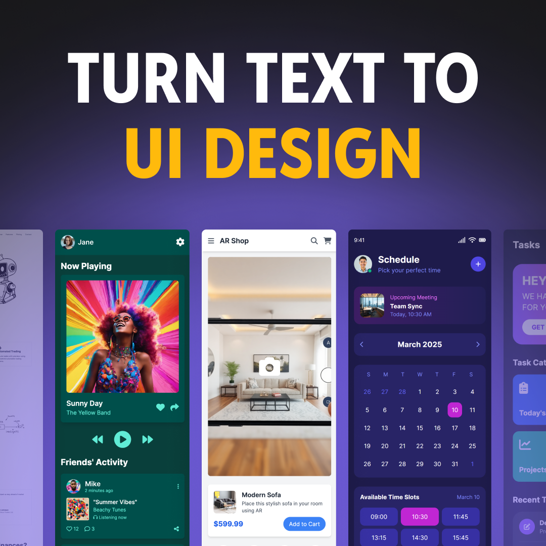


Launched in 2011, Trello boards were the first Kanban boards for many of us. Since its inception, Trello has come a long way. Or has it? Unlike many other tools, Trello hasn’t introduced any major new features likely to avoid unnecessary complexity.
But we’ve written this article not to ponder over Trello’s product team’s thought process, but rather to give our two cents on the “new stuff” recently introduced to the app. The “new stuff” is, of course, the introduction of the premium app version in February 2021.
⚠️ Disclaimer: All of the remarks below are meant for educational and entertainment purposes only. Trello’s designers worked hard on the new features and did a killer job. However, we thought it would be fun to think of how to make a great product even greater.
With that of the way, let’s dive in!
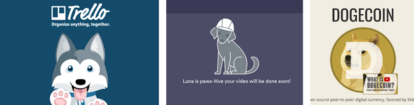
Dogs are taking over the world
Are you a cat person? Too bad. Cats are endangered species now. In products’ branding at least. While this is not a comment on Trello’s UX design, we couldn’t help but notice that so many brands develop dog-themed designs. To name a few: Taco from Trello, Luna from Loom, Dogecoins.
Not that we have anything against dogs. It’s just a fascinating observation, that what was once a cat-dominated world of branding is slowly getting its share of dogs as well.


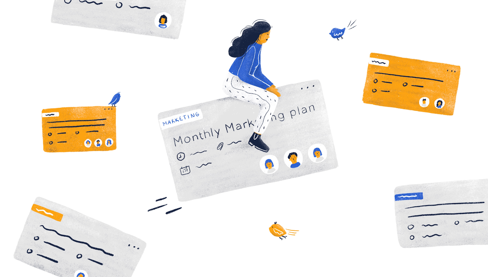
On Trello’s illustrations
Did you notice how all of the sudden all landing pages started looking ident.. pretty similar? We did too. Take a look at the two illustrations at the screenshot’s corners. Looks familiar? – Cause it is familiar.


Maybe it’s just how people do illustrations these days.


Also, is it just us, or do Trello’s illustrations actually look like stock images? We can’t be sure that they are, since we didn’t find the source. However, if an illustrator puts hard work into a design, the worst thing that can happen is for someone to assume that it’s a stock image.
There’s something wrong with using stock images, it’s just that usually bigger apps want to stand-out with custom and authentic visuals.
On Consistency
Consistency is one of those design mantras we hear a lot. Rightfully so. Consistent designs are easier to remember for users and are easier to keep in order for designers. Keeping this in mind, let’s take a look at the following screenshot collage from Trello.


Illustrations in multiple styles, minimalistic outlined icons, minimalistic filled icons, detailed icons, and images are all in one app. In our humble opinion, it’s a little much. We generally try to stick with a single design direction, that is defined with the help of a style guide .
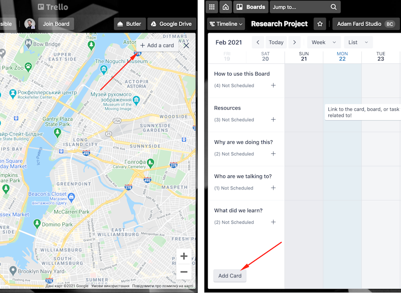
Another thing that we noticed is the inconsistent placement of the “add card” buttons. On the screenshot below, you can see the map and the timeline views side by side. Placement aside, there’s also a “+” on the left, and there’s none on the right.
Visual consistency aside, there’s also a thing we’ve noticed with the task date usage pattern.
Take a look at the gif below. Once you create a task and assign a deadline to it, you can view it in a calendar mode. Once the deadline is assigned, you can move the task around directly in the calendar mode. Pretty neat.


And now, take a look at this gif 🔽


We’re in a timeline view now. We still can stretch the task in terms of its start date and the deadline. However, we no longer can move the task with our mouse or move it across the boards. Yes, instead of moving the whole task, you can move the start and end date, but that’s a whole extra click. No one has time for that :)
On Accessibility
Overall, we didn’t notice any major issues with the accessibility of the platform, except for one thing. Boards with backgrounds are not the easiest to read.


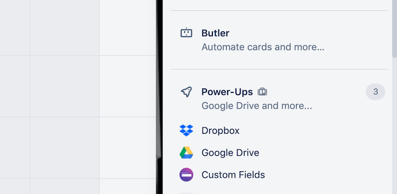
On Feature Naming
Similar features often have similar names. You have your standard “sign up”, “log in”, “create a task”, etc. These universal naming standards help users navigate apps easier since familiar product language taps into the mental models users already have.
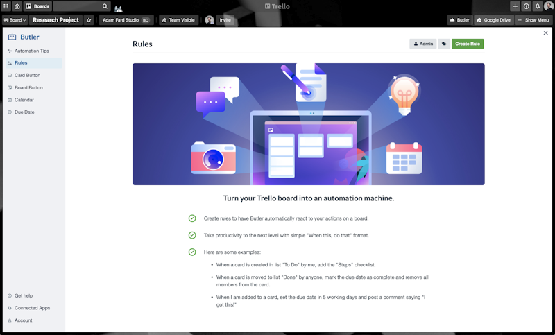
That said, Notion, Asana, and Monday.com have integrations and automation both in terms of the functionality and its naming. What about Trello? Well... Trello’s got 🥁 Butler… and Power-ups. One might argue that such an approach goes against the principle of clarity in UX writing .
Trello’s team included subtitles under the headers probably to tackle the said issue. Perhaps it’s one of the ways Trello's team wanted to differentiate themselves, but we personally would have stuck with easier names.


On templates
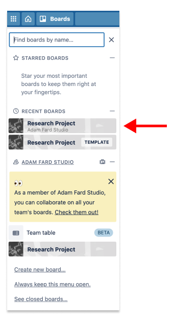
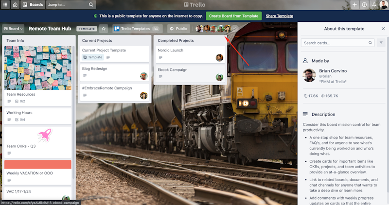
Upon creating a board from a template, the first thing that confused us was these users (see the arrow on the screenshot below). Are these people actual users or dummy accounts? Will they have access to my new board? Weird.


On dashboards
Having dashboards is a great idea. However, users might fail to find the card hidden below. We certainly did fail to find the tile as fast as we should have. In UX jargon, this issue is referred to as poor discoverability.


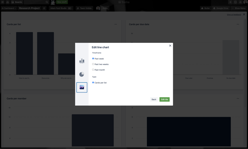
Here’s another thing we notice with the dashboards. Take a look at the dashboard modal below. Notice how we move from an oversimplified look (the background) to these radio buttons on the third modal in the flow. These radio buttons don’t seem to fit in with the rest of the design. Intentional or not, it feels like the CSS is missing.


The last improvement we would suggest is about creating previews for these charts. Here's how Google Data Studio does this.


On Onboarding
Although the app is seemingly simple, we thought we’ll share some thoughts on what we would consider improving.
Take a look at the screenshot below. It’s a checklist you get, once you upgrade your account to business class. The checklist approach is alright, but we thought that the onboarding would be even better if the Trello team decided to take the learning-by-doing approach.
So, instead of a checklist, the system could have helped users pick the power-ups they need and set them up, create boards, tasks, etc.


Now the automation onboarding is even less interactive than the checklist above. We really wish the system helped us create the first automation, rather than just giving us a list of bullet points.

Below, there's an illustration of the approach we think Trello should have taken. It's usually referred to as "learn-by-doing". It entails holding users' hands while they complete tasks that are essential to the product. If you're curious to read more about the different kinds of onboarding, feel free to read our article on Onboarding in UX.


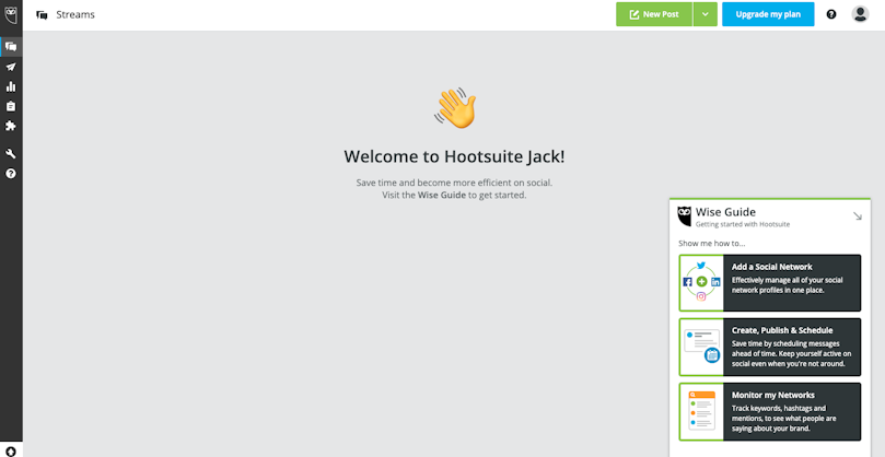
A screenshot taken from Hootsuite
On migrating from other tools
Let’s assume that I want to move my team’s task management to Trello, from say... Asana. There’s no way to do it as of writing this article.
Notion, for example, developed a way to easily transfer tasks from Evernote which undoubtedly helped some of the users to avoid the horrors of manual transfers. We would love to see Trello do the same with popular apps.


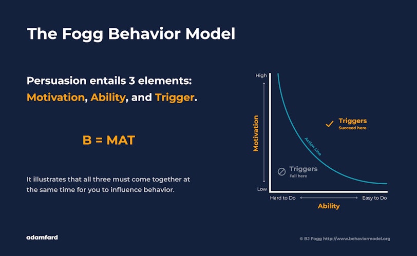
To ensure that the maximum number of users who use competing apps will switch to Trello, you need to motivate users and make adopting Trello easy. Only then, the trigger of asking to switch will work. This is a concept known as The Fogg Behaviour Model. We go into more detail on that in this article on UX and SaaS monetization .


Closing notes
It’s great to see Trello introducing new features. We’re excited about the new stuff and hope the team achieves the result they hope for.
What we also hope is that your, our reader, found our thoughts useful or entertaining. Or both, perhaps. In any case, thank you for sticking till the very end, and see in our new articles!