

Creating something people want is one thing. Making money off of it is another. While this article is not about the purely business side of making profits, it focuses on how design can help you nudge users to buy your SaaS solution.
Without further ado, let’s get into the article.


Boost your Revenue Through Impeccable UX
Let us skyrocket your metrics. We can get the project off the ground in days.
Contact usMonetization models
There are plenty of monetization models for digital products. SaaS products, however, generally are subscription-based. The latter could either mean that:
you’re paying to use a product for a certain amount of time (Netflix, Spotify);
you’re paying to use a product in a certain capacity (Remove bg.)
It could also be a combination of the two.
There’s also a common model, often referred to as “freemium”. Freemium apps usually have a free version, and a paid (premium) one. The premium plans are obviously more potent.
For the sake of this article, we'll view monetization as making money, i.e. getting a user to subscribe to your product.
Fogg Behaviour Model
Regardless of the monetization model, SaaS apps employ similar UX strategies to encourage users to get a subscription. Let's touch on that.
The Fogg behavior model is the underlying principle behind how users make decisions. It’s dead simple. If it’s easy to convert, and a user is willing to convert, a trigger (in-app pop-ups, push notifications, e-mails, etc.) is likely to succeed in converting.


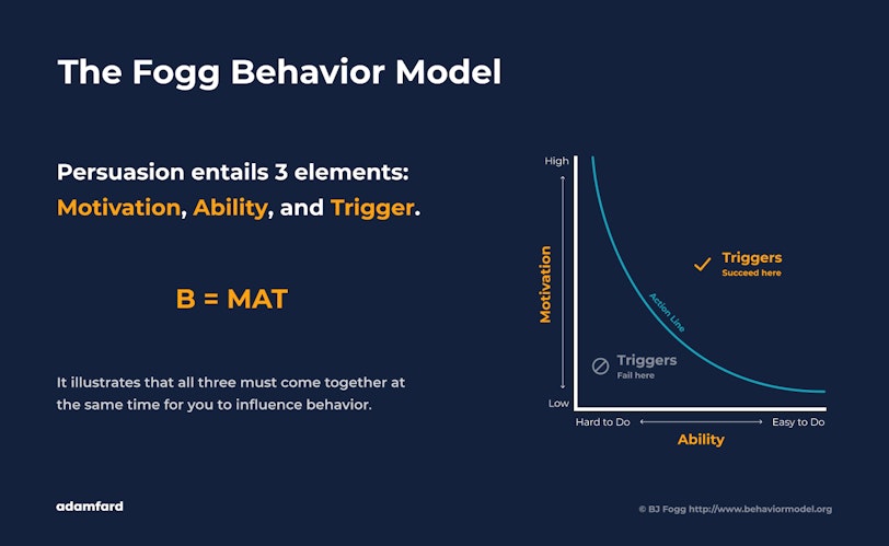
Although this concept is seemingly simple, it creates a framework for us to think within. It also helps us ask the right questions. How easy is it to become a subscriber at a given customer journey stage? How motivated is the user to become a subscriber? Is there a trigger to help users convert? All of these questions are essential to maximizing conversion numbers and a wide range of other SaaS metrics.
How we nudge users to subscribe
We’re firm believers that design should inform business decisions and vice versa. Therefore, as product people, it’s one of our goals to create such an environment, that would encourage users to get a subscription or a premium version of the product.
While focusing on nudging users in the right direction, we like to think of our products from a bird’s eye view, i.e. through a customer journey map (CJM). If you need your memory jogged, here’s an example of a CJM below.


The reason we look at the whole journey is simple. Creating a cohesive and consistently good experience should go beyond the in-app interactions so that we avoid unnecessary early user drop-offs.
Having mapped our users' journey, we can then apply the Fogg model to each touchpoint and pinpoint areas that need special attention or improvement. Let's break down a few of the key touchpoints.
The Pricing Page
Since in order to subscribe a lot of users will visit your website first, let’s start our journey there. The pricing page is exactly what we’ll need to focus on the most. One of the mistakes we see product owners make with their pricing pages most often is communicating features rather than value.
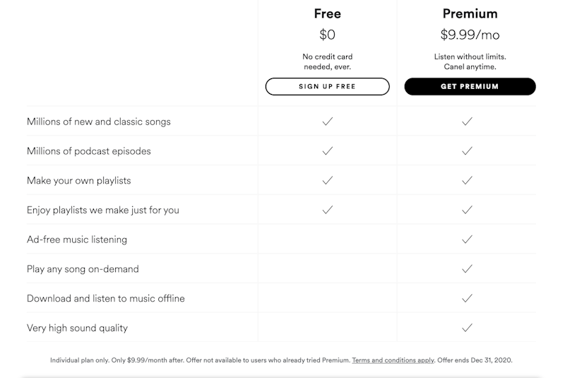
Look at how Spotify’s pricing communicates the value of its functionality. If the Spotify team decided to proceed with a feature-oriented approach, instead of saying “Millions of new and classic songs”, they would write “Browse songs”, which is less tangible and doesn’t convey the value of the app.


We also chose to highlight the way HubSpot goes about its pricing page. At first glance, this product seems to have opted in for a feature-oriented approach. “Landing page”, “Smart Content” or “Marketing Automation” don’t seem to have any tangible value associated with them right off the bat. However, all of these features on hover display hints, that describe the actual value behind these features.


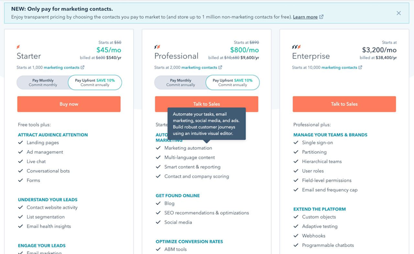
Another important factor is keeping these plans as simple as possible. The longer the feature grids and the greater the variety of plans, the less likely a user is to through it all to make an informed decision. If your product offers a variety of plans, make sure to specify for whom these plans will work best, e.g. “individual”, “a small/medium business”, “enterprise”, etc.
In-app Experience
Nudging the users in the subscription direction inside of the app is a lot more creative than creating a compelling pricing page. It requires thorough product mapping and identifying occasions where the users are most likely to convert.
Since every app is different, we’ll look at some great examples to get you into the right line of thinking.
Let’s start with Slack. Take a look at the screenshot below. The way this particular piece of design nudges users in the right direction, is through placing messages that suggest getting a premium account (trigger) when a user attempts something that exceeds his free profile capacity (motivation).


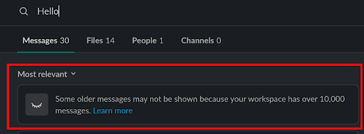
This particular message is also placed strategically throughout the app. The free version allows storing up to 10 000 messages. Is there a better time for a user to realize the value of unlimited messages history, if not when he/she’s risking to potentially lose important information? We think not.
Out-of-app experience
Brand experience is so much deeper than in-app experience. Additionally, nudging users to subscribe is a goal shared by a variety of roles within a product development team. That’s why designers should be nosy and closely collaborate with the rest of the team.
Outside of your website and app, the Fogg model applies just as well. With the help of user behavior tracking software, you can reach out to your users through e-mail, push-notification, and ads. All of the above can serve as triggers and also rekindle motivation.
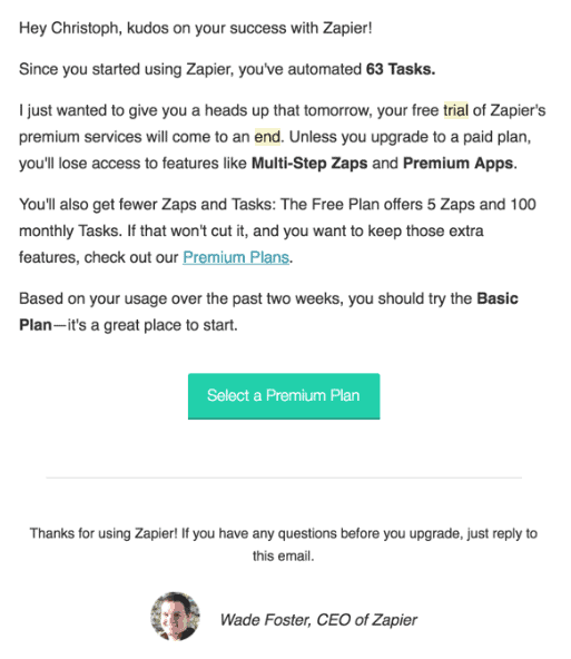
Zapier, especially as a freemium SaaS app, does a good job sending users occasional triggers.


Bottom line
Thank you to sticking to the very end!
Here’s a one-paragraph recap of the article to help you digest what you’ve just read as a reward:
As product people, we should also be responsible for ensuring the product makes money. The best way to do that is to be nosy and look at the customer journey as a whole. You can employ the Fogg behavior model on every step of users' journey to ensure your soon-to-be customers are motivated, taking the next step is easy, and the triggers are also there.
We hope that making products profitable became just a tad easier for you!