

“Stand out”. This is the go-to business advice you’ve probably heard a lot; and rightfully so. Visual identity is one of the most obvious ways to do stick out in a world full of brands. People remember your product because you look memorable. Pretty straightforward.
In order to be memorable though, people should recognize you by your visual identity, which should be consistent across all of the touchpoints with your customers. However, keeping things consistent is easier said than done, especially in large teams. This brings us to this article’s topic: style guides.
What is a style guide
A style guide is a document that contains design guidelines for each repeatedly used design element, such as visual identity elements, icons, interface components, and their states, headings, etc. Styleguides are often developed after the high-fidelity wireframes phase so that you could see what elements you’ll need, design them, and then refactor them into a style guide and later into a design system. In case you’re interested to learn more about the phases, check out this page on our design process.
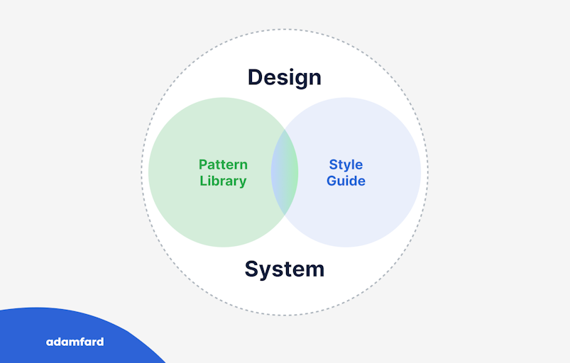
A style guide, as mentioned before, is a part of the design system or its early version. In layman’s terms, style guides are a compilation of all design elements, while a design system is built on top of the style guide by describing the relationships among the elements and their use cases.
There are different approaches to when you should create a style guide. Atomic design is the approach that suggests that you should create all elements first and then build your products from these blocks. On the other hand, you could ignore unifying the design elements, if your goals are to purely validate the product or design idea.
Why bother creating a style guide
There are a few reasons why style guides are a great idea. Let’s go through each of them.
Saving time
Style guides include all common design elements that are ready for use. That means that every time you need to use, say, a “sign up” button, you don’t have to design it from scratch or look for it on other screens but rather just copy it from the style guide.
The same is the case for development. Tools like Figma, Zeplin, Storybook, and InVision allow saving the code for each design element so that you have to code each element just once, and then copy it every time you need it.
Saving money
This benefit is highly dependent on the previous one. Time is money, so the less time it takes you to design and code the interface elements, the fewer expenses there are to pay. Pretty straightforward.
Design & code consistency
It goes without saying, that there is almost an infinite number of ways to code a single element, the same is also true about design. For instance, why would you have a button designed and coded differently every time it’s used. It’s bound not only to be wasteful in terms of resources, but it will surely result in inconsistencies in code and design.
Boost performance
The other benefit that is implicit from saving time, is that both designers and developers will have extra time that they can spend on thinking through the product logic, the flow, and the user experience component of great product design.
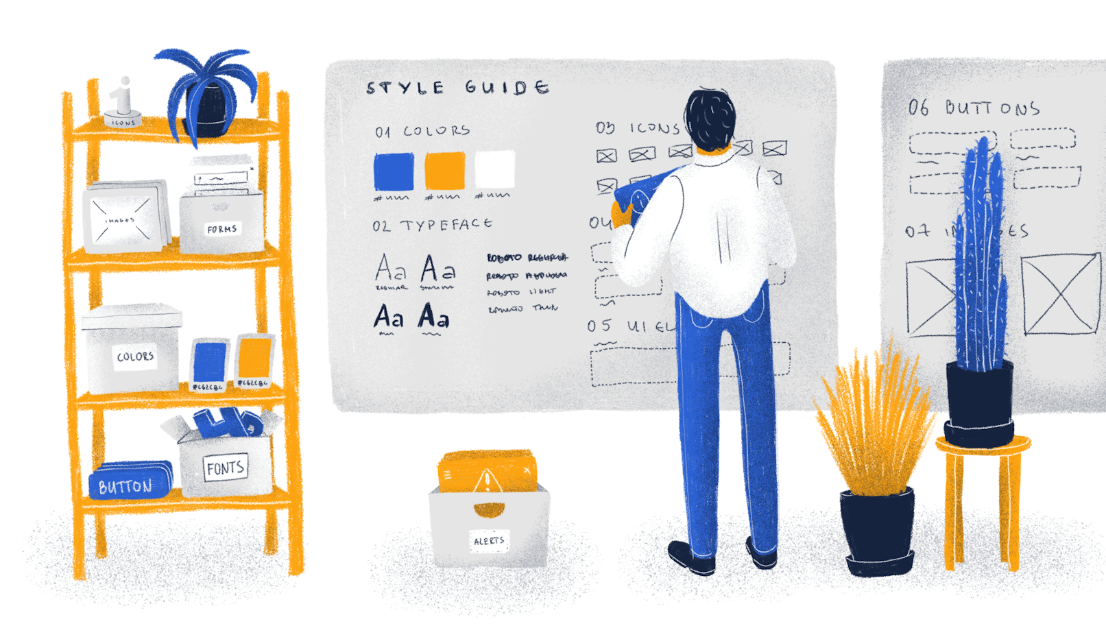
What goes into a style guide
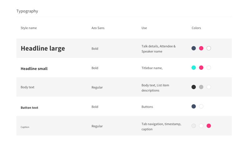
Typography
Headings (H1, H2, H3…);
Body copy;
Image captions;
Typefaces. (It’s mostly advised to stick with one font throughout the whole product or two fonts at the most.);


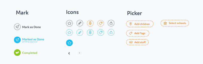
Icons
There are plenty of rules in iconography, but in our opinion, the most important ones are to use consistently designed icons (line weight, fills, etc.), and having icons that are intuitively recognizable. You can download icons for free from various places on the web or hire a designer to create them for you.


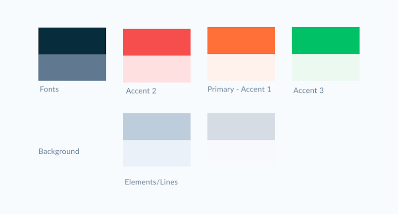
Colors
It’s generally considered a good practice to have 2-3 brand colors: base, accent, and neutral. The UI colors are a different story. At the very least you’ll need to incorporate semantic colors such as green for success and red for errors, etc. If you’re interested in learning more about colors in UI, check out this article on UX Planet.


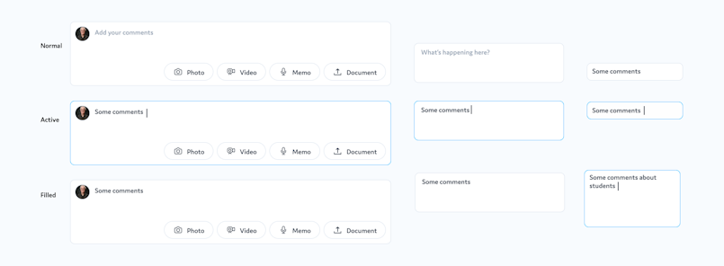
Buttons, dropdowns, other components & and their states
It pretty much goes without saying that buttons and their states should be consistent throughout the whole product.


Grids
Branding Elements


You might think that one svg. version of the logo would be enough since it scales but logos are also used on different resolutions (landscape, square or portrait). They are also used across different mediums (interface, mugs, t-shirts, etc.). Make sure to consider all instances of using the logo and reflect that in its design.


Complex elements that are made of child subelements
What should the end-product look like?
It’s generally useless or at least inconvenient to have the style guide anywhere other than the design or design hand-off tool. The reason is that you can't really copy design from a google doc. or a pdf., the same is true about the code. However, you can use tools to make these file types work for you and save time editing your documents. With that said, a google doc. or pdf. isn’t always the best solution.
Here are a few tried-and-true tools for keeping the style guides:
storybook
Figma files
InVision files
Zeplin files
Special dedicated tools like Zerogeight
What makes these tools great for design systems is that a) they’re collaborative, and b) developers can attach code snippets to separate elements so that they don’t have to code the same element twice. If you’re curious to learn more about these tools, feel free to check out our article on the design tools that we use.
Pro tip: make sure to use symbols (Sketch) & components (Figma), and styles, so that you can make global changes to the design elements, and therefore update the style guide and the instances of the elements a lot quicker (without using symbols, components, or styles, you’d need to update each identical element separately, which is problematic for large products).


Conclusion
If you ever wonder again whether it’s worth your time to create a style guide, hopefully, this article will have convinced you to create one. Feel free to explore the tools and the processes we outlined to see the benefits of style guides first-hand.