What’s UX writing
In a nutshell, UX writing is any text that users encounter while interacting with software. Be it button names, menu items, or product categories, you’re dealing with UX copy, often referred to as microcopy.
If you ever dealt with regular copywriting, you’ll notice that the same principles that make good copy for blog or ad purposes, apply to UX as well. This is because both regular and UX copywriting share the same goal, which is conveying information and nudging users in the right direction. The more efficient we are at conveying information and guiding users, the better the copy is.
Why it’s important
Copy is everywhere
Before diving into the reasons why UX copywriting is vital for a product’s success, let’s take a look at Facebook and Amazon with no UX copy.

A depressive sight, isn't it? As you can see, UX writing is kind of everywhere. The moral of the story is that regardless of how intuitive an interface is, it still heavily relies on copy as the main means of communication.
Copy directly impacts your business metrics
It’s tempting to think that microcopy is trivial. What do these few lines of copy matter anyway? As a matter of fact, they do. Yvonne Gando, a senior UX writer at Google, presented a case study, that shows that the difference in clicks between the least performing and most performing invite message Google chose for their app Duo is 30.1%.
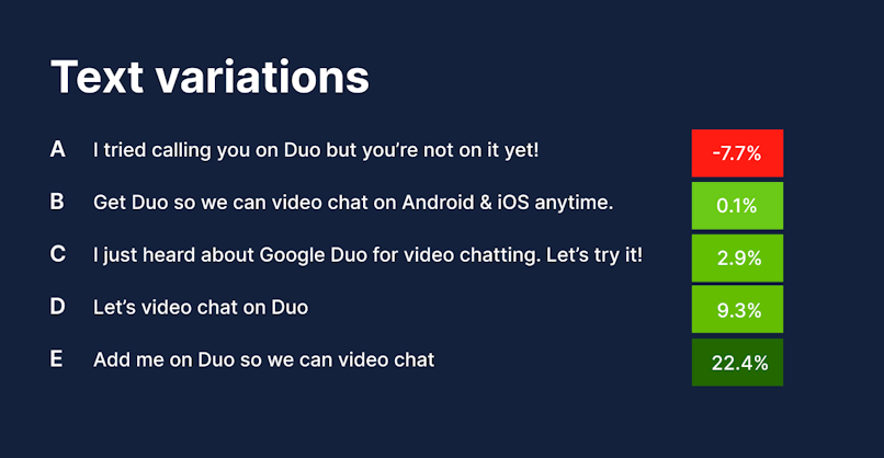
Business implications of UX writing are similar to business implications of UX in general: better retention, less user frustration, and increased revenue as a result.
Consistency
Having a UX writer on-board is especially crucial for complex projects with multiple teams working on them. The more people are involved in writing, the less cohesive and unified it becomes. That’s why having a UX writer on board provides immense value.
Having a separate person working on UX copy also reduces the risk of using professional jargon, which a designer, developer, or PM might incorporate into the copy.
What makes great UX writing
Usefulness & Correctness
When it comes to usefulness, any text that’s on the interface is meant to help users achieve their goals. UX copywriting, along with icons, illustrations, videos, etc., is a way to ensure intuitive navigation and task completion.
Take a look at the examples below. The first screen provides very little value, it merely states a fact. On the other hand, the second screen explains what might have happened to the page and provides users with further instructions.

As for correctness, it’s pretty straightforward. Typos don’t look good, neither do wrongly named buttons. Anything that could be fact-checked, tested, or proofread should be.
Conciseness
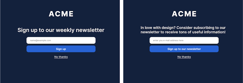
The saying goes that brevity is the soul of wit. This applies perfectly to UX writing. Not only a condensed copy provides more value per character, but it also helps UI designers who don’t have an unlimited screen space to work with.
Being concise generally involves abstaining from complex grammar constructions. If the point you’re trying to convey requires a lot of space, consider using other mediums, such as videos, illustrations, graphs, animations, etc.
Clarity
Digital products are not calculus textbooks or international treaties, they are meant to be accessible to the widest audience possible. This means that the language used in said products should be plain and easy-to-understand. Let’s go through a few tips to help you achieve that.
Active voice is better than passive voice.
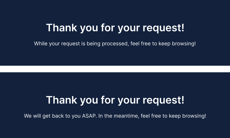
People usually speak in the active voice. That’s why your interface should speak it too if you want to sound natural. Also, speaking in passive voice avoids mentioning the subject of the action, which can come across as secretive.
Take a look at the examples below. Which one works better?
Double negatives
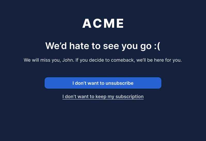
Can we all agree to stop using double negatives? That wouldn’t do no good. Notice how the last sentence is both unnatural and unclear. That’s precisely the reason why it’s never a good idea to include a double negative in your interface copy.
No technical language & jargon
This principle is simple. You generally want to stay away from jargon as much as possible. Unless you’re creating an app for quality assurance specialists, “error #238” message doesn’t really help. And I’m sure QA’s too would love some human language for a change. Such messages are useless. All they do is force the user to google this error, which creates an unnecessary extra hoop to jump through.
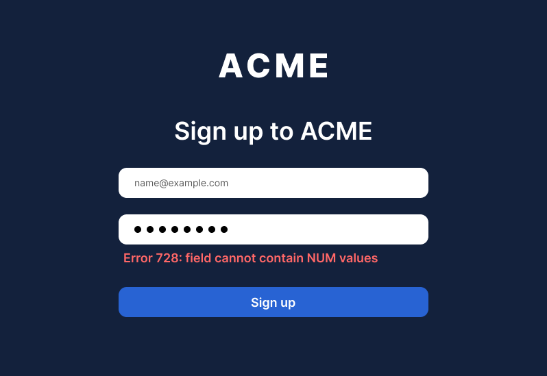
Professional jargon also includes abbreviations like PM, MQL, BOT, IA, etc. It’s quite precarious to presume users know all this. While shortening complex words into abbreviations certainly helps to keep things concise, you should be mindful of educating users first.
Being on-brand
Nailing the copy in terms of clarity and conciseness is great. However, these two principles don’t tell us much about what tone to use. Do we sound playful or serious, neutral, or humorous? These questions are answered through branding. Take a look at the spectrum below and see where your product fits.
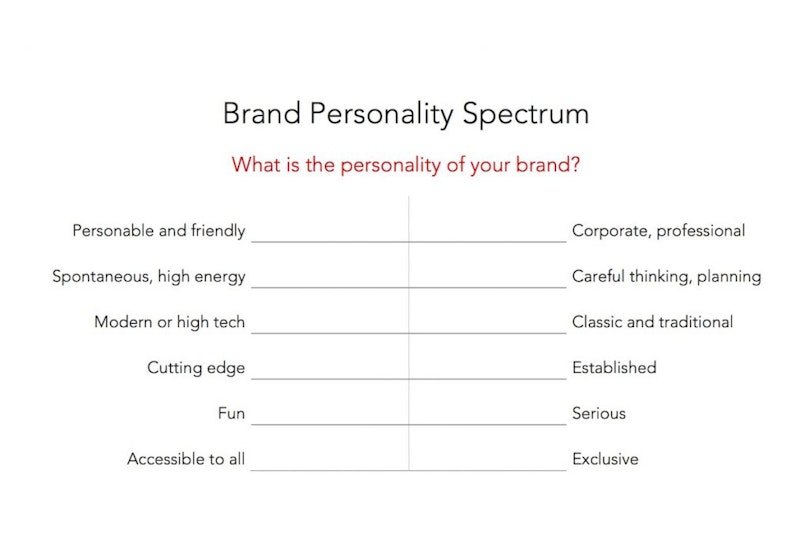
Having established your place on the spectrum, make sure to align your copy with your branding. That way your overall product messaging is guided by the same principle.
Conclusion
As we’ve seen, UX writing is a necessary part of any software. It guides users through your product and helps them achieve their goals. That’s why nailing the copy is vital for your product. Following the following principles will help you to do just that: usefulness & correctness, conciseness, clarity, and being on-brand.


