

We live our lives believing that we understand the world we live in and make objective assessments of our surroundings—that’s only partly true. There’s a variety of processes happening in the back of our minds that govern both our conscious and unconscious. An important set of such mechanisms are the Gestalt principles—they define the way the human brain identifies shapes.
These processes allow us to make sense of the world we live in without delegating it to our conscious minds. How do we know that something looks like a kettle? It’s safe to assume that most of us just know that something looks like one without having to invest too much time and effort into making this assessment.
Naturally, UX and UI designers leverage Gestalt principles to create interfaces and experiences that are intuitive and easy to process.
This article is about one of the most widely used Gestalt laws used in design—the Law of Similarity. Let’s take a closer look at how you can start using this principle to your and your users’ advantage.
A quick intro in Gestalt psychology
The name of this school of thought originates from the German word “shape” and was established in the 1920s by a group of European psychologists. The founders of this school focused their research on the way humans organize and categorize visual stimuli and how this helps us derive meaning. One of the fundamental tenets of Gestalt is that the whole is always more than the sum of its components. Let’s take a look at a quick example.


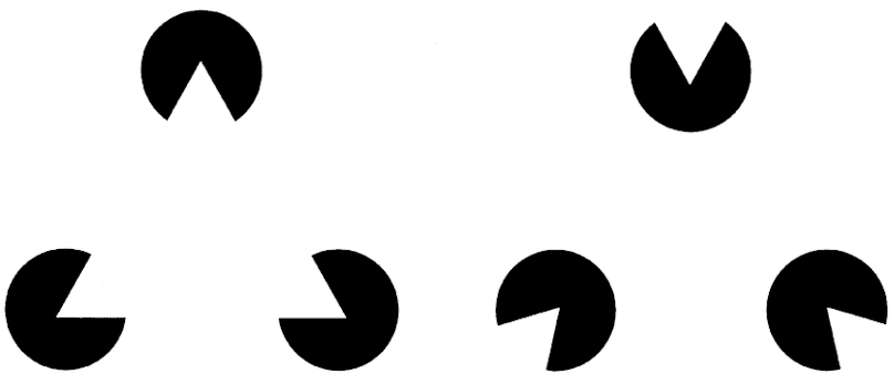
The Kanizsa triangle is an example of a depth illusion based on Gestalt principles. The inferred figure (triangle) seems to rest on top of the Pac-Man-like discs. The three discs constitute the sum of all visual elements, while the triangle acts as the surplus meaning derived from them.
There are eight essential Gestalt principles:
Similarity
Continuation
Closure (also known as Reification)
Proximity (also known as Emergence)
Figure/Ground (also known as Multi-stability)
Symmetry and order
Common fate
Common region
So, what is the law of similarity?
Humans have a tendency to group visual elements into distinct categories based on shape, color, and other parameters. This is most likely an evolutionary adaptation that allows us to process a large number of visual stimuli.
Think of it this way—you’re in a forest, and, for whatever reason, you’re worried for your safety. Your brain will automatically lump similar things together, like leaves, trees, allowing you to identify the source of your potential threat—things that stand out. This will enable us to analyze our surroundings much quicker and increase our chances of surviving.


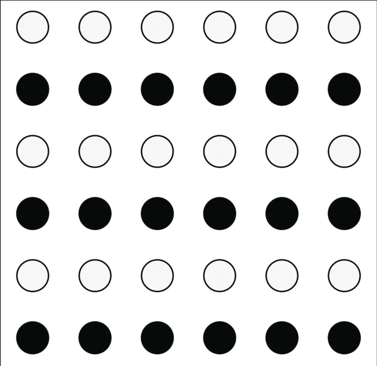
Take a quick look at the image above and think about what you see. Most of us will see it as rows of black and white dots rather than columns of dots that alternate in color. This is the law of similarity in practice—your brain is trying to make sense of the world in a meaningful way.
Applying the law of similarity in UX design
Now that we’ve taken a look at the general implications of the law of similarity, let’s see how they work in practice.
Shapes
Using shapes to enforce the law of similarity is a highly effective way of helping users understand the information architecture on a page without causing excessive cognitive load. This enables people to understand where the most information is on a page, as well as intuit the relationship between different types of elements. As a result, this will allow users to extract more meaning from a UI without having to rely on copy to guide them.
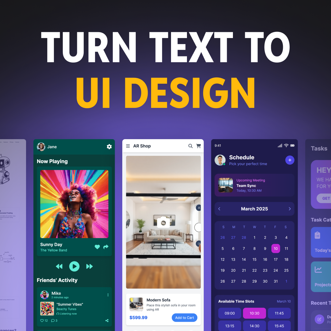
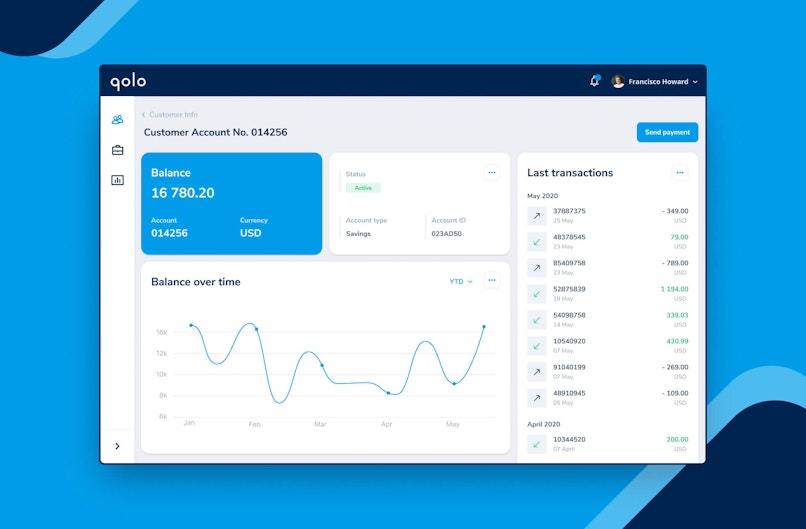
Below is an example of the law of similarity in practice. While the UI uses a wide range of different Gestalt principles, let’s focus on the clickable elements and input fields.


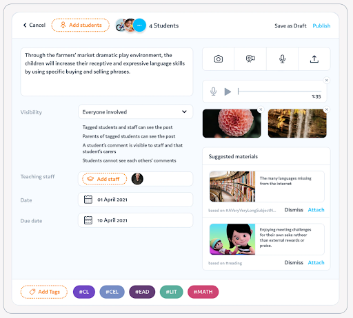
Let’s start with the four buttons in the top-right corner. This section revolves around uploading or recording media. You can either take a picture, record a video or an audio file, or upload a separate file from your device. All these buttons are similar in shape and easily distinguishable from the rest.
The same goes for the input fields in the center of the screen. They all share the same shape, which gives us a clear understanding of their function before reading into the microcopy.
Colors
When combined with basic color psychology principles, Gestalt techniques can really improve your design in terms of intuitiveness. In the example below, you’ll find two columns of data that relate to the change in percentage.


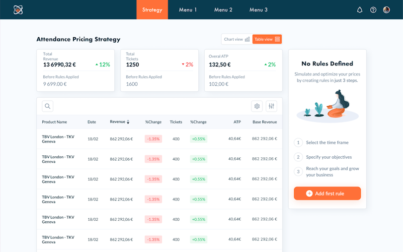
This allows users to quickly group and make sense of the color-coded information and make a preliminary assessment of the change in revenue.
Sizes
Grouping elements by size is another extremely efficient way of helping users navigate an interface. Like other types of Gestalt similarity, it provides people with an immediate context, making their interaction with a new UI more intuitive and frictionless. It helps make the most important content visible and establishes a clear priority among visual elements.


In this example, you can clearly see groups of information categorized by size. The navigation icons are of the same size to suggest that they all have a similar function of transporting the user elsewhere. The same applies to the transaction history.
Other categories
It’s important to underline that similarity goes beyond shape, size, and color. Here are a few other parameters we can leverage to make use of the law of similarity in design.
Direction
Often, we choose to align various elements of our design vertically or horizontally. This allows us to use space in an efficient manner while also ensuring that the content is legible and its structure is intuitive.


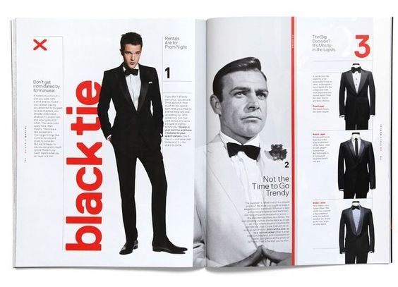
In the example above, you’ll see that content is very distributed in terms of direction. For instance, the suits showcased on the right page are aligned vertically, while the accompanying text is horizontal.
On the other hand, the red text on the left page is different in terms of direction, color, size, making it quickly distinguishable from other text types.
Position and fonts
A very simple way of applying the law of similarity when working with text-heavy parts of a website or product is by creating a clear font hierarchy.


For instance, when we scan a blog post, we can clearly distinguish the parts of the text that are written in larger and bolder letters, as opposed to the lighter body text that uses smaller fonts.


Aside from font differences, there’s also a difference in positioning. Headings typically rest above body text. Creating a sense of continuity among types of text will also allow users to scan your copy more efficiently, thus improving their experience.
Closing thoughts
UX is interdisciplinary in its nature, and the fact that we make use of Gestalt principles in design confirms it. The law of similarity is a very straightforward yet powerful way of creating experiences and interfaces that are easy to navigate and cause little cognitive friction.