

How to read this case study
Boy was this project a journey. We went from an early childish-looking platform to a mature validated edtech product with a sleek modern design and a number of new features. Not to mention a number of new business opportunities for our client.
This epic design saga took 1 year and 7 months. To help you digest this adventure and not get lost midway, we’ve split this case study into two sections: the design process and the features we designed.
The design process section is the set of activities that constitute a single iteration or sprint. Since this process is relatively consistent for each group of features, we’ll go over it just once. The features we designed section covers the most important features we designed (duh) by following the process outlined in the design process section.
With that out of the way, let’s get into the case study.
Edtech Design Process
Eliciting requirements
The initial stage of our engagement with the product team naturally involved getting a deep understanding of why they needed our help. It’s exceptionally important to help clients articulate their needs and understand the basis behind them. A good analogy here is that to shortlist a list of potential diagnoses we’re looking to define the symptoms well.
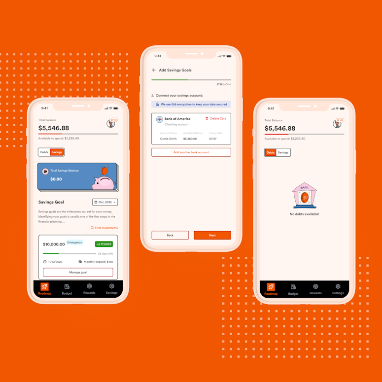
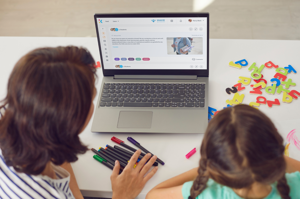
At this stage, we’ve learned more about the current product version, branding, users, and their workflows. The Kinteract team wanted to change the technology of their front-end, and move away from the K-12 look-and-feel, so the product identity is less childish.


Auditing the initial state of affairs
Armed with the ideas of product improvement, we proceeded with conducting an audit of the existing designs. The issues we identified were then prioritized and scheduled to be worked on.
One of the major issues was that the LMS mobile app wasn’t consistent with the web one. Additionally, it hadn’t been really intuitive, which was a suspicion of ours that was then further proved by the usage data.
The rest of the improvement areas included working on the existing design components and visual design, reducing cognitive load, better usability.


Early Concepts
Now that we had a list of issues to tackle, it’s time to focus on how we could do it. The solutions would first take the form of rough concepts. The more the better. This stage is all about quantity. The best concepts would be potentially merged and make it into the optimal version.


Wireframing & idea validation
Having prepared a wide range of potential concepts for the features, we’ve fleshed out the best ones.
Separating the wheat from the chaff in terms of design looks something as follows:


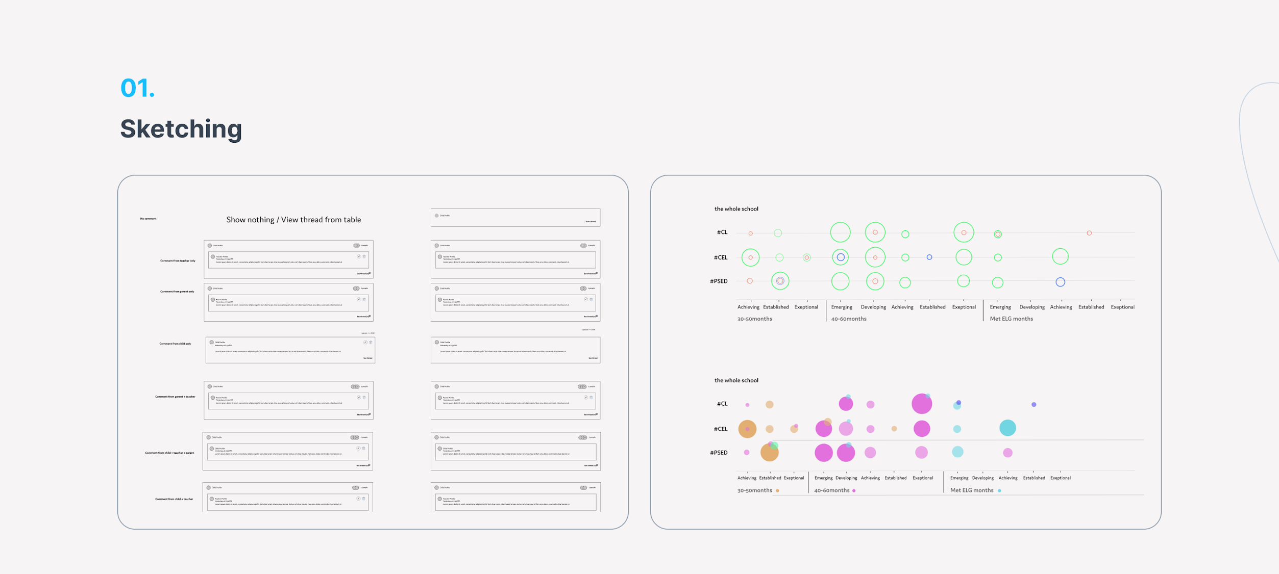


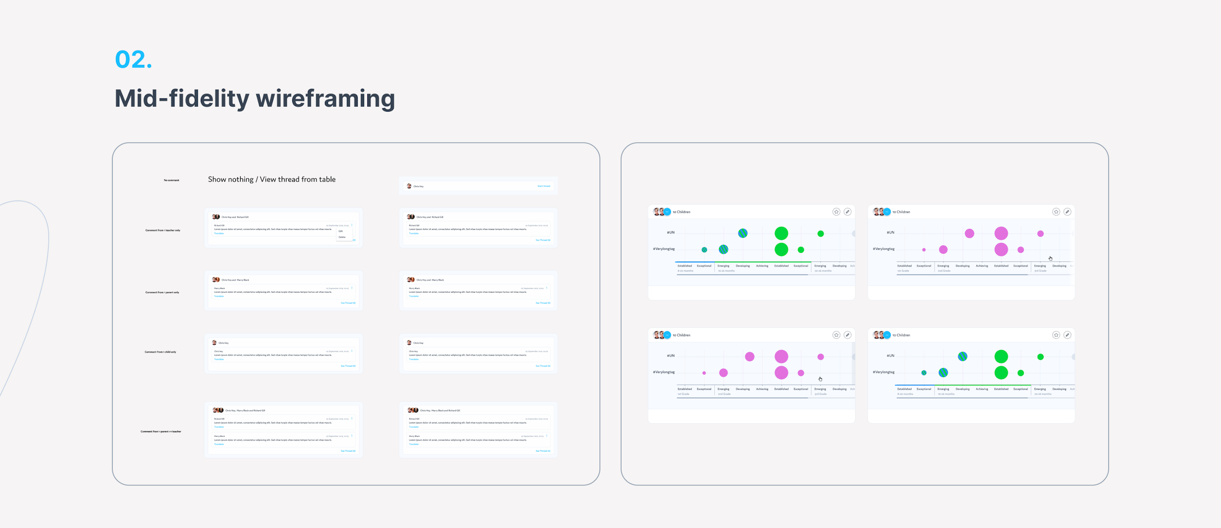


For each major shift in design, we’ve conducted internal and external interviews with potential users, domain experts, educational consultants, teachers, and other stakeholders. Who we talk to depends on the feature we’re designing. That’s how we knew whether our designs worked.


Qualitative research, i.e. usability testing sessions, allowed us to identify potential usability issues early on, which made it quick and cheap to fix them before a single line of code is written. Beta testing is yet another way we used to validate our design decisions through gathering quantitative data.
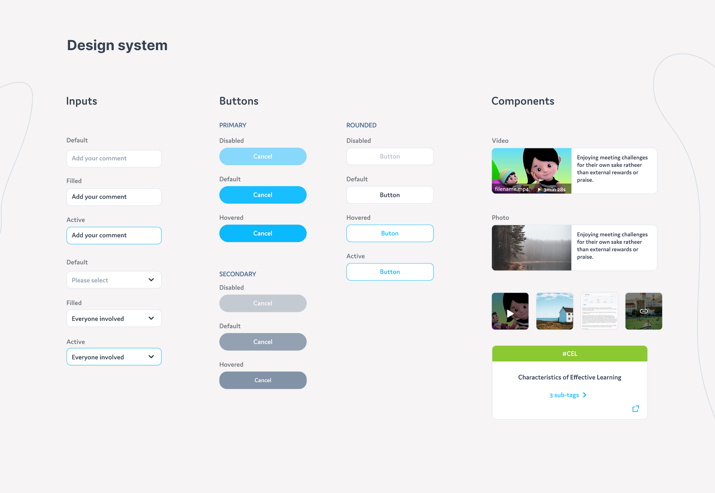
High-fi Design & Hand-off files
The next step for a validated wireframe is making it look stunning. That’s what we put our effort into. These designs were then turned into hand-off files for the development team.
There were developers working on the project already, so there were a lot of things running in parallel. At any given point in time, developers had things to do, and so did we. That’s one of the other benefits of the agile design approach.


The features we designed
How an edtech feature is born
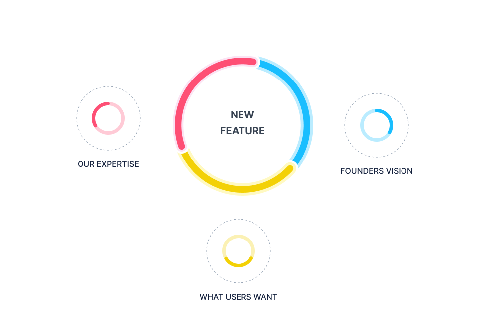
Coming up with features is tough. No new features – the competition gets ahead. On the other hand, pumping the product with features is a recipe for unnecessary complexity. That’s why we decided to approach feature ideation in a smart way.
Out approach to feature ideation combined the vision of edtech product team, our expertise and experience, and the user research findings we collected. That way all new features were viable.

The features
The process we outlined above is iterative. That means that in order to keep designing, validating, and coding features as rapidly as we can, we worked in increments. Here are some of the most important features we designed:

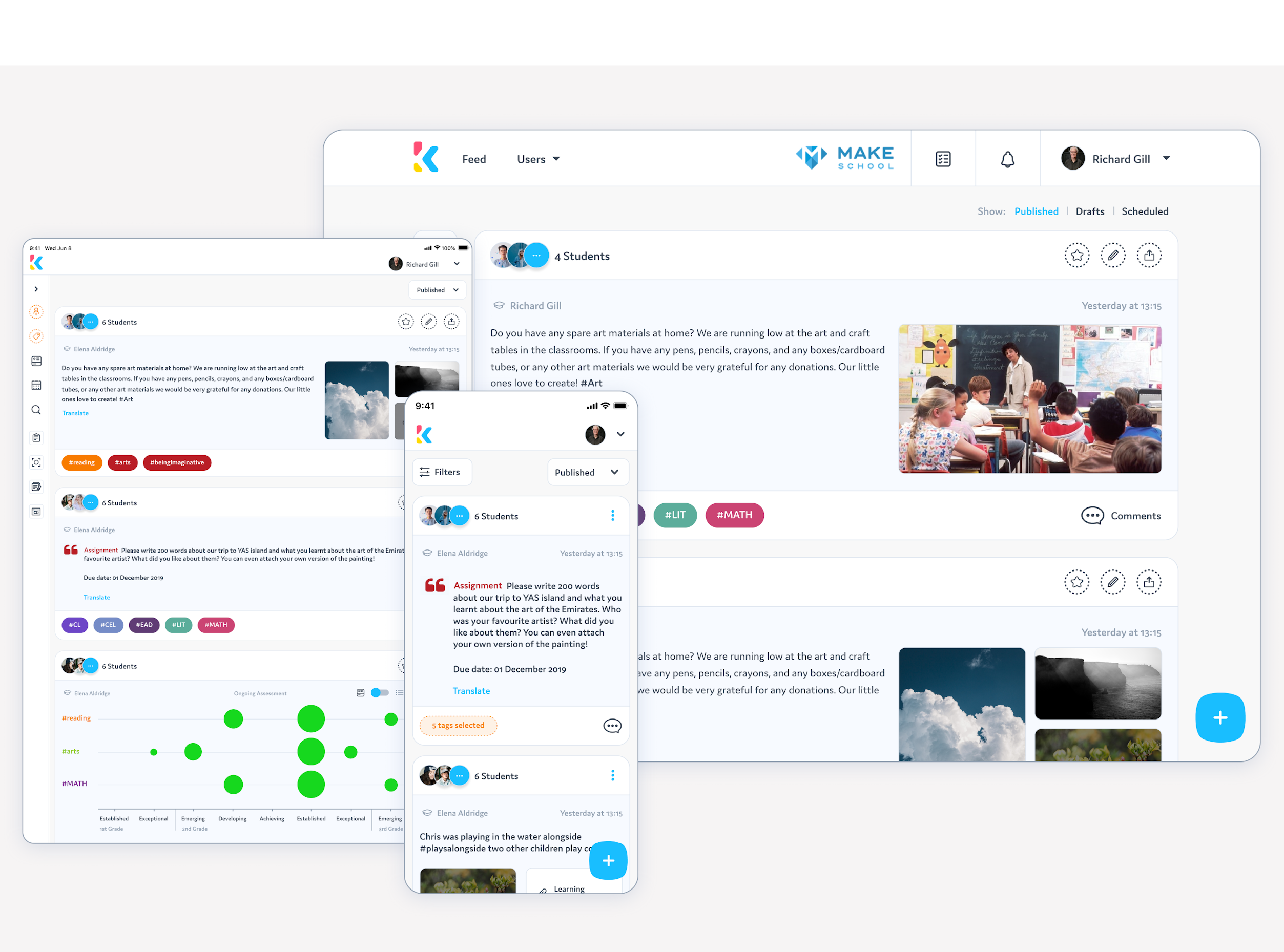
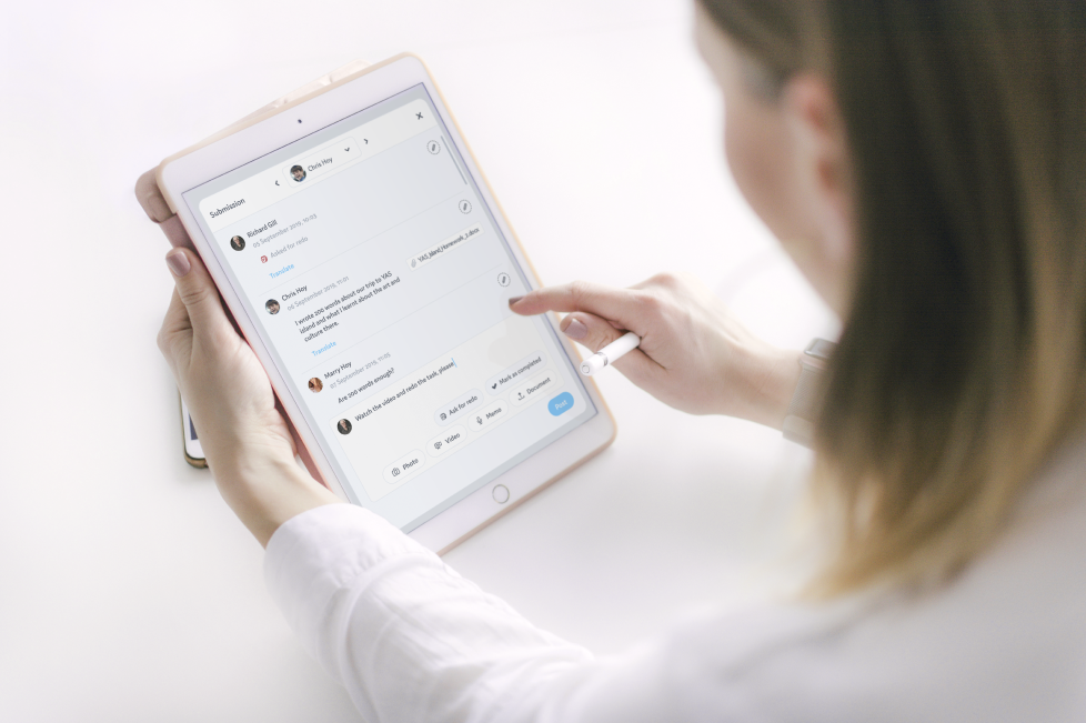
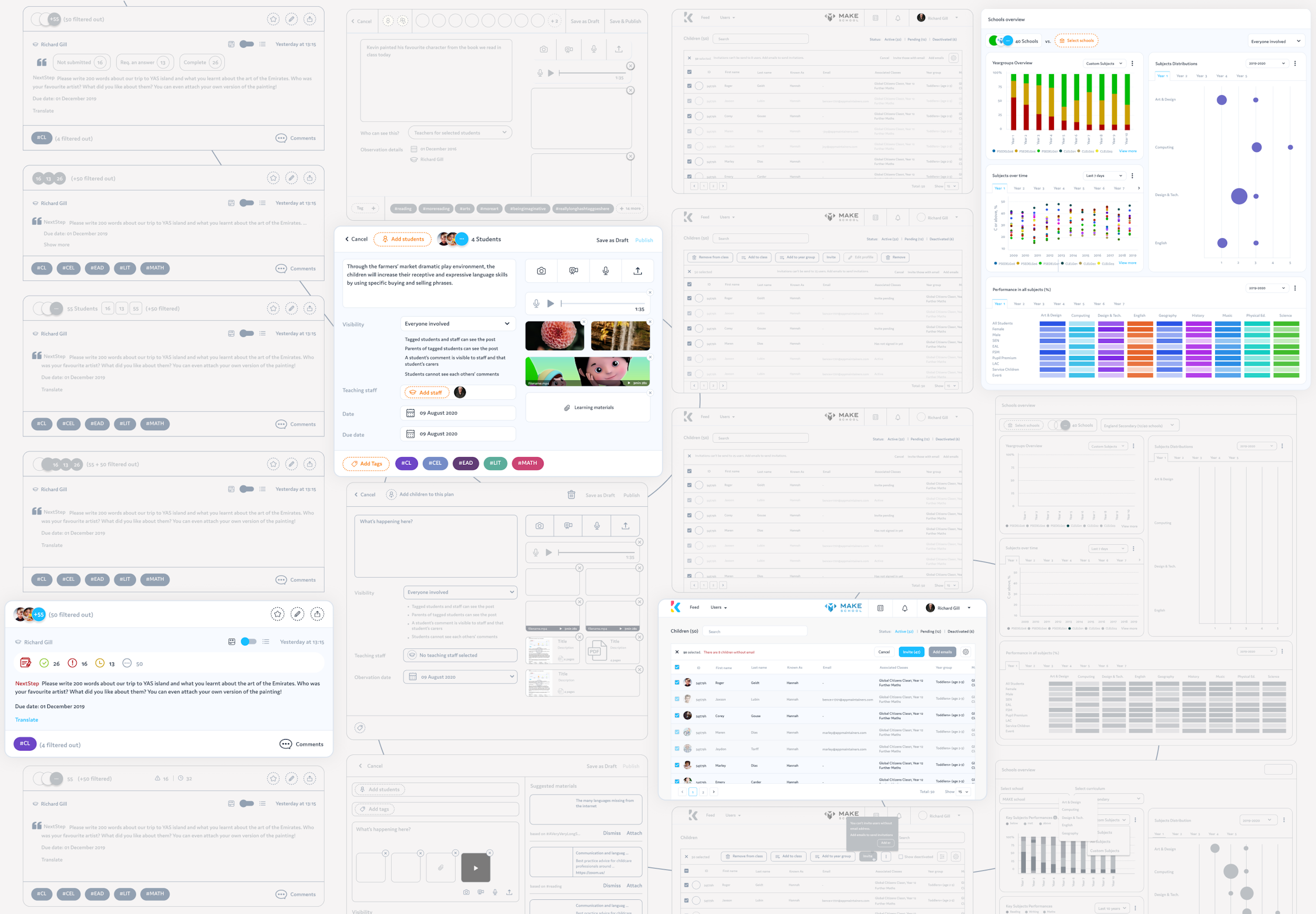
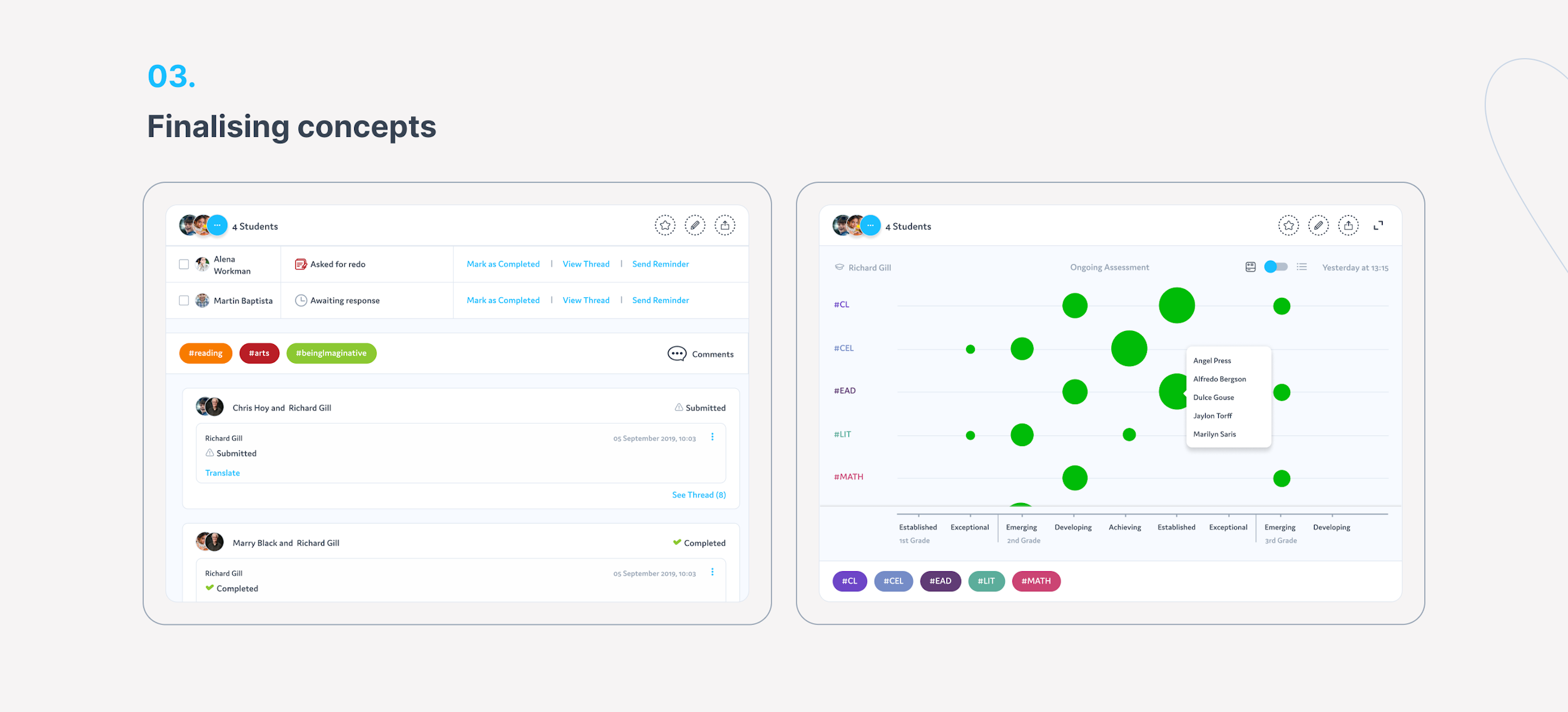
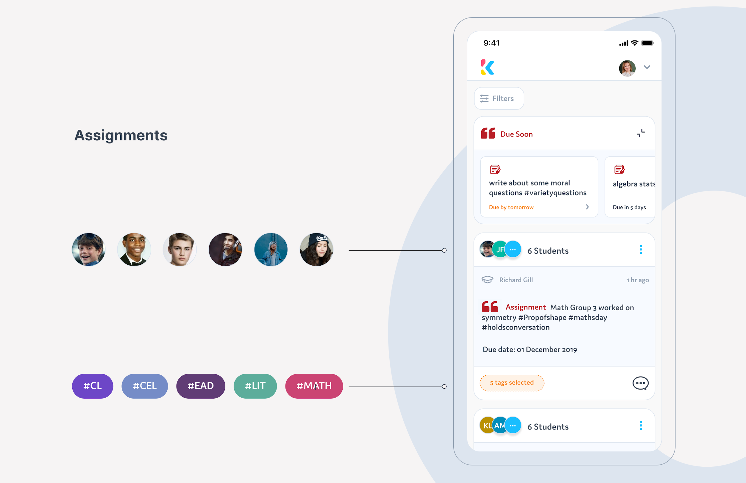
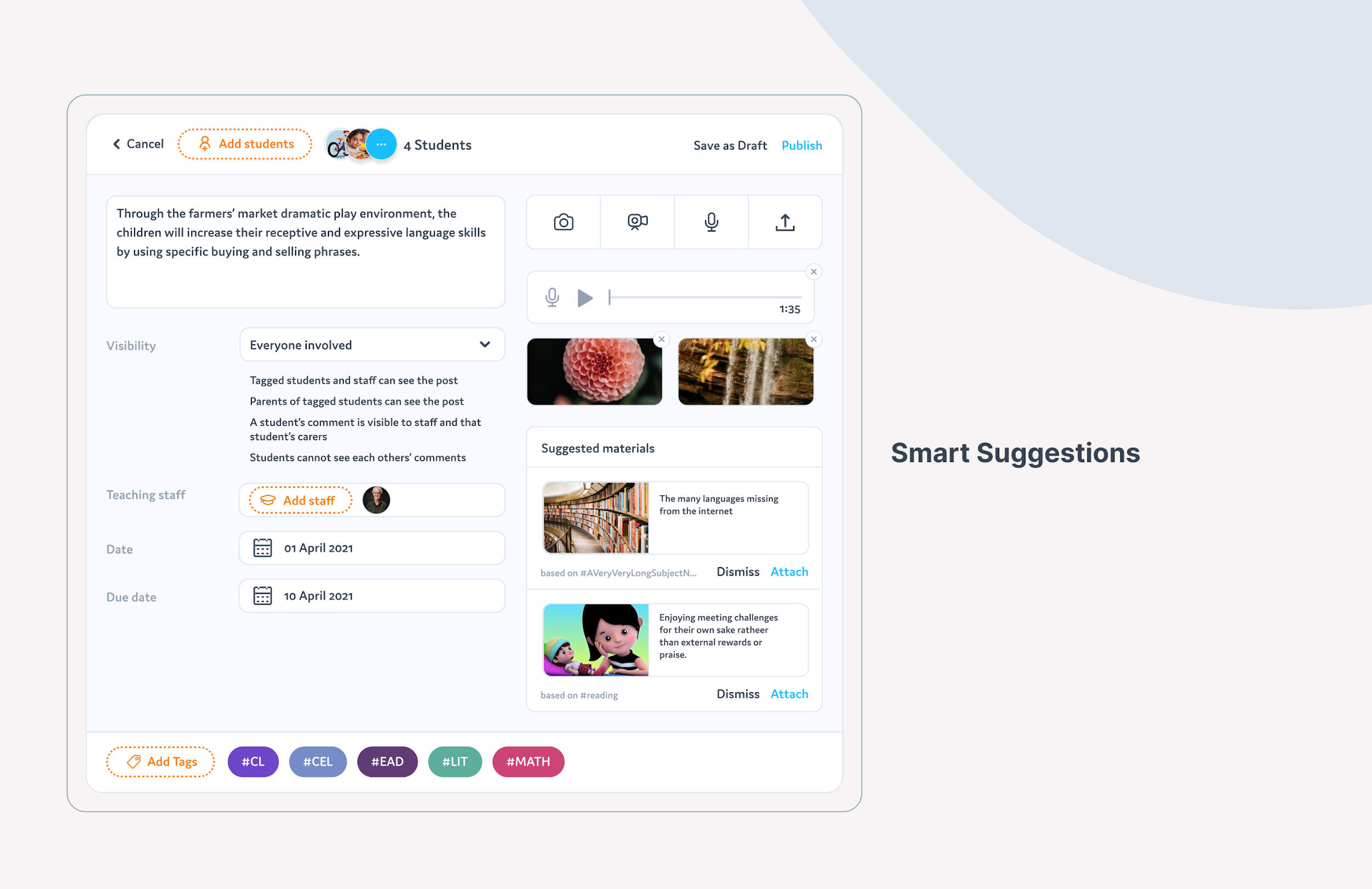
Assignment and smart suggestions
To avoid the hassles of making sure that students write down their homework, we’ve enabled teachers to create assignments and next steps for pupils, which were also visible to parents.
Suggested learning materials are a smart feature based on selected tags, students' grades, and their progress.


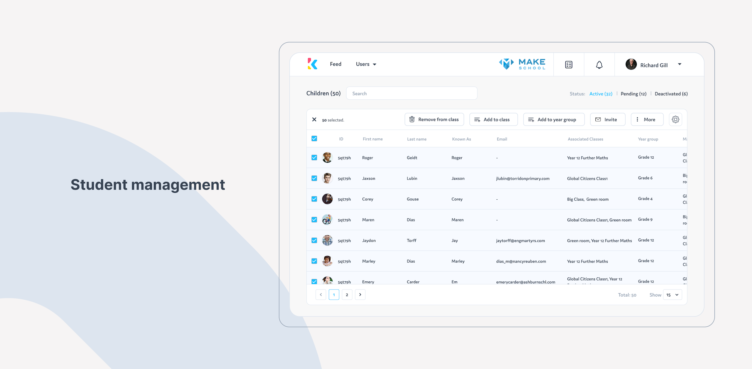
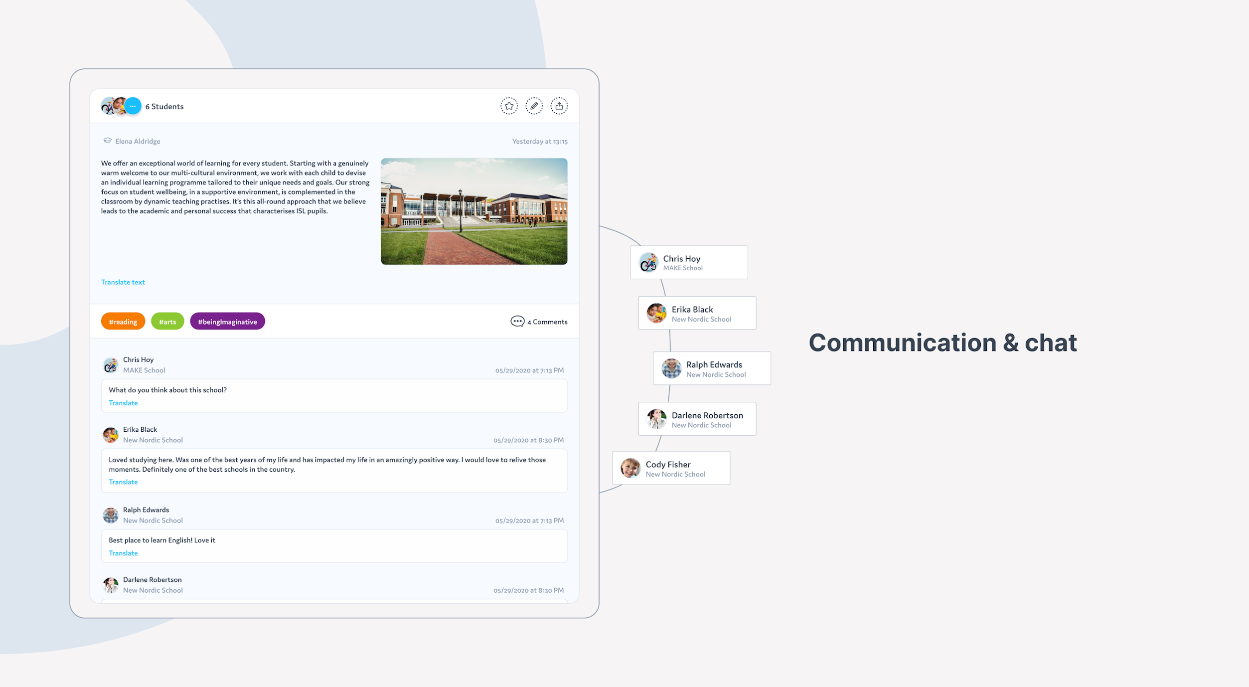
Students management and communication
Assigning students to groups, classes, or removing them has never been easier.
The LMS app allows communication among multiple groups, teacher-to-parent, teacher-to-teacher, parent-to-parent, and so forth.


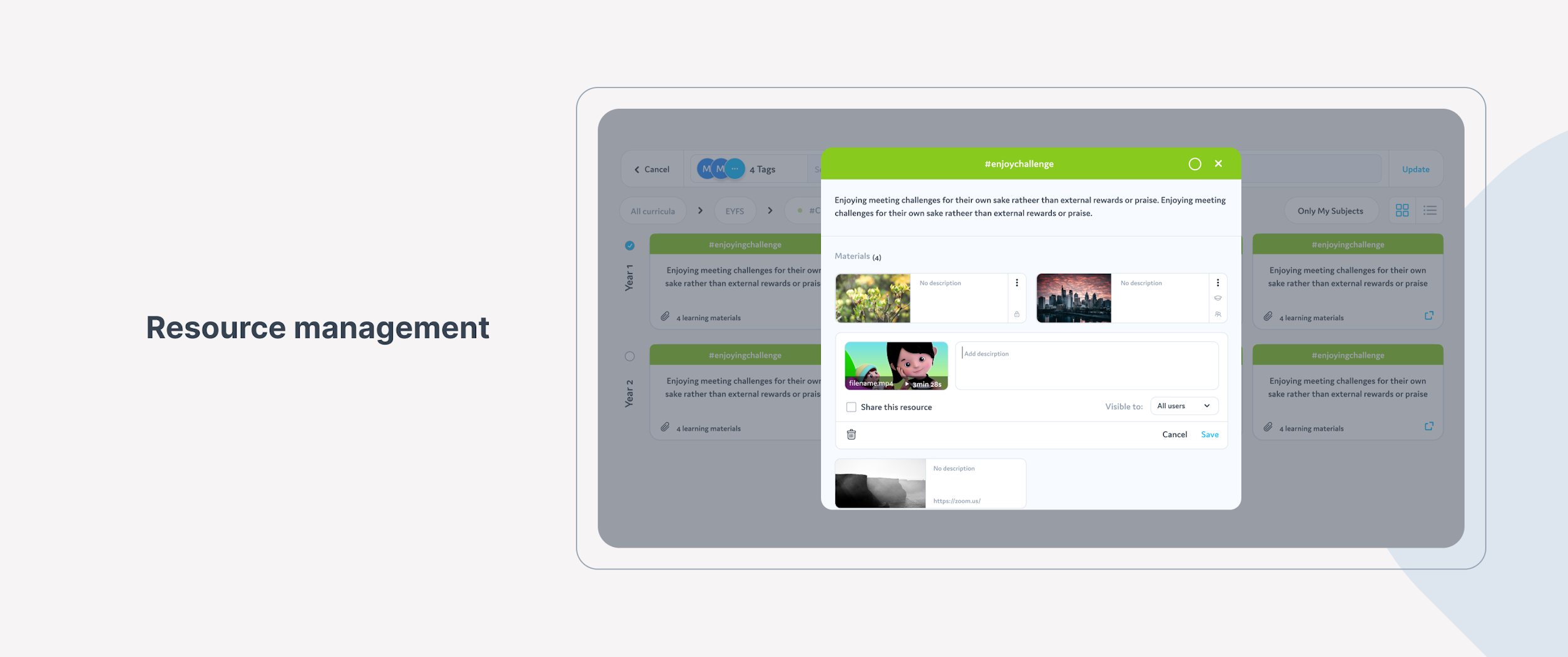
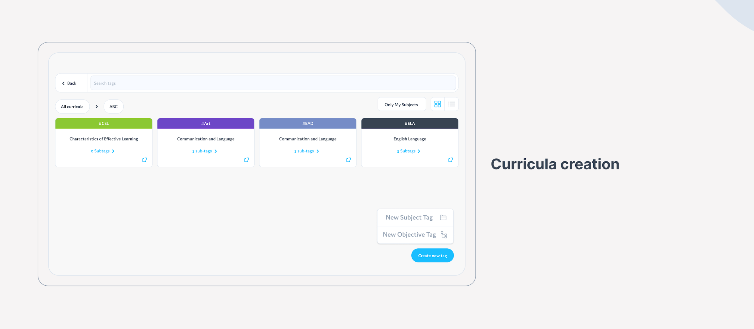
Resource management and curricula creation
Multimedia has become a major part of a modern classroom. That’s why we’ve enabled teachers to attach all kinds of documents to the lesson plans, and students’ curricula.
Creating and storing curricula and lesson plans is as easy as editing a google doc. Teachers can always adjust things and enrich their materials and methods.


Achievement timeline
Motivation is a major part of quality education. To help kids and students get through the more stressful parts of their studying, we’ve designed an achievement timeline so that they can easily see what progress they’ve made over the years.
Interactive Figma Prototype. Open in new tab
The journey ends here
Thank you for sticking by till the very end of this case study! We hope you had as much fun reading about our design as we did designing. If you need help with a similar project, feel free to drop us a line.