


Design process
Project overview & Initial information
At the time the Qolo team approached us with a project in mind, the customer had a great idea, a PowerPoint presentation with rudimentary wireframes, and a google doc with some of the features for their product.
Our role in this endeavor involved turning this idea and a list of features into a functional and validated design for both desktop and mobile devices.
Wireframes & User Flows
Based on the documents we were provided with, we’ve turned the list of features and requirements into user flows & wireframes to validate the logic behind the flow. Having reiterated a few times to address some of the initial design issues, we’ve come to a deliverable that was ready for early usability testing.

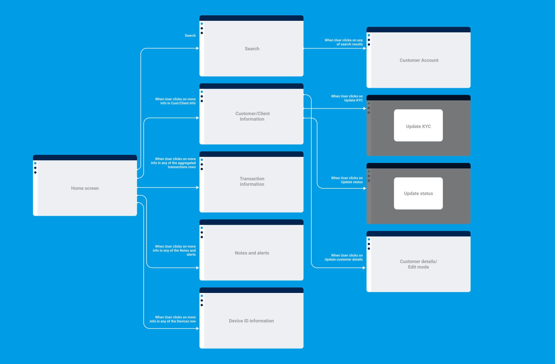
The Qolo team took the responsibility to test the current flow with both internal and external users. Having received initial positive feedback, we were ready to move forward with designing the brand aesthetic.
Moodboard development
In terms of the brand aesthetic, the Qolo team just had their logo at the time. Having used Qolo’s logo as a springboard in terms of colors and style, we’ve gathered a list of relevant design references to settle on a specific look & feel we wanted to accomplish.
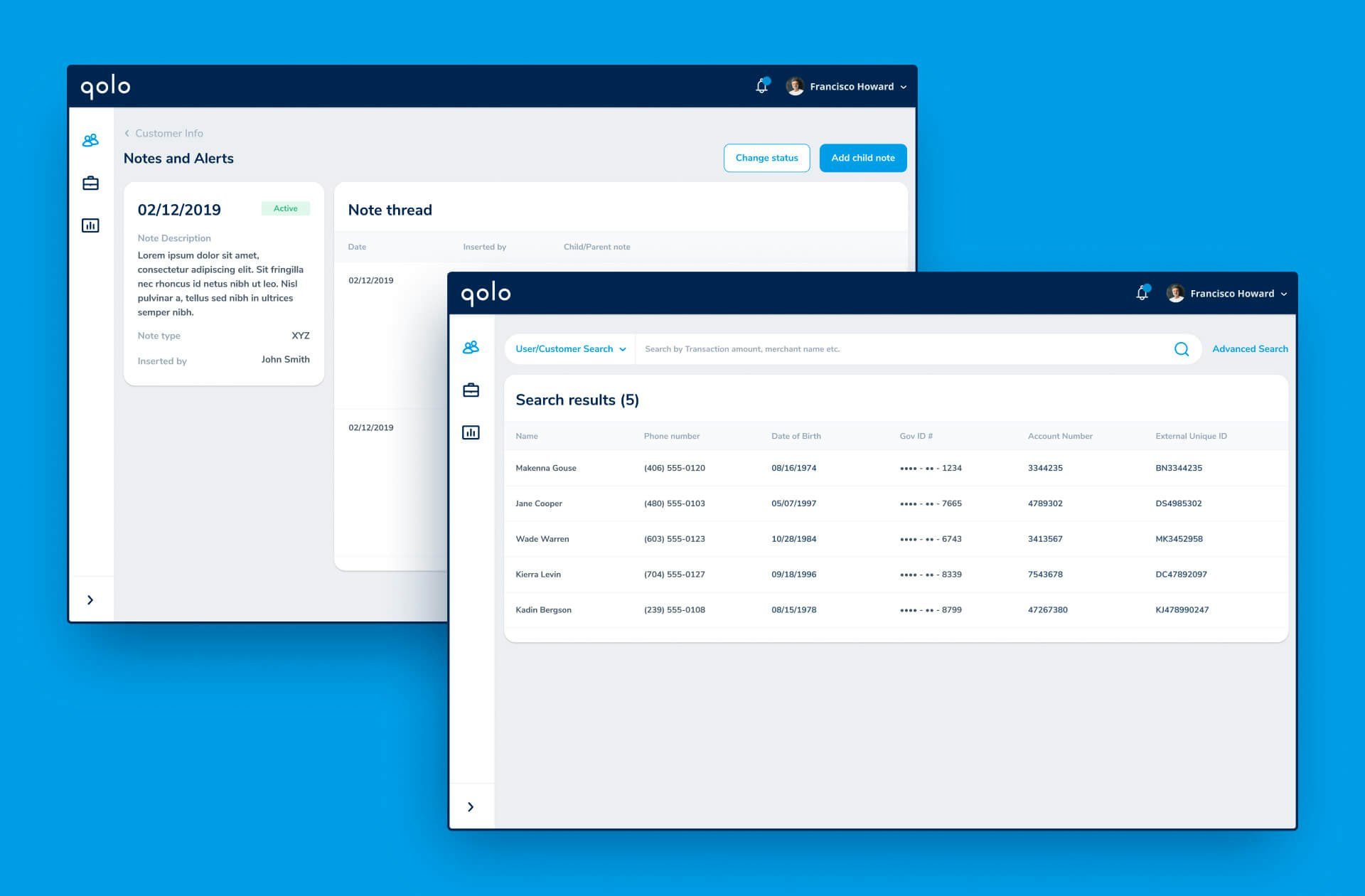
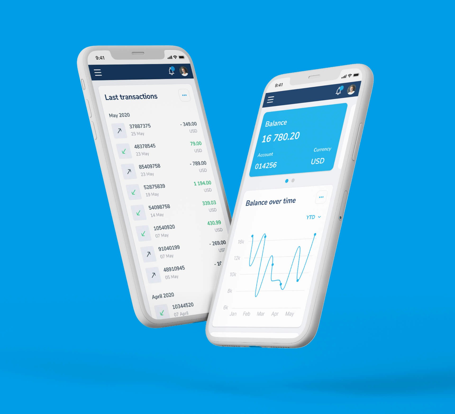
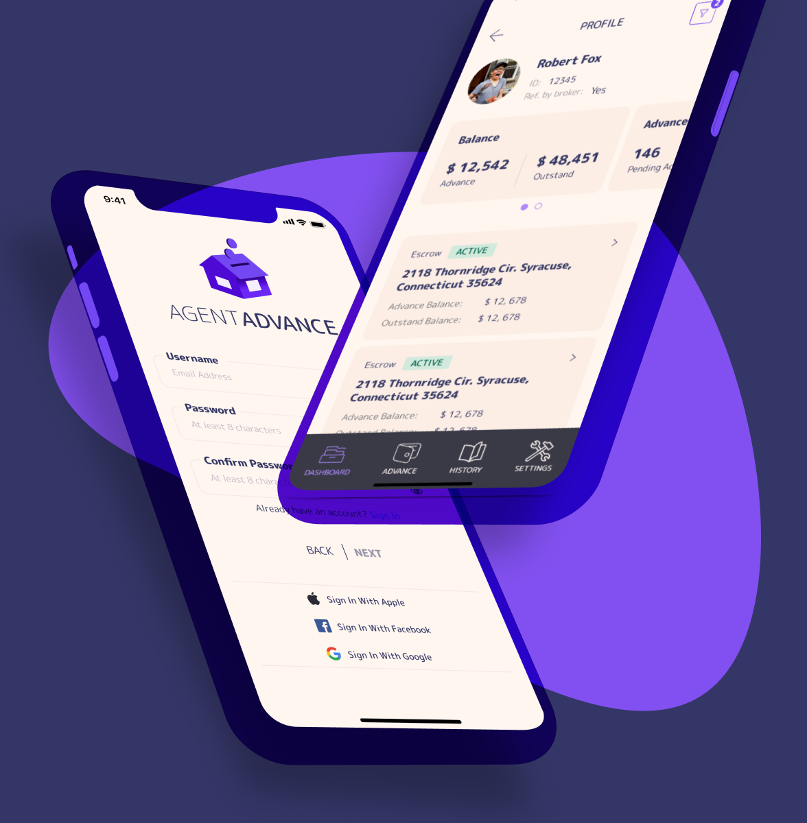
User Interface Design
Having settled on a visual style that conveys Qolo’s brand personality, we moved on to turning the wireframes into the final user interface. This process involved both designing for mobile, tablet and desktop devices.