In a world where the tech scene has gone fully agile – a methodology that’s all about being “quick and dirty” – it might seem that there’s no place for careful, slow, and methodical activities. We, however, beg to differ.
Design is a discipline that sits between art and science. The former is often quicker and more intuitive, while the latter demands a more methodic and laborious approach. While design manages to elegantly blend these qualities, it has always required some sort of framework for it to continuously produce good results.
In this article, we’ll take a closer look at which design activities should be done fast and which ones should be performed in a more thoughtful and deliberate manner.
Let’s dive right in.
What is the ‘Quick and Dirty’ / Agile method?
Agile design is often referred to as “quick and dirty.” It’s an approach to developing products that is iterative and incremental, and strives to dismiss perfection in the earlier stages of the process. Its beauty revolves around collecting quick feedback and redirecting it towards further iterations of a product. The main goal is to ensure that each version of the design is good enough, often leaving aesthetics for the later stages of the process.
While this approach has shown to be highly successful in recent years, it does open companies up to investing too little time in the facets of a product that demand a more methodic and strategic approach.
We believe that this can be easily improved. We think that there’s a middle ground that will allow mitigating a wide array of issues associated with a very quick-paced design process—we like to call “designing fast and slow.”
What should be done fast?
There’s a variety of practices that provide a massive return in value on invested time. Some important examples are testing and early feedback—they allow designers to validate solutions but also prevent them from creating multiple unnecessary iterations.
Prioritizing speed
Assumptions are your enemy
The conventional UX wisdom says that you are not your user. That's because assumptions are your enemies. Your own idea of what the users want more often than not will lead astray the whole product design process and priorities. I'm sure you know what it means – weeks upon weeks of wasted time and money.
Usability testing is a notoriously fast and inexpensive way of surfacing potential improvements in a design solution. Typically, a single test takes about 15 minutes to an hour to run. However, it’s important to point out that there are shockingly short tests, like the 5-second test that allows assessing the information hierarchy of a product.
To keep your testing quick, consider the following methods: Guerrilla testing, click test, navigation test, A/B test.

You won't know unless you ask
Getting early feedback from potential users will ensure that you’re building the right thing at the right time. Businesses often hesitate to put early iterations in front of their customers because they feel that they need a fully coded product to test it with users—that’s not true. There’s a lot of value to be extracted from understanding your users’ experience even with pencil-drawn prototypes.
Even at the earliest stages of the wireframing process, you can start collecting feedback. The earlier the better.
This example is taken from a project we've completed. See case study.
Another common fear among companies is that users won’t like their early prototypes. Fundamentally, that’s not the point of getting feedback on designs—your goal is to extract insight that is useful and actionable.
A few suggestions:
Don’t be afraid to put sketches in front of your potential users—the earlier you get feedback, the better.
Don’t spend too much time on documentation. Yes, it’s helpful to have your insights neatly organized in a PDF file that will provide an in-depth view of your findings, but consider sticking to bullet points—that’ll save you time and help you focus on the most essential information.
Apply your findings as quickly as possible and go back to your users for their opinion.
Diversify the methods you use. Consider running focus groups, contextual inquiry, multi-variate testing, user interviews, whatever helps you better understand their viewpoint and extract the most insight.
No matter if you spend 15 minutes or 15 days working on a screen, you operate under a lot of assumptions and speculations. That's why it's unwise to polish something before you even know it's worth polishing (cause 90% of the time it isn't). If you've ever been involved with usability testing you'll know – you never get it right on the first, second, or even third attempt.
Make sure to test everything quickly before you invest any significant resources. Otherwise, you're doomed to scrapping weeks' worth of hard work.
On that note, let’s take a closer look at the stuff we think teams should never rush.
Prioritizing quality
The Product Structure (IA)
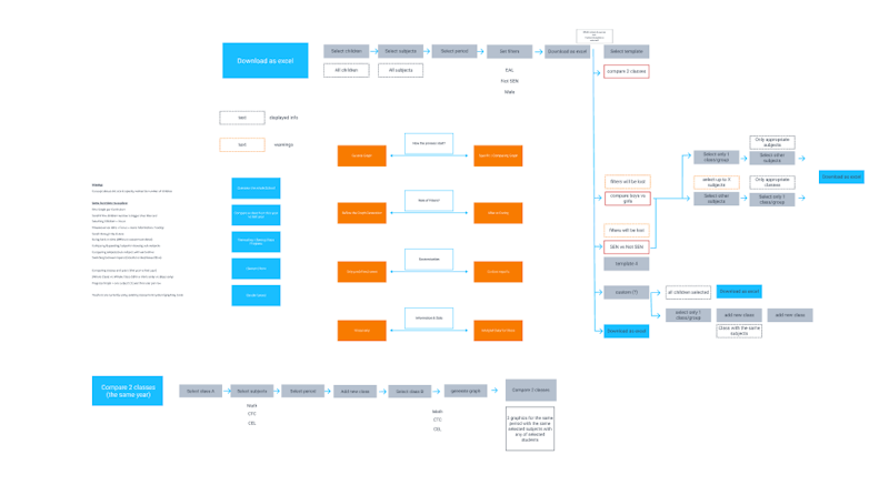
Trust us, figuring out the information architecture (IA) along the way is not a good idea. If you go right into the wireframes without seeing the big picture, you'll inevitably create a disjointed experience.
To make matters worse, making tweaks to IA is not as simple as moving a few elements from one screen to another. Structural changes might mess up literally everything you've designed. Therefore, you should do yourself and your team the favor of not having to redo your hard work further down the line.
Furthermore, developing a product’s IA from scratch can be very demanding unless you’re not creating a standard format product. It takes time to run extensive research to understand the market, the industry, and the users within this market. To create an architecture that will be intuitive to their users, businesses should run a fair share of card sorting, user interviews, and other testing methods to ensure that they can confidently proceed to prototyping. Failing to do so will invariably result in spending even more time restructuring the user experience.

An example of information architecture we've developed for a client of ours. See the case study
The Product Blueprint
A design blueprinting is a document that prescribes how a product will be developed and how a company’s processes will be organized to satisfy customer needs. These blueprints are often combined with customer journey maps, which allows companies to adopt a user-centric approach to developing a product.
Humans aren't perfect. We can't foresee everything. That doesn't mean that we shouldn't try though. Thinking through the blueprint (which shouldn't take longer than a week or two) is how you avoid stumbling blocks that can delay your work for weeks or even months.
Developing a product design blueprint should be a collective process undertaken by the product experience team. Another common mistake is having these blueprints developed by a single person like a CEO or a CTO. For a representative blueprint, you need input from ALL stakeholders.
It’s also vital to underline that such blueprints are subject to continuous tweaking and optimization. They should be adapted to the product’s and the users’ needs, based on findings and insight extracted from research and testing.
Parting thoughts
Businesses are often biased towards solutions that are quick, efficient, and require the least amount of investment, which is why the “quick and dirty” has seen such overwhelming adoption—it really works. However, in order to create products that will be more successful in the long run and ensure a more efficient development process, some phases should be allotted more time and attention.
We’re confident that the “Fast and Slow” approach will enable businesses to create products that are better thought-out and provide their customers with a better user experience.


