Project Overview
The customer has approached us with an existing app with very limited capabilities. It's functionality included connecting the app with the wearable device and the word calculator.
Having collected the requirements, we've identified seven core user groups: children, their parents, and non-parent users (product owners, speech-language pathologists, pre-schools, libraries, and non-profit organizations). Non-parent users had different views based on their needs; more on that later. While children's needs did not need to be addressed through UI, it was our task to design the expanded functionality for parents and a whole new flow for non-parent users. The business goals also included boosting the retention of parents, and profit as a consequence, and providing non-parent users with data on the product's usage.
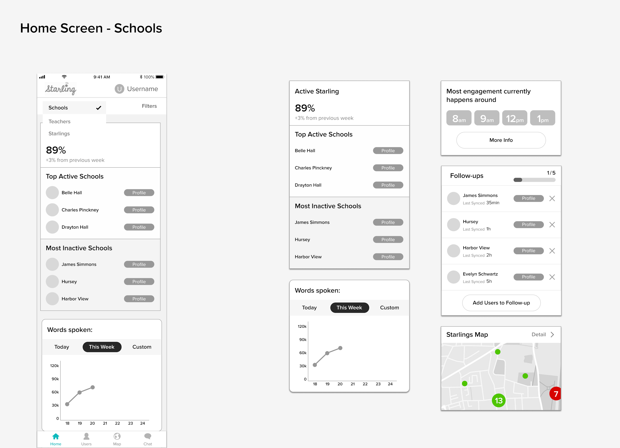
Before setting any design decisions in stone, it's mandatory to test the app's flow through wireframes. That's exactly what we did. Having designed the low-fidelity wireframes that met the needs of both users and stakeholders, we proceeded with designing the interface.
Parents
As previously mentioned, the app was meant to be used by parents and non-parent users. Let's start with our design for parents.
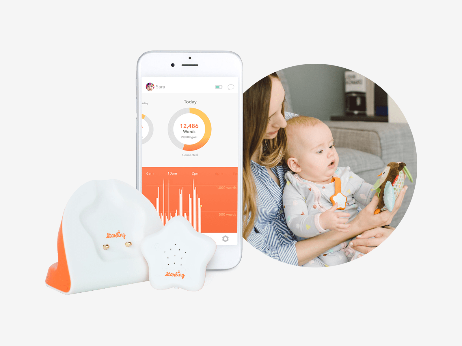
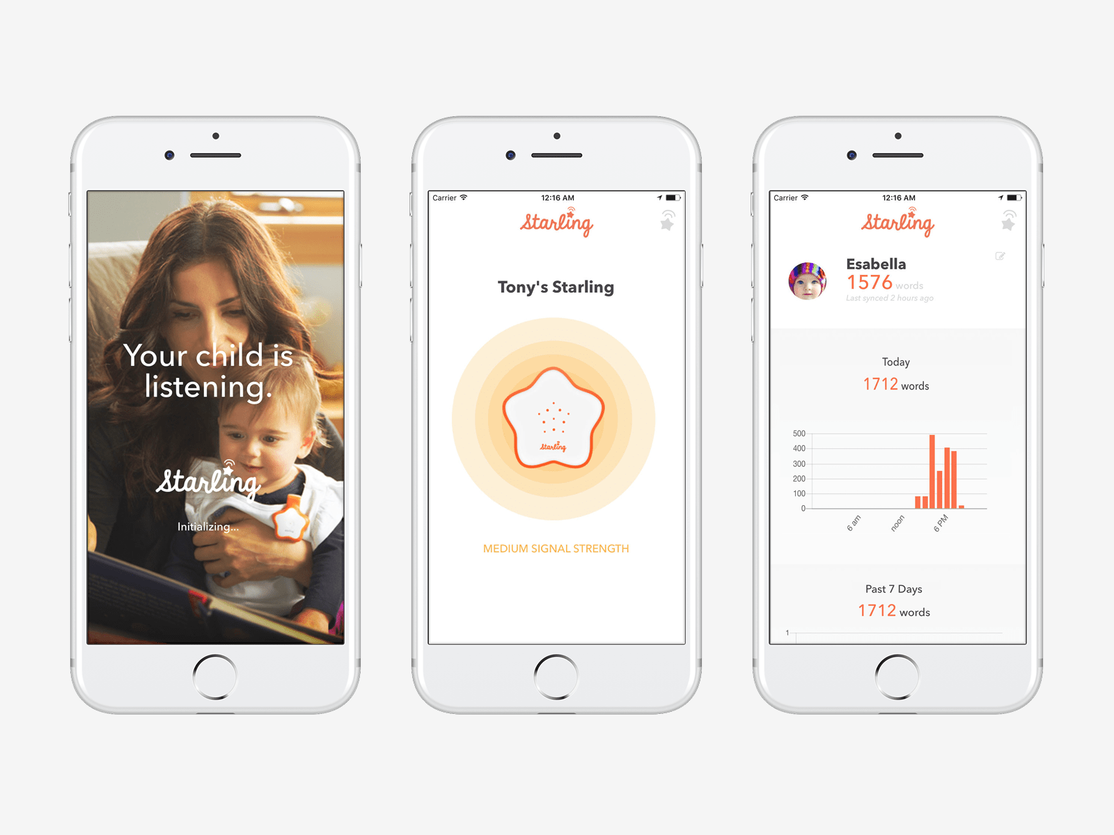
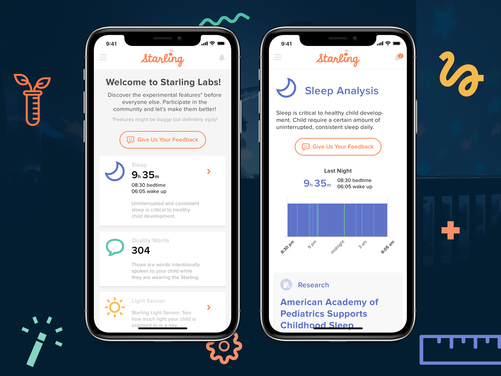
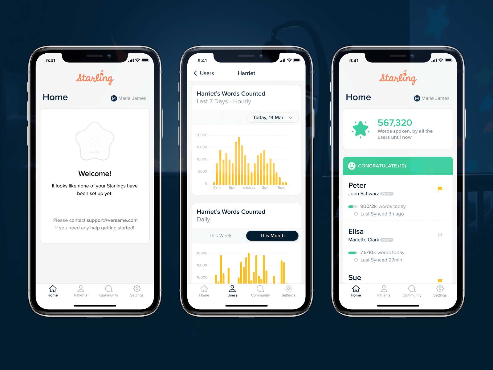
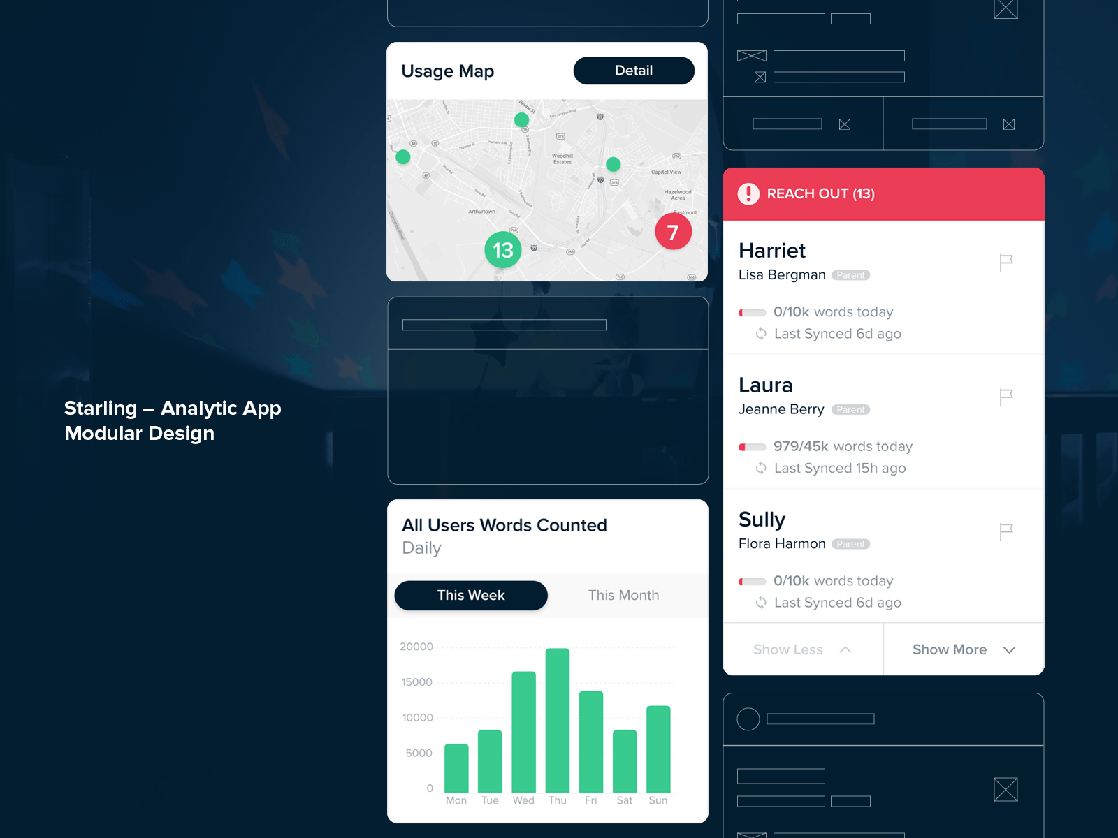
In order to provide parents with insight on their child's progress, we've developed a dashboard with graphs representing the number of words spoken to a child and its movement. Also, since the app's monetization was subscription-based, retention is the most important determinant of revenue. Keeping that in mind, we've designed a daily goal system to motivate parents to talk to their kids as much as possible.
Non-parent users
When it comes to non-parent users, their needs were different yet fulfilled with the same data. Non-parent users are comprised of product owners, pre-schools, libraries, language-speech pathologists, and non-profit organizations. Let’s breakdown the needs of each non-parent subgroup:
Product owners. Through the flow we designed, product owners were able to study their active & inactive users: their geography, unique traits, and activity patterns. Such insights are invaluable for making informed product decisions.
Pre-schools. With the help of a starling device and the app, the schools were able to track the teacher’s performance to identify teachers who needed help with operating the device and teachers with exemplary performance. Also, the schools were able to tell whether there was a need to alter the length or the frequency of lessons.
Speech-language pathologists (SLP’s). Starling helped SMP’s track their patients’ activities, the app also served as a simple CRM to help the doctors coordinate patients’ visits.
Libraries & Non-profits. Both of these user groups were provided with Starling devices which they, in turn, provided to the end-users.
Bottom line
As a result of our cooperation, we've helped our customers to revamp and expand the features for parents and designed a new module for five non-parent subgroups thereby meeting the client's business goals on time, and on budget.

