


Kick-off Call
The client had too many uncertainties about the scope of the product, what features to include, the business model, etc. We agreed to begin researching the market to help come up with ideas and asked the client to provide us with all the information they had to help speed up this process

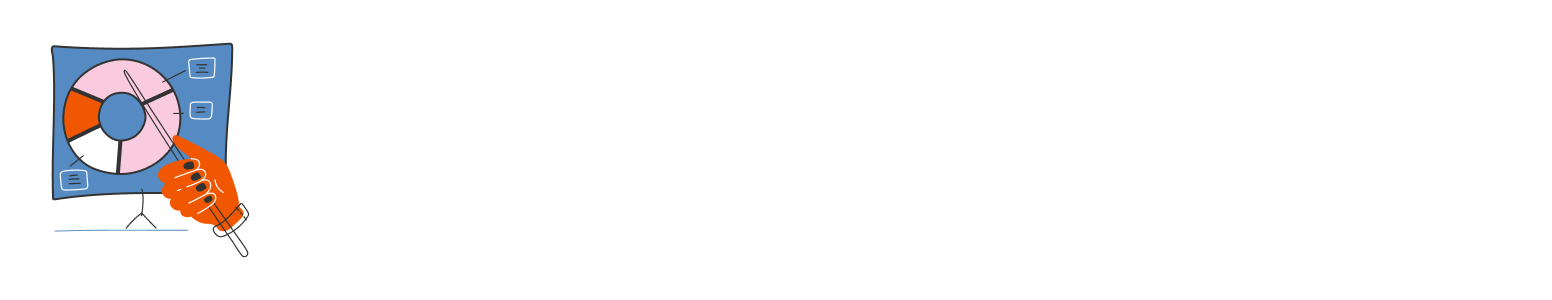
Lightning Decision Jam
In this workshop, we defined together the product vision and goals, and prioritized the challenges we would work on based on the initial project scope. We also created a FAD Matrix, adding the facts, assumptions, and doubts everyone had on the project's context: market, users, business, technology, and product.

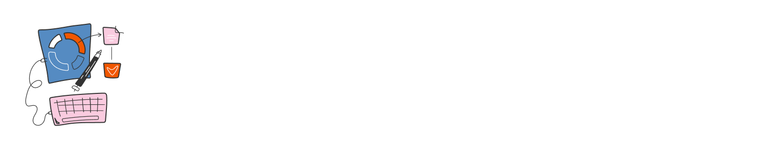
Desk Research
We conducted 2 desk research studies separately, Benchmarking similar tools and researching online studies/articles both scientific and non-scientific on the target audience, market, and business situation. Both were very useful in increasing our understanding of the entire project context, and also helped generate insights into what should be built, why, and how.
User Persona
In this workshop, we defined together the main user profiles that would be served, describing the pains/needs and how we can serve those needs. During the workshop, we built together two user personas and asked the client to provide us with the customer journey from having the need come up to adopting the tool.


Ideation Workshops
In this workshop, we presented to the client the Discovery Results and proposed an exercise to generate the main solution hypothesis to be validated by this project. We were able to align three main hypotheses for each user need (refined after concluding the discovery phase).
Then we conducted a sketching exercise to come up with ideas on how to implement those hypotheses. This was very interesting as the client did it before. We also participated and were able to select the main direction of the solution, for us to use as a reference next when building the first concepts
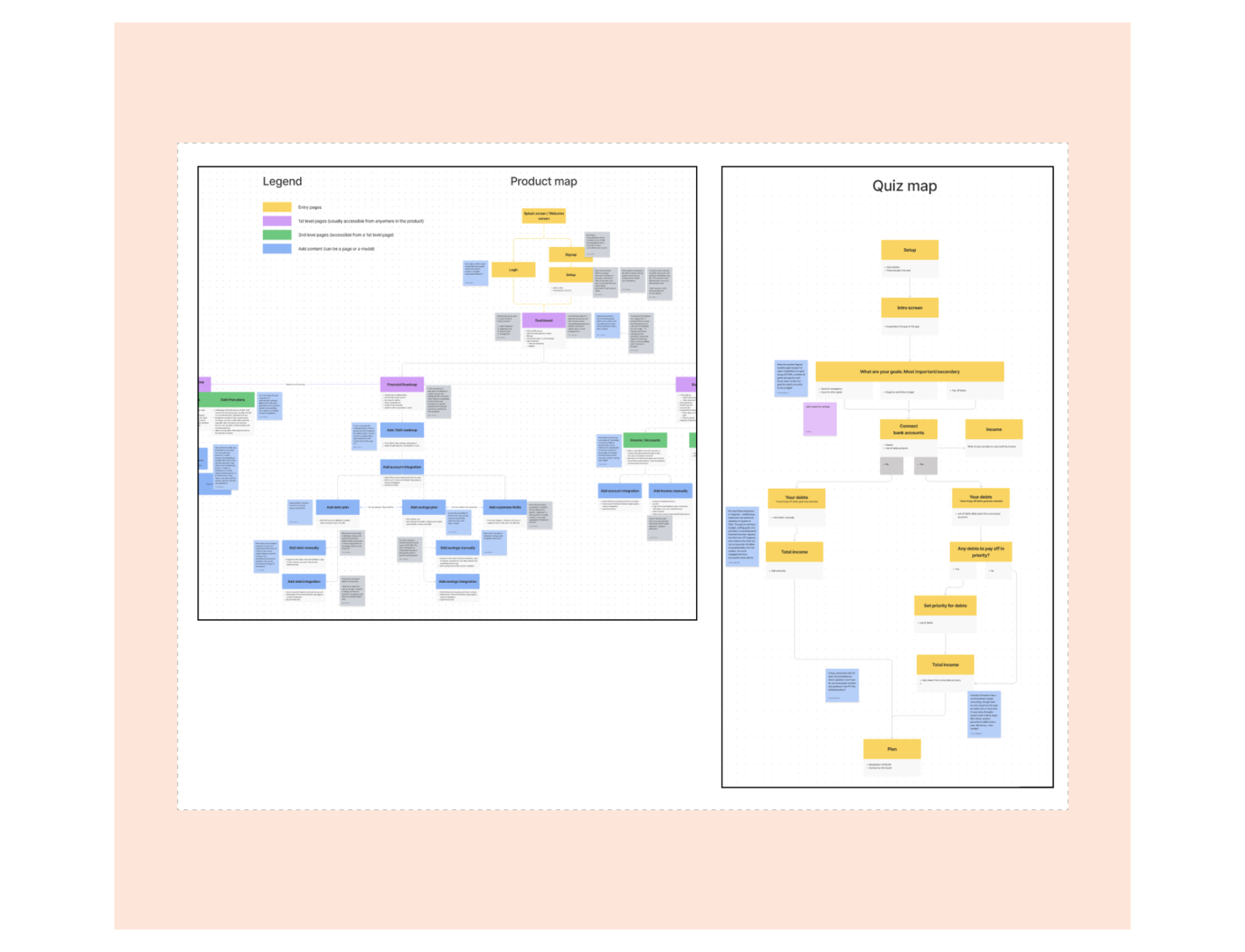
Information Architecture
After the ideation workshop, we started working on the Information Architecture of the application, based on the main ideas generated.
The work consisted of proposing a navigation structure through a product map and layout options based on the map. We also proposed a user flow for the first part of the new user experience, the setup of the account, through a series of steps to collect the necessary data to present users in the app.


LoFi Wireframes
After having the concepts for navigation ready, we focused on building a low-fidelity prototype of the main user flows. The main ideas were already proposed in the ideation sessions, but the IA study helped to shape the navigation and integrate the parts better.
The process of wireframing in low fidelity involved a few sessions of feedback with the client, showing the prototypes, and making adjustments until we had something that was somewhat ready to be tested. The client had a hard time using async communication in Figma or Figjam, demanding meetings almost on a daily basis.


Usability Testing
For the usability tests, we used the tool userinterviews.com to recruit users. The process of selecting users was done based on the characteristics that were closer to the personas created, looking for people who shared most of them and would also contribute to the test (more descriptive in the screening questions).
We used the low-fidelity prototype to validate ideas, orienting users from the beginning that it was a black-and-white draft of the final product, etc.


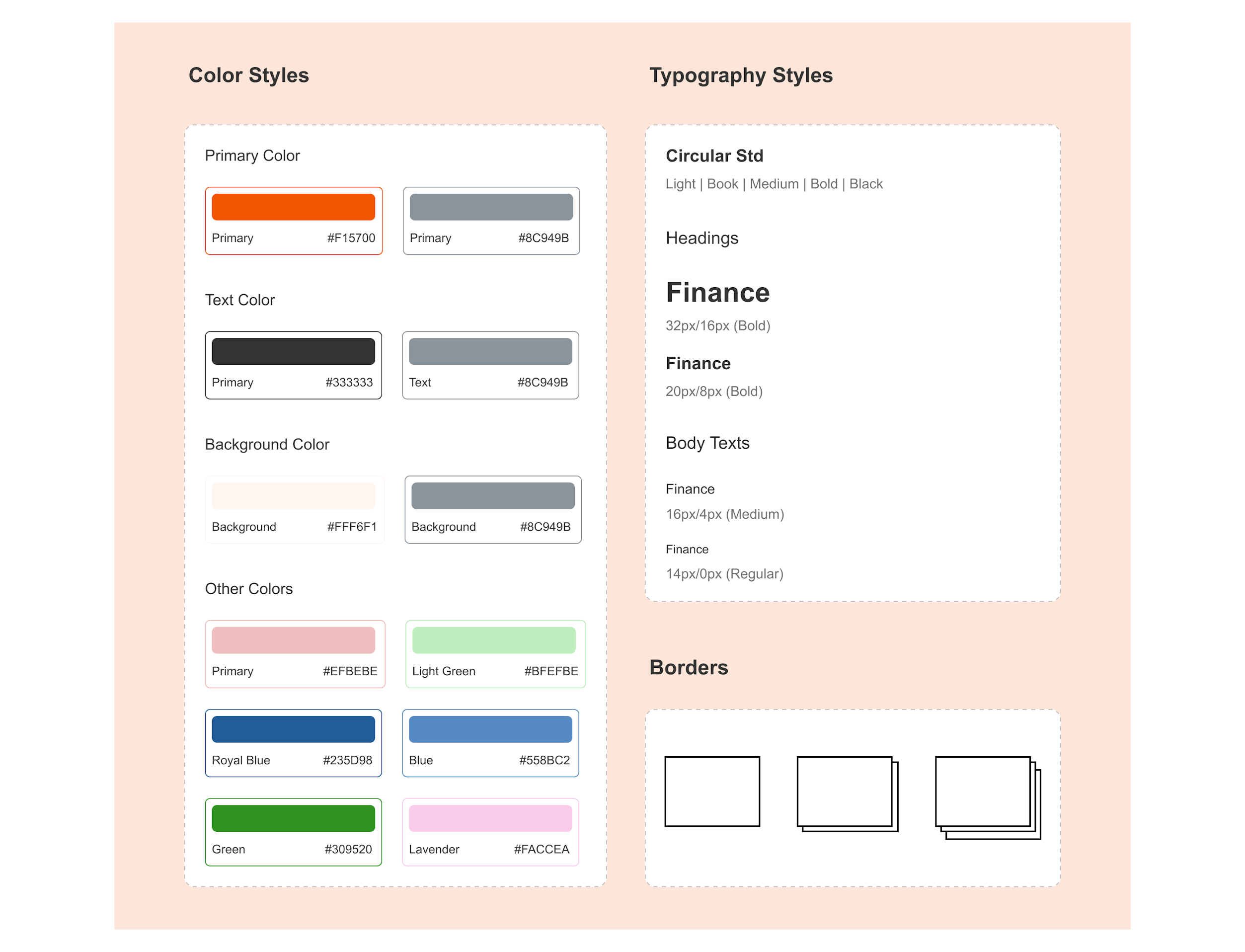
Visual Style Guide
In parallel to our work on the user research we also worked on the mood board. We conducted an exercise to determine the visual and communication attributes, to use as a guide to reaching the appropriate Look & Feel. Then we asked the client to provide us with references to using as inspiration, adding to the ones that we had already collected.
Last we proposed a few different versions, settling on one that was used to turn the low-fidelity wireframes into high-fidelity.


Hand Off
After the usability tests were analyzed, the resulting insights were applied to the wireframes, already bringing them in high fidelity aligned with the moodboard. Although we were still concluding the moodboard, the overall look & feel was pretty decided so we used it as the design direction.
We also started working on other parts of the product, on features that were also very important for the MVP.
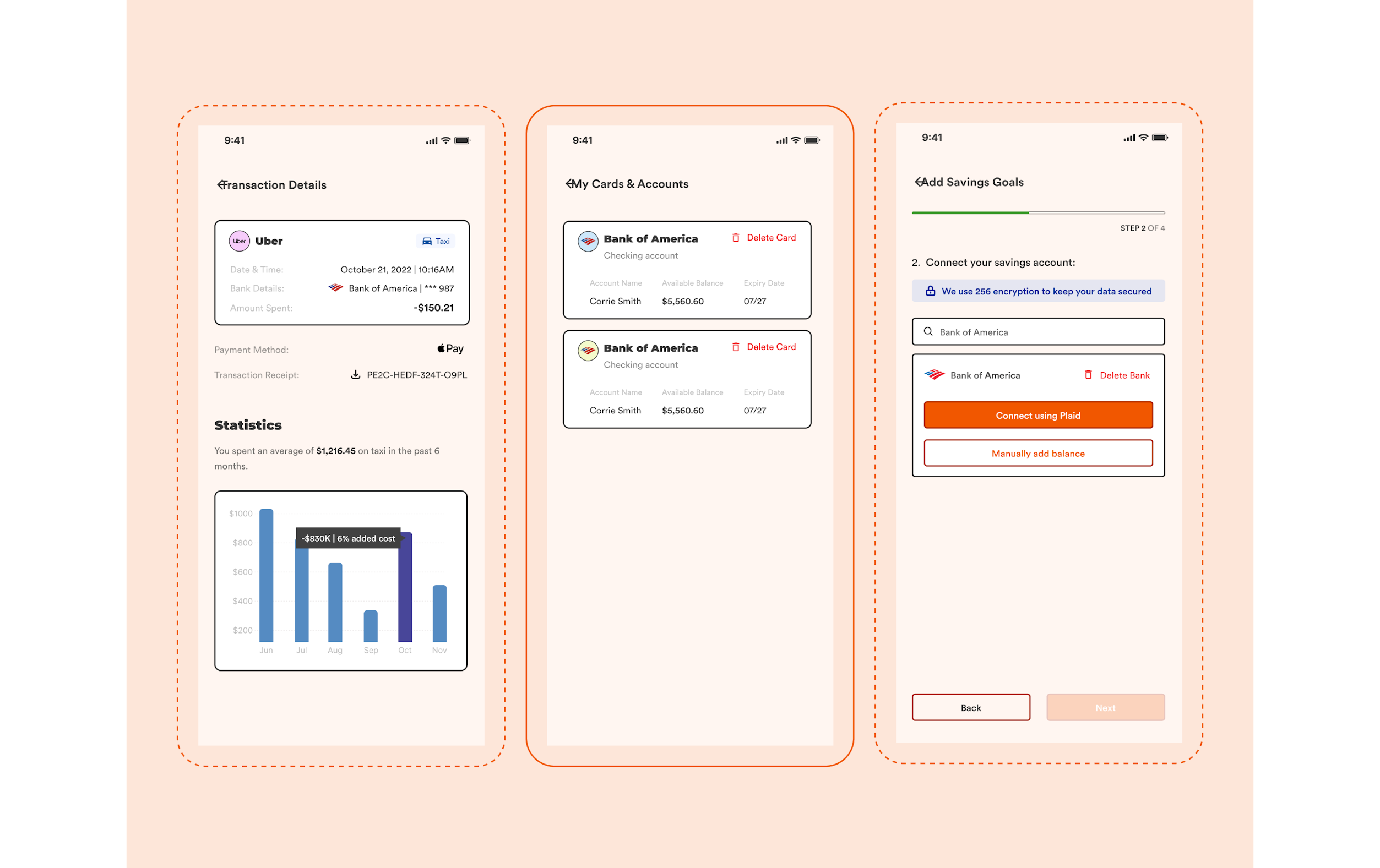
High-Fi Wireframes
The last week was dedicated to finalizing the prototypes, making final adjustments, and creating a navigational prototype so the client could use it to present to possible investors.
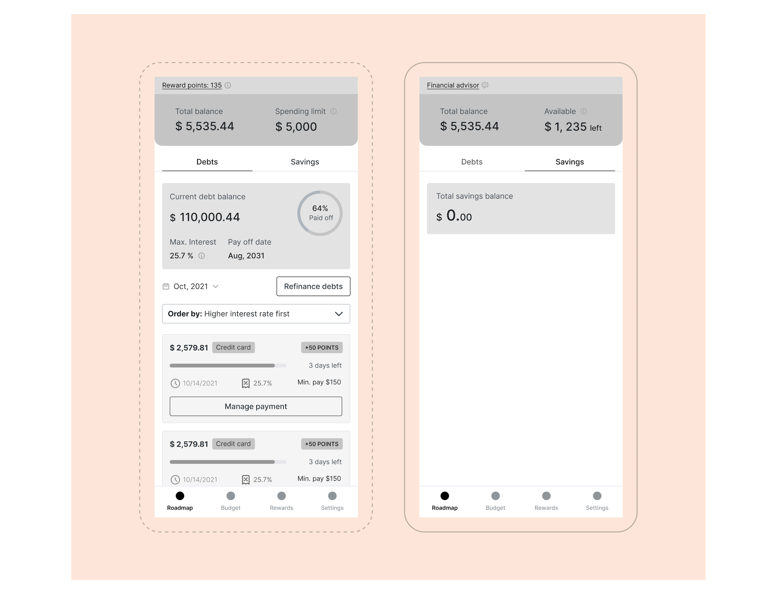
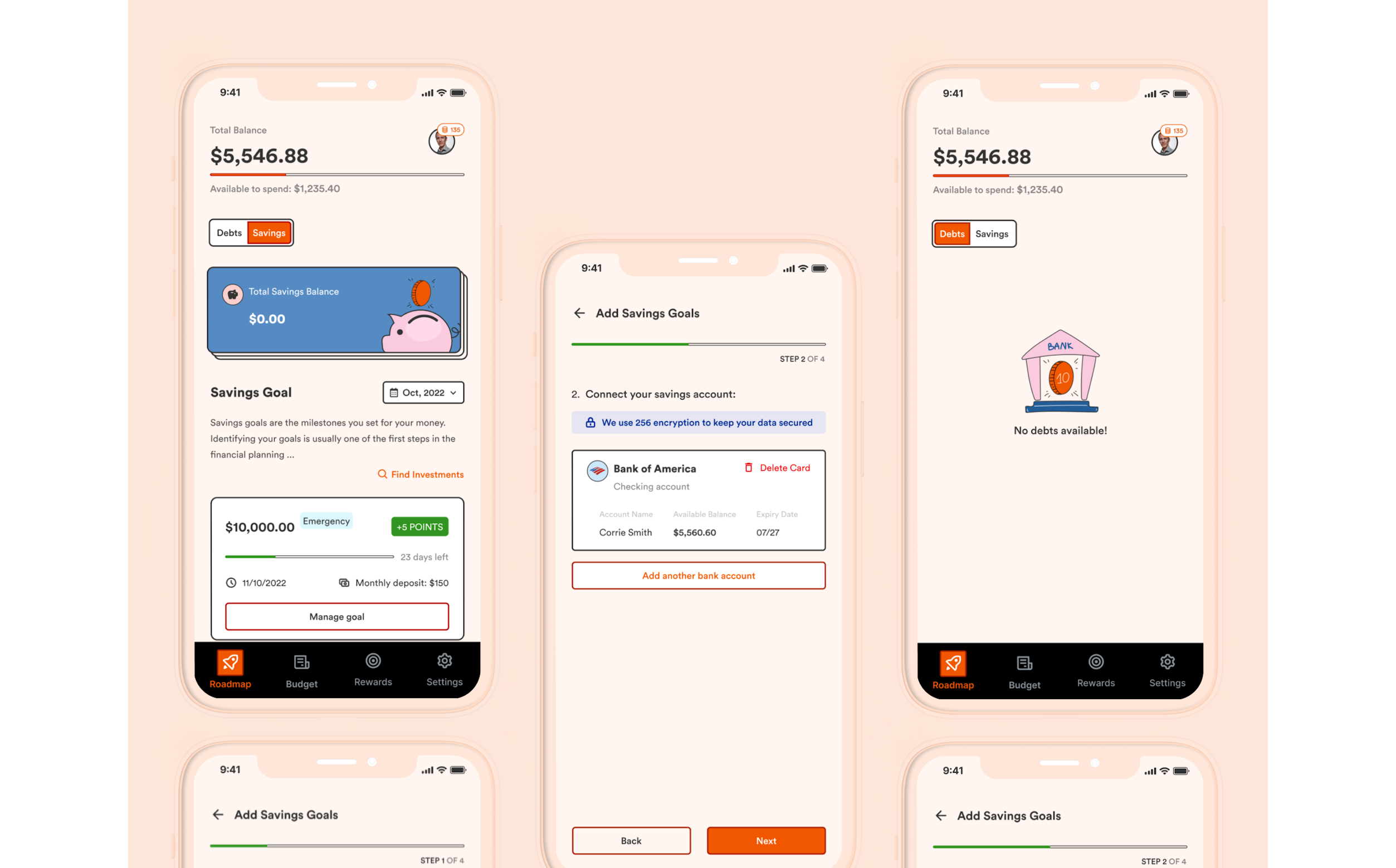
Roadmap
The focus is on helping users organize their finances and make gradual progress in paying off their debts.


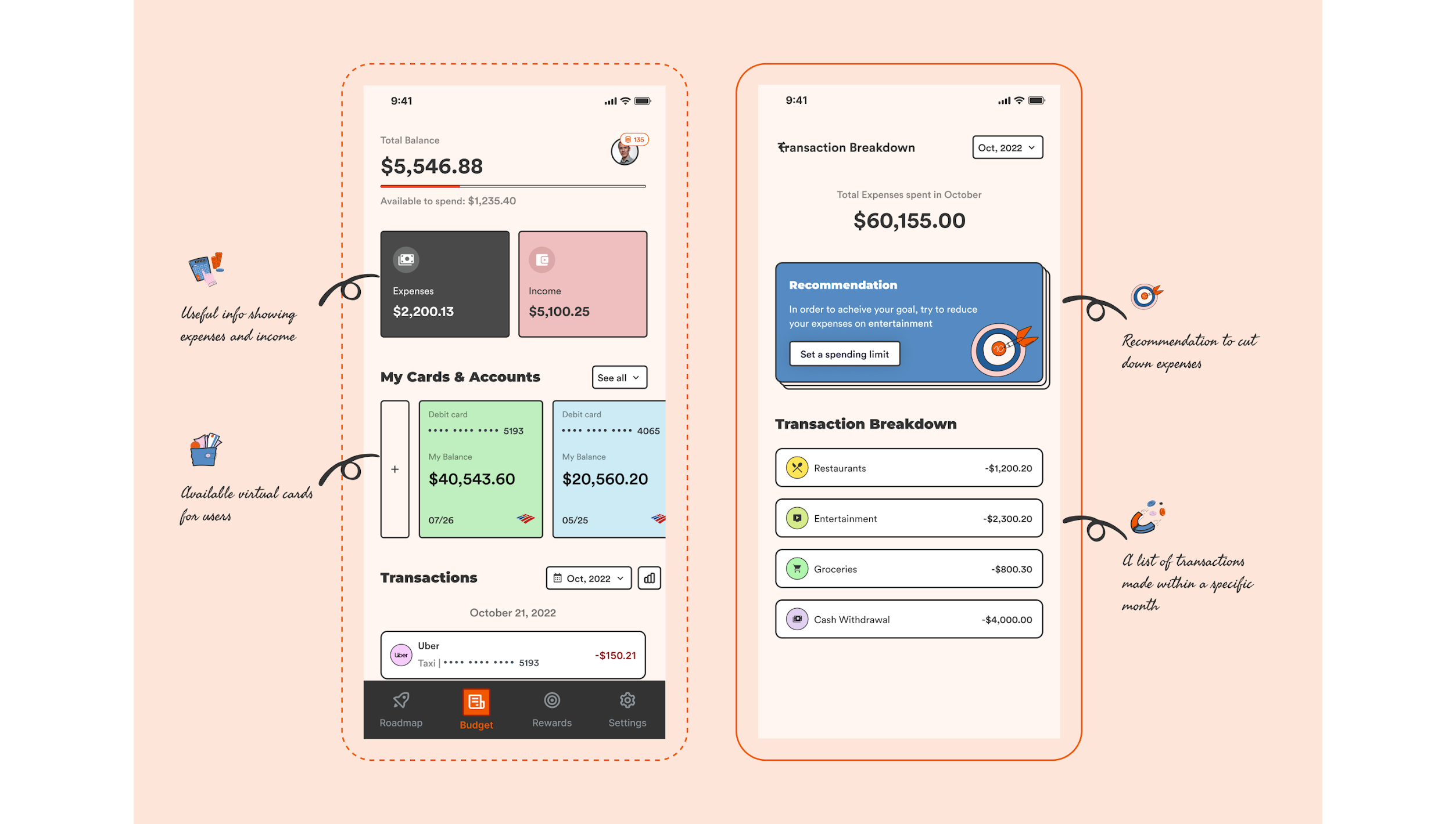
Budget
Integrations connecting credit cards and bank accounts that would be used to gather all the information on debts and also the budget (income/expenses)


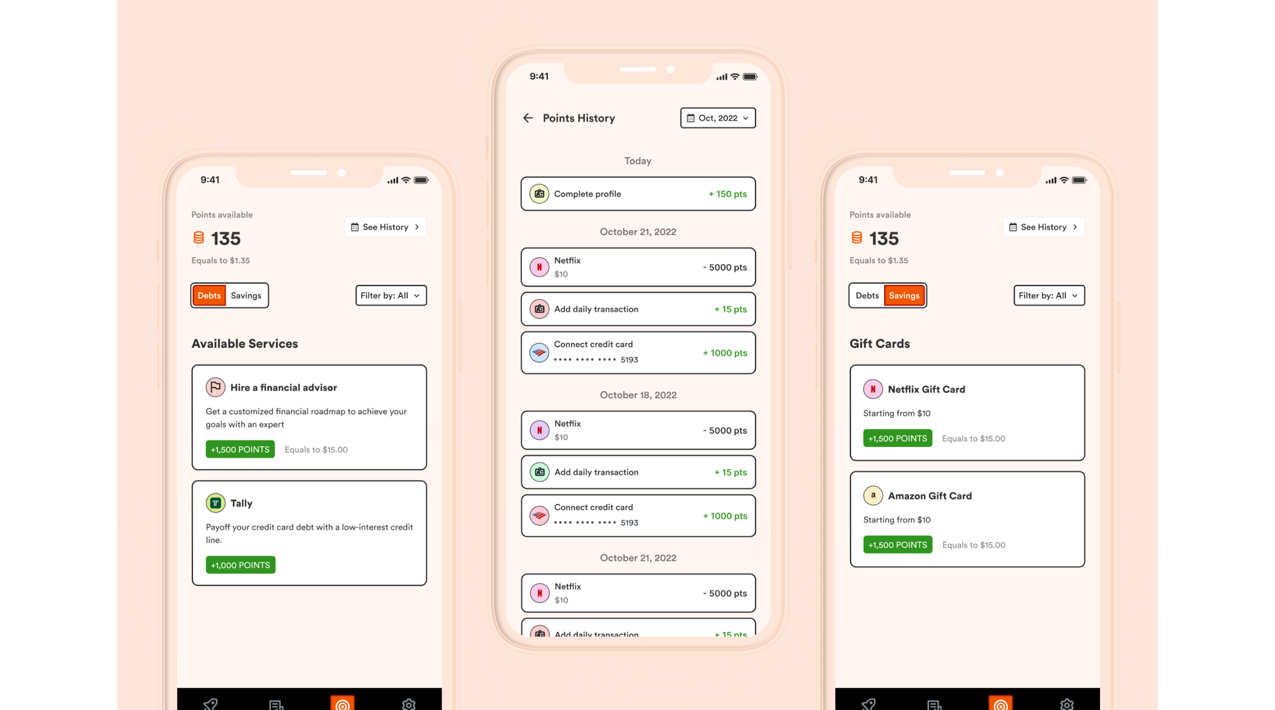
Rewards
Goal-oriented actions with rewards for completing payments and saving money to help users create habits and keep engagement high.


Other screens