The initial client’s input
When the customer approached us with an offer to work together, they already had a launched web and mobile application. The web version hasn’t been complete with all of the planned features, while the mobile version suffered from poor usability, user experience, and interface.
Additionally, the client’s team had their own UI kit and some wireframes for the new features. Later on, we had to tweak both of these design artifacts.

Wireframing & idea validation
Having interviewed users and the stakeholders on the client’s side, we’ve shortlisted requirements and suggested multiple concepts for the product dashboard. The dashboard is meant for agents and brokers alike, though the latter user group had more permissions.
Having validated the concepts internally, we’ve moved on to developing the best ones into a wireframe.
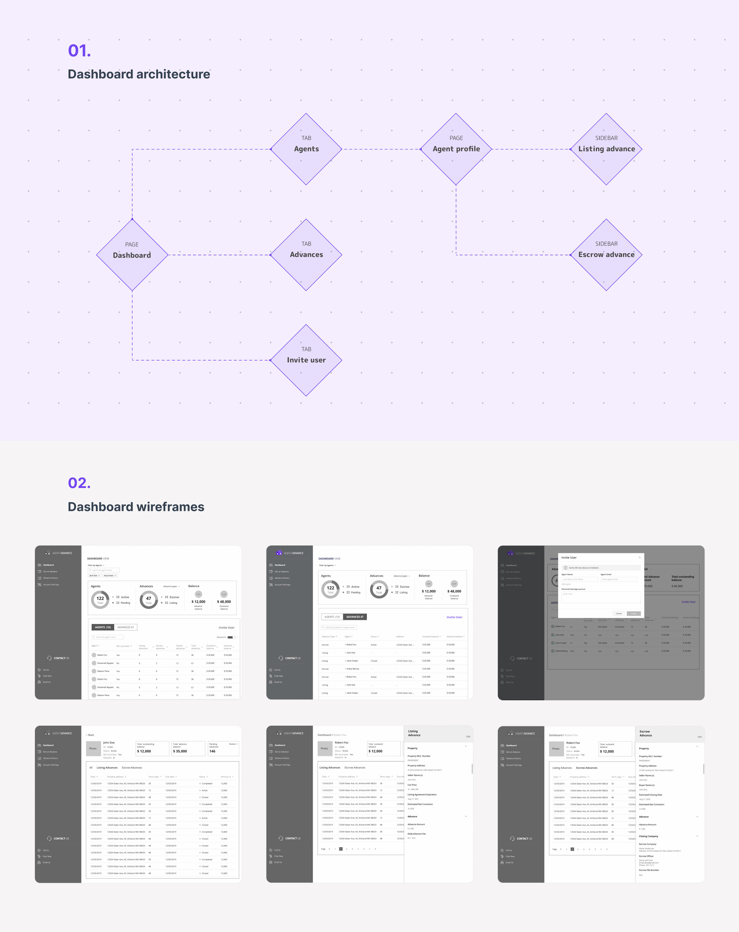
Web app
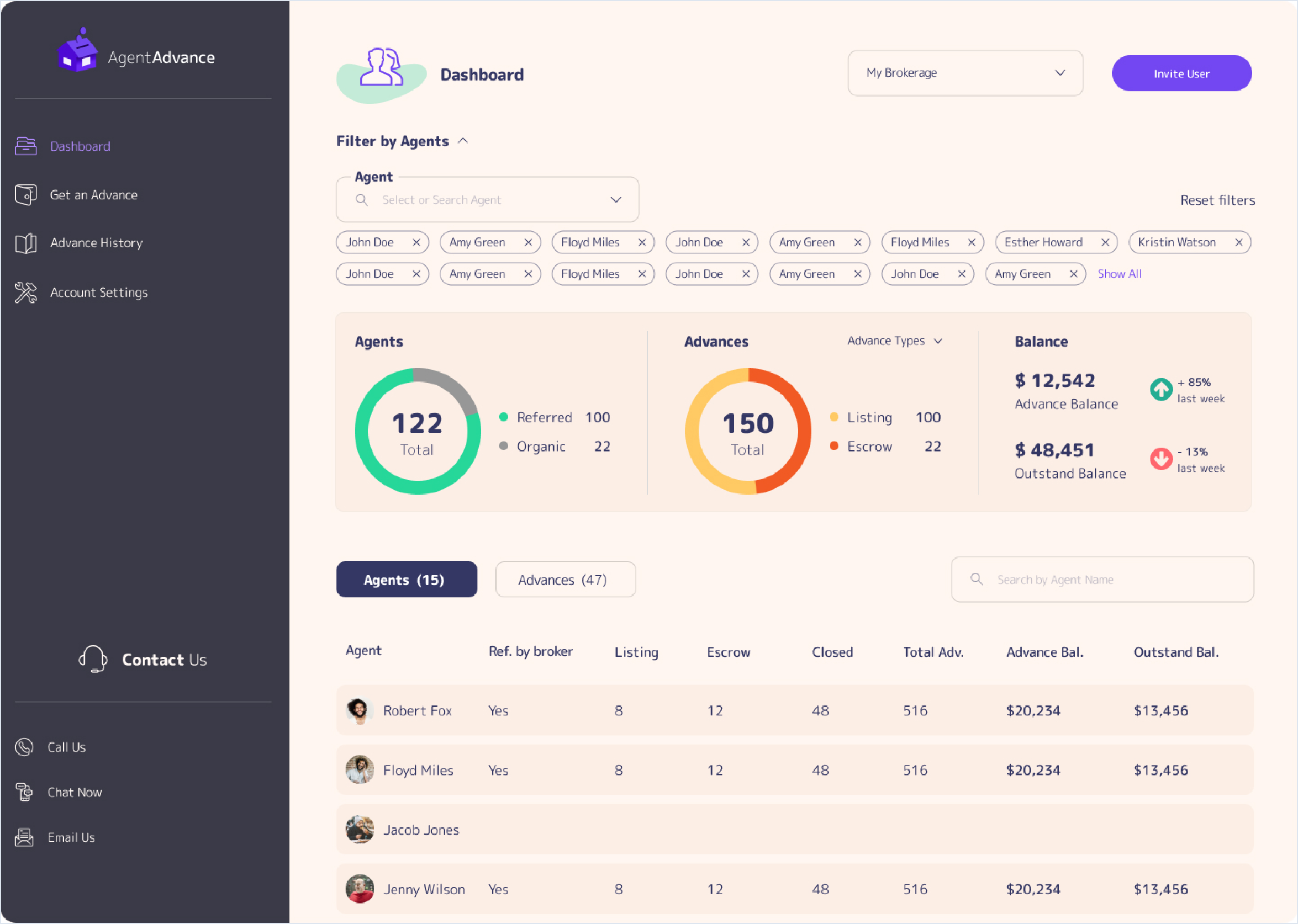
High-fidelity dashboard design
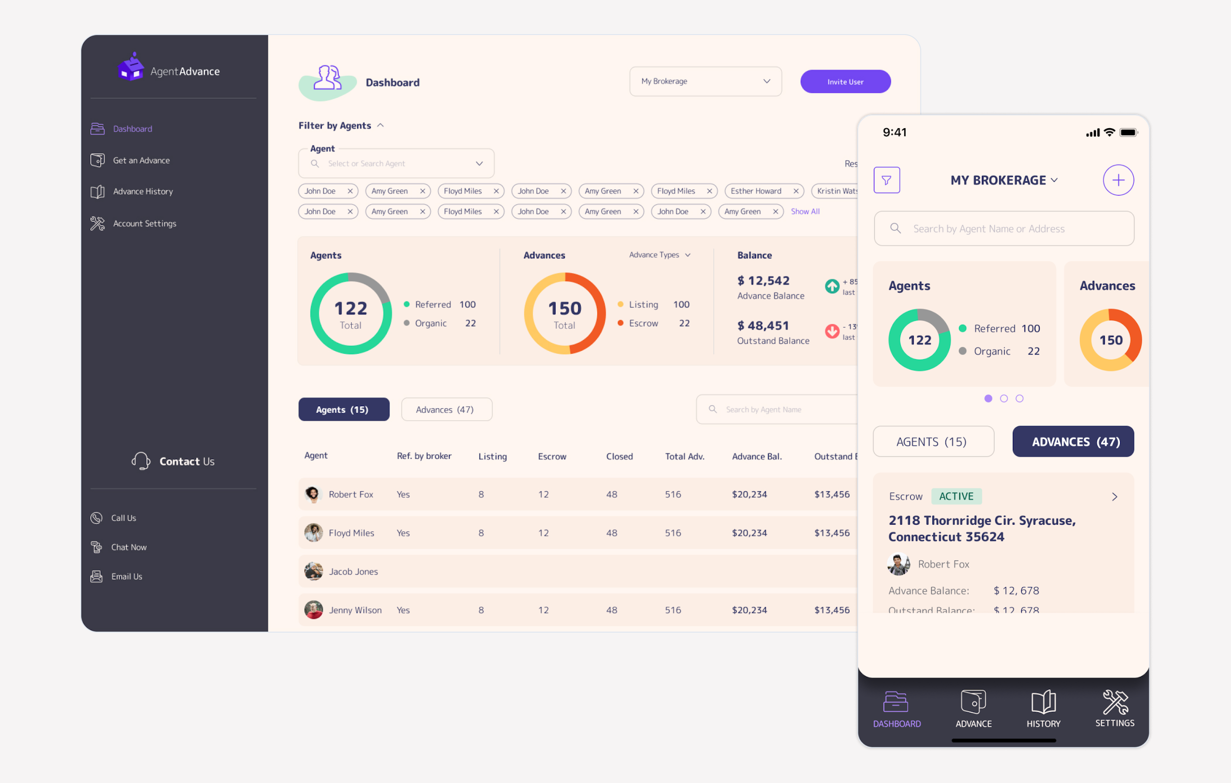
After selecting the dashboard concepts that proved to be the most useable, we've moved on to designing the high-fidelity version. The final result looks as follows:
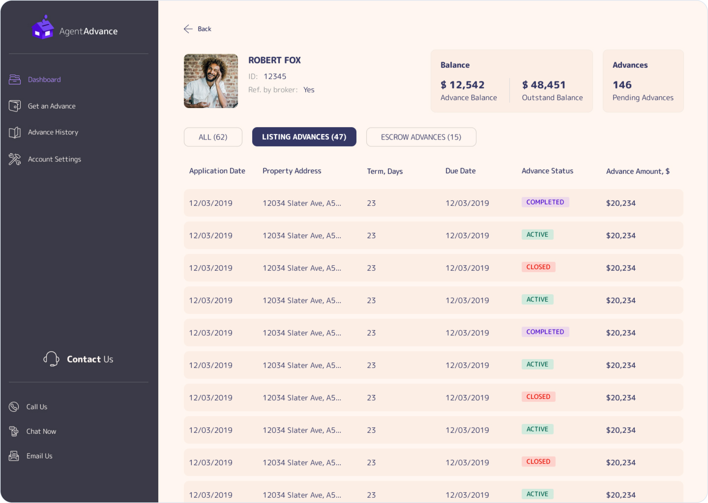
Agent Profile
Helping brokers track their agents' progress is a vital feature to the success of Agent Advance. As such, we've put maximum effort into adequately accessing brokers' needs through user research activities. Then, we've translated the findings into the profile page you see on your left. Finally, we've validated our design decisions both internally and externally.
User Invitation Flow
Our quantitative research and the interviews we’ve conducted suggested that brokers had a hard time inviting agents to their accounts. This is one of the reasons we’ve redesigned it in both web and mobile versions.
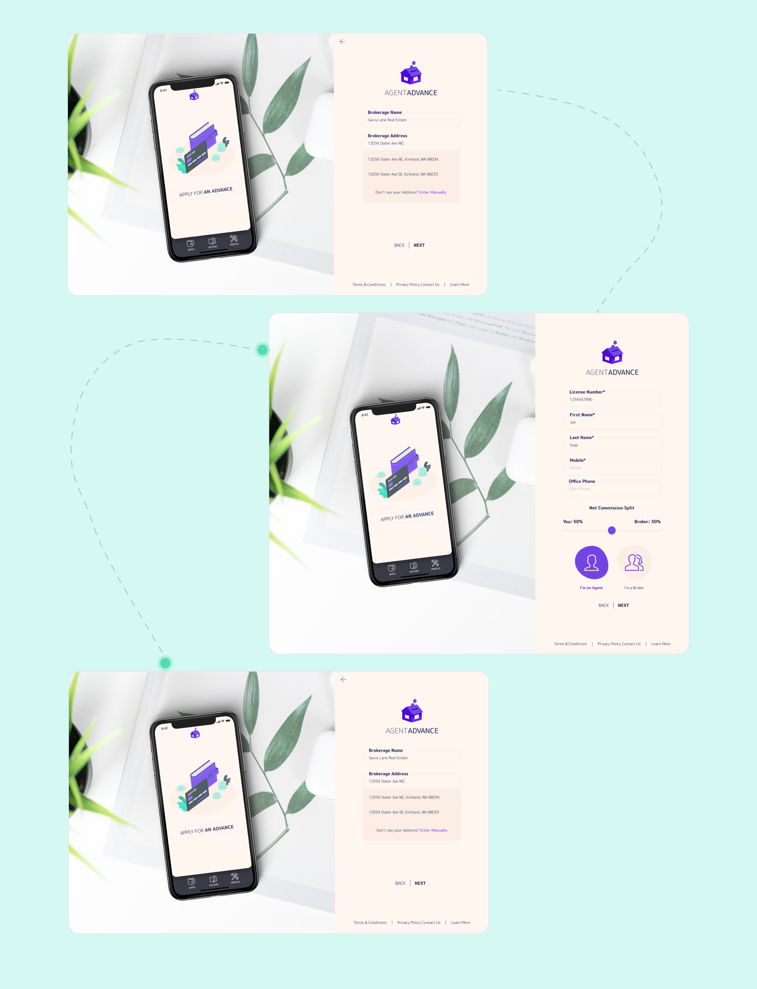
Mobile App
Dashboard
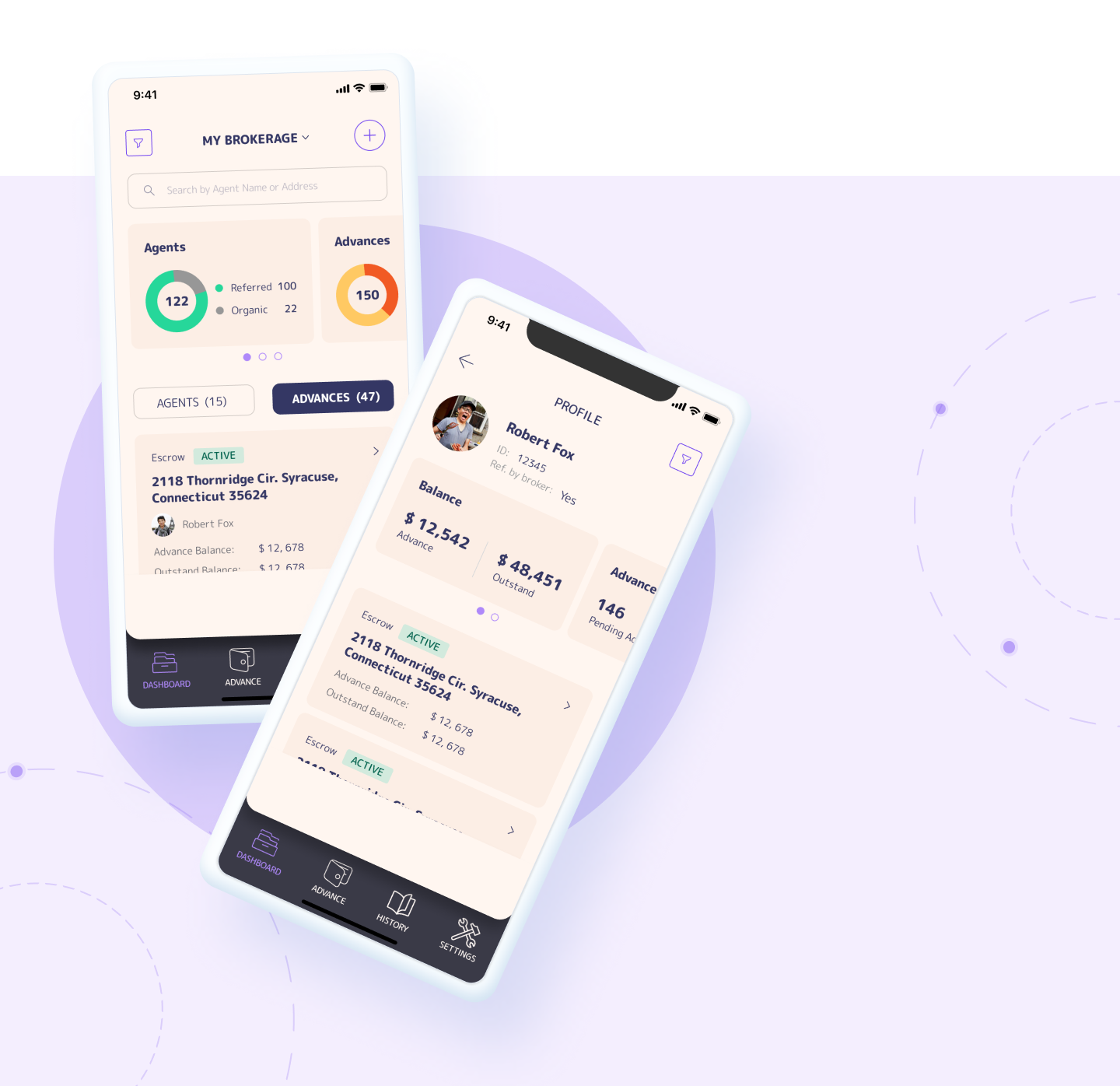
A large part of the project's scope included translating the web app functionality into a mobile app. Compared to the web version, we've had considerably less space to work with. However, we've managed to integrate all features into the mobile experience. A couple of rounds of usability testing helped ensure that the functionality isn't crammed and is highly useable.
UI Kit
To help ensure consistent design patterns throughout the whole customer experience, we've developed a UI kit. The latter includes all design elements, including buttons, their states, font styles, tables, etc.


