According to bmc.com, the SaaS industry has been growing by 18% each year. On top of that, there are very few SaaS niches that are truly unique these days. This could only mean one thing – the competition is getting more fierce by each day.
In these conditions, securing a compelling competitive advantage is a top priority for any SaaS business: large or small. You may offer more and better features, deliver more value for the price that you’re charging, have a larger marketing budget, but it isn’t enough. Your product is only as valuable, as your users perceive its value. Perception is exactly what’s going to drive users to the subscriptions, not the defacto state of things.
In this article, we’ll go over the best practices to communicate the value that you bring to the table.
External SaaS Communication
In the overwhelming majority of use cases, the first encounter with your SaaS product will come through marketing in some shape or form. Be it Google, social media, or ads, that’s the first chance you’ll have at communicating what your SaaS does. Let's go over some of the best practices for showing what you do.
Talk Value not Features
It’s an insanely common pitfall for SaaS businesses, to have the following on their website:
“World-class project management tool”
It might as well be true, that the tool in question is indeed world-class. However, such a tagline gives very little idea of what value you provide. A much better tagline would be something like:
“Manage teams, track tasks and get your projects done twice faster”
SaaS products are not like pencils. You don’t need to market a pencil as a light, wooden writing device that fits in your pocket. Everyone knows already what those are. On the other hand, SaaS products need to have a value-oriented approach to their communication. Such an approach can significantly improve SaaS metrics like activation and conversions.
Showing Value Through Case Studies & Reviews
In a nutshell, a case study is a story that goes as follows: Company A used our tool and achieved results X and Y. So can you. Here’s how.
The strength of a case study is numbers (or other tangible value) and the implicit social proof. Numbers are the most tangible way to show “the before and after” effect of your tool. If your tool is about project management, track how much faster you can complete tasks and coordinate. You can also learn project management through online courses
If it’s about social media managementt, track how much more social media engagement your posts received. If you’re selling a data scraping tool, show how many hours you’re saving as opposed to gathering data manually. You get the idea.
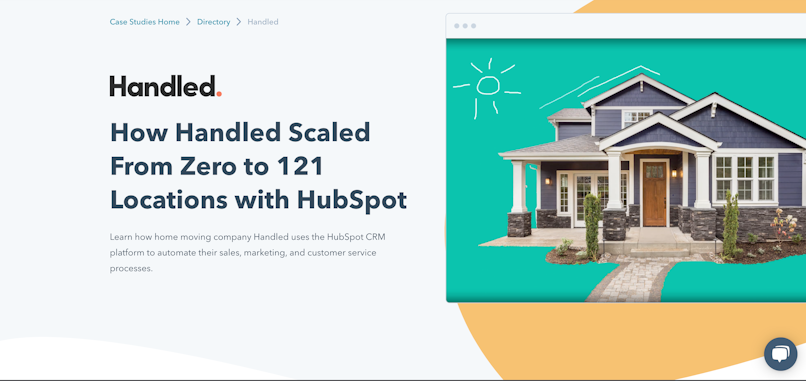
Screenshot taken from hubspot.com
Show & encourage social proof
Any kind of social proof is a way to build trust. By showing the experience other users had with your SaaS, you implicitly tell prospects about the results they can achieve.
When it comes to reviews, It’s always a good practice to be very specific about who’s leaving the review. “An anonymous SaaS founder” with no image won’t do. You need the actual name, image, title, and preferably a link to the reviewers’ social (provided they give consent). Otherwise, you’re losing credibility.
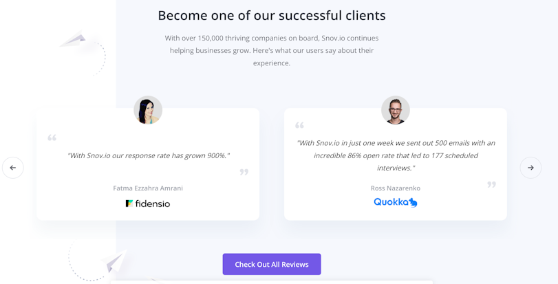
Screenshot taken from snov.io
Apart from the user reviews, you can use other types of ranking platforms like the ones you see below:

Screenshot taken from snov.io
On top of that, you can also feature your prominent press appearances. Those also signify your credibility as an expert in your industry.

Value over Price
“Would you be willing to pay $100 for my product?”. This is one of the questions early-stage founders may ask to shape their pricing strategy. The thing is, that as long as a product provides a positive net ROI, it doesn’t really matter how much it costs: $10, $100, or $10,000. It’s exactly why it’s your job to communicate how your product will make users’ lives easier.
Apart from the ROI, the difference between charging $10 or $10,000 is the trust you need to build. Losing $10 is hardly a loss worth fussing about. The 10k subscription, on the other hand, will require approvals and consideration.
In-Product SaaS Experience
Onboarding
The goal of any onboarding is to equip the users with the knowledge they need to use the tool efficiently and to collect enough information to make the tool functional. Let’s unpack that.
There’s a law in UX, that’s referred to as Postel’s law. It goes as follows: be robust in what you do, be liberal in what you accept from others. In plain terms, it means that you should always do the most you can with the least effort on the users’ behalf. In the case of SaaS onboarding, this means that you should minimize the amount of information you need, i.e. no one likes filling out huge forms.
Ok, so to onboard new users, we need to ask only for the necessary data. How do we know which data is necessary though? – The short answer is UX research. Typically, each persona will have their own needs, and therefore a separate onboarding. You should avoid copy-pasting your onboarding to all user groups.
Additionally, your onboarding should focus on highlighting features that are the most important for activation. How do you know which features are those? – Again, UX research.
Another pitfall you might see is shoving onboarding down users’ throats. Oftentimes, the users will recognize design patterns without the need to show unskippable onboarding sequences, so don’t overdo it and spoonfeed. Alternatively, a user might have a specific task in mind, so the only thing onboarding does is annoy and slow them down. The bottom line: onboarding should be skippable and resumable.
Avoid blank profiles
It could be the case that your SaaS requires a lot of setting up. Especially if your tool requires aggregating data. True, in that case, you will have nothing to display to the first-time user. That doesn’t mean that there’s nothing you can do.
One approach you can have is creating a sandbox account. For example, Google Analytics has a sandbox mode for those users who haven’t yet connected their websites to the tool. It looks as follows.
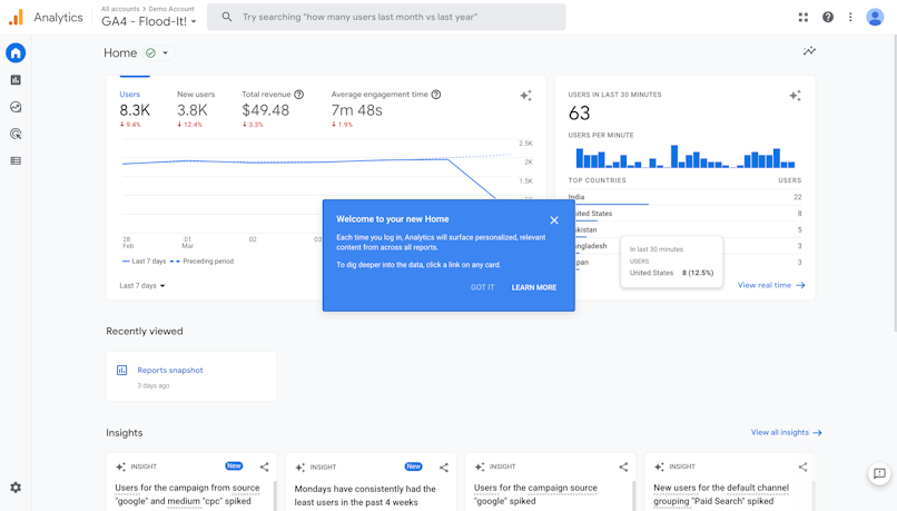
Screenshot taken from Google Analytics
Having a sandbox mode allows users to explore the app without the need to wait. Additionally, there isn’t a risk of “breaking” something.
Additionally, the empty states should definitely be more descriptive than just “no data”. If there’s a blocker – let the user know. Below, we’ve shared an empty state we designed for one of our clients. Read the full case study on SaaS edTech design here.
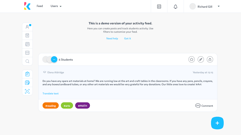
Call things what your customers call it
Modern language is versatile enough to allow for a multitude of synonyms. As such, there are a huge number of ways you can talk about what your SaaS tool does and what its value is. Out of all of these options, you have to find a few that resonate with your users the most. Let’s go over how you can do that.
KW research
In a nutshell, keyword research is identifying which phrases people use in search engine searches to look for certain things. You’re almost certainly going to be dealing with Google.
In practical terms, high-quality keyword research requires you to use an SEO tool. Here are a few that are market leaders right now: ahrefs, Moz and Semrush. To our best knowledge, the only free somewhat viable alternative is ubersuggest.
Once you’ve decided which tool suits you, you should then brainstorm the list of potential search queries, and then export them into the tool you’ve chosen. Based on that, the tool will show you similar queries you might have missed, their keyword difficulty, and search volume. This information will give you a good idea of how your users refer to certain features.
An example of keyword research | Gif recorded in ahrefs web app.
You’ll likely find thousands of potential keywords. Don’t be intimidated though. All of the SEO tools give you powerful sorting options. Additionally, you can exclude certain queries that you don’t need.
User interviews
At the time you’re launching your product, you will hopefully have already spoken to your users. One of the best ways to talk to users is through interviews. These will give you a wealth of insights, one of which is seeing how your users refer to things.
As the name suggests, user interviews are recorded interviews sessions with users (typically, one at a time). These can be conducted at virtually all stages of the product lifecycle. Though, generally, these are the most potent early on, when there is lots you don’t know.
User interviews are essential for building personas and uncovering all kinds of insights. Most importantly, these give you a first-hand peek into what users care about and the language they use.
User interviews are a large topic that deserves its own content. Luckily, we do have it. You can find a full article on user research methods here.
Navigation & Card Sorting
The whole point of designing navigation is structuring the content in a way that makes sense to your users. That way, users will find the things they want to find in the places they will look for, and hence have a chance to see the value.
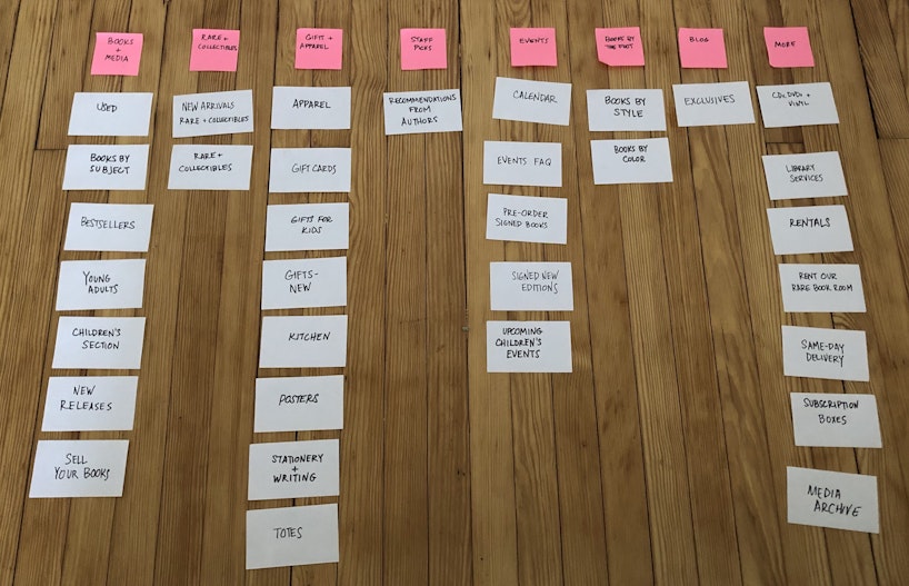
One of the most potent ways to design navigation in a user-first fashion is through card sorting. As the name suggests, this activity involves having users arrange a number of cards in a hierarchical manner.
In order to conduct such a session, you would need to prepare a list of all informational entities within your product, and then have users arrange them.
The picture below shows card sorting with actual stickers, but any digital tool such as FigJam will let you do these sessions remotely.
The bottom line
Demonstrating the value of your SaaS is no easy task. However, with the help of our tips, we hope you'll let the whole world know why your tool rocks 🔥


