Creating a product from scratch is a lengthy and intricate process—there are so many things you have to get right: user and market research, design, development, marketing, among other things. But, unfortunately, getting all of these things right doesn’t necessarily grant you the desired adoption and retention if your onboarding UX isn’t well-thought-out.
UX Onboarding from Scratch
Check out our free editable onboarding checklist to ensure optimal activaiton & conversion.
DownloadWe strongly believe that having an intuitive and user-friendly onboarding experience is your product’s second chance to make a solid first impression, which is why it can make it or break its success.
But fear not! This article will help you create a seamless onboarding experience for your users. In it, we’ll take a closer look at the type of research you should do, as well as touch on crucial design and implementation practices you should be aware of.
Let’s get into it!
What’s onboarding
Okay, so let’s go back to square one and talk about what onboarding is and what it aims to achieve.
Basically, guiding your user through your product allows you to familiarize them with its functionalities and, as a result, showcase the value that it can bring. Your users will know precisely what they need to do to get started and solve pressing issues without having to deal with that pesky learning curve.
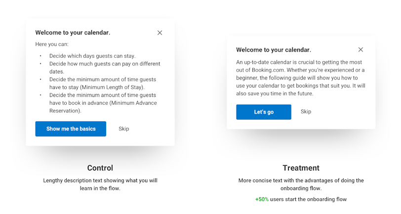
To illustrate the importance of meaningful user guidance, imagine that there is none. Imagine that you download an app, and there’s pretty much no information to help you navigate it. This results in a sense of disorientation and failure to appreciate its true potential. Naturally, this will lead to decreased adoption and bottom line.
An excellent onboarding UX will provide users will all the necessary tools to extract value from your product.
How is SaaS onboarding UX different?
Every SaaS product seeks to increase the number of its customers. However, when it comes to onboarding, this type of service has a fairly limited amount of time to showcase its value in order to avoid user churn.
We’re in the middle of a booming market, and new products go live on a daily basis. SaaS products need to do their best to trigger a user’s so-called “Aha" moment in the hope that they consider becoming a customer at some point.
There is no other way to achieve this but to help users become proficient in using your product in record time. Here’s how.
How to design an onboarding experience for a SaaS app
There are a few things SaaS products should take into account when creating a user guidance experience:
It should provide users with autonomy: don’t rush people into onboarding before they have a chance to look around. Allow users to learn at their own pace;
Do more with less: deliver as much value with as little information. Nobody wants to spend their time reading vast blocks of text;
Onboarding experiences should be frictionless: make sure that users don’t run into distractions or roadblocks in the process;
Tailor your guidance: don’t just explain how your product works. Explain it to your users. If your potential customers happen to be trained professionals, you can leave out a lot of surface-level information from your onboarding.
However, to be able to achieve the things above, businesses should do a fair share of research. Here are some of the essential things you’ll want to do beforehand:
Identify business goals: when designing your onboarding experience, think about the features that matter most to them and your business;
Identify UX personas and their priorities: people have different needs and expectations from products, and you need to factor that in when it comes to guiding your users. Think about the most common issues your ideal customers have to deal with and how your product helps in solving them;
Do competitor research: it’s very likely that there’s considerable overlap between your potential customers and your competitors’ clientele. Take some time to research how your competition approached their onboarding experience and identify things that you can replicate and things that you can improve.
Define the KPIs: depending on your product, you’ll want to define the metrics you want to follow. Generally speaking, the most common onboarding KPIs are customer engagement, time-to-value, milestones completed, and customer support analysis. However, depending on your niche or industry, you’ll want to add a few others to help you understand how successful your guidance has been.
Identify the type of onboarding: there are many kinds of guidance you can provide to your users, and it’s essential that you make the right call. They can be benefit-focused, function-focused, account-focused, manual, and so forth. It’s best to take a deep dive into the benefits of every single one of them and choose the onboarding type that will suit your user experience.
Designing and implementing
Okay, now that we’ve taken a look at the theoretical side of things, let’s explore designing and implementing an onboarding UX.
Fine-tune
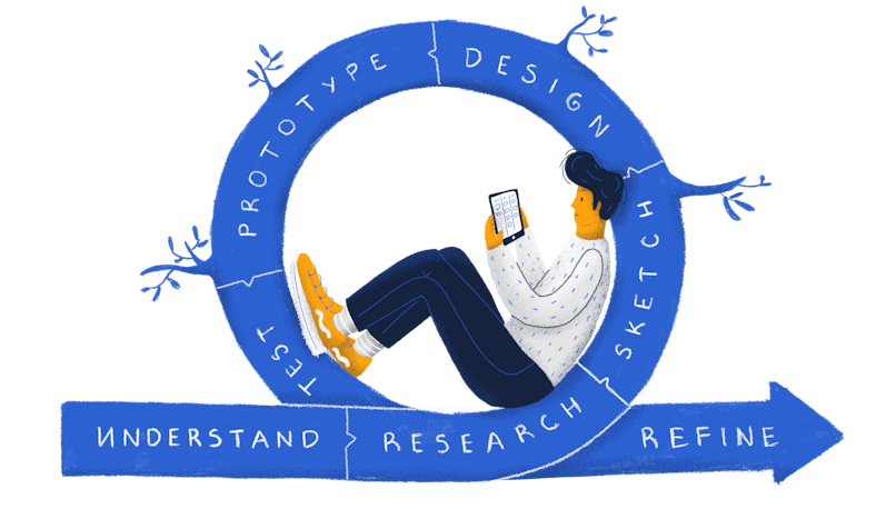
It’s essential to underline that, like designing a product, an onboarding flow should be an iterative effort. Start by creating something that’s good enough and commit to continuously improving it over time. Investing effort into regularly revisiting this part of your product’s experience will only lead to greater customer adoption and satisfaction.
Remove friction
When crafting an onboarding flow, it’s essential to remove anything that may prevent users from exploring your product. Nobody really wants to fill out huge forms. Help them focus on your most valuable features and help them learn effortlessly.
However, if you ever have to request any kind of information from them, make sure that it’s data that’s absolutely critical for providing. The only information you should request is the one that’s absolutely a great experience.
Make it optional and resumable
Oftentimes, the user will already know what they need. Furthermore, that same user might already have the UI figured out. When that happens, an unskippable onboarding becomes a source of frustration. Provide them with the freedom to quit and resume the onboarding flow whenever they see fit.

Personalize it
Good design isn’t about making the whole world happy. Instead, it should focus on creating experiences that specific groups of people will find useful and usable. The same applies to your onboarding—keep a close eye on your user persona’s needs when creating it. Adjust it to your potential customers’ needs and expectations.
Keep track of the context
The onboarding process shouldn’t be viewed as a single learning experience—it might take time. As such, you can extend it in time and provide it contextually. For example, if a user is attempting to use a certain feature, then it would make sense to do an onboarding session on it. Otherwise, out-of-context onboarding is forgetful and useless.
Conclusion
Creating a thoughtful and intuitive onboarding flow does require a fair amount of research, analysis, and design. However, the return on this investment is very much worth it—you’ll see a significant boost in your user engagement, customer satisfaction, and bottom line.

Skyrocket your Adoption, Retention & Activation.
Let us help you get your SaaS ahread of the curve through impeccable product design.
Learn moreFAQ
What is SaaS Onboarding?
SaaS Onboarding is supplying users with all the knowledge they need to succesfully use your SaaS product.
How to run a sucessful SaaS onboarding process?
Successful SaaS Onboarding comes from personalization, fune-tuning, and contextualizing. These three principles will set you on the right path.


