Heuristic evaluation is a thorough assessment of a product’s user interface, and its purpose is to detect usability issues that may occur when users interact with a product and identify ways to resolve them.
We also have a comprehensive video that covers all aspects of heuristic evaluation. Consider taking a look at it if you prefer watching over reading.
When we think about the design of a product, the first thought that comes to mind is how something looks:
Is it eye-catching?
Do the colors complement each other?
Does it have the aesthetic appeal that will lure consumers in?
While all this is technically true for a good design, a great design needs to go the extra mile. How to achieve this?
By making sure your product not only looks awesome but also provides a seamless user experience.
"Good design is actually a lot harder to notice than poor design, in part because good designs fit our needs so well that the design is invisible."
– Donald Norman.
Great usability reflects a product's quality. Therefore:
The better the usability, the more users will engage with the product — and the higher the ROI.
It's the ultimate cycle of a successful product and a happy user.
Download the Heuristic Evaluation Template
It's easy to create a product that looks good, but what about making one that's practical and easy to use? Do a variety of usability tests to ensure your product is user-friendly.
The most efficient way is via heuristic evaluation.
What Is Heuristic Evaluation?
Heuristic evaluation is a key part of designing a great product that users can easily engage with and find value in their interaction. It is a thorough assessment of a product’s user interface, and its purpose is to detect usability issues that may occur when users interact with a product, and identify ways to resolve them.
The heuristic evaluation process is conducted against a predetermined set of usability principles known as heuristics. The process relies on in-depth tests run by several usability experts at a time.
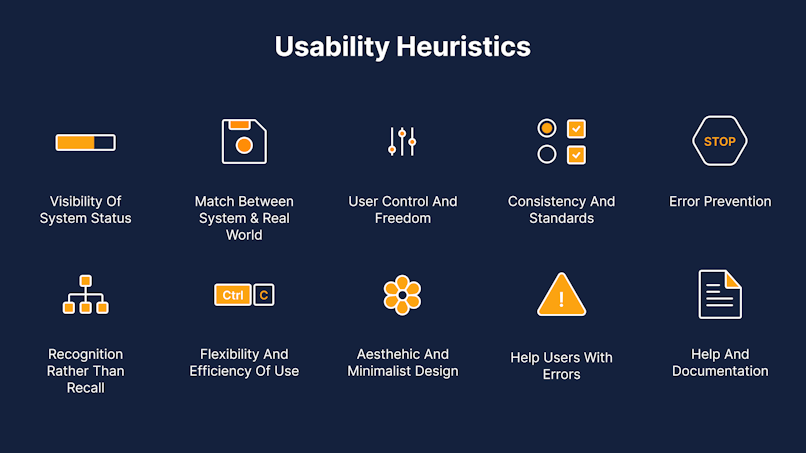
Although there are numerous heuristics, the most commonly used criteria in usability inspection were developed by Jacob Nielsen in 1995, known as the Heuristics for User Interface Design. Here are the Nielsen Heuristics summarized by a picture 🔽

Let's briefly breakdown the 10 of these heuristics in more detail:
Visibility of System Status (users should know the system status at all times and get feedback on interactions with it);
Match between system and the real world (the system should resemble the experiences that users already had);
User control and freedom (users should be able to reverse their action if done by mistake);
Consistency and standard (similar system elements should look similar);
Error prevention (minimize the likelihood of making mistakes);
Recognition rather than recall (users should be able to interact with the system without prior information or context;
Flexibility and efficiency of use (both new and experienced users should be able to efficiently use the system);
An aesthetic and minimalist design (declutter as much as possible, less is more);
Help users recognize, diagnose, and recover from errors (make error messages understandable, and suggest ways to fix an error);
Help and documentation (if a user has a hard time interacting with your app, make sure there’s help that’s easily accessible).
Other heuristics include:
Ben Shneiderman’s Eight Golden Rules of Interface Design
Jill Gerhardt-Powals’ 10 Cognitive Engineering Principles
and Alan Cooper’s “About Face 2.0: The Essentials of Interaction Design.”
Is it your first time doing a heuristic evaluation? We strongly suggest using Nielsen’s heuristics.
This specific collection of heuristics contains 10 rules of thumb that have been proven to produce excellent UX designs.
Additionally:
There are several inspection methods for heuristic evaluation:
Heuristic analysis
Cognitive walkthrough
User testing
While the end goal is similar, the efficiency and validity of each are not.
The Difference Between:
Heuristic Analysis, Cognitive Walkthrough, and User Testing

Often, these terms are used interchangeably.
However, they are all distinctly different in their own right, and one is just as valuable as the next. To best illustrate each usability evaluation method.
let’s take a closer look:
Cognitive walkthrough
Who: New user.
What: Performs specific user tasks in line with user goals.
Why: To determine if the sequential processes to get from point A (user task) to point B (user goal) work in the correct order they were designed to.
User testing
Who: End-user.
What: Uses the digital product in realistic circumstances.
Why: To understand how representative users will complete typical tasks in real-life situations.
Heuristic analysis
Who: System expert.
What: Compares usability to predefined heuristics.
Why: To see if the digital product can be used in a way that is most compatible for users and aligns with recognized usability principles.
From all three usability inspection methods, heuristic analysis is the most reliable, as tests are more rigorous and systematic.
They are also completed by evaluators with a deep understanding of:
Heuristics
Human variability
Interaction design (IxD)
HCI (human-computer interaction)
UX design
Also:
Evaluators typically have a background in relevant disciplines, including:
Psychology
Computer science
Information sciences
Business
This is why we will focus on heuristic analysis as the inspection method of choice for an impeccable UX design.
Using Heuristic Analysis for Usability Evaluation
Appointing 5–8 heuristic evaluators should identify over 80% of usability hitches.
Heuristic analysis is a usability inspection technique where a small group of usability experts (ideally, five to eight) tests a given digital product’s UI.
Comparing it to given heuristics, heuristic evaluators use the product and flag usability problems as they occur. During the evaluation, each evaluator marks usability issues according to a severity scale.
This is so that project managers and design teams can organize their backlog based on the severity rating assigned to each issue. By doing so, they can prioritize tasks and determine which issues require immediate intervention, working their way down the list.
Once the review is over, the heuristic evaluators provide a comprehensive report on the usability status of a digital product.
Although one experienced evaluator will be able to flag the most critical UX issues, employing the services of several evaluators is a better option.
Appointing five to eight heuristic evaluators should identify over 80 percent of usability hitches. This should be more than enough to increase the quality of your product’s design.
Why Should You Do It?

Unless you want to have a mediocre (or bad) product that’s barely bringing in new users, let alone retaining old ones, then you desperately need a heuristic evaluation.
Seriously.
Doing a heuristic evaluation is extremely important in improving the overall design of your digital product.
Are you wondering why your product is performing terribly? Then a usability inspection will give you the answers you seek. Perhaps you need to have clearer navigation or shorter registration forms. You’ll never know unless you do some testing.
So, why delay it?
What Are the Pros and Cons of a Heuristic Evaluation?
Before you jump into the heuristic evaluation, it’s important that you understand both its advantages and disadvantages.
Pros
Quick and cost-effective. Use the internal resources you already have in place to administer an evaluation.
Flexible. Complete testing at any stage of the design process. Evaluate wireframes, prototypes, live products — or all of the above.
Exhaustive. Enable a comprehensive scan of your product’s current UX design.
Severity rating. Organize usability issues, and solve them in accordance with their level of severity.
Usability principles. Following a set of heuristics lets you identify problems in specific user flows.
Compatible. You can combine multiple usability testing methods at the same time.
Cons
Shortage of usability experts. Finding an experienced usability evaluator can sometimes be a challenge, depending on the niche of the product being tested.
Lack of experience. Onboarding newbie evaluators may influence the value of the usability issues identified.
False positives. Issues that are flagged based on heuristics may not necessarily cause a negative user experience in practice.
How We Conduct an Effective Heuristic Evaluation

An accurate heuristic evaluation calls for careful preparation and requires you to follow a strict order of steps. Skipping a step may deem your test results invalid.
Here are the steps to ensure that your heuristic evaluation yields maximum results:
Step 1: Define the scope of your evaluation.
The first thing you should do is define the scope of your evaluation in keeping with your budget and deadline.
Do you need to test every aspect of your product or should you concentrate on particular user-flows?
Do you need to identify major issues in a small time frame?
Then it’s best to limit the scope and focus on precise parameters.
Think about the specific usability parameters that you want to test, such as:
Registration
Login/out
Email signup
Navigation
Shopping cart
Checkout
Having a limited scope is easier to control and assess.
Ask yourself: What do I want to test?
Step 2: Know your end-user.
Understanding who your end-user is and what their goals are will aid the usability evaluation.
This is an important part of mapping out the user flow, as different user groups have distinct expectations and user behaviors.
For instance:
Some users might not have issues registering for a product
while others may see it as an unnecessary step and abandon a product.
User motivation depends on various factors, including:
Demographics
Personal preferences
Skillsets
and more
Know your end-user, and create advanced user personas to assist evaluators during the evaluation process.
Ask yourself: Who is this product for?
Step 3: Choose your set of heuristics.
Select which heuristics the evaluators are going to use.
This will ensure that they are all using the same guidelines throughout the evaluation. We mentioned a few of the most popular heuristics earlier, so check them out.
Without heuristics, the usability evaluation will produce unreliable, inconsistent, and ultimately, useless results. Essentially, all your efforts will be for nothing.
Ask yourself: Which usability principles should be followed?
Step 4: Set up an evaluation system and identify issues.
Decide how evaluators will evaluate and report the usability of your product.
Try setting up a simple evaluation system using a severity rating:
Critical issue
Normal issue
Minor issue
Good practice
or a traffic lights scheme (red, orange, yellow, green).
Whichever evaluation system you choose, discuss it with evaluators beforehand to make sure everyone is on the same page. Furthermore:
Evaluators should keep track of issues by making detailed notes of where they encountered the issue and how serious it is. This will help organize the design team’s backlog later on.
Ask yourself: How will evaluators assess and report a usability issue?
Step 5: Analyze and summarize findings.
As the evaluation draws to a close, it’s time to gather, compare, and summarize the findings.
One of the key benefits of using multiple evaluators is that they will each find issues that their counterparts have missed.
Start by removing duplicates and organizing the data consistent with the severity rating of each issue. This will facilitate the design team in prioritizing their workflows.
The findings will become the launchpad for improved UX design and an all-around better product.
Ask yourself: What do the findings show?
Should You Pay for a Heuristic Evaluation or Do It Yourself?
Many companies are sitting on the fence about whether they should pay for a heuristic analysis. Some may argue that they already have an in-house team of UX designers, so why should they have to fork out the additional expense?
Others may be willing to pay if doing so will benefit their product in the long run. The overall design and heuristic evaluation process can be a bit overwhelming.
And while you may have a great team of UX designers working on your product, you need to consider the bias that might appear when evaluating their own designs, albeit unintentionally.
Spending hours working on, looking at, and testing a design will take away that fresh perspective needed to identify weak spots. It’s in cases like these that paying for a heuristic evaluation is not such a bad idea.
If you want to be absolutely certain that your design will tick all the boxes when undergoing a heuristic analysis, getting help from a professional UX design agency is a smart idea.
That being said, it’s okay to get that extra set of eyes to work alongside you and your team. This tiny investment will save you time and (a lot of) money in the long run.
So, in response to whether you should pay for a heuristic evaluation, ask yourself these two questions:
Do you trust that your UX design team will be 100-percent objective in their evaluation?
Can you afford a biased heuristic evaluation that could hinder the success of your digital product?
Looks like you’ve got your answer.
Can You Use AI for a Heuristic Evaluation?
The short answer? Yes.
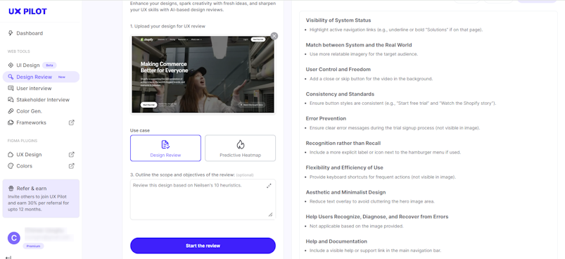
If you’re considering conducting a heuristic evaluation yourself, AI can help make the review more objective and efficient. UX Pilot Design Review provides actionable AI-based UX design reviews for a tiny fraction of the time and cost of hiring an expert.
The process is simple and only involves a few steps. And if you want to kill two birds with one stone, the UX Pilot design review feature can also generate predictive heatmaps to show where your audience will most likely focus.
Here’s how it works:
How To Do a Heuristic Evaluation With UX Pilot AI
From your UX Pilot dashboard, select UX Design Review.
Next, upload your designs to be reviewed by dragging and dropping the image or clicking the upload area to choose an image from your device.
After uploading your design, an input box will appear where you can outline the scope and objectives of the review. Enter this prompt: “Review this design based on Neilsen’s 10 heuristics”.
Click ‘Start the review’ and wait for the AI to do its thing. It only takes a few seconds.

Easy peasy, right? And here’s how to pinpoint the key focal points in your design with the UX Pilot predictive heatmap:
Follow the 1st and 2nd steps of conducting a heuristic evaluation illustrated above.
After uploading your design, select ‘Predictive Heatmap’ as the use case.
Click ‘Start the review’.

And what if you want to conduct a heuristic evaluation without leaving Figma? You absolutely can! Here’s how to do it with the UX Pilot AI Design Review plugin:
How To Do a Heuristic Evaluation With UX Pilot AI Plugin
From your Figma design file, go to the plugins community and search for UX Pilot. Then select UX Pilot AI: Design Review from the available plugins. Once the UX Pilot pop-up window appears, it’s time to get started.
Select the frame you want to evaluate.
Select Neilsen 10 Heuristics from the input field labeled ‘Choose a template’.
Click ‘Review design’ and let AI do the heavy lifting.

It’s as simple as that!
There you have it—your answer to whether AI can help with a heuristic evaluation of your designs. But this brings us to an even bigger question:
Should You Rely on AI for Your Heuristic Evaluations?
Here’s the thing: AI-generated design reviews can give you a great head start when evaluating your designs. Given that we’re all biased to some degree, having a second opinion can help spot potential blindspots and increase objectivity. However, here are some key points to keep in mind when evaluating your design with AI:
Always double-check the output as AI can make mistakes.
When dealing with complex designs or unique contexts, it’s best to leave the evaluations to humans.
The output will vary with each generation, so consider generating multiple results to get a more comprehensive view.
AI tools might not capture all the nuances of user experience, so it’s best to use them as a complement, not a replacement for human insight.
Heuristic Evaluation vs. Expert Review: A Comparative Analysis
While some people assume they are the same, heuristic evaluation and expert review are actually two distinct methods used to assess the usability of a user interface. Admittedly, the two activities share many similarities, but they have unique characteristics and applications.
Heuristic Evaluation
Focus: Identifies usability issues based on established usability principles or heuristics.
Process: A small group of experts independently evaluate the interface against a set of heuristics.
Benefits:
Relatively quick and cost-effective.
Can identify a wide range of usability issues.
Can be used early in the design process.
Limitations:
Relies on the expertise of the evaluators.
May miss issues that are not covered by the heuristics.
Expert Review
Focus: A broader assessment of the user interface, including factors like information architecture, content strategy, and overall user experience.
Process: A single expert or a small group of experts evaluate the interface based on their knowledge and experience.
Benefits:
Can identify a wider range of issues than heuristic evaluation.
Can provide more in-depth insights into the overall user experience.
Can be used to assess the effectiveness of design solutions.
Limitations:
Can be more time-consuming and expensive than heuristic evaluation.
Relies on the expertise of the evaluator.
Heuristic Evaluation in Action
Aliaswire, a fintech platform, faced many challenges with a complex user interface and inconsistent visual design. To address these issues, we conducted a comprehensive UX audit, including a heuristic evaluation. Through this, we were able to identify and rectify usability problems; we simplified user flows, enhanced visual design, and improved the overall user experience. This led to increased user satisfaction, higher conversion rates, and reduced support costs.

Finished design for the Aliaswire dashboard.

Need expert assistance? Book a free consultation to learn how our experts can solve your usability problems.
When to Use Which Method
Heuristic Evaluation:
Early in the design process to identify major usability issues.
When you need a quick and cost-effective assessment.
When you have a specific set of usability principles to evaluate against.
Expert Review:
Later in the design process to assess the overall quality of the user interface.
When you need a more in-depth analysis of the user experience.
When you have a specific user group in mind.
Combining Both Methods
Often, a combination of heuristic evaluation and expert review can offer designers a more comprehensive assessment of a user interface.
With both methods, it's easier to identify a wider range of usability issues and further improve the user experience.
Remote Heuristic Evaluation: A Practical Guide
As teams continue to work remotely, remote heuristic evaluation is becoming increasingly popular. Though it presents unique challenges, it can still be an effective way to identify usability issues and improve the user experience.
Challenges of Remote Heuristic Evaluation
Lack of Physical Presence: Without being physically present with the product, it can be difficult to fully understand its context of use.
Communication Barriers: Remote collaboration can lead to misunderstandings and delays in communication.
Technical Difficulties: Issues with screen sharing, remote testing tools, or internet connectivity can hinder the evaluation process.
Limited Contextual Understanding: Remote evaluators may not have access to the same level of contextual information as in-person evaluators.
Best Practices for Conducting Remote Heuristic Evaluation
Fortunately, proven methods exist to help tackle the above limitations. Let's consider them.
Clear Communication and Collaboration Tools:
Use reliable communication tools like Zoom, Microsoft Teams, or Slack to facilitate real-time discussions and collaboration.
Establish clear guidelines for communication, including meeting etiquette, response times, and documentation.
Detailed Documentation and Screen Sharing:
Create a detailed evaluation plan outlining the scope, goals, and specific tasks to be performed.
Use screen-sharing tools to allow evaluators to share their screens and point out specific issues.
Encourage evaluators to take detailed notes and screenshots to document their findings.
Structured Evaluation Process:
Develop a structured approach to the evaluation, such as using a checklist or a rating scale.
Establish clear guidelines for identifying and reporting usability issues.
Consider using a collaborative tool like Miro or Figma to facilitate discussions and document findings.
Pilot Testing:
Conduct a pilot test with a small group of evaluators to identify any issues with the remote evaluation process.
Use the feedback from the pilot test to refine the process and improve the overall experience.
Post-Evaluation Debriefing:
Schedule a debriefing session to discuss the findings and identify any areas for improvement.
Collaboratively prioritize the identified issues and create a plan for addressing them.
These best practices can help you conduct effective remote heuristic evaluations and ensure the usability of your products, even in a remote setting.
The Bottom Line
You’d be surprised by just how many usability issues your product may have.
Performing a heuristics analysis with the skill set of even just one usability expert is enough to identify and fix major problems in UX design.
As soon as necessary changes are made, you’ll notice the difference in:
User engagement
Bounce rates
Product sales
Moreover, don’t limit yourself to just one usability inspection method.
Combining a heuristic analysis with cognitive walkthrough and user testing will ensure your product’s design is up to standard — from both a design expert's and an end user’s point of view.
At the end of the day: It all comes down to whether you want to develop a strong product or one that’s bound to flop in time. At Adam Fard Studio, we blend heuristic analysis with cognitive walkthroughs and user testing, ensuring your design excels from both expert and user perspectives.
Ready to elevate your product? Schedule a FREE consultative session with us, get your questions answered and embark on a journey to product success.

Download the free heuristic evaluation template to find out if your design makes the cut!
If you’re wondering why your product is performing terribly, then a usability inspection will give you the answers you seek:
Download NowHelpful links
How is the Heuristic Evaluation Conducted?
The heuristic evaluation process is conducted against a predetermined set of usability principles known as heuristics. The process relies on in-depth tests run by several usability experts at a time.
How many inspection methods are there?
Heuristic analysis, Cognitive walkthrough, User testing

![Heuristic Evaluation: Eliminate 80% Usability Problems [${currentDate} Upd]](https://www.datocms-assets.com/16499/1577274968-what-is-heuristic-evaluation-cover.jpg?auto=format&dpr=0.84&w=1920)


