Designing banking apps can be quite a demanding process, given how complex and important the topic of money is for everyone. A person that chooses to use a digital product to manage their money grants it a fair amount of trust—even the smallest of design and experience hiccups can undermine it.
In this article, we’ll take a closer look at some banking app UX practices aimed to help businesses ensure that their users feel safe while using their products. We’ll touch on accessibility, communication, and a host of other things that help improve Fintech products.
Let’s dive right in, shall we?
The state of banking UX
Banking apps have been somewhat late to the mobile boom. They were there, but they weren’t really good. The earliest mobile banking products that were released around 2009 had a few features, mostly geared towards balance inquiries and finding ATM/branch locations.
Ten years later, banking apps have become somewhat of a standard in the industry. According to an ABA report, 87% of institutions with an asset range between $50 million and $15 billion have developed and released their own banking apps.
The incentive is there—the fact that these companies choose to invest a considerable amount of effort and resources into their products is a sign of overwhelming acceptance and trust from users.
More importantly, this skyrocketing adoption is nowhere near halting. There are now over 3 billion people using digital banking worldwide—this number is projected to continue growing.
UX principles banking apps should consider
Creating a usable and enjoyable UI revolves around making the user’s experience intuitive. Your primary goal should be designing a product that doesn’t place too much cognitive load on the person using it and ensuring that their learning curve isn’t too steep.
Another thing that is also worth paying close attention to is making your app evoke positive emotions. After all, we all care for joyful experiences.
Let’s explore how you can achieve the two.
Make things easy to find
Banking apps come in different shapes and forms, but they all have a single unified goal—managing people’s finances. That’s why information like account balance, recent spending, spending analytics, or anything relevant should be easily accessible to the person using the product.
The important thing to mention here is that UX research is absolutely critical here because to ensure superior findability and discoverability, designers need a solid information architecture (IA). They need to know how users think about categories and how they navigate the niche that your product or service is in.
More importantly, to ensure that your IA is rooted in a correct interpretation of user research data, it’s critical to test the design vigorously. This is where most usability, discoverability, findability, and other “-ility” issues will surface, which will guide you towards a better, frictionless experience.
Lead by innovating
We mentioned previously that banks weren’t exactly fast in adopting digital experiences, and they can be a little conservative when it comes to innovating them. Many bank applications seem to just copy their competitors’ products, which allows the more daring and open-minded brands to shine with new features.
Being competitive in this space partly revolves around having a framework geared toward continuous innovation. This also has to do with the ever-changing intergenerational perception of money and personal finances—we all agree on what money is, but people in different age categories think about it differently.
Provide educational content
Unfortunately, the importance of financial education hasn’t really been grasped worldwide, and there aren’t many educational systems that focus on providing it outside programs that focus on it.

An example of a FinTech product offering finance education | Source
Banks can and probably should aim to provide their customers with accessible and bite-sized educational content that would help people make better, sounder decisions with their money.
This is a valuable tool for a person’s experience with a product. Imagine a service that helps you manage your finances that also cares about and contributes to your financial wellbeing—it’s a valuable source of customer loyalty and satisfaction.
Ensure clear communication around regulations
Financial services normally come with lots of regulation since they’re dealing with people’s vital resources. Regulations might limit the capability of your products and the ease of the experience. Although important for a person’s security, things like two-factor authentication (2FA) can create hiccups in a banking app’s UX. This is why it’s important to communicate the importance of such security regulations.
Yes, sometimes this may seem like an unfair disadvantage, but by providing clear communication to users, you can help them understand the importance of this added friction and use it to build additional trust.
After all, it’s for everyone's safety. Unfortunately, user don’t always appreciate it—they sometimes churn as they don’t understand why their seamless experience has to be interrupted by such events.
Plus, this could be a valuable opportunity to educate your users on scams and help them recognize and avoid them. A product should aim to strike a balance between convenience and security.
Create tailored experiences
Banking products that leverage personalization in a strategic and holistic manner are currently enjoying impressive returns on their investment. By personalizing beyond a person’s basic information, apps can emphasize the value users are receiving and build a long-lasting relationship with them.
It’s worth mentioning, however, that while a deeply-personalized experience should be a goal in itself, it’s safe to say that companies should attempt to reach it in small steps. This is a demanding and time-consuming process, and getting it right through small victories is the way to go here.
According to a Blend study, almost 75% of decision-makers in the financial sector are looking to grow their investment in personalization, and nearly a third of them are looking to increase it considerably.
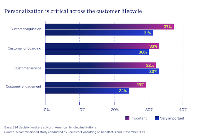
The reason why the organizations behind financial apps should seek to further their interest in personalized is that more “mature” companies that have been invested in ensuring data-driven personalization outperform those that don’t.
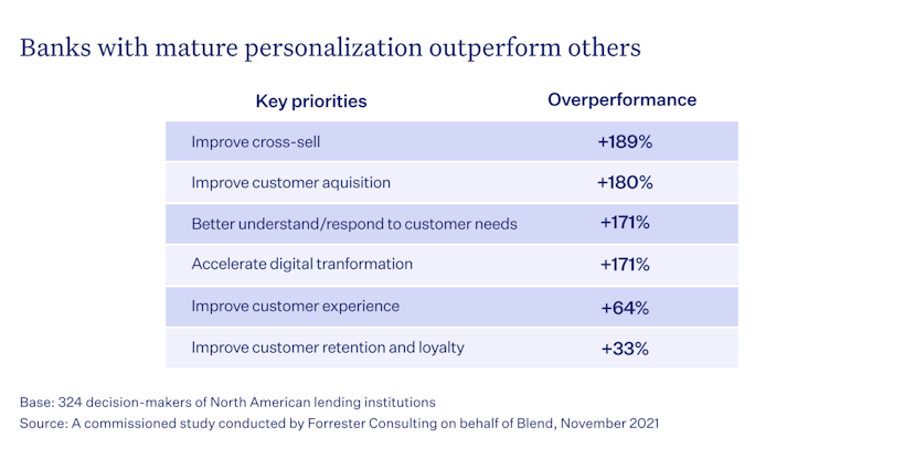
This was confirmed by a Forrester study that found that high-maturity banks outperform their low-maturity counterparts by up to 189% in terms of cross-selling, customer acquisition, and a host of other critical parameters.
Ensure an accessible and inclusive experience
Certain accessibility standards are mostly enforced through banking regulations, but instead of just ticking those boxes, try to provide a rich and inclusive experience that will accommodate people with a broad spectrum of conditions and disabilities. Here are a few things to keep in mind:
Opt for simple, accessible language
Use inclusive images, illustrations, and branding elements
Use gender-neutral copy
Remove clutter like redundant pages, buttons, and other elements
Ask for essential information only to keep forms short
Include a progress bar when possible
Provide users with an intuitive auto-completion feature
Banking apps are commonly used to pay for things like groceries, restaurant bills, or train tickets. It’s important to provide these features to users in the most effortless way possible.
Spending analytics
Many people, myself included, sometimes wonder, “how on Earth did I manage to spend this much money this week/month?”. That’s why it’s vital to have a system in place to help categorize spending, allowing your users to make informed decisions about finances.
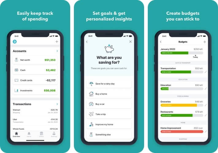
No one should be forced to go through their transactions to manually do the math.
Help clients reach their goals
The banking apps help people make sense of the money they have available. On top of being just a resource that allows you to buy things, money is also something people almost always like to have more of. People often set goals for saving up for things like cars, apartments, computer gear, etc.
That’s why you should have a system in place to help people save. One common mechanism for doing that is saving jars, which can round up your balance daily and transfer the surplus to the piggy bank. You could also have hints and saving plans.
Or, you could have a system to help users cut spending by comparing their financial activity to an average month. As a result, this can allow you to create valuable in-app prompts that could, for instance, help them cut their spending on entertainment by 10%, allowing them to buy a car three months faster.
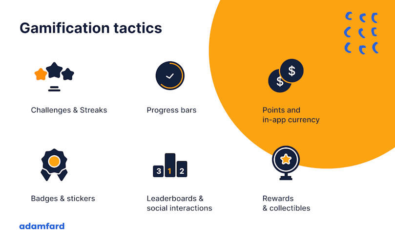
There is a wide array of gamification features you can experiment with—points, levels, leaderboards, badges, progress charts, and many other features that will help make the product experience more engaging.
Transferring funds shouldn’t be a bother
One way or another, users will inevitably be in a situation when they share a bill with someone. Be it something minor like a dinner or a month-long road trip. You need to make sure that this feature is available to them in a swift and effortless manner.
Currently, many users have to use third-party apps like Splitwise, and then go through the trouble of copying the credit card info and sending funds.
There’s definitely potential to make this process easier. If both users use the same app, you could identify the person rather than a credit card and spare the tedious copying of the personal and financial data.
Provide lightning-fast support
One of the most frustrating things in the world is having your banking app not work. Payments are often very time-sensitive events, and preventing people from making transactions can be a problem.
Situations like these happen, and you need to make sure these issues are immediately resolvable through phone calls or live chat.
Ensuring security and privacy in banking apps
Security is of utmost importance in the digital age, especially when it comes to managing personal finances. Banks must put robust security measures in place to protect user data and instill confidence. Below are some techniques to do that in banking apps.
Data encryption
To protect sensitive information, banks employ advanced encryption techniques. This ensures that even if data is intercepted, it remains unintelligible to parties that are unauthorized. Additionally, secure data transmission protocols like HTTPS protect data as it travels across the internet.
Two-factor authentication (2FA)
2FA adds an extra layer of security by requiring users to verify their identity through a second factor, this could be a code sent to their phone or a biometric authentication. Although this enhances security, it's important to balance it with user experience. Streamlined 2FA processes, like push notifications, can minimize friction.
Fraud detection and prevention
Leveraging the power of AI and machine learning, banks can identify and prevent fraudulent activities in a proactive manner. Real-time monitoring systems enable banks to detect suspicious behavior and take immediate action to protect user accounts in their app.
Biometric authentication
Biometric authentication has emerged as a powerful tool to enhance user experience and security in banking apps today. Users can authenticate themselves quickly and securely through unique biological traits, such as fingerprints and facial recognition.
Fingerprint and Facial Recognition:
Seamless User Experience: Biometric authentication offers a seamless and intuitive user experience, eliminating the need for passwords or PINs.
Enhanced Security: Biometric data is highly personal and difficult to replicate, making it a strong deterrent for unauthorized access.
Challenges and considerations
While biometric authentication offers significant benefits, there are challenges and ethical considerations to address:
Accuracy and Reliability: Ensuring the accuracy and reliability of biometric systems is crucial to prevent errors and unauthorized access.
Privacy Concerns: The collection and storage of biometric data raise privacy concerns. It's essential to implement robust security measures to protect this sensitive information.
Ethical Implications: The use of biometric data raises ethical questions about surveillance and potential misuse.
If these factors are duly considered, banks can leverage biometric authentication to enhance user experience while safeguarding security and privacy.
The use of AI and machine learning in banking app design
Artificial intelligence (AI) and machine learning (ML) are two exciting fields reshaping the banking and finance industry, empowering institutions to deliver innovative and personalized services. Here's how they can be leveraged to create better banking apps:
Personalized experiences
AI-powered algorithms can deliver tailored recommendations for financial products and services by analyzing user behavior and preferences. This personalized approach ends up enhancing user satisfaction and promoting long-lasting relationships.
Fraud detection
Another area that AI has been outstanding in so far is fraud detection. With the power of AI and machine learning, banks can proactively identify and prevent fraudulent activities on their apps. Real-time monitoring systems can detect anomalies and suspicious behavior, enabling banks to take swift action to protect user accounts.
Chatbots and virtual assistants
AI-powered chatbots and virtual assistants provide 24/7 customer support, answering queries and resolving issues efficiently. This has arguably been the biggest use of AI in business. By automating routine tasks and inquiries, these intelligent assistants free up human agents to focus on more complex issues.
With AI and ML, banks can deliver innovative and personalized services that meet the evolving needs of their customers.
Maintaining cross-platform consistency
In today's multi-device world, it's essential for banking apps to provide a consistent and smooth user experience across different platforms. To achieve this, banks must prioritize cross-platform consistency. Here's how to achieve that
Design system
A well-defined design system ensures a cohesive visual language across all platforms.
Consistent typography, color palettes, and iconography create a seamless experience for users, regardless of the device they're using.
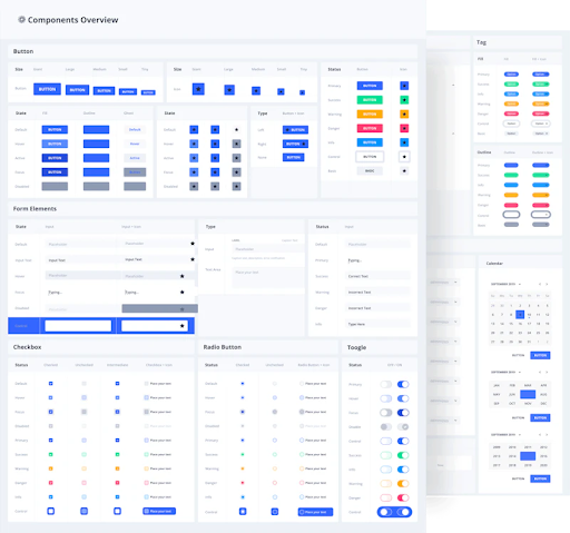
A design system.
Responsive design
Responsive design ensures that the user interface adapts to different screen sizes, providing an optimal experience on desktops, tablets, and smartphones.
By optimizing performance for mobile and web platforms, banks can deliver fast and responsive experiences, even on slower connections.
Platform-specific considerations
Adhering to platform-specific guidelines, such as Apple's Human Interface Guidelines and Google's Material Design, ensures a native-like experience.
Also, taking advantage of platform-specific features, such as touch gestures, voice commands, and notifications, can enhance the user experience and differentiate the app.
Dark mode and night mode
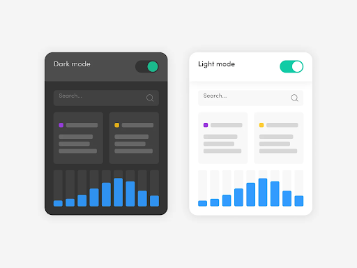
In recent years, dark mode has gained a lot of popularity among smartphone users. Apart from the aesthetic appeal, dark mode has other benefits, which include:
Benefits of Dark Mode:
Reduced Eye Strain: Dark mode can reduce the amount of blue light emitted by screens, which can alleviate eye strain and improve sleep quality.
Improved Battery Life: Dark mode can help conserve battery life, especially on OLED screens.
Design considerations
Before implementing dark mode in a banking app design, there are some vital factors to consider. You can read our more detailed article on dark mode vs. light mode for more insights.
Color Contrast: Ensuring sufficient color contrast between text and background is vital for readability, especially for users with visual impairments.
Accessibility: You must consider accessibility guidelines to ensure that dark mode is inclusive for all users, including those with visual impairments.
Seamless Transition: Implementing a smooth transition between light and dark mode can enhance the user experience.
Gamification in banking apps
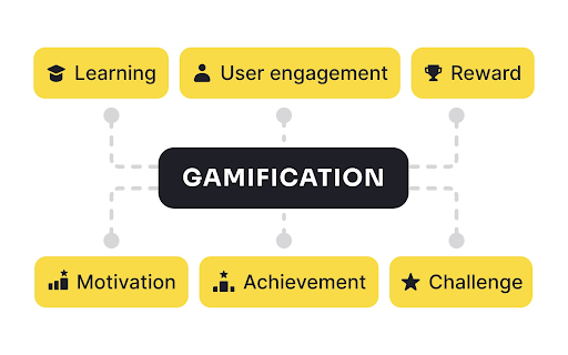
Gamification is an effective technique to motivate user behavior and make financial tasks more engaging. You can encourage bank app users to set and achieve financial goals by incorporating game-like elements.
Motivating user behavior:
Financial Goals: Gamification can help users set and track financial goals, such as saving for a vacation or retirement.
Habit Formation: By introducing challenges and rewards, banks can motivate users to develop healthy financial habits, like budgeting and saving.
Gamification techniques:
Points and Badges: Users can earn points and badges for completing tasks, such as making timely payments or setting financial goals.
Leaderboards: Friendly competition can encourage users to stay motivated and strive for better financial habits.
Progress Bars: Visualizing progress towards financial goals can be motivating and rewarding.
Challenges and Rewards: Offering challenges and rewards can incentivize users to take specific actions, such as saving a certain amount of money or investing in a particular financial product.
These gamification elements make apps more engaging and fun, ultimately leading to improved user satisfaction and financial well-being.
Case study: Aliaswire
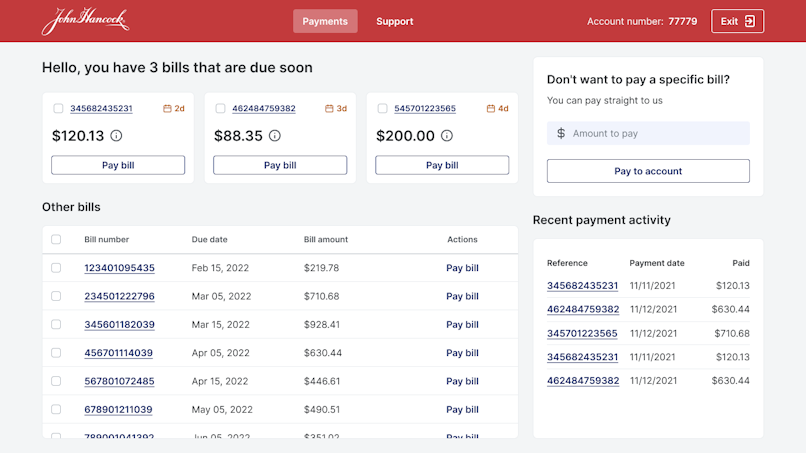
Adam Fard Studio transformed Aliaswire's fintech platform into a sleek and intuitive user experience. By diving deep into the client's needs and leveraging design-thinking principles, our team created a solution that not only met functional requirements but also captivated users. From the initial login screen to the detailed payment history, every interaction was meticulously designed to enhance usability and delight customers.
Key outcomes:
Elevated User Experience
Enhanced Platform Functionality
Increased User Engagement
Improved Brand Image
Successful Client Partnership
Do you need help revamping your banking app or creating one from scratch? Book a free consultation with our experts today to discuss your needs.
Future trends in banking app UX
The future of banking app UX is brimming with exciting possibilities. Emerging technologies are reshaping the way we interact with our finances.
Voice Assistants and Voice Commands
Hands-Free Banking: Voice-activated banking allows users to perform tasks like checking balances, transferring funds, and paying bills without typing.
Personalized Financial Assistance: Voice assistants can provide personalized financial advice, answer questions, and help users make informed decisions.
Augmented Reality (AR) and Virtual Reality (VR)
Immersive Experiences: AR and VR can create immersive banking experiences, such as virtual branches and interactive financial visualizations.
Personalized Financial Advice: Virtual financial advisors can provide tailored advice in a virtual environment, making complex financial concepts easier to understand.
Blockchain technology
Secure Transactions: Blockchain technology offers a secure and transparent way to record transactions, reducing the risk of fraud and errors.
Decentralized Finance (DeFi): DeFi applications built on blockchain technology can provide innovative financial services, such as lending, borrowing, and trading, directly to users.
These emerging technologies will allow the creation of more engaging, efficient, and secure banking experiences for their customers.
The bottom line
Digital banking has grown in use dramatically since the beginning of the pandemic—the digital finance landscape has become smarter than ever, nudging many organizations to rethink their design and overall experience.
By incorporating these principles, you’ll be able to help your customers manage their money with ease and confidence.


