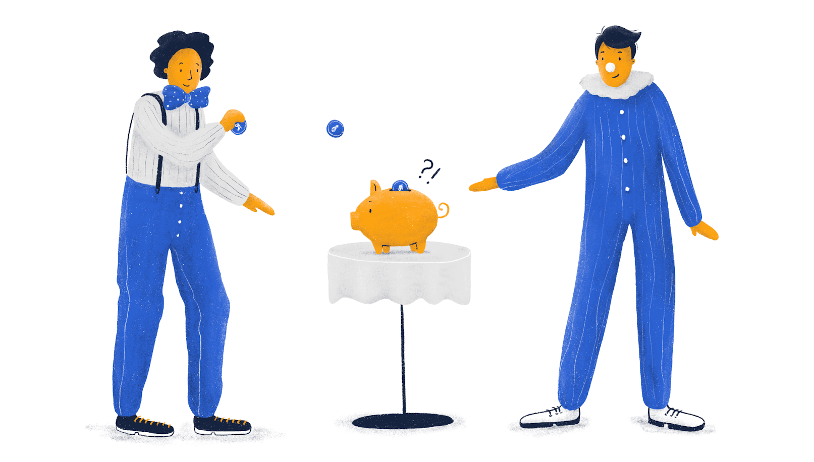
Let's face it, when was the last time you got excited about finance? If you're like most people, it must have been a while. But what if we told you that finance could be fun? Yes, fun, you've read that right. And not only that, but adding a little bit of fun to your financial product could take it from good to great.
Don't believe us? Well, according to Finances Online, companies that introduced gamification elements to their products saw a staggering 700% boost in conversion rates. That's not just a small bump, that's a game-changing difference.
So why aren't more digital and fintech products jumping on the gamification bandwagon? It's a mystery to us, but we have a few guesses. Maybe it's because the trend is still relatively new and hasn't caught on yet. Or maybe it's because people don't typically associate finance with fun. But whatever the reason, it's time to change the game and start gamifying our financial apps.
Why make FinTech fun
According to Forbes, among the ten issues most detrimental to fintech startups are getting early adopters and then activating them. Additionally, churn and poor differentiation also made it into the list.
All of these problems are addressable through UX and gamification in particular. That’s not to say that it’s a cure-all. However, it’s a surefire way to stand out among “reserved” and “serious” competition.
In other words, gamification has a direct impact on:
User engagement (you can’t get more engaging than games);
User activation and retention (users are likely to stick with the products they enjoy using);
Word-of-mouth referrals (People don’t refer good apps. What they do refer is amazing apps that go beyond their expectations)
Very few fintech products, especially in b2b, embrace the fun elements. Now is the time to zero in on gamifying your fintech product before the concept explodes.
To drive our point home, according to Mordor Intelligence, the gamification market is expected to grow by 350% by the end of 2026, compared to the 2020 data. Therefore, it’s time to embrace the trend.
Tips for introducing fun to Fintech
Now that we’ve gone over why you should bother with gamification, let’s discuss the actionable tactics you can employ. By the way, we can’t stress enough that these tips apply to both b2b and b2c.
Gamification can be introduced through a variety of tactics, but in our experience, there are 6 major ways you can leverage it.
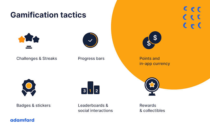
Let’s go through each tactic.
Rewards, Collectibles, Badges & Stickers
It’s a long-discovered psychological fact that positive reinforcement considerably boosts motivation. While this has been mostly talked about in the context of workspace, the same psychological principles apply to digital products.
Take a look at the screenshot below. It’s taken from a Ukrainian banking app monobank. Humanizing fintech and making it fun helped the app take off.
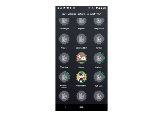
The screenshot is taken from this app.
While using the mobile banking app, users earn achievements through different activities. More activities mean more rewards. It's a virtuous cycle.
The English version of the app has a 4.9 avg. rating based on 8 thousand reviews, while the Ukrainian version maintains the same ratings with 540 thousand reviews.

While gamification isn’t the only thing that monobank nailed, it certainly contributed an immense amount.
Progress bars
Take a look at Mint, one of the leading bill-tracking and budgeting apps on the market. One of the key value proposition points the app offers is helping users save up. As such, it’s essential to help users set clear goals and provide clarity as to their progress. Few user interface elements can do it better than a progress bar, though it isn’t the only thing progress bars are good for.
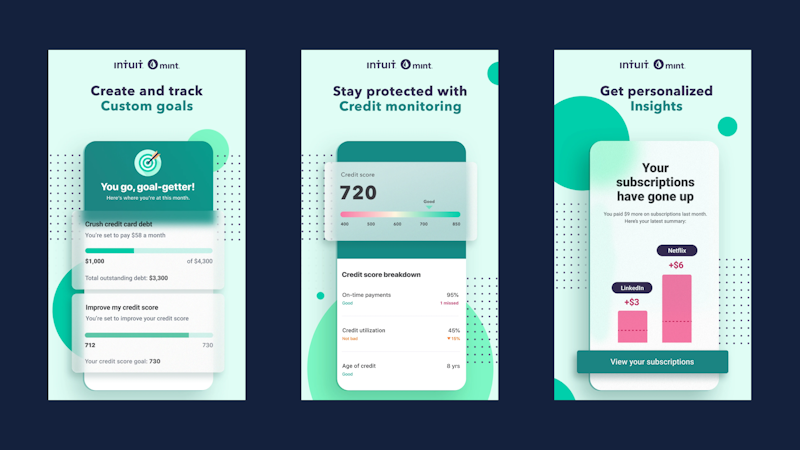
Progress bars help users stay motivated, and get a dopamine boost each time they see the bar move closer to the goal. In business terms, this boosts retention, satisfaction, and ultimately revenue.
When it comes to helping users stay consistent with their savings, you could provide them with a specific end result. Look how Acorns, a multifunctional banking app, shows its users just how much money they can get if they invest.
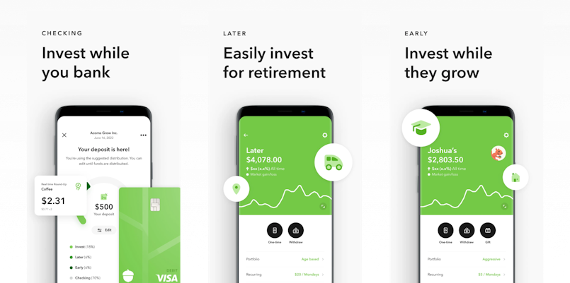
The screenshot is taken from here.
Challenges & streaks
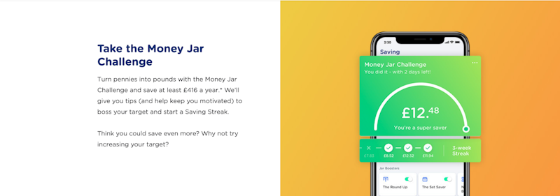
Another killer feature for helping users stay consistent is streaks. This user interface pattern is applicable to any desirable and repetitive action. For example, Yolt, a savings app, implemented a feature that keeps track of how many weeks in the rows users meet their saving goals.
Leaderboards & social elements
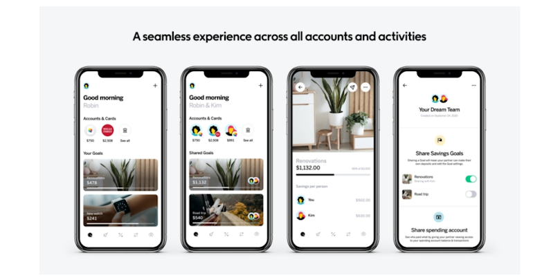
To illustrate this point, we’ve decided to show you a feature Qapital launched. Just like Mint Qapital is also an app that helps users save up.
What makes Qapital somewhat unique is the ability to have collaborative saving accounts where you can see how much each person contributed. While this isn’t a leaderboard per se, it still does the same thing – providing a competitive element.
In-app currencies
While in-app currencies are great for a lot of industries, it somewhat loses its purpose in fintech. Users already have a currency they use. And it’s a real one.
Gamification ≠ Gamification mechanism
Here’s a thing about gamification. It shouldn’t be done just for the sake of it. You need proper data about your users in order to achieve a successful gamified experience. Gamification should help users complete their tasks better. If that’s not the case, think twice before introducing too much of it.

Boost Your Fintech App With Impeccable UX
Whether you're building a new app, or improving an existing one, we've got you covered.
See Our ServicesDesigning for delights
Many of us have a preconceived notion of fintech. A lot of us would associate it with grey and dull interfaces, lots of numbers, and boring charts. However, it’s only the part of the story. Making all of that fun is your job. One way you could do that is through aesthetics.
Illustrations
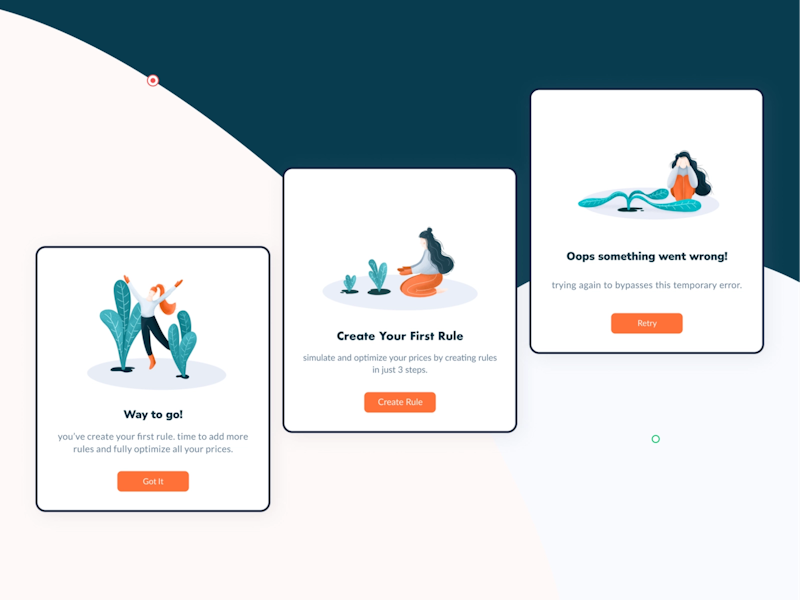
Illustrations do a killer job in humanizing the user experience of your product. They help convey complex information and diversify the purely functional parts of the user interface.
Animations and interactions
You know how the world’s largest corporations invest lots of resources into ensuring things like product surface texture, smells, sounds are all great and on-brand? For example, do you ever notice how all McDonald’s restaurants smell the same? Yeah... it’s no coincidence.
Even though subtle things like these are often hardly noticeable, they matter. The same principles apply to digital products. Smooth interactions, animations, and great visuals help digital products become a lot more enjoyable to use. Hence the great product metrics.
Tone of voice
Another vital part of fintech’s user experience is the copy users encounter. While UX writing and branding are huge subjects in themselves, our point is that copy is another way to introduce fun.
Aside from avoiding jargon, writing with clarity and purpose, you should also avoid sounding too dry. That’s why you should also consider adding some playfulness or humor where tasteful. What’s tasteful is usually decided by the core of your brand identity.
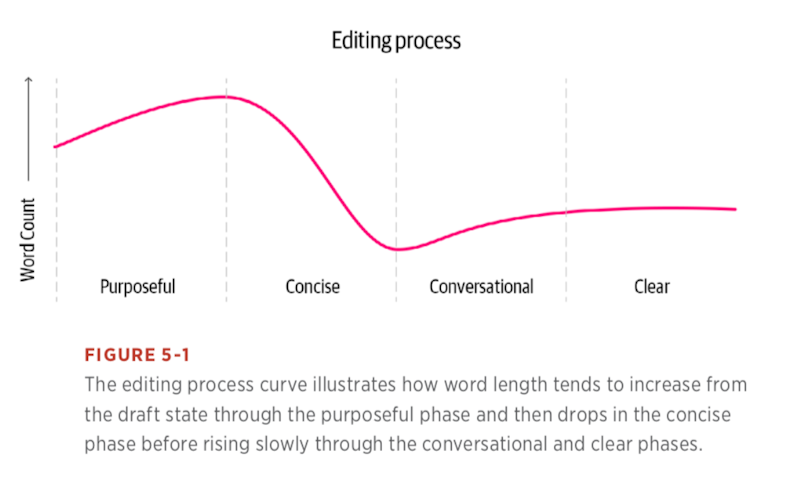
Here’s a bit of practical advice: UX copywriting is a process. Not a surge of inspiration. Therefore, make sure you follow a methodical path that includes the principles outlined below. You focus on the practicalities first. Playfulness is great, but the copy has to be purposeful, concise, conversational, and clear first. Once these criteria are met, playfulness can add extra flavor.
KANO model
The KANO model is essentially a feature prioritization framework. The reason it’s relevant in the context of making your fintech product fun is its emphasis on excitement. While threshold attributes must be working properly, and performance attributes are certainly great, the excitement features are what yield the most satisfaction.
You could try integrating these principles from the KANO model into your current prioritization matrix.

Conclusion
Introducing fun and gamifying FinTech is surely the way to go. We hope that some of the tactics we've outlined in the article will help boost your product's metrics.
Additionally, thanks a ton for sticking till the very end! We hope you've enjoyed this piece and found it useful.

