


Gone are the days when the SaaS pioneers like Salesforce could enjoy a relatively competition-free business landscape. Since 2014, the SaaS industry has doubled its market size. Given the market saturation, digital products should do their best to secure a compelling competitive advantage. One such advantage is a great user experience.
Among other UX elements, dashboards are arguably the most important features to nail.
A brief introduction to SaaS and Dashboards
Before diving into the meat of the article, let’s briefly go over the definitions. SaaS stands for “software as a service”. Generally, an app could qualify as a SaaS, if it makes money through subscriptions. In other words, you’re paying a recurring fee to get access to a piece of software. Here are a few examples of SaaS apps: Slack, HubSpot, Dropbox. You get the idea.
A dashboard is a design element often found in those apps. Dashboards are in-app screens that provide an overview of certain information. This information should provide a birds-eye view of the core app analytics.
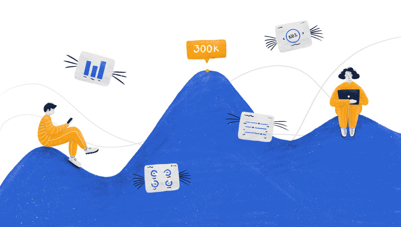
To make things more tangible, here’s a dashboard example:


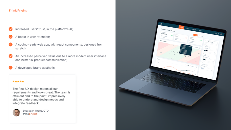
Dashboard example from the Th!nkPricing project.
What’s so special about SaaS dashboards
How is a SaaS dashboard any different from any other? Well.. generally with SaaS apps, and b2b ones especially, users are looking to complete a specific goal or make their life easier. Oftentimes, you can associate certain metrics with how this goal was achieved. Individuals and businesses often pay for results, and therefore they need clarity on whether their expectations are met.
Purposeful Information
While being able to collect information on anything you want is fascinating, some information is definitely more useful than the other. If you've built, say, a tool for social media management, you’d expect to measure things like impressions and engagement. On the other hand, data on, say, time the user spent using the said app is unlikely to be of much value. The example given here is intentionally obvious, but oftentimes it isn’t.
Out of all the things you can measure, which ones do your users value the most? The only way to find out for sure is to ask them. Here are a few activities you can do to learn that:
User interviews. As the name suggests, this activity is all about getting a hold of your users and talking to them until you fill all the gaps in your knowledge.


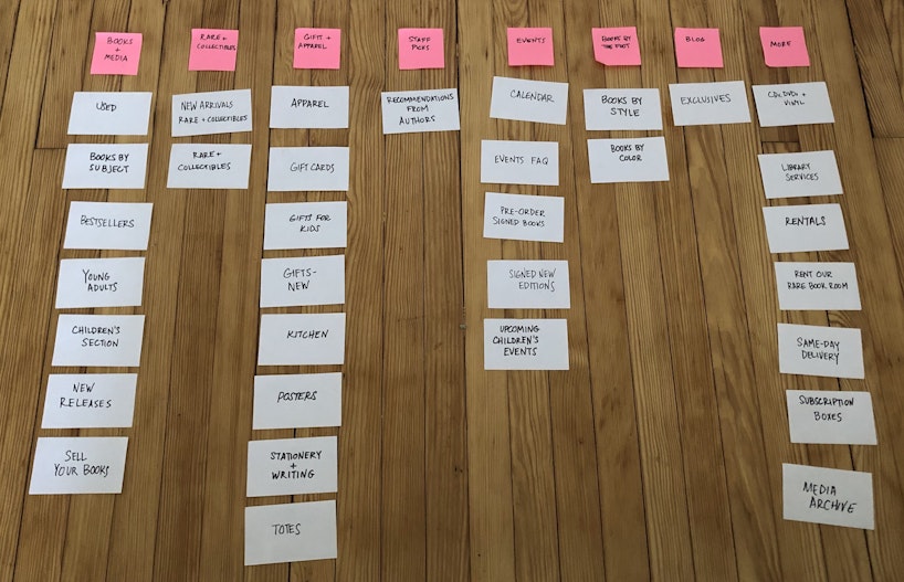
Card sorting. Basically, this technique involves you shortlisting every information element your dashboard can offer, and asking the users to arrange these elements in a hierarchical manner. In practical terms, you give participants stickers with information elements, and they stick them on a whiteboard.


Diary Studies / Contextual Inquiry. This research technique is all about observing the users in their natural environment. In practical terms, you would analyze how your users currently go about tackling the problem your product solves through direct observation or recordings.
Analytics. This technique works great for the products that have been launched for long enough to aggregate usage data. Analytics should give you an idea of which features your users use the most often, what is the sequence of features they use, where they spend the most time, etc. These insights are of huge value when it comes to designing dashboards.
Usability Testing. Once you have a solution or a prototype of it, you then test it in real-time with users to gather feedback. It’s a little more complicated than it sounds, but it’s the gist of it.


An example of a remote usability testing session.
These activities should result in creating an information architecture. It looks something like this 👇


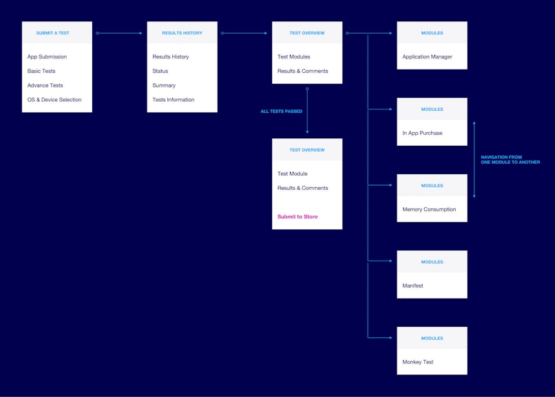
You may notice that the example above features the map of the whole app, rather than a single dashboard. That’s true. However, you should take into account that dashboards can branch out pretty drastically. Think of a Google Analytics dashboard for a second. There are so many things you can do with the filters and different views, that designing such a dashboard would require solid information architecture.
Bottom line: whatever user research activities you do, the end goal should be to clarify which SaaS metrics and information are the most important to then display it on a dashboard. In our experience, the best way to present your findings is through an information hierarchy tree.
Actionable insights
The raw data is as good as your judgment based on it. Providing information alone is not enough, because computing should be left for computers, not people. Therefore, the way you display information should be humane.
Here are a few ways to enrich the raw data with actionable insights:
Dynamics. Show your users the tendencies of a certain metric compared to historical data. An isolated number gives little context and value.
Give Reference. Oftentimes, especially when you’ve just started using an app, you don’t know if you’re doing a good job. Let’s take a hypothetical email automation app as an example. How do you know if your open rate or click-through rates are good? Here’s when an app can go the extra mile and compare your metrics with the industry benchmarks.
If there aren’t any industry benchmarks, you can compare the information with the other users. For example, here’s how Grammarly provides not only the information itself but also compares it with that of other users.


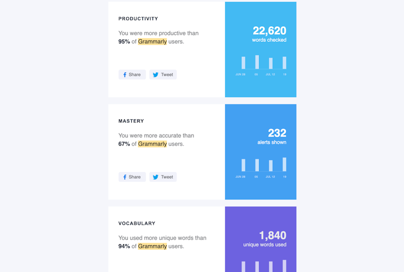
Screenshots taken from the e-mails Grammarly sends out.
Suggest Solutions. Now that you’ve informed the users about the areas they can improve on, it’s time to go the extra mile and suggest solutions. Bad email open rates? Suggest resources on writing a better subject line. Bad punctuation? Suggest educational resources. You get the idea.
Here’s how Grammarly goes about helping people do better, instead of just informing them of their shortcomings 👇


Screenshots taken from the e-mails Grammarly sends out.
Immaculate Hierarchy
There’s this thing called the “five-second rule” in UX. It’s not about dropping food though. Basically, regardless of the screen, users should be able to find what they need within 5 seconds or less.


Boost your SaaS App With Impeccable Design
Whether you're building a new SaaS product, or improving an existing one, we've got you covered.
Browse SaaS UX Case StudiesThe key to providing such clarity and convenience is a great information hierarchy (IA). The core IA principle is simple: the more important the information the more prominent it should be. Now that you’ve done some user research and have insight into what information your users think is important, you can design accordingly.
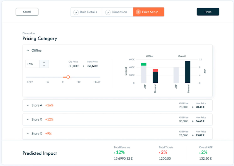
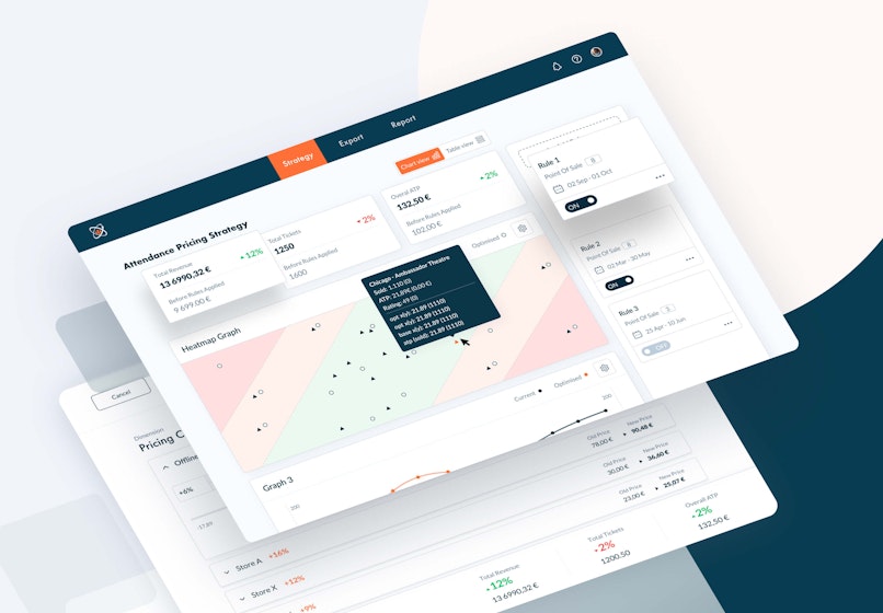
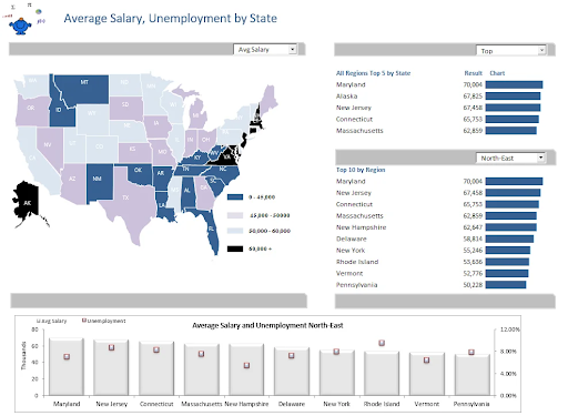
Take a look at the example below. It’s a dashboard we designed for one of our projects. Having clearly understood what our users need to keep track of, we’ve only displayed the crucial information. If there’s a need to dig deeper, you can always use filters or change views.


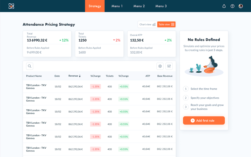
Dashboard example from the Th!nkPricing project.
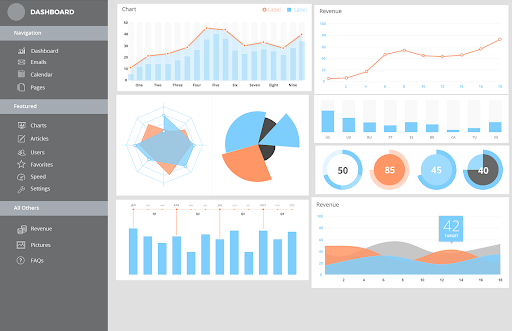
Now look at what happens when a dashboard doesn’t have a clear hierarchy. All seven groups of charts below seem equally important, or rather equally trivial.


Going Beyond Bar Charts and Line Graphs
Bar charts and line graphs are great, but they often fall short in conveying the full complexity of modern datasets. With techniques like heatmaps, treemaps, and network diagrams, you can do more with greater confidence.
Heatmaps allow you to visualize patterns and correlations across multiple variables, while treemaps provide a hierarchical view of data, revealing relationships and dependencies. Network diagrams, on the other hand, illustrate connections and interactions between different entities, helping you understand complex systems and identify key influencers.


Heatmap example (Source)
Bringing Data to Life with Interactive Visualizations
Let's face it, static interfaces are boring. Interactive visualizations are a game-changer in data analysis and storytelling. They allow users to directly manipulate and explore data, providing more engaging and insightful experiences.
From allowing you to zoom in on specific data points to filtering data based on various criteria, or even animating trends over time, these dynamic visualizations are quite captivating. What's more? They can also help users discover hidden patterns and make better decisions.
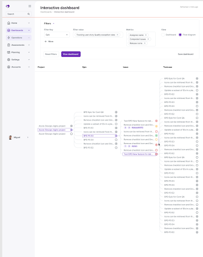
For instance, interactive SaaS dashboards can provide real-time insights into business performance, enabling users to monitor key metrics and identify potential issues.
Below is an interactive dashboard we designed for Kaiburr. This was delightful to users and helped drive engagement in the software delivery app.


Data Storytelling: Turning Numbers into Narratives
We all love a good story. Data does not have to mean a bunch of boring figures.
Data storytelling is the art of transforming raw data into compelling narratives. If you effectively combine data visualization with storytelling techniques, you can create fun and informative experiences.
A well-crafted data story starts with a clear understanding of the audience and the message to be conveyed.
Once the target audience is identified, it's easier to tailor the story to their specific needs and interests. Using a central narrative, you can guide the audience through the data, highlighting key insights to help them draw meaningful conclusions.
Context is important in data storytelling. So, it's best to provide sufficient background information and explain the underlying assumptions clearly. This can help the audience make sense of the data.
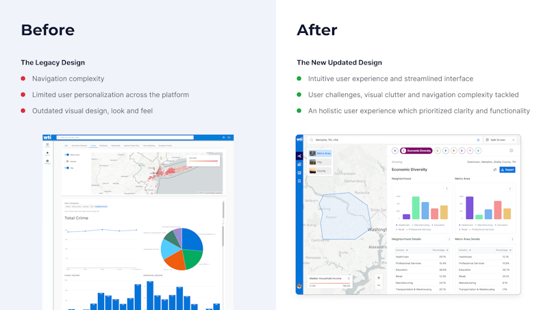
DesignStream Case Study
To illustrate this, consider the following: a side-by-side comparison of DesignStream's old platform and our new interface. We've not only modernized the design for a more intuitive experience, but also incorporated data storytelling techniques to deliver personalized insights and clarity.


Need a SaaS dashboard that drives insights?
Get on a free call with our experts to discuss how we can help you.
Book A Consultation Today
Utilizing AI in SaaS Dashboard Design
AI-Powered Personalization
AI has changed the dashboard design game mainly by enabling personalized experiences tailored to individual user needs and preferences.
Nowadays, AI algorithms can dynamically adjust dashboard layouts, visualizations, and key performance indicators (KPIs) to provide a more relevant and engaging experience.
For instance, AI-driven recommendations can suggest specific visualizations or insights based on the user's role, goals, and recent activity. Intelligent insights can automatically uncover hidden patterns and trends, saving users time and effort.
Automated Insights and Alerts
Away from personalization, AI can significantly enhance the value of dashboards by automating the detection of trends, anomalies, and critical events. These systems can monitor data streams and identify significant changes to generate automated alerts that can notify users of potential issues or opportunities.
These automated insights and alerts can help organizations respond quickly to emerging trends, prevent problems, and capitalize on new opportunities. If the manual effort required to monitor and analyze data is reduced, users can then focus on strategic decision-making.
Mobile-First SaaS Dashboard Design
Today's world is heavily mobile-centric; designing dashboards that are accessible and usable on a variety of devices is a no-brainer. Responsive design principles ensure that dashboards adapt smoothly to different screen sizes and orientations, providing a consistent and optimal user experience.
Key considerations include:
Prioritizing Essential Information: Identifying the most critical information and presenting it prominently, even on smaller screens.
Simplifying the User Interface: Reducing clutter and focusing on core functionalities to avoid overwhelming users.
Flexible Layouts: Employing responsive grid systems and fluid layouts to accommodate different screen sizes and resolutions.
Optimizing Touch Targets: Ensuring that buttons, sliders, and other interactive elements are large enough to be easily tapped.
Security and Privacy Considerations for SaaS Dashboards
To protect sensitive user data, SaaS dashboard designs must implement robust security measures. Some key considerations include:
Encryption: Encrypting data both in transit and at rest to prevent unauthorized access.
Strong Authentication: Implementing strong authentication methods, such as multi-factor authentication, to verify user identities.
Regular Security Audits: Conducting regular security audits to identify and address vulnerabilities.
Secure Access Controls: Limiting access to sensitive data to authorized personnel.
Privacy by Design
Privacy should be a core principle in your dashboard design. This is especially true for SaaS dashboards. Designers can ensure that user data is handled responsibly and ethically by incorporating privacy considerations from the outset.
Key strategies include:
Data Minimization: Collecting and storing only the necessary data.
Transparent Data Practices: Clearly communicating data collection and usage practices to users.
User Consent: Obtaining explicit user consent before collecting and processing personal data.
Data Retention Policies: Implementing policies to securely delete or anonymize data after it's no longer needed.
Future Trends in SaaS Dashboard Design
Augmented Reality and Virtual Reality Dashboards
For many experts, the future of data visualization is undoubtedly immersive. Augmented reality (AR) and virtual reality (VR) technologies are poised to change the way we interact with data. AR and VR can provide highly engaging and informative experiences by overlaying digital information onto the physical world or creating entirely virtual environments.
Imagine being able to visualize complex data sets as 3D models, explore interactive data visualizations in virtual space, or overlay real-time data onto physical objects. These technologies have the potential to transform industries like healthcare, engineering, and finance, enabling users to make better decisions and gain deeper insights.
Voice-Controlled Dashboards
Voice-controlled dashboards are emerging as a powerful tool for hands-free interaction with data. Users can simply speak commands to access information, generate reports, or visualize data by leveraging voice recognition technology.
This can significantly improve efficiency and productivity, especially for users who are constantly on the move or have limited mobility.
To design effective voice-controlled SaaS dashboards, you need to consider factors like natural language processing, speech recognition accuracy, and the clarity of voice commands. You can create intuitive and efficient dashboard experiences by carefully designing the voice interface.
Bottom line
Nailing a SaaS dashboard is challenging, but not impossible. We’re certain that if you follow the principles we outlined above, you will make yours and your users’ life much easier. And if you ever need help, you can always drop us a line here.