


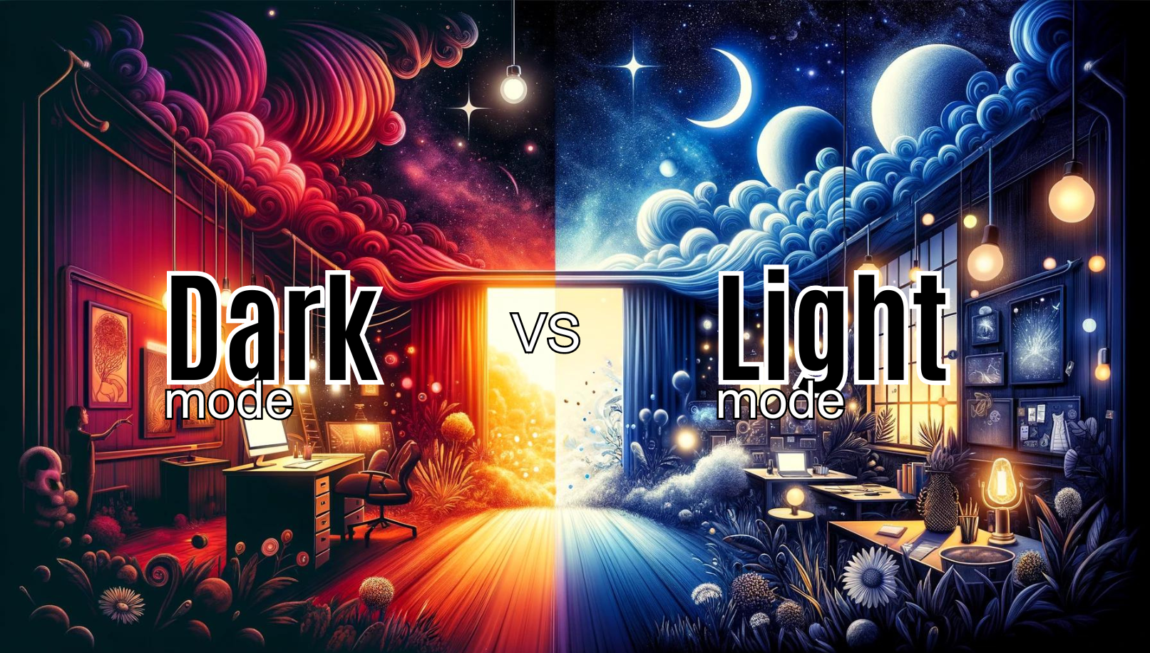
In the world of digital product design, there's a debate that's as timeless as the most modern interfaces we use today:
Should we go for the crisp, bright vibes of Light Mode, or dive into the mysterious allure of Dark Mode?
This discussion takes us to the core of the matter, shedding light on crucial aspects like how easy it is for users to read and how comfortable an interface is over long periods.
My goal in this article is to help designers make choices that truly match what their users need and love.
Introduction to Dark Mode and Light Mode
Choosing between Dark Mode and Light Mode is more than just picking what looks good—it's a big part of the user experience (UX) these days.
Thanks to tech advancements, this choice now affects more than just our eyes. It touches on everything from how easy it is to read the screen, to how much battery your device uses, and it can even impact your health.
For us designers, it's really important to get a deep understanding of how each mode affects users. This way, we can create interfaces that don't just look great but are also comfortable to use and help save on battery life.


Understanding Readability in UX Design
Readability isn't just a buzzword in design; it's at the heart of how engaged users feel with your digital product. It's also where the debate between Dark Mode and Light Mode heats up, with user performance, understanding, and happiness all on the line.
Light Mode: A Beacon of Clarity Light Mode isn't just about bright screens; it's about mimicking the natural light of day to boost readability and task performance across the board.
With its high-contrast background, text pops out, making it easier for users to focus and understand what they're reading.
For folks with normal vision, Light Mode means making fewer mistakes and getting the gist faster, which lays the groundwork for a more engaging online experience. You can dive deeper into this topic with insights from Fireart Studio.
Dark Mode: A Comforting Alternative Dark Mode doesn't just compete with light mode, but offers something different. It's especially designed for users dealing with visual challenges like photophobia, dyslexia, and astigmatism, providing a retreat from the blinding light of standard interfaces.
Its softer colour scheme cuts down on eye strain in dim settings, opening up the digital world to those who find bright screens painful. For people living with these conditions, Dark Mode isn't just a feature; it's a game-changer for comfort and accessibility. Learn more about the benefits of Dark Mode for specific visual impairments at Apexon.
Both modes have their place in the world of readability, shining their light on different user needs, environments, and visual preferences.
The choice between them—or a smart combination of both—should be informed by a thorough understanding of who your users are and how they prefer to engage with your digital products.


Long-Term Usage and User Comfort
When we dig into the choice between Dark Mode and Light Mode, it's not just about the look—it's about comfort and health over time. The way we use our devices today requires a thoughtful balance, where comfort goes beyond just the immediate to include long-term wellness.
For the Night Owls: The Benefits of Dark Mode
For those of us who are up late, our screens are our night-time companions. Dark Mode is kind to our eyes in these low-light moments, possibly reducing eye strain with its softer luminance.
There's also talk about how it might help with our sleep by cutting down on blue light, which could help our natural sleep cycles. But, the research isn't all in yet, so while Dark Mode seems like a night owl's friend, it's not a magic fix. Fast Company provides more insights into these studies here.
Light Mode: Ruler of the Day
Then there's Light Mode, which rules the daytime. Its clear visibility and potential to lower the risk of developing myopia with long-term use make it a solid choice when the sun is up.
The idea of switching modes to match the day's natural light is emerging as a smart way to keep both our eyes and overall health in check. This adaptability could be key to a balanced digital life.
Adapting to User Needs
What these insights underline is the importance of flexibility in design. By letting users switch easily between modes, we give them control over their digital space, making their experience more comfortable and personalized.
The Real Impact of Dark Mode on Battery Life
Beyond aesthetics and comfort, the Dark Mode vs. Light Mode debate also ventures into the technical territory of battery life.
OLED Screens and Dark Mode: The Myth Examined
Dark Mode is often praised for saving battery life, especially on OLED screens where dark pixels don't use as much power. But the actual savings might be smaller than we think—just a modest 3-9% improvement.
This calls into question the narrative of Dark Mode as a major player in battery saving. Want to explore more on this, check out user stories and design efficiency.
Looking Beyond Mode for Efficiency
Instead of banking all our battery-saving hopes on Dark Mode, it turns out that making apps and websites more efficient overall is a better strategy. Things, like optimized image loading and streamlined code, could have a bigger impact on saving power than which mode you choose.
This dive into Dark Mode vs. Light Mode shows us it's not just about personal preference. It's about how these choices affect our health, comfort, and even our devices over the long haul.
By focusing on what users need and how they interact with our designs, we can create experiences that are not only beautiful but also thoughtfully tailored to our well-being and daily lives.
For more on optimizing design beyond mode choices, our past insights on Data-Driven Design are a great resource for strategies to improve overall product efficiency.


Deciding Between Dark and Light Mode
The choice between Dark and Light Mode is more nuanced than it might seem at first glance. It's not just about what looks cooler; it's about crafting a user experience that feels right for everyone. Let's break down the factors that play into this decision.
User Demographics and Conditions: The age of your users, their eye health, and specific conditions like photophobia, dyslexia, and astigmatism are big factors in choosing a mode.
Younger folks and those with certain visual challenges may lean towards Dark Mode because it's easier on their eyes. On the other hand, Light Mode could be a hit for its brightness and ease of use for others.
Dive deeper into how these factors influence preferences in our past article on user behaviour.
Environmental Context: The light (or lack thereof) in our surroundings also matters. Dark Mode is a go-to in dimmer settings to cut down on glare, making for a more comfortable viewing experience. Meanwhile, Light Mode shines in brighter environments, offering better readability and less strain on the eyes.
Task Type: The task at hand can sway your mode preference. If you're diving into lengthy articles or reports, Light Mode might make reading a bit easier, thanks to the strong contrast.
However, if you're binging videos or getting creative with design, Dark Mode could be your best bet, especially for saving some battery life on those OLED screens. Check out the exploration of the UX Design Process to learn how tasks influence design choices.
Cultural Background and Personal Preference: Sometimes, it's all about what you prefer or the cultural cues you pick up on. Dark Mode might come across as sleek and modern to some, while others might stick with Light Mode for its classic look.
Choosing between Dark and Light Mode isn't just about black or white—it's about understanding who's using your product, where they're using it, and what they're doing with it.
It's a blend of science, art, and empathy, aiming to match every user's needs and tastes. Mockplus offers a comprehensive guide to navigating these choices.


5 Best Practices in Implementing Dark and Light Modes
Implementing both Dark and Light Modes is becoming a must-have in digital products today, addressing the varied tastes and requirements of users. Here are key strategies to make sure both modes hit the mark effectively:
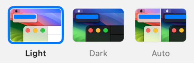
Give Users the Reins: Make switching between Dark and Light Modes a breeze. A clear, easy-to-find toggle not only empowers users but also boosts their satisfaction by remembering their preferences for future visits.
Focus on Readability and Accessibility: No matter the mode, readability is key. Ensure text stands out against the background, offering enough contrast to be accessible to everyone, including users with visual challenges. Dive into our article on web accessibility for deeper insights.
Keep Your Design Consistent: When users flip the switch between modes, they shouldn't feel like they've stepped into a different app. Keep your design elements consistent across both modes to ensure a smooth and seamless experience. For more on maintaining design integrity, check out this article on prototyping.
Test, Test, Test: Don't roll out your design without putting it through its paces on different devices and in various settings. Testing helps spot any issues with contrast, readability, or overall user experience that might slip through the cracks otherwise.
Respect System Defaults and Adapt to the Environment: Tapping into system-wide settings for Dark or Light Mode can make your app feel more integrated into the user's device ecosystem. Additionally, think about automatic switching based on environmental cues like ambient light or the time of day to tailor the experience even further.
By sticking to these principles, designers can ensure their Dark and Light Modes not only cater to user preferences aesthetically but also support their functional needs, paving the way for a digital experience that's inclusive, accessible, and engaging.


Conclusion
Navigating the choice between Dark Mode and Light Mode isn't about which one wins overall. It's about what works best for users, depending on their needs, where they are, and what they're doing on your device.
Giving users the freedom to switch between modes is crucial. This flexibility enhances the overall experience by catering to individual preferences and situations.
In the world of digital design, staying adaptable and receptive to user feedback is key. Offering both Dark and Light Modes is a nod towards inclusivity and making sure everyone feels comfortable using digital products.
Want to dive deeper into creating user-friendly designs? our expertise can elevate your project. Schedule a call with us at Adam Fard Studio to explore more