Understanding user behavior is key to finding out how users interact with your product. Specifically, how much time do they spend using it? What do they click on the most? At what point in the user journey do they decide to bounce? Analyzing your users’ behavior will answer such questions and help you continuously refine your product.
In fact, understanding user behavior is the foundation of building a great product and an indicator of good company organization. Not only does it provide valuable insight about your product, but it also gives you a competitive edge, increases customer retention rates, ensures that you meet customer needs, and takes the guesswork out of UX design.
What Is User Behavior?
In the simplest of terms, user behavior refers to the way users interact with a particular product. To analyze user behavior, you need to set up various user metrics to measure usability and intuitive design. There are countless UX metrics you can monitor and analyze, such as clicks, navigation, session length, and conversion rates.
For example, let’s say that your conversion rate for this month is 30% higher than it was the previous month. How can you find out the reason for such a drastic improvement?
You have two options:
You can take a lucky guess.
You can look at your users’ behavior for the past two months and compare how their interactions with your product have changed over this period of time.
Identify the design variables that may have influenced the changes in user behavior. Namely, have you started using a new CTA, played around with the placement of buttons, or added fresh colors?
Perhaps you’ve even made use of click-through-rate manipulation to make your landing pages more visible in the first place, thus bringing in the right audience in the first place? Often it’s a combination of factors, rather than just one magic bullet change, that is behind a sudden spike in conversions.
The ultimate goal of collecting user behavior data is to learn why users behave the way they do. What is the trigger that gets them to act? Or what is the reason for their inaction? Looking at — and understanding — user behavior helps answer these questions and more.
But how easy is it to really understand and convert gathered information into valuable user data?
The answer is simple: It depends.
Although understanding user behavior is technically not rocket science, it’s not really a walk in the park either. Thankfully, there are a few ways to make understanding user behavior much easier.
Here are 7 essential steps to understanding user behavior and developing a functional, intuitive product.
Understanding User Behavior
1. Seek out deliberate, purposeful action
People love to think they make deliberate choices. They have a plan and go through with it. If most customers’ life and product engagement decisions are consciously driven, why is it that so many times in practice, you can’t predict user behavior with up to 100% accuracy?
As research indicates, things are not that simple. There are evolutionary causes to people’s behavior. In the past, they were predominantly motivated by immediate stimuli to stay safe in a hostile environment.
The present-day is wrapped in a much more conscious action. From Pavlovian dogs to top-performing athletes, there are numerous examples that point out how repetitive actions can be used to change behavior, move conscious processes into the unconscious, and ingrain new habits.
Both types of insights about customer behavior, conscious and unconscious, are useful. And they’re not mutually exclusive.
How can you get the best of the two worlds? This question leads us to the next step on this list:
2. Discover habitual patterns
Your customers may have kept a part of their reptilian brains. They are galvanized by deep-seated emotions. However, they are not powerless slaves to instinct.
They do make careful, well-thought, and planned decisions. They do take purposeful action when they interact with your products.
In this meaningful interaction, your most important task is to find a way to map their journey in-depth, analyze interaction insights, and use them to predict user behavior, which will then help you guide your users toward making mutually beneficial decisions.
3. Map insights onto the user journey
Users don’t always know why they are mesmerized by a product, but they do know how they react when they see it.
They don’t always know why they feel the way they feel, but they usually know how they feel by reacting and responding to your product.
Use the interactions to translate the unconscious processes into actions by putting them on a user journey map.
4. Fine-tune user benefits
Users won’t be bothered by your product unless it can benefit them in one of three overarching ways:
Solve a problem.
Address a need.
Do something to make them feel better.
Even with a fully ready product that is currently on the market or about to hit the stores, when you develop customer journey maps, it’s worth delving into what customers really want.
How can you get to those core needs?
Create multiple touchpoints on the user journey map. Keep it alive all the way through the design process, in the beginning, and when developing finer functionalities.
To see how a user interacts with a product and find out more about the multiple touchpoints, put yourself in their shoes.
Dig deep into the user persona to understand their pains, motivation, and goals.
"Get closer than ever to your customers. So close that you tell them what they need well before they realize it themselves."
Steve Jobs
The questions you can ask about your users’ experiences during their journey are literally endless. Each question can provide an insight that you can use to further advance your business goals by linking it with a user need.
Of course, you cannot endlessly explore and ask questions. When the time for action comes, you need to have neatly packed records and insights, which you will turn into frictionless product flow and helpful features. For that, you need technology.
5. Use automation tools
The “whys” behind users’ behavior stem from instinctive, unconscious processes. You may be more interested in the “hows” delivered as outward actions and events on your user journey map. Let the UX tools do the work.
Behavior analytics software consists of sophisticated algorithms that can examine complex interactions between touchpoints. It produces metrics you might not have been aware of if you had been relying on exploring those relationships yourself. Doing the process manually, on pen and paper or digitally in Excel, is worthwhile but inevitably less powerful or less “intelligent” than software.
To stay on top of all that overwhelming customer behavior, make your software tools both the start and end point of the analytical process.
6. Iterate
Don't underestimate the value of feedback. Feedback from software platforms or from in-app interactions, for instance, contains tons of value-packed data you can use to pierce through the “hows” and get into the “whys.”
Use these treasure banks to fine-tune your journey maps, revamp your business goals, and enhance your products.
7. Don’t assume, check
Remember, your user’s perception matters more than yours. You can always analyze emotion-driven KPIs and observations behind the action.
However, you need to be focused on how the user perceives the product you think you have delivered and see if your perceptions match.
Garnering deep insights into the relationships between unconscious and deliberate action and surgically-precise user journey mapping are just a part of the solution. When such deeper insights into the product design process are supported by powerful analytics software, you won’t need to dedicate as much energy to the “whys” of user behavior. These seven steps can help you separate the wheat from the chaff of user data, as well as help you gain valuable knowledge to improve conversion and retention rates and increase your customer lifetime value.
Influencing User Behavior
Now that we’ve gone over understanding how users behave, we can go a step further. Understanding alone is surely fascinating, but our ultimate goal as designers and product people is to influence users to get the most value out of your product.
How does one do that? – Let’s start with figuring out what motivates users to do anything in the first place.
The Science of Motivation
The Fogg Behavior Model was created by Dr. B.J. Fogg, a behavior scientist, and computer science professor. Fogg’s behavior model outlines the importance of three elements converging at the same time in order for a behavior to occur:
1. Motivation: How motivated is the user to partake in the behavior?
2. Ability: How easy is it for the user to partake in the behavior?
3. Trigger: How is the user prompted to partake in the behavior?
When a behavior does not occur, then at least one of these core elements is missing.
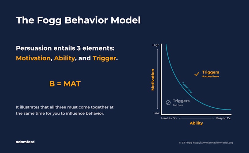
However, the level at which these elements are present can vary and still result in behavior. Specifically, motivation and ability have a compensatory relationship, which means that they can vary in intensity and be traded off:
High motivation > low ability. Low motivation < high ability.
For instance, a user who is highly motivated will be more willing to do something that is difficult if they are given the right trigger. Similarly, a poorly motivated user will still participate in a task if the task is easy to do and with an appropriate trigger.
Naturally, the triggers your users respond to will differ according to their individual preferences. So, what triggers one group might not work on another. Therefore, it’s best to conduct market and UX research to better understand your users.
On Changing User Behavior
Now that you know there is a whole science dedicated to the study of motivation, how can you influence — and ultimately, change — user behavior?
There are countless methods and strategies to influence user behavior, with some being more popular than others. You’ve probably experienced a few yourself.
Here are 3 methods you can apply to your UX design to influence and change user behavior.
1. Focus on Consistency
Consistent design is key to influencing how users interact with your product. It’s in the very DNA of good UX design. With the help of consistent design, users can intuitively use your product without second-guessing themselves. It helps build trust and propagates familiarity.
To achieve a consistent design, focus on standardizing different elements. For example, users should be able to predict how different design elements will behave by merely looking at them. Hence, buttons that look the same should behave the same too.
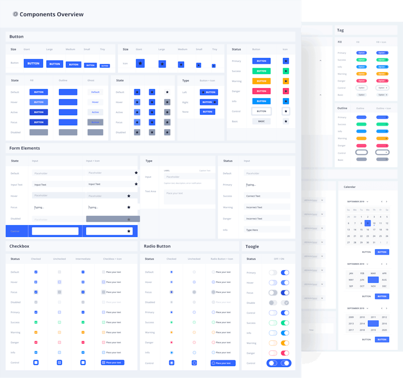
A practical way to ensure consistency throughout the whole digital product is a design system. It's basically a collection of all reusable elements, patterns and the rules of their usage. It looks something like this:
This brings us to the next point: Why do users value consistency so much?
The answer is pretty simple.
As users, we all want to feel in control. We want to be able to predict how something works without reading a user manual. We want to make connections and draw conclusions. This knowledge gives us a sense of empowerment, security, and trust.
So, what does this have to do with influencing and changing user behavior?
“A user interface is like a joke. If you have to explain it, it's not that good.”
— Martin Leblanc
By making it easy for users to use your product, you’re already ticking one of the key elements of prompting a behavior: ability. Additionally, you can use your design elements as a trigger to get users to do what you want them to, such as:
Register as a user.
Enter their email.
Sign up for a newsletter.
Leave a review.
Add an item to their cart.
Head to the checkout.
Consistent design is a powerful tool to influence and change user behavior, so make sure you wield it.
2. Play With Scarcity
Our brain places a higher value on things that will soon become unavailable to us, while it places a lower value on things that are easier to acquire and are in greater abundance.
By playing with the perception of scarcity and urgency, you can influence user behavior.
Here are several ways you can introduce scarcity in your design:
Promote time-sensitive deals – This offer ends in 3 days.
Display a countdown clock/stock meter – Only 3 left in stock.
Offer exclusive benefits – The first 3 people to register get free shipping.
Using limited-time-offer phrasings, offering exclusive benefits, or displaying a countdown clock are all effective ways to convey scarcity and urgency. It feeds on the principle of supply and demand. As availability decreases, demand increases.
Furthermore, this sense of urgency and scarcity not only acts as a trigger but also enhances the user’s motivation to act. For instance, if you tell a user that an offer ends in 12 hours, then the user will be more motivated to act within that period of time than if the same user had an unlimited amount of time to act. This is because in such situations, users are pushed toward behaving a certain way, though often unwittingly.
That said, users are definitely smart enough to tell whether they are being manipulated. Going overboard with the principles of scarcity is a borderline dark pattern. On top of that, many companies might resort to displaying false information to incite users to make a purchase (e.g. 17 people are looking at this offer right now, only 3 items left”, etc.). Ethical considerations aside, whatever minute reward you might reap will always be overshadowed by the loss of trust.
3. Use the Goldilocks Effect
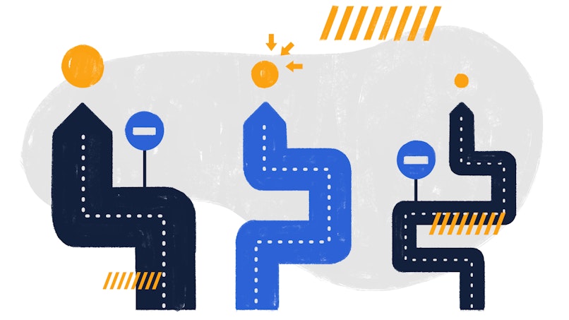
The Goldilocks Effect is another effective method used to influence user behavior. While you might not be aware of the name, chances are that your buying decisions have been influenced by it at one point or another.
So, what is it?
The name of the method is derived from the popular children’s story, “The Three Bears,” in which the main character, Goldilocks, tastes three different porridges. One is too hot, one is too cold, and one is just right. This “just right” option is what the Goldilocks Effect is all about — and the one you should be aiming for in your own design.
For instance, if you’re selling software, offer three types of packages: basic, professional, and enterprise. Or bronze, silver, and gold, whatever suits your product best. The first package should be the cheapest, though limited in features, and the last package should be the most expensive and have the most features. The middle option, on the other hand, should have a price and features somewhere in between the other two. Why? Users will, more often than not, choose the middle option over any others.
“It is impossible to work in information technology without also engaging in social engineering.”— Jaron Lanier
It’s interesting to note how users’ minds process information when presented with multiple choices.
When trying out a new product, users want to avoid extremes. This includes things like extremely high prices, packages that force them into lengthy contracts, or access to excessive features. Instead, users tend to gravitate toward the more moderate option because they think it’s the typical option.
An additional trick you can try with this method is to highlight the middle option as the typical option. Give it social proof. Apply a “most popular” banner to it, or place it just a bit in front of the other options so it visually stands out. This way, you are subtly influencing user behavior.
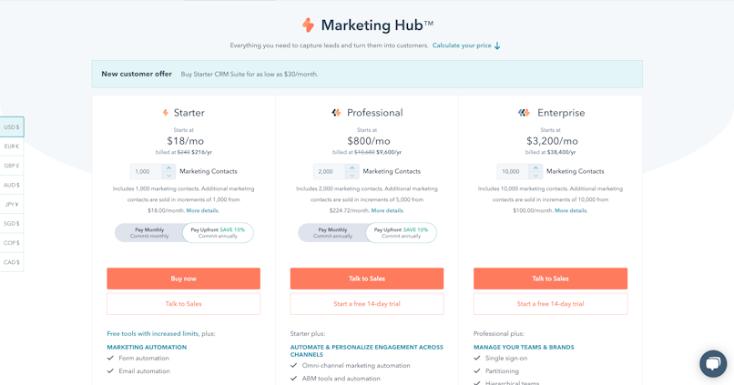
Example of HubSpot pricing with three tiers.
Keep in mind that the key to successfully using the Goldilocks Effect is to offer similar options. When used correctly, this method is an unbeatable force when it comes to influencing and changing user behavior.
To really make your design speak to users, you have to start making decisions that are supported by user psychology and scientific data. Your design should be inviting, easy to use, and relevant to target users.
4. Use Social Proof

Have you found yourself in a situation where you rely on the opinions of others to make your own decision? Chances are that you have, consciously or not.
For instance, imagine you’re looking for a nice place to have dinner. You see two restaurants. One is busy with a long line of people waiting to get in, while the other is empty. Which restaurant do you go to? Your likely choice is the one with more people.
Why? If there’s a crowd of people patiently waiting for a table at the first restaurant, then the food must be really awesome. Similarly, if the other restaurant is empty, then surely the food must be bad, right? Naturally, you would opt for the former, even though your assumptions may be incorrect.
This is an example of social proof. Your decisions as a consumer are based on the behavior of those around you. In other words, you choose to follow the crowd to justify your choice in terms of time, money, and interest. So, if the majority of people say something is good — or bad — then the rest will generally take their word for it.
“The dominant social force that drives our thinking and our actions is the unconscious search and need for social proof.”— Dragos Bratasanu
The good news is that social proof is a powerful tool you can use to influence users’ behavior. Try getting existing users to write reviews, include video testimonials on your website, and share case studies. Get news of your product out there, and you’re sure to see a spike in interest and sales.
5. Follow the Peak-End Rule

The peak-end rule is a psychological heuristic developed by Nobel Prize-winning psychologist Daniel Kahneman. According to Kahneman, every person has two selves:
The experiencing self is a fast, intuitive, unconscious mode of thinking and experiencing that is focused on moments as they are unfolding in the present. The experiencing self rarely converts experiences into memories.
The remembering self is a slow, rational, conscious mode of thinking that transforms intense moments into memories. These memories then influence the decision-making process.
In simple terms, the peak-end rule is a psychological heuristic that looks at how people remember an experience. This idea suggests that users generally remember the “peaks” of an experience and its “end,” rather than the experience as a whole. The peaks of an experience are usually the most emotionally intense points of an experience — positive or negative — while the end refers to the final moments of an experience.
For example, let’s say you go out to buy ice cream. Your mind doesn’t care about how long it took you to reach the ice cream parlor or how long it took you to eat the ice cream. What your mind does care about, though, is if it was a good experience and if it ended well. Namely, did you enjoy the ice cream, or did you get it all over your favorite shirt?
This is the kind of information that will impact your ice cream decisions in the future. You won’t remember how much the ice cream cost, who was standing over the counter, or what color shirt you were wearing. What you will remember is the emotion that the experience evoked.
“People will forget what you said. They will forget what you did. But they will never forget how you made them feel.”— Maya Angelou
Therefore, in order to influence your users, you need to stir a strong enough emotion so the experience eventually becomes a memory. To make the most of the peak-end rule, use story mapping to design an emotional peak and a satisfying end for your users’ experience.
6. Try Gifting
One of the cornerstones of successful businesses is that you have to give before you can take. By developing a rewards program for loyal users or offering users freebies every now and then, you can:
Create positive brand awareness. By giving out something for free to your users, such as a free trial or e-book, you are actually promoting your brand and generating positive buzz.
Inspire users to try new products. Offering free samples of your new product will make users more inclined to give it a go. This approach allows users to try before they commit. If they like the free product, they will be more likely to look into your other products.
Improve consumer relationships. Gifting is an effective way to connect with your users, as the gesture encourages loyalty and trust. Additionally, users who receive a free gift feel a greater urge to reciprocate by either paying for your product or sharing their positive experiences with other users.
Foster buying habits. Letting users get a taste of your product for free is actually one of the most effective promotional methods. If the user likes your product after a free trial or sample, then chances are that they will be more than happy to purchase it and future products.
Freebies and gifts are a powerful way to influence users into meaningful interactions with your product. Plus, freebies can be hard to resist. So, use the art of gifting to your advantage and keep users interested.
7. Spark Curiosity
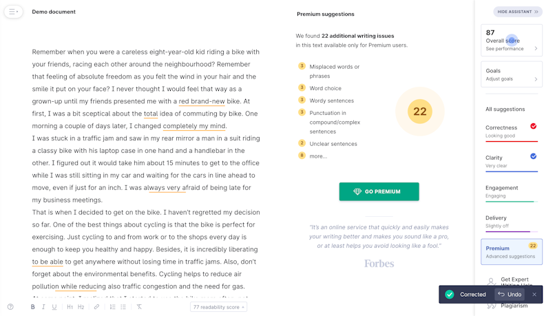
See how Grammarly sparks curiosity by showing the mistakes that are only correctable with a premium account.
Curiosity is another method to influence your users. This is because the human decision-making process is driven by emotion and intelligence. However, when push comes to shove, emotions nearly always prevail over intelligence. It’s just the way the human brain works. Users would much rather find out the answer to something — regardless of how good or bad it is — than to be kept on ice.
Curiosity is undoubtedly a powerful driver of conversions. Give users an itch, and they’ll be more than happy to scratch it.
8. Offer Delighters
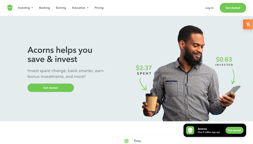
Sometimes all it takes to influence users is to keep them happy. Offering simple delighters is a great way to meet — and surpass — users’ expectations. Here are a few tips for designing a product that users will love using:
Intuitive flow. Make sure your users enjoy using your product by enabling them to achieve their objectives easily and comfortably on their own, with little to no assistance.
Personality. Every design has its own personality in the form of typography, colors, graphics, and other design elements. Adding your personal touch does help increase influence.
Functionality. Prioritize usability when designing your product to ensure the product is easy to use and provides an overall delightful user experience.
Humanization. Allow users to connect to your product emotionally by developing a more human experience for users, such as offering face recognition or a voice user interface.
Users remember and respond to the small, unexpected, and playful pleasures in your design. So, focus on designing a user-friendly product that is intuitive, fun, and easy to use. This will help you get users’ attention and influence their actions.
Feeling Your Way Through Design: The Emotional Side of UX
Ever wondered why you're drawn to certain websites or apps? It's not just about functionality; it's also about how these digital products make you feel.
Understanding the Emotional Landscape of UX
Let's break down the emotional journey of a user. It's a complex interplay of:
Cognitive: How users think and process information.
Affective: How users feel, including emotions like joy, frustration, or surprise.
Somatic: How users physically respond, such as increased heart rate or tension.
These dimensions work together to create the overall user experience. By understanding these emotional nuances, designers can craft products that resonate with users on a deeper level.
Harnessing Emotions for Better Design
Now that we understand the various emotional factors, So, how can we leverage emotions to create more effective designs?
Identify Your Users' Emotions: What emotions do you want your users to feel? Joy, excitement, or perhaps a sense of accomplishment?
Design for Positive Emotions: Use bright colors, playful animations, and positive language to evoke joy and excitement.
Use Negative Emotions Strategically: While it might seem counterintuitive, negative emotions like frustration can be used to motivate users to take action. For example, a low battery warning can prompt users to charge their devices.
Understanding and strategically using emotions enable designers to create products that not only function well but also delight and inspire users.
Emotional Intelligence: The Human Touch in UX
To truly connect with users, we need to step into their shoes. By understanding their feelings and perspectives, we can create designs that resonate on a deeper level. Imagine yourself as a user—what frustrates you? What makes you happy? Thinking this way about your users can help you design experiences that are both functional and emotionally satisfying.
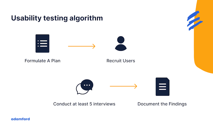
To validate our design choices, we can use various user research techniques. User testing, surveys, and A/B testing help us understand how users feel about our designs. The feedback and insights can lead us to refining our designs to create more emotionally resonant experiences.
Unmasking User Behavior: Essential Tools for UX Insights
Understanding how users interact with your product is crucial to creating a seamless and enjoyable experience. Let's dive into some powerful tools that can help you uncover valuable insights:
Popular Tools to Uncover User Behavior
Heatmaps and Click Maps: These visual tools show you where users click and how they engage with your interface. It's like a heat map of your website or app, highlighting the hottest areas of interest.
Session Recordings: Imagine watching a replay of a user's journey through your product. Session recordings provide a detailed view of user behavior, allowing you to identify pain points and opportunities for improvement.
A/B Testing: Want to know which design or feature performs better? A/B testing lets you experiment with different variations to see which one resonates with users.
User Surveys and Feedback Tools: Directly ask your users for feedback. Surveys and feedback tools can help you gather qualitative insights into their thoughts, feelings, and suggestions.
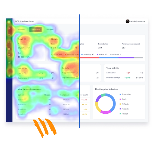
Heatmap example.
Choosing the Right Tools for Your Needs
Selecting the right tools depends on various factors. Firstly, consider the cost of the tools and if they fit within your budget. Also, a larger team might require more advanced tools, while a smaller team might benefit from simpler solutions.
Finally, identify the specific insights you want to gain. For example, if you're focused on user flow, session recordings might be a good choice.
To maximize the value of your analytics data, integrate your chosen tools with your existing analytics systems. This will provide a holistic view of user behavior and help you make data-driven decisions.
Data-Driven Design: Turning Insights into Action
Once you've gathered valuable insights from your user behavior analytics tools, it's time to put them to work.
Identifying Pain Points
User behavior data can help you pinpoint areas where users are struggling or getting frustrated. This knowledge empowers you to address these pain points and improve the user experience.
Uncovering Hidden Opportunities
User behavior data can also reveal unexpected opportunities. Perhaps users are spending more time on a particular feature or completing a task in an unconventional way. These insights can inspire innovative solutions and drive product growth.
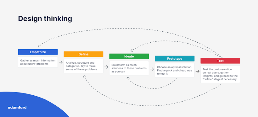
Iterative Design: A Continuous Improvement Cycle
Data-driven design is an iterative process. You have to continuously analyze user behavior and make data-informed decisions. With this strategy, you can refine your product over time.
Test, Learn, and Iterate: Experiment with different design variations and measure their impact on user behavior.
Prioritize User Feedback: Incorporate user feedback into your design process to ensure that your product meets their needs.
Testing: Conduct A/B tests to compare the performance of different design elements and make data-driven decisions.
With a data-driven approach, you can create products that truly delight users and drive business success.
Designing for Accessibility: Making Your Product Inclusive for All
Accessibility isn't just a fancy term; it's a moral imperative. Your products need to be accessible to everyone. We can create more inclusive and user-friendly experiences with accessibility in mind.
Understanding Disability and Diverse Needs
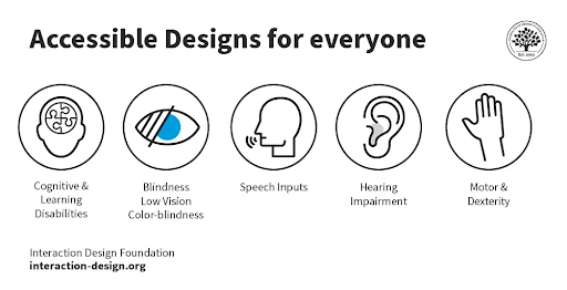
Disability comes in many forms, both visible and invisible. It's important to consider a wide range of accessibility needs, including:
Visual impairments: Users with low vision or blindness may rely on screen readers.
Hearing impairments: Users who are deaf or hard of hearing may rely on captions and transcripts.
Motor impairments: Users with limited mobility may require keyboard-only navigation and touch-screen alternatives.
Cognitive impairments: Users with cognitive disabilities may benefit from clear and concise language, as well as consistent and predictable layouts.
Adhering to Accessibility Standards
To ensure your product meets accessibility standards, consider the following:
WCAG (Web Content Accessibility Guidelines): This international standard provides guidelines for making web content accessible to people with disabilities.
ADA (Americans with Disabilities Act): While primarily focused on physical accessibility, the ADA also has implications for digital accessibility, especially for government and public sector websites.
Practical Tips for Accessible Design
With the theory out of the way, here are practical tips you can implement in your system to create more accessible products:
Color Contrast: Use sufficient color contrast between text and background to improve readability.
Alternative Text: Provide alternative text for images to make them accessible to screen readers.
Keyboard Navigation: Ensure that all interactive elements can be accessed and operated using a keyboard.
Clear and Concise Language: Use simple language and avoid jargon to make your content understandable to a wider audience.
Responsive Design: Design your product to adapt to different screen sizes and devices.
Regular Testing: Conduct regular accessibility testing to identify and fix issues.
The Future of User Experience: A Glimpse into Tomorrow
The world of UX design is rapidly evolving, primarily due to technological advancements. User expectations are drastically shifting too. To create products that stand the test of time, you must be up-to-date with developments in the industry.
Let's explore some of the exciting trends shaping the future of user experience:
Emerging Technologies and Their Impact
AI and Machine Learning: AI and ML are revolutionizing UX design by enabling personalized experiences, predictive analytics, and intelligent automation.
Voice Interfaces and Voice Assistants: Voice-activated devices are becoming increasingly popular, and designers must consider how to optimize user experiences for voice interactions.
Augmented Reality (AR) and Virtual Reality (VR): AR and VR technologies offer immersive experiences that can transform the way we interact with digital products.
Responsible Design: Creating designs that are inclusive, accessible, and sustainable is essential for a positive impact on society.
By staying informed about emerging technologies and ethical considerations, designers can create innovative and responsible user experiences that shape the future.
The bottom line
Influencing and understanding user behavior is no walk in the park. It requires careful analysis and thought-through decisions. However, we hope that with the help of this article, we've made this task at least a tad easier for you.

