

UX is a discipline with a clearly defined structure and process, yet it still has a wide array of variables that are open for interpretation. Fortunately, this flexibility provides for a more creative and innovative environment. On the other hand, that makes it possible for misconceptions to enter the field. These misconceptions get passed around and become established industry myths that end up harming both users and businesses.
In this article, we’ll weed out some of these myths and explore their flaws. We’ll look into things like the “7+-2” rule, the 3-click rule, and other principles that will likely have an adverse effect on the quality of your work as a UX designer.
Let’s dive right in, shall we?
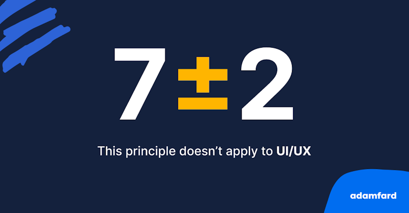
Myth 1: 7+-2
George Miller is a cognitive psychologist that published one of the most cited papers in psychology called “The Magical Number Seven.” The subject of his paper has received so much traction in its early days that it was coined “Miller’s law.” This principle states that an average person can hold about seven (7+-2) objects in their working memory.


Given the interdisciplinary nature of UX and its close ties to cognitive sciences, it was quick to adopt this principle. While it is extremely important to be mindful of the limitations of human cognition, this law is often misused among designers.
Some user experience professionals use this law to limit the number of items they provide to their users in lists, menus, and so forth.
The truth
Unfortunately, George Miller’s paper suggested that people can only remember around seven unidimensional stimuli like tone, pitch, etc.
More importantly, this number explicitly deals with recall rather than the ability to understand the information presented to us since we have immediate access to it on our screens.


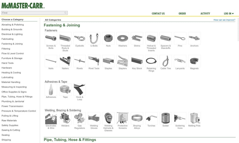
Another reason why menus can afford to have more than seven items is that they have context. Think of the menu of a large e-commerce store that sells clothing. You’ll often see that their dropdowns are extensive, but they’re always easy to navigate. Take a look at the example below:


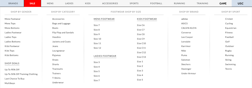
Nearly every subcategory of the menu has far more than seven items on it, but by no means is this design hard to navigate, neither does it cause excessive cognitive strain.
The right approach
Top-level and link-rich structures can arguably provide for better usability since they allow users to find what they’re looking for much quicker, thus reducing cognitive load. The key here is to provide enough context and find the right architecture.
Think of Amazon, for instance—their menu is huge, but by structuring it correctly, the platforms ensure that their customers have quick and frictionless access to the items of their choice. The same applies to similar extremely successful sites like Craigslist, McMaster Carr, and many others.


Despite being often misused, the 7+-2 rule has a wide array of applications in UX design. This principle should always be considered when users need to memorize data like confirmation codes, security phrases, and other information that lacks obvious context.
Myth 2: People are rational beings (spoiler: they aren’t)
The human mind is incredibly complex, but that doesn’t mean that our brains operate impeccably. We tend to believe that we navigate life by making sound and rational decisions all the time.
The idea that humans are rational agents comes from the field of economics. Homo Economicus, as coined by John Stuart Mill in the late nineteenth century, is a being that strives that maximize utility via rationality. This perspective has been long disproven by a number of psychologists, the most prominent among which are Richard Thaler, Daniel Kahneman, and Dan Ariely, that have conducted extensive studies in human cognition and decision-making.


The Truth
People have a strong penchant for making decisions based on emotional impulses rather than cold-blooded logic, and there’s a large body of research to confirm that. One of the most important reasons we tend to deviate from rational thought is by falling into the trap of cognitive biases and logical fallacies.
Neuroscience research suggests that rational thought is a relatively new development in humans in the grand scheme of things. We arguably need many thousands of years of continuous development in order to “sharpen” this tool of ours. The emotional brain remains a much stronger decision-maker, and there’s very little we can do about it.
The good part is that our irrationality can be predicted since it operates in ways that we understand, and knowledgeable designers leverage this insight into the human mind.
The right approach
Designers should aim to reverse-engineer and leverage the cognitive biases that all of us are prone to. Biases like the Framing Effect, Anchoring Bias, Progressive Disclosure, Confirmation Bias, and many, many more are widely used in UX to ensure a better experience with products.
It’s important for us to keep in mind that these distortions of our perception aren’t inherent flaws; rather, they’re adaptations that helped us survive throughout evolution as a species. As designers, we should use them ethically to create what truly is human-centric design.
Myth 3: People can articulate what they want
While it’s impossible to overestimate the importance of user interviews and user research in general, some of their principles are often misunderstood. Organizations mistakenly rely on asking their customers “what they want,” but time and time again, this has proven to be a risky endeavor. The reason why this is a questionable practice is somewhat rooted in our previous myth—the belief that “we are rational about our desires.”
The truth
It’s typical for humans to make very confident but false estimations about their preferences and behaviors. More importantly, we’re prone to changing our opinions quite often on a variety of things that don’t have a massive impact on our lives.


A few examples of how user-generated data can be misleading
Furthermore, it’s probably unwise of us as designers to ask people that aren’t versed in this field to tell us how to, well, design things. Part of the reason is that we’ve invested countless hours into understanding the intricacies of the craft and learning about the peculiarities of human cognition.


The right approach
Rather than asking very straightforward questions like, “what features would you like to see in this product?” we should instead observe how they interact with actual features that have been developed by designers. On a similar note, if users actually knew what they wanted, UX researchers would be in the business of cold calling people and asking for their opinion.
The right way to go about asking the right questions is to have faith in UX research and leverage the benefits that it provides. Explore a variety of research methods that would allow you to better understand what users want without asking them directly—diary studies, field studies, user observations are but a few of them.
Myth 4: Fewer clicks = happier users (the three-click rule)
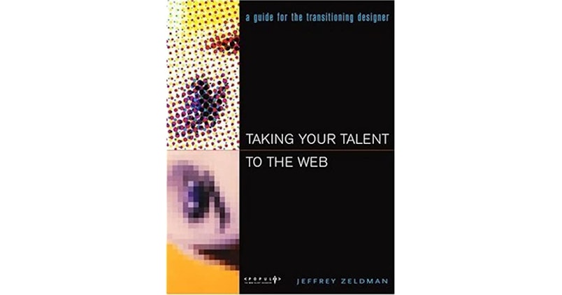
Nobody really knows where the 3-click-rule originated from. The first time it was mentioned in writing was in Jeffrey Zeldman’s 2001 book, Taking Your Talent to the Web. It’s considered an unofficial heuristic that states that a user should be able to find what they’re looking for in 3 clicks (or taps) or less. While this does seem like a good idea, it doesn’t necessarily warrant a good user experience.


The truth
In fact, there is no direct correlation or causality between conversion rates and the number of interactions users make. More importantly, there is pretty much no evidence to support this claim. Every product has its own usability requirements that stem from its complexity, industry, and many other factors.
Plus, the claim behind this rule is that it counteracts poor conversion rates. There is also little statistical support for the fact that longer interactions make users drop off quicker. This claim was debunked as early 2003 by Joshua Porter in an article published on UIE’s blog. The study showed that neither user satisfaction nor dropoff increased with more extended interactions.


The same study also suggests that most tasks can’t be completed in such three clicks. Porter’s study found that it took most users over 15 clicks to complete about 80% of the tasks.
The right approach
It’s important to underline that the UIE study we mentioned above was conducted nearly 20 years ago, and design is lightyears away from what it used to be back then. While this might indicate that users can perform tasks in fewer clicks, that still makes the 3-click-rule somewhat unrealistic in a wide array of scenarios.
This doesn’t mean we have to ditch this rule entirely; we should probably preserve the intention but refrain from setting a cap on the number of interactions.
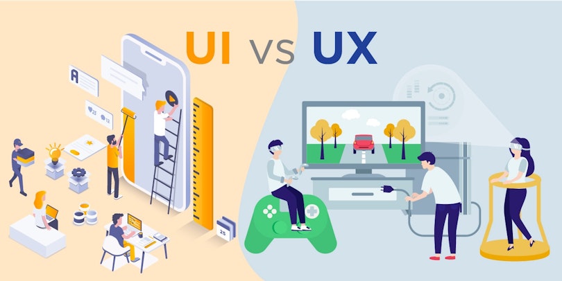
Myth 5: UI and UX are like yin and yang of product design
A common misconception among designers and people outside this field is that UI and UX are just different sides of the same coin and that they have equal importance. Debunking this myth won’t necessarily revolve around diminishing the value of UI but rather emphasizing its function within the UX process.
Additionally, humans are very prone to binary thinking: good and evil, yin and yang, chaos and order. UI & UX design also often falls into that dichotomy. To make matters worse, "UX vs UI" might be the most common type of article there is on product design, which further cements this misconception.


This binary thinking is what makes it easier to make sense of the world. That said, these "extremes" are gross oversimplifications. No, UX is not just logic, and UI isn't just visuals. Let us explain.
The truth
UI is part of UX. User experience design is a very lengthy and methodical process, and designing an interface is but a stage among others.
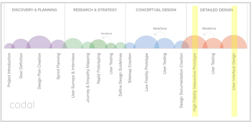
Take a look at the image below. The infographic gives a rough overview of a product design process. We've highlighted with yellow the parts of the process that fit the conventional criteria of "UI design". Not a lot of yellow, eh?


Personally, we like to avoid the term"UI&UX" design in favor of "Product design". The false dichotomy makes it all too tempting to dedicate equal effort and time to UI and everything-that's-not-UI. The latter approach is a recipe for mediocre products at best.
The right approach
We should remember that UI is a fraction of UX, and should be treated accordingly. The two depend on one another. However, interfaces with no experience in mind are pointless in the modern business ecosystem. Furthermore, it’s important to underline that both aim to achieve the same goal, but through different means.
Myth 6: Less is more (yes and no)
Less is more has been an especially common principle in design over the last few decades. Since the early 2000s, designers have adopted this rule to create slicker and more appealing interfaces in order to part ways with the clunky and unwelcoming design that preceded this era. The important question here is, “is ‘less is more’ relevant at all times?”.


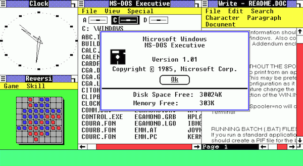
Here's a UI designed in the 1980s. Hurts to look at, right? 😄 | Source
The truth
There are certainly areas where this rule provides for better usability and user experience in general. We know that people appreciate clean webpage layouts that aren’t bloated and cluttered. People also appreciate succinct and clustered information that is easy to take in as well as elegant branding.
There is no doubt that less is more has its place in design, but there are areas that might suffer from this approach. A good example of an adverse effect this principle may cause is the oversimplification of complex processes, which can cause users to feel lost. Similarly, the strive for minimalism may also push designers to obscure essential information that is vital for the user’s experience with a product.
Take a look at the UI below. It's tempting to call it cluttered, right? For an average user, it's likely complex and confusing. However, this particular dashboard is meant to be used by professionals who deal with complex things daily. Therefore, simplifying this design for its own sake would probably be counterproductive.


The right approach
Less is more remains a valid and valuable principle in design. However, in order to avoid the pitfalls of this approach, we need to have a simple framework in mind. The easiest way to do so is to focus on user experience—and while it sounds simplistic, it enables us to adopt a minimalist approach whenever we can afford it and discard it when we can’t.
Parting thoughts
As UX designers, we should always remain mindful of the fact that our fundamental goal is to serve user needs. Our craft is what makes people’s experience with products more efficient and satisfying, which is why we must carefully inspect the ways we choose to do so.