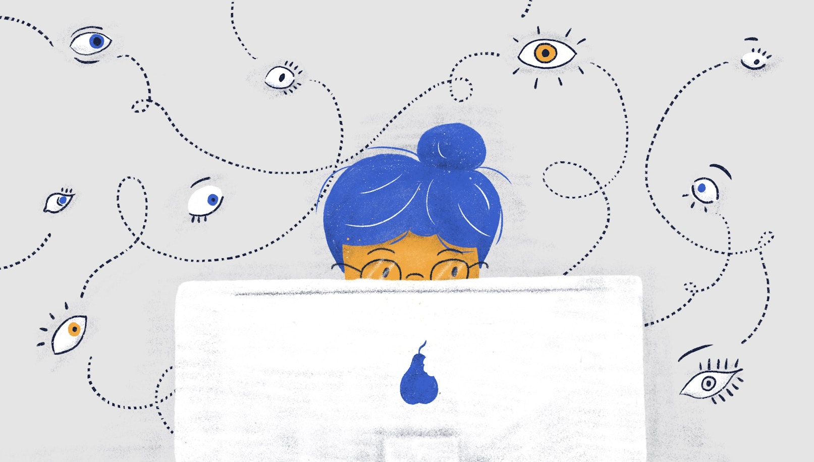
A week ago, we explored some pitfalls associated with trusting your users too much. Today, on the other hand, we’ll take a closer look at our own biases and how they can affect our work.
As UX designers, we collect a wealth of data from research and user testing. Extracting valuable and actionable insight from a bunch of disorganized information can be demanding. This is precisely where our biases start creeping in and make us stray from the right path.
In this piece, we’ll take a closer look at the most dangerous cognitive biases that designers face. More importantly, we’ll give you a few recommendations on overcoming them.
Let’s dive right in, shall we?
What is confirmation bias?
This bias makes us look for patterns that confirm our hypotheses and reject the ones that don’t. It secludes us in an echo chamber that limits our growth and understanding of the topic at hand.
Confirmation bias in UX design can significantly stagnate the design process. More importantly, it can impact the quality of our judgment and pretty much invalidate our efforts of understanding our users.
Solution: A great way to tackle this issue is to have a few researchers on board. However, in most settings, having even one researcher is a bit of a luxury.
Suppose you’re the only person responsible for extracting insight from research — seeking out criticism. Share your theory with a knowledgeable person (or two) and ask for constructive feedback.
What is framing bias?
Framing is all about how information is presented. Let’s take a look at two versions of the same issue:
“Every fifth user failed to find the search button."
“80% of users successfully completed the search task."
Basically speaking, both of these statements are a truthful representation of the same event. However, the critical question here is whether these statements are useful to us. Obviously, the first sentence is the one that allows us to focus on the problem rather than rest on our laurels.
An improper framing can also lead us astray and harm our decision-making.
Solution: There is no guaranteed way to rid our thought process of framing. As humans, we don’t have access to the so-called “objective” truth. However, our goal here is to identify the framing that won’t allow us to overlook valuable data.
Avoid making quick decisions. Often, this may lead us to choices that take important context into consideration.
Another simple solution is to assess the actions your framing might require. If a viewpoint nudges you towards useful action, consider holding on to it. Otherwise, you should probably review it.
What is hindsight bias?
This bias reflects a tendency to claim that a particular outcome was to be expected. We typically feel that we “knew” something would happen. One of the reasons we’re affected by this bias is the inherent need to understand the world around us. It’s a mechanism that helps us feel safer in an unpredictable world.
Hindsight bias can be harmful to the UX design process. We often selectively recall certain events and viewpoints that are consistent with what we know to be true. This, as a result, allows us to fallaciously validate our knowledge and understanding of the world.
Acting upon this bias can jeopardize a designer’s thought process and lead to improper choices.
Solution:
Unfortunately, there isn’t a surefire way to counteract this bias. However, there are a few steps that can be taken to prevent it from affecting your judgment.
Some researchers suggest that a straightforward way to prevent this bias from messing with your judgment is to consider other outcomes that could have taken place but did not.
What is polarization bias?
This bias can often prevent us from accepting that there are valid reasons for viewpoints other than our own.
In order to make sense of the world, we strive to create frameworks of meaning. This allows us to live with less ambiguity and uncertainty. However, it’s essential to underline that it doesn’t, by any means, make us right.
Polarization bias can be problematic when designing research and tests as well as analyzing their outcomes. We tend to favor the results that support our bias and discard the ones that disagree with it.
Solution: A simple way of approaching this bias is to go back to UX design fundamentals — empathy. People make certain choices not because they’re bad people or outright wrong. Their opinions are a product of their experience, environment, and upbringing.
We must strive to be accepting of others and not invalidate their viewpoints, even if they tend to disagree with us.
What is clustering bias?
Humans are inherently uncomfortable with chaos. We like to lump things into categories to make sense of the abundant stream of information we’re surrounded by.
This bias arises when we mistake small coincidences within a small data set for a commonality. It’s especially common when analyzing qualitative data. We spot a small trend in a sea of randomness and assume that it’s a widespread phenomenon within our data sets.
Solution: A great way to bypass or counter this bias to have large sample sizes. A more diverse and detailed user base will allow for a more granular view.
Plus, it’s always a good idea to brainstorm and discuss your findings with peers. This will allow you to identify potential biases as they arise.
The bottom line
Dealing with our biases is a crucial part of a designer’s growth. We tend to believe that it’s never us who are prone to such distortions, but it’s never the case.
Being mindful of potential biases that cloud our decision-making is the first important step in overcoming them. We must remain open-minded and humble in order to improve.
Similarly, it’s essential to remind ourselves that biases are an inherent part of our neurobiology. To err is human. However, being aware of your biases will make you a better person and designer.


