


If you’ve been keeping up with our blog, you know that occasionally we publish UX reviews. We hope these reviews will give you insight into a design review process. Maybe you’ll even pick up a few nuggets of UX wisdom 😄
This time we’ve reviewed Pipefy, a business automation SaaS product. We thought this would be a great product for a UX review, because it uses a lot of common patterns other SaaS products do.
Without further ado, let’s get into the review!
Pipefy review process
Pipefy is a large product with lots of modules and features. Reviewing the whole thing would make for a laborious, time consuming and huge review. That’s why we focused on a few modules, which are:
Navigation
Performance tasks
Onboarding
To access Pipefy’s onboarding, we’ve used an unmoderated 20-minute think aloud protocol per user. Then, we also had a questionnaire for the interviewees, which was as follows:
The system feels powerful and that it provides a lot of functions at my disposal
The tutorial messages were accurate and provided useful information
If I get lost in the system, or don’t know what to do to finish my task, help function provides appropriate explanation
I think that after the tutorial and initial exposure to the system I am sufficiently equipped to work with this system
System’s features are clearly understood and straightforward
The product’s tour left me with few unanswered questions
I felt like the tutorial dragged on
I felt like this product was suited to a different audience than me
I could easily recommend this product to a person without much experience with this type of system
The workflow presented in the tutorial was completely different from how I’d use the system
The scale for the answers is 1-7 (1-completely disagree, 4-no opinion, 7-completely agree).
Navigation and task performance
We’ve combined navigation and task performance into one usability testing. In a nutshell, while completing the tasks we’ve requested the interviewees had to figure out the navigation as well.
The navigation & performance assessment took us 30 minutes per interviewee;
Questions were divided into 2 sets (nav+perf)
Here are the tasks we asked interviewees to complete (in random order)
Create a project board and setup 3 files within it (just set titles, not the content);
Setup request management pipe and create a HR request to take vacation for 3 days;
Create 3 database record types for your company (A checklist, text and attachment)
Export data from a card in PDF format
Variables (success indicators):
Reported success levels
Time of completion
Insights gathered from Think aloud protocol and post-testing questions (end-to-end UX)
Onboarding
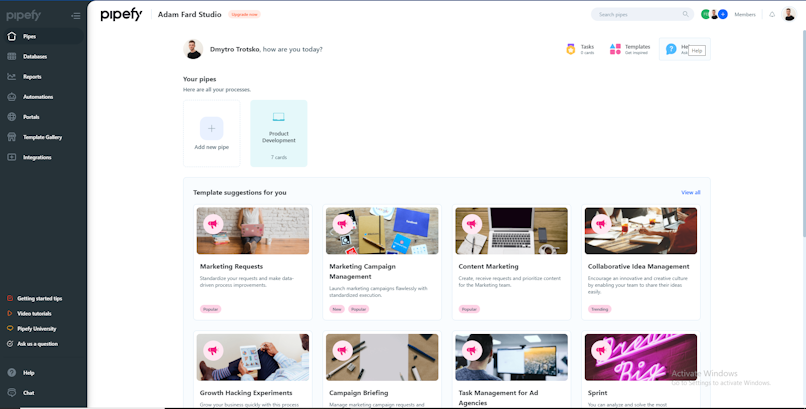
Pipefy did a great job with the SaaS onboarding process. It leads users through the flow and supports a balanced amount of introductions and explanations. Let's explore them one by one.
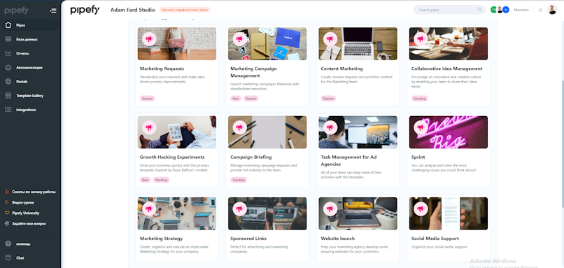
Templates
This is the first thing that users see after signing up. Templates are clearly structured by categories and provide an overview of major features of the app.


Empty states
Well-designed empty states provide context and reassurance on how to proceed, they guide the user to explore and fill in content. This way users are not left alone with all features, they are given with filled examples of cards.


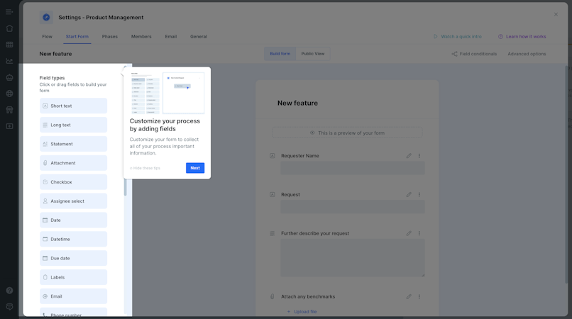
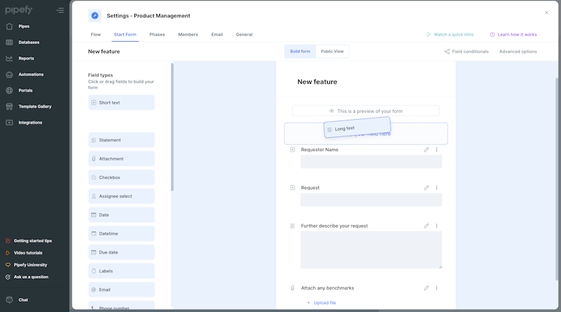
Interactive tour
The interactive tour helps overcome confusion during the first usage. Tooltips point out the most important functions that users need to interact with the product. This process prompts users to take relevant actions like clicking on a button to navigate to another screen or drag and drop elements to customize forms.


Gif & video explanations
For more complex processes users might need more detailed explanations. In that case they can refer to video instructions. Short gif’s instructions give a quick overview of the feature. Pipefy has plenty of gifs which do a great job explaining more complex features.


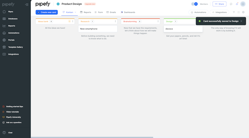
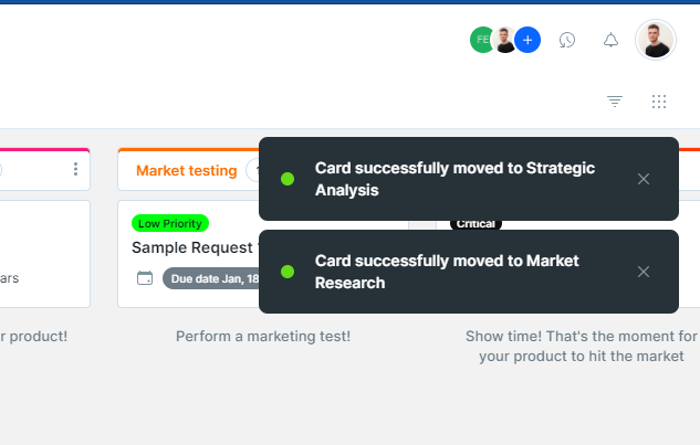
Success states
When the user completes a relevant task, it's a good time to provide positive feedback.


Performance (Usability Testing and its insights)
Overall experience, features, and options available
The system provides a lot of features from the very beginning of its usage. After setting up the account, the user is given the option of choosing the right template for their “pipe” which is populated by default with few generic categories of items and initial setting up of a board. There is also a wizard meant for custom pipe building, yet it is a feature that would be mostly welcome to experienced users. The time one needs to access most of Pipefy functionality is very short and there is a distinct feel for the system of empowering users with a multitude of flexible solutions as soon as possible.


Flexibility can be detrimental (logical fallacies can occur):


A task being low- and high-priority
Pipes? Databases? Templates?
Pipefy suffers from its abundance of features - users reported that the usage of colors and tagging of kanban board elements are complex, hard to read at times or provide too many ways of content identification. This includes both experienced and beginner users. At the same time, copywriting of the entire platform uses a lot of platform-specific language to describe its functions, and components. This has proven to severely extend task completion in case of simple functions (card export as PDF). For more complex workflows and features, its inherent complexity aided to an extent in faster finalization of tasks, yet, in both circumstances, users were looking for positive feedback when exporting, setting up or changing settings to no avail. The current notifications either didn’t have enough visibility or weren’t used in the right workflow steps to reinforce users.
Example of unclear access to history of changes made on a board:


Solving problems
Despite the initial overwhelming experience for the user, Pipefy comes with a plethora of help systems that can mitigate the confusion. Help center, chat, and community portal provide a lot of easily accessible explanations, tutorials, guides and videos showing users step by step how to best use the systems within their pipes. The search field in the help center is particularly useful in trying to uncover enigmatic notifications or feature groups that users can stumble upon while setting their platform.


Closing thoughts on performance
Pipefy allows experienced users to harness its plentiful features from the very first clicks. If complex workflows, highly customizable process management tools are important to you as a user, then this solution provides that and more. However, if you would like to explore functions, learn at your own pace, start slow and gain momentum learning about systems and management within an organization - there are better options out there. Of course, your mileage can vary, but the bottom line is that Pipefy is more of a sandbox-like environment, giving most of its benefits to seasoned power users, rather than a scalable solution for someone who seeks simplicity and flawless execution of core functions that is “just enough” for the task at hand.
Navigation breakdown
First-level navigation


Main navigation pages (1st level) are found in the left sidebar. The pages follow a very similar template structure, highlighting the active navigation item in the sidebar and showing the content in the right, below the topbar.
The only diverging option that does not follow the same navigation pattern is the Template Gallery, which on click opens a modal window on top of everything showing a list of templates for the user to choose from and create a new pipe. This creates the first inconsistency in the navigation system, as the user expects a page to be opened and instead, a modal window appears (also creates an inconsistency in the navigation item component by not changing it to the active state while the modal is open). Perhaps if this option was set apart from the other options, this behaviour could still be used and not feel strange, as something dislocated.
Another issue is on the label, which does not indicate at first read that it's main use is to create a new pipe, which might be misleading and could've been much more helpful if the action and its goal was clear to the user.


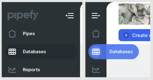
This sidebar can be collapsed, hiding labels and showing only icons and freeing more space for content. When hovering an icon, it shows the corresponding label next to it helping to remind users what the icon stands for. One inconsistency found was the diverging style of the navigation item after being hovered when the navbar collapsed and when it expanded. The hover state is different in each one, and not slightly different, but quite different with the collapsed state offering more visual differentiation between the rest and hover states.
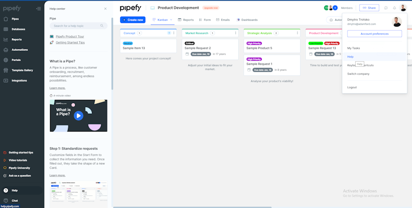
Help Center


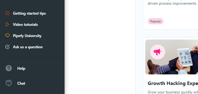
Help related topics are all kept in the bottom part of the left sidebar, grouped by learning topics (Getting started tips, Video tutorials, Pipefy University and Ask us a question) and contact actions (Help and Chat).
One issue found was in the use of ”Ask us a question” and ”Chat” with both actions leading to the same end result - opening a modal window on the right, powered Intercom. These menu items could've been reduced to a single action. That way you could remove ”Ask us a question” and change it to ”Chat”, so that you could cover both use cases with one menu item. This would also help to keep the resulting action more consistent as all of the upper actions lead the user to a different tool in a new tab window, while the bottom ones open inside Pipefy.
The Help action shows a section between the sidebar and the content with contextual help regarding the page the user's in, which can be a powerful tool to help new users do their task without having to learn it on an external page.
Topbar


The topbar is divided into 2 sections, and it appears in every page in the system, just like the left sidebar, holding part of the navigation system (1st and 2nd level) and providing contextual information on the page accessed.
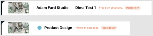
To the left of the topbar there's the company logo, name, the current page (when applicable) and information regarding the plan (when applicable).
The point of attention goes for the current page title, which only appears in 2 cases:
Company members page
User tasks page
The intention was good, but this pattern is only applied to half of the pages in the topbar, without a clear reason. These inconsistencies make it harder for users to locate themselves without an active navigation item visible, page title or breadcrumb.
Another contextual element of the topbar is the search bar, only shown in the pages ”Pipes” and ”Members”, being used to find specific items inside each page, since they are the ones that can hold bigger lists. This is a nice example of minimalism, using elements only when they are truly needed.
This space is reserved to show the members of the company (in case of pages in the 1st level of navigation) or the members part of the pipe/database (in case of pages in the 2nd level of navigation).
An improvement that could help users identify the members quicker without having to open the page would be to add a tooltip with the member name when hovering their avatar, so members without a picture can be identified too.


This space is reserved to show the members of the company (in case of pages in the 1st level of navigation) or the members part of the pipe/database (in case of pages in the 2nd level of navigation).
The User Menu


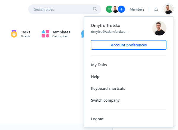
The user menu is usually a place reserved for profile and account related subjects, like basic profile info, links for settings pages, switch account and logout. In Pipefy, this isn't different, with all of the above part of the user menu.
Some ideas to improve this:
”My tasks” seems to be the kind of page that shouldn't be hidden inside a menu like this, accessible only here and in the home/pipes as a shortcut, but more visible like the ”Members” link.
Help feels a bit repeated since there are a bunch of links in the left sidebar and the contextual help sidebar.
Keyboard shortcuts look good and do a good job to inform heavy users so they can increase their efficiency using the tool
Switch company makes total sense, label and positioning, although it could also be grouped with logout.


In second level pages, like a specific Pipe or Database page, the page title is also shown, with slight differences where in Database page it also shows the Company name, and in the Pipe page it shows the icon of the pipe. Not necessarily an inconsistency, but probably a planned decision to benefit the exhibition of the pipe name, since there are some really long names in the templates section.


In a specific pipe page, there are two extra actions in the topbar:
Share
Activities (icon only)
These actions are contextual and work only for a specific pipe page. The odd thing is that they are located together with the other common topbar actions, which can be bad for users that suffer from change blindness, where they don't detect a change in a scene that is in a region far away from their focus of attention. Since the topbar looks almost the same in all pages, a change only in one page can go unseen for a lot of users.
Conclusion
Well, having gone through a few Pipefy modules, we can conclude that the team has done a decent job designing and building the app. That said, there were a few mishaps like inconsistent navigation patterns, confusing UX copy here and there.