Mental models are an exceptional tool—they help us make sense of the world around us. The easiest way to think about them is to see them as conscious or unconscious templates that we’ve extracted from life experiences.
Whenever we go out in the world, we have to regularly deal with new and complex situations that we’ve never been in before. To get a better understanding of how we should navigate them, we use mental models from past experiences. This helps us make sense of things quicker and more efficiently instead of doing so from scratch.
In this blog post, we’ll take a closer look at what mental models are and explore how they can benefit a person’s experience with a product and service.
Let’s jump into it.
Okay, so what are mental models exactly?
Let’s take a look at a more academic definition of mental models and try to unpack it:
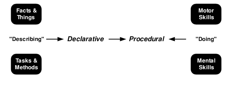
“Mental models are internal representations containing meaningful declarative and procedural knowledge that people use to understand specific phenomena.”
Declarative knowledge typically refers to information that is considered to be generally true about the world. This type of information is static and is not expected to change. Stuff like “2+2=4.”
On the other hand, procedural knowledge is the understanding of how a person should behave or act in a particular situation to achieve a specific outcome.

Mental models blend these two types of knowledge to help us understand the phenomena that surround us. One of the simplest models that people commonly use is the idea of surfing—to ride a wave, you need to catch it. To ride it for a longer time, you need to catch it as early as possible. You could apply this to pretty much anything around you. Thinking of investing in a stock? You could use this model to make sense of the soundness of your decision. Is this wave worth catching? Will catching this wave provide me with enough time surfing it?
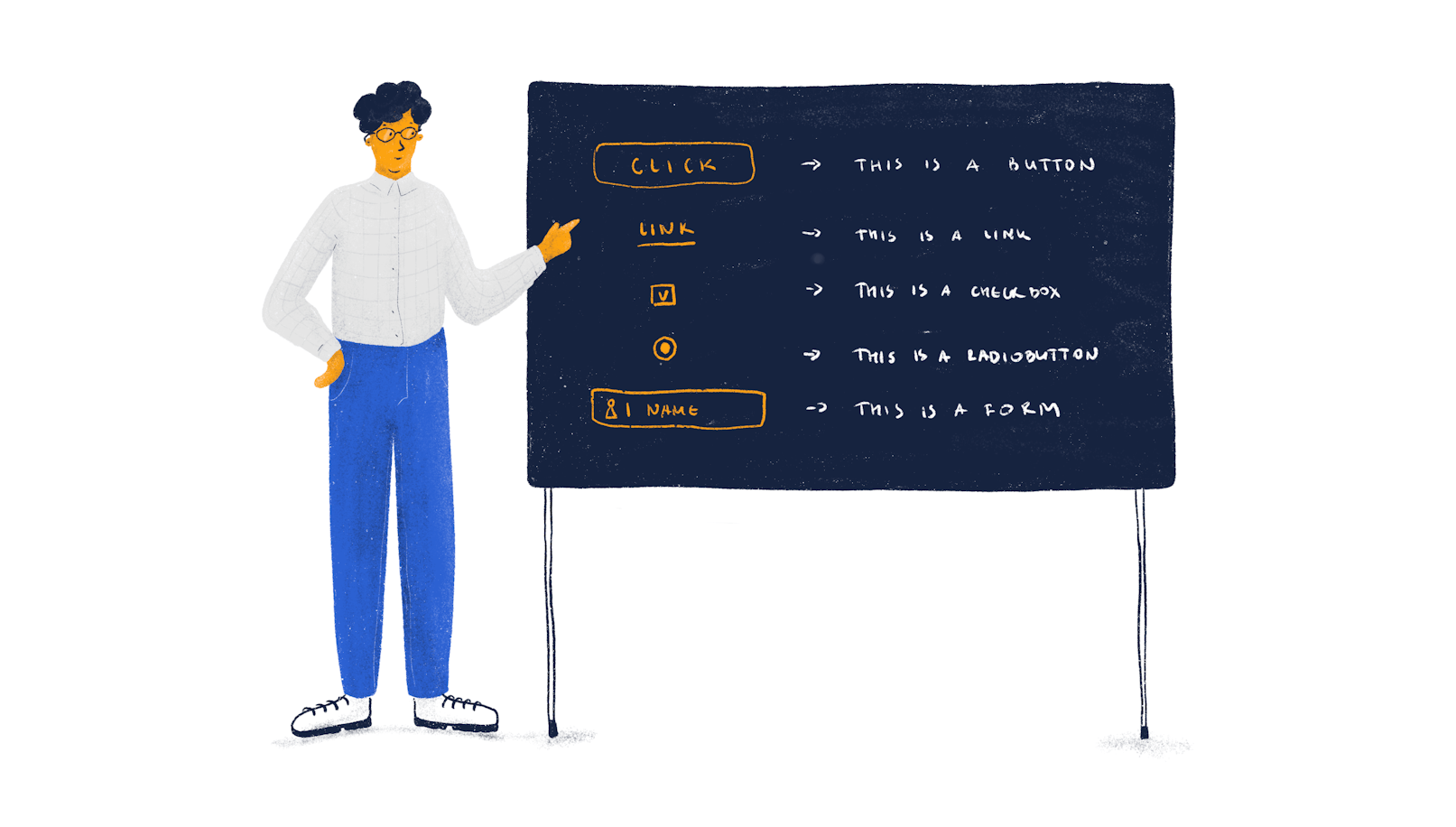
When it comes to UX, standard mental models include having rectangles with a text inside as buttons or tags, having links underlined and highlighted with color, the login sequence, and so forth.
Think of it this way, a theoretical Mac user is well-acquainted with the operating system’s design and interface. However, whenever they have to use a Windows machine, they aren’t suddenly disoriented. Yeah, there may be a slight lag in the person’s efficiency for a short while, but they can still comfortably navigate this new OS. This is possible thanks to the mental models of various UI elements that we commonly recognize and understand their functions. A button on macOS is still a button on Windows, Linux, and so forth.
How do you determine your users’ mental models?
But mental models go far beyond the basic recognition of design elements, and to figure out which models your users utilize, companies need to do a fair bit of research. Typically, it’s user and competitor research.
User research
This type of research is essential early in the design process. Using methods like user interviews and surveys will help you understand how your users think about your user experience. This should be followed up later in the process at the wireframe or prototype phase with user testing of the design you’ve created.

Why is this important? By gathering enough information about the way your users navigate the world, you’ll be able to create experiences that are both intuitive and satisfying to your target user base. More importantly, user testing will allow you to surface a variety of discrepancies between your product’s experience and the mental models your audience uses to navigate interfaces. As a result, this enables you to address experience-related issues before the product hits the market.
Competitor research
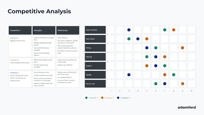
Understanding how your competitors structure their products will provide you with plenty of insight into what their users are looking for.
Theoretically, every product intends to provide something that others don’t. By exploring a variety of relatively similar UI designs, you’ll be able to establish what parts of the experience you should adopt and explore areas where you can innovate.

Source: UX Process
How to implement mental models to your designs
Okay, so the important question is, “how do you make sure that your design fits the users’ needs and their mental models?”. Let’s take a quick look at a few steps.
Design for patterns that users are accustomed to
You may have heard about Jakob’s Law—it’s an essential UX principle that suggests that “people spend most of their time on other websites; therefore, we should create designs that will fit their expectations.” This will help you both match your users’ existing models that they’ve amassed throughout their interaction with hundreds of apps and websites in the past.
Understand how users think
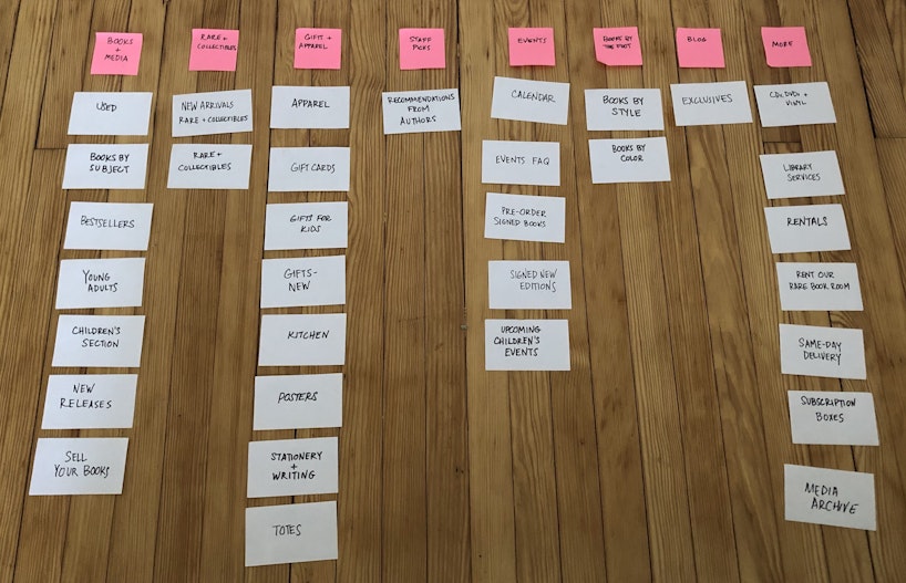
A great way to learn more about how your users think is to run card sorting exercises. This research method allows designers to determine how users categorize information and how this will impact their interaction with your product.
There are two common types of card sorting exercises:
1. Open card sorting—This is where participants are provided with a series of cards and are then asked to group and categorize them. Another vital part of this exercise is to have your subjects attribute a name to the category they’ve created. This is especially useful when designers don’t have a solid structure at hand and are looking to find a way to categorize all the customer-facing information they’re working with.
2. Closed card sorting—This is a fairly similar exercise, the only difference being that users have to make decisions based on preselected groups and categories. This is a better way to go when there’s a sense of clarity in regards to the information architecture of a product.

Reduce abstractions
To make designs less abstract and give them a more real-world quality, designers should look into NUIs (natural user interfaces). Basically, the idea behind them is to design natural, intuitive, and easy-to-use interactions. Think of how you would swipe a screen from the bottom up on a smartphone to display the contents at the bottom of the page. The same goes for macOS users that can swipe the trackpad with four fingers to the left or right to show the contents of a different screen.
Whenever a user happens to uncover such interactions, they feel a sense of accomplishment. Follow these recommendations to design more natural and intuitive experiences:
Make use of progressive disclosure to provide users with a clear learning path. It’s important that they learn to use these interactions in a progressive manner, starting with simpler ones and gradually moving the more complicated ones.
Create experiences that will provide users with immediate feedback once such actions are performed.
Do not overload your users early on.
NUIs aren’t a new thing in UX. Companies like Apple have been at the forefront of natural design for years. They successfully managed to optimize their users’ engagement by leveraging actions that appear natural to us—and it’s safe to say that their focus on this type of interaction has set them apart from the rest of the competition.
Mixed-up mental models
It’s important to underline that while mental models help us navigate the world, they are also numerous and diverse. As a result, when designers use improper mental models in their designs, their users may find interfaces confusing, or they may fail to understand the difference between similar parts of a system.
Here’s an example: Google’s search feature. Reports indicate that sometimes users can’t differentiate between the search field on Google.com and the address bar in their browser. Users often type in the name of a site in the search bar instead of just typing it in the address bar.
A study conducted by the Nielsen Norman Group outlines the most common mental model confusions that users are confronted with:
Browser commands and commands that are held within an app
Local and remote information
Login options and passwords
Windows provided inside an operating system and those inside a browser
Windows and applications
Icons and applications
So how do we address these issues? The problem is that there’s no surefire way to eliminate these confusions entirely. There are only tools we can use to make them occur less often. As we mentioned above, it’s essential to run extensive user testing sessions with your users throughout the design process to ensure that your design leverages the suitable mental models.
Closing thoughts
Mental models are at times elusive. Nevertheless, they remain a vital part of good UX design, and the way to ensure that your design’s mental models coincide with those that your users' research and testing are essential. Investing time in the two will ensure that your products are intuitive and easy to use.


