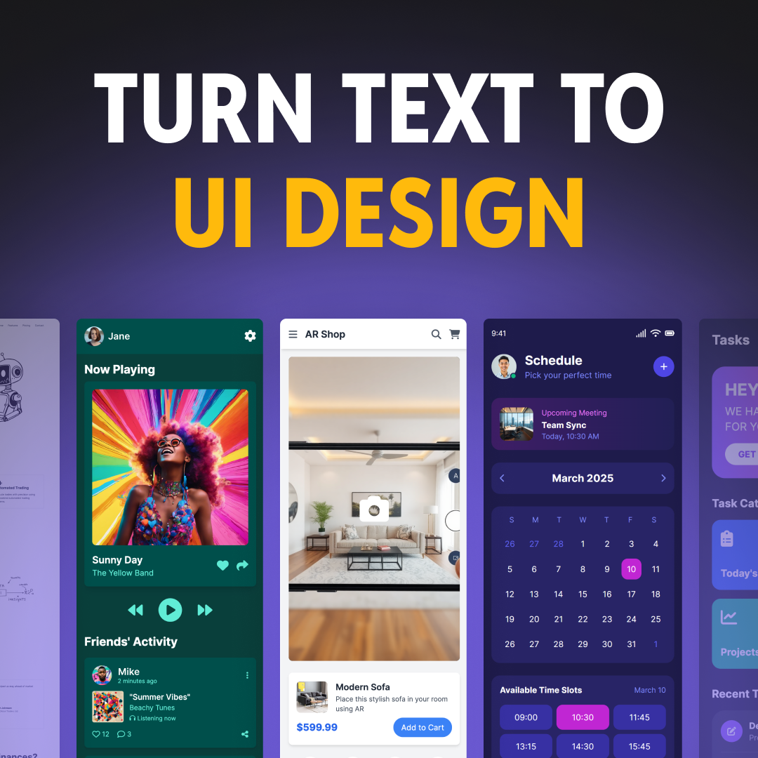
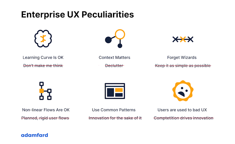
“Don’t make me think” is a renowned mantra in the world of design, coined by Steve Krug. It has served as a guiding principle in the world of design and UX for twenty years. It teaches us how to create great experiences in a straightforward and accessible manner.
In this article, we’d like to look into enterprise design and its peculiarities. It’s essential to underline that the very nature of enterprise UX slightly differs from consumer UX. As a result, some of Krug’s principles must be adjusted when designing enterprise software.
This article is by no means a refutation of the design principle. Please treat it as a mere asterisk with a fine print at the bottom.

Product Design For Complex Enterprise Solutions
We thrive on complexity. Let us help you humanize your solution and skyrocket metrics along the way.
Contact usEnterprise UX Design: Principles, Challenges, and Best Practices
Enterprise UX Design stands at the crossroads of improving productivity and user satisfaction within professional environments. Unlike traditional consumer UX, designing for B2B interfaces and corporate software solutions presents unique challenges and strategies essential for large organizations.
Before diving into what makes enterprise UX its own category, let's go over what it is in the first place. As opposed to consumer UX, enterprise UX design entails designing for people at work, i.e. professionals. In more practical terms, apps that require enterprise UX are complex b2b solutions for large organizations.
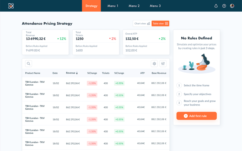
The Enterprise UX Design Learning Curve
Balancing Complexity and Productivity
According to Krug, products that make people think also make people unhappy. Products with steep learning curves very rarely succeed in the modern business ecosystem. Customers will pretty much always choose the path of least resistance. This isn’t necessarily true of enterprise products.
Mostly being power users, professionals interacting with enterprise UX design face niche software daily. It's essential to recognize the unique challenges and benefits of enterprise UX to cater to their advanced needs effectively
Creating an interface that demands some learning results in a steeper learning curve isn’t inherently wrong. It allows users to work more efficiently once they’ve invested a certain amount of time into training and learning.
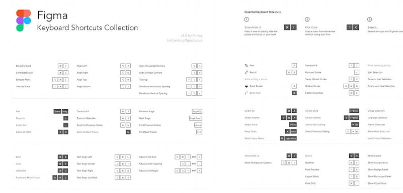
Take, for instance, products like Figma, Sketch, Adobe Pro, or any other professional software — most of them have a wide array of shortcuts. Features such as shortcuts may take a while to master, but they’ll ensure a significant boost in productivity once learned.
Simplifying Enterprise UX Design
A Cautious Approach to Productivity and User Needs
While simplifying interfaces is crucial, mastering the balance in enterprise UX design without compromising productivity requires a deep understanding of the professional tasks at hand.
Plus, it can be argued that by making the interface too simple, we risk generating friction rather than eliminating it. Let’s envision an interface of a product that displays a wide array of charts and data, like a trading platform.
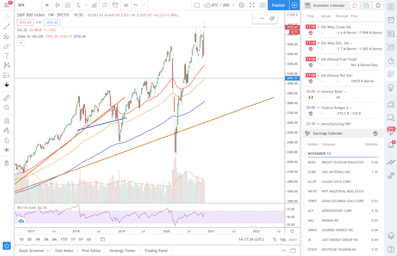
A professional that regularly interacts with visual data needs immediate access to it at all times. Having to perform extra actions to access vital features is both frustrating and unproductive. And here lies one of the most significant differences between consumer UX and enterprise UX (eUX).
Consumer UX is really passionate about sleek UIs, while enterprise software must ensure that users are able to do their work comfortably. Therefore, simplified, minimalistic interfaces aren’t really what enterprise UX designers are after.
Wizards are cool, but…
Onboarding your users is a vital step aimed at ensuring an optimal user experience. However, while Wizards and guided tours are an excellent solution for casual users, it’s not necessarily the case for power users.
An example of a wizard and a guided tour | Source
In both consumer and enterprise UX, designers must aim to develop products that require as little hand-holding as possible. However, simplistic product tours can be… well, simplistic. They often fail to uncover the entire functionality of a product, which is especially relevant for experienced users.
After running a series of tests, we found out that enterprise users tend to prefer to leave the app or platform for instructions. While this does seem somewhat disruptive to the experience of a product — it is understandable.
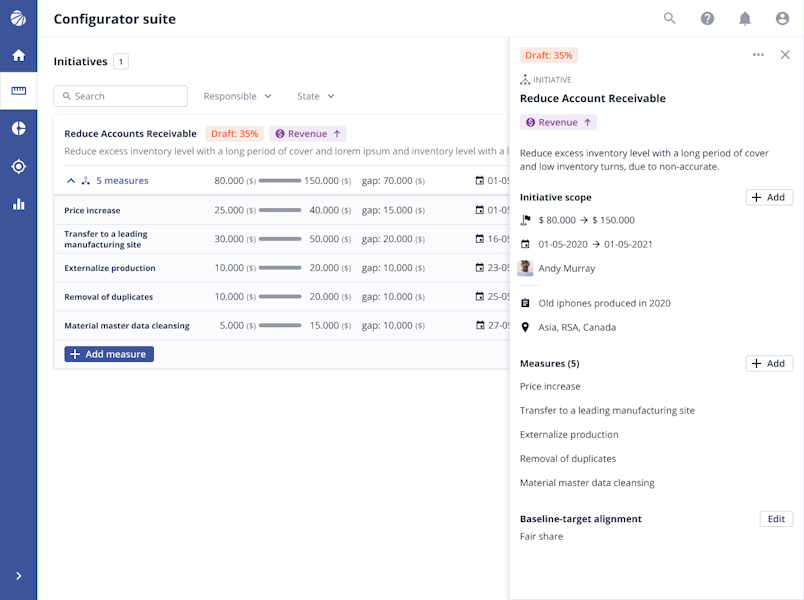
Off-page instructions can provide more in-depth explanations rather than the ones that are placed on the screen. Compare, for instance, a tool-tip and an article dedicated to a particular function.
Plan for non-linear flows
When it comes to designing enterprise UX&UIs, designers face a truly arduous task of creating complex, non-linear flows. These flows often involve a variety of roles, UX personas, responsibilities, kinds of security, and much more. Our goal is to create a consistent and recognizable experience throughout all of these variables.
The complicated part, however, is not to force users into flows and scenarios. Experts and professional users need that freedom to make decisions and use the platform as they see fit.
Think of a person that is deeply versed in Microsoft Excel. They’ve been using this software for nearly a decade, and they know it like the back of their hand. More importantly, they have their style of working and solving problems. Limiting such users via linear and rigid flows could defeat the purpose of boosting their productivity.
Don’t fix it if it’s not broken
Innovation is a crucial element of UX design: enterprise or otherwise. We strive to continuously seek new and creative solutions to old problems. Often, we can even choose to be bold and put forth experimental solutions.
However, when it comes to enterprise UX, we have to be somewhat more conservative and experiment with caution. Enterprise software isn’t quite receptive to design solutions that go against the grain.
Since the central purpose of such software is to deliver quality work in short amounts of time, “reinventing the wheel” isn’t always a great idea.
When designing for enterprise, keeping an eye on your competition is even more relevant than in consumer software.

An example of a competition matrix
Let’s go back to Excel once more — imagine you’re trying to reinvent a complex, spreadsheet-based product. You’re looking to change the ways it represents data, or certain actions are performed. While this does sound like a laudable task, the critical question is — why?
In enterprise software design, the real value of a product is in its unique selling point that is translated via a design that looks familiar and intuitive.
That is not to say that the light of innovation never shines on enterprise products, but user expectations often trim the lengths we can go.
Navigating User Expectations in Enterprise UX Design
The Shift Towards Improved Usability
This is not an attack on enterprise designers, we promise. However, large companies don’t change their software often. That’s quite understandable. If there’s a piece of software that’s been used company-wide for years, it’s a huge can of worms to migrate into something else.
As such, there’s next to no incentive for software providers to change things. Their enterprise clients will probably stay no matter what. On top of that, such an environment isn’t really conducive to a fierce competition among enterprise software providers.
That said, we do hope that a shift toward great UX is a matter of time. Sooner or later, “the UX revolution” will shake up the industry, and it’s best to be at the forefront of it.
In conclusion
As we delve into the complexities and opportunities of enterprise UX design, it's evident that our commitment to the 'don't make me think' principle, while vital, only scratches the surface of what's possible. Within the conservative confines of enterprise design, there lies untapped potential for innovation and creativity. These constraints don't limit us; they propel us towards reimagining the future of work to be more intuitive, efficient, and engaging.
Recognizing these opportunities and navigating the nuanced landscape of enterprise UX requires expertise and a forward-thinking approach. Our team is at the forefront of merging practicality with innovation, crafting user experiences that not only meet the intricate needs of professional environments but also set new standards for usability and satisfaction.
If you're intrigued by the prospect of elevating your enterprise solutions and are eager to explore how exceptional UX design can transform your user's workday, we invite you to book a FREE consultation with us. Let's discuss how we can bring these principles to life in your projects, creating a future where work isn't just about tasks but about experiences that inspire.
Q&A
What is enteprise UX?
As opposed to consumer UX, enterprise UX design entails designing for people at work, i.e. professionals
How to recruit enterprise users for UX Research?
Asking stakeholders for help is your best bet. Customer Success representatives, for instance, could be of great help.
Why does UX matter for enterprise apps?
On top of the universal value of UX, enterprise users use their software for hours every day. As such, you should ensure it’s highly usable.


