According to Business Insider, the chatbot market size is projected to grow from $2.6 billion in 2019 to $9.4 billion by 2024. That’s more than 360% in growth. With the growing demand for chatbots, you can no longer surprise users by just having a chatbot. What you need is a great chatbot. This article will hopefully shed more light on how to provide your chatbot users with the best possible experience.
So what makes a great chatbot? Let’s dive right in.
1. It’s actually useful
As in pretty much anything business-related, it’s a good idea to start with “why”. Why do you need a chatbot? What are your expectations? Can a chatbot meet them? Do our users use messengers? If so, what messengers? These are some of the questions you should probably ponder upon before deciding whether it’s a good idea to commit to developing a chatbot.
When are chatbots not useful?
Normally, chatbots have an interface with a few navigation buttons to guide users through the bot experience. Now imagine that the scope of information the chatbot is meant to provide is too vast. So vast that there are too many buttons to fit into one bot. There are a few ways to mitigate that.
One way is to train the bot to respond to manually written commands. As of writing this, though, NLP (Natural language processing) is nowhere near advanced enough to recognize every single way a user might request information (as you will see in the example below). Not to mention, that it would take a lot of explaining to users in terms of what the bot does.
Take a look at the example below. The commands that we gave the bots were pretty clear and yet the bot didn't provide much value.

The second option is to separate the functionality into a few separate bots to decrease the scope of their usage, which also has its flaws. The more bots, the more confusion users have about what bot does what. The screenshot below shows a bank that has five different chatbots. And it's not that obvious what each of them does just judging by their names.

You could also greatly involve a support team to provide information to users to avoid inaccurate NLP, but it defeats the purpose of having a chatbot in the first place.
The bottom line here is to do the research first, estimate the scope of bot’s functionality, and whether it would actually benefit users.
2. Great copywriting
When it comes to chatbots, copywriting is a big deal. Text is the main means of communication between the user and the bot. Therefore, nailing the copy is as important, as designing a great flow, or coding it right.
Principles that make great UX writing apply to chatbot copy too: conciseness, usefulness, clarity, and being on-brand. However, there are some challenges that are unique to chatbot copywriting. Let’s go through some of them.
2.1 Lack of screen space
A good rule of thumb is that you shouldn’t go above 90 symbols per message. This has to do with the fact, that the best you could hope for with a mobile device is half a screen since the keyboard will occupy the other half. That’s especially relevant to in-messenger bots that are most commonly used on mobile phones.
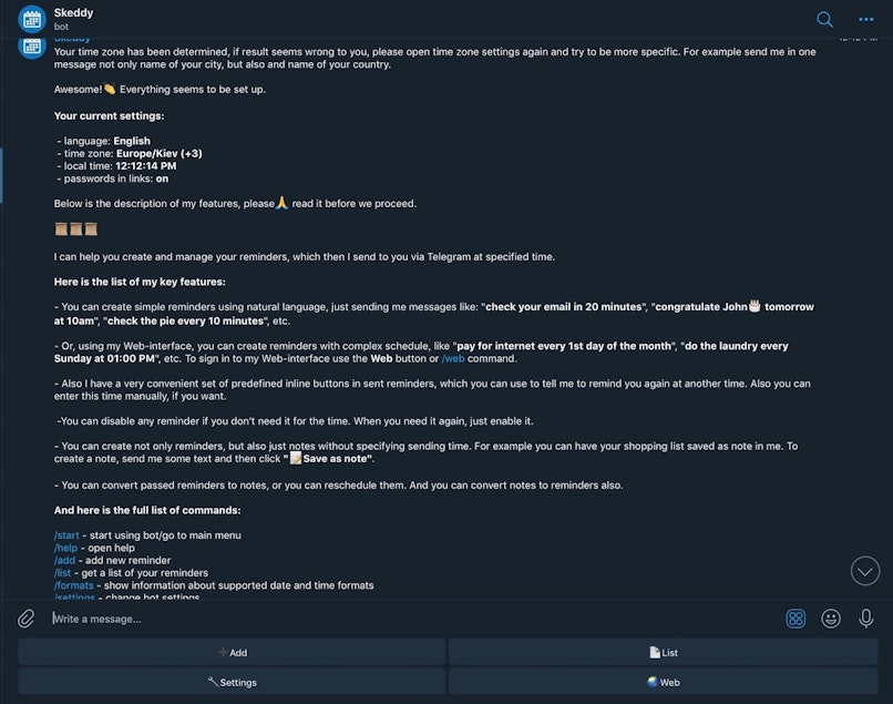
Take a look at the example below. We intentionally switched to the desktop version of Telegram to capture all this copy in a single screenshot. While this copy does a good job explaining what this bot does, it's an insanely long read. We suspect not many users will actually read the whole thing.

2.2 Limited formatting options
With a few exceptions, in messenger chatbots (Facebook, Viber, WhatsApp), there’s no way to bold, italicize, underline or alter the copy formatting in any way. That makes information hierarchy a little more challenging since there are fewer means of emphasizing what’s important.
In order to overcome this limitation, consider using caps. Be careful, though, using too much caps in UX copy is a frowned-upon practice since it reduces the reading speed and comes across as screaming.
Other than caps, emojis, pictures, and gifs are also helpful. We encourage using emojis to add personality, humor, or structural information. They're particularly convenient when conveying your message, depending on the tone of the conversation and the target. The best part is that you can use them on almost any device (even a desktop), thanks to websites such as Picsart. Overusing emojis, though, makes the chatbot seem immature.
Below, you can see an example of using emojis to visually separate paragraphs. However, one way Yandex.Translate could have improved the flow is through separating the paragraphs into separate messages sent with a small interval. That way users would have time to read all information.

2.3 Making sure users know that the chatbot understands them
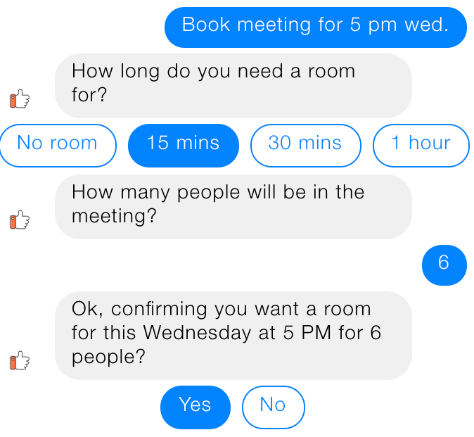
Chatbots often ask people for some input. It could be order or tracking numbers, personal information, flight details, etc. This information could be vital to get right. Imagine booking a flight to the wrong city, for example, because of a misspelling, that we’re especially prone to on mobile devices.
In order to mitigate the risk of the wrong input, it’s a good practice to repeat the user’s input and ask for confirmation.

3. Quick response time (with a twist)
On average users will wait eight seconds before leaving a non-responding bot. And yet, bombarding users with 3 separate messages within a 0.2 seconds interval is not a great idea either.
You should generally strike for sending messages with an interval sufficient to read the previous ones. That way it’s a more natural texting experience, plus the users are less likely to skip a message altogether.
When it comes to pulling information that requires some time to be pulled, it’s a great idea to let the user know that their request is being processed. This aspect of human-to-human communication is reflected in showing that your conversation partner is typing something in messengers.
Develop a personality
Ideally, the chatbot experience shouldn’t be any different from human-to-human interaction. Having a personality brings a chatbot closer to this ideal. In more specific terms, adopting a distinguishable tone of voice, humor and other personality traits is enjoyable for a couple of reasons.
Firstly, it’s entertaining, which is a factor that significantly influences user retention. Secondly, such chatbot would be much more likely to be remembered, which again speaks to customer retention and brand visibility.
Take a look at how Gamee goes beyond the usual robotic tone of software, making this bot an entertaining experience.

Wrapping up
Hopefully, pieces of advice in this article will help you craft an outstanding chatbot user experience. And while developing a great chatbot is no easy task for a variety of reasons, we hope that nailing the UX will be at least a bit easier for you now that you’ve read our article.


