If you’re a fan of cartoons, you’ve probably seen that moment when the main character has a great idea, and a lightbulb turns on in their brain. Or maybe a genius plan falls into place. Well, “aha moments” aren’t just for cartoon characters. Businesses need them too.
Coming up with “aha moments” for your users isn’t always smooth sailing, but they are worth the effort. It’s not always a case of reinventing the wheel. Many of the best “aha moments” come from looking at what other businesses are doing.
That way, you can learn from their experience (both wins and losses) and apply this knowledge to your own user journey.
We’re breaking down how to manufacture “aha moments” for your users and what we can learn from other SaaS leaders.
What’s an “aha moment”?
An “aha moment” is the moment your users realize the value your product provides. Think about the last time you thought, “ah, so that’s how this works!”.
Do you remember the first time you created an Excel formula? Felt good, didn’t it?
Of course, those moments go way beyond software design, but the digital user experience is what we know best. So, we’re focusing on those types of “aha moments” in this article.
How to find the “aha moment” for your product
Now it’s time for the million-dollar question; how do you find the “aha moment” for your product?
We’re pretty sure you already have some clues. You probably have some idea of the key value your product provides. For instance, think back to when Google Documents was launched.
Before it hit the scene, it just wasn’t possible to work collectively on a document in real-time unless you were in the same room. That first moment you saw your colleagues making edits on your document was the “aha moment.” You get the idea.
Things aren’t always so obvious, though. The kinds of “aha moments” you want to elicit will depend on the unique value proposition you’re offering.
An “aha moment” isn’t necessarily a clearly defined moment in time. Sometimes, it’s the combination of the small things that make the difference.
Either way, there are a couple of ways to find your product’s “aha moment” for sure.
Customer journey mapping
By itself, a customer journey map (CJM) will not tell you where drop-offs or “aha moments” occur. It might give you some handy clues, though.
A customer journey map is the path user goes through from a stranger to (hopefully) a brand evangelist. This UX artifact is so valuable because it gives you something to map your insights on.

Do people tend to skip onboarding? – Put it on the customer journey map. Do most of your support questions have to do with a certain feature? – Log it on the customer journey map.
You see where we’re going with this. Get digging and see what clues you can garner from your CJM. Then, use those insights to pinpoint where your users need more help finding that “aha moment”.
User interviews & usability testing
We want to start by clarifying that even though we’ve grouped these two activities together, they’re not the same.
Sure, both user interviews and usability testing entail talking to users, but there are some key differences.
User interviews are conducted at the very early stages of product development when you aren’t entirely sure what the end product is going to look like. They guide you in defining exactly what you’re going to build.
User interviews will help you understand your users’ habits, priorities, and wants. After all, how else are you going to craft a valuable product and elicit an “aha moment”?
On the other hand, usability testing is less about learning what to build and more about whether you’ve built it right. They're also great opportunities to witness aha moments (or lack thereof) in real time.

Is your product intuitive? “Aha moments” just wouldn’t happen unless users understand how to use your product.
Churn & Retention
These two metrics are two sides of the same coin. Gauging churn will not tell you where the “aha moment” is but rather where it isn’t.
So, what do we mean when we use the term “churn”?
Churn simply means that the user didn’t see enough value in continuing to invest their time into your product. Put another way, they didn’t get that “aha moment” that showed them the value of your product.
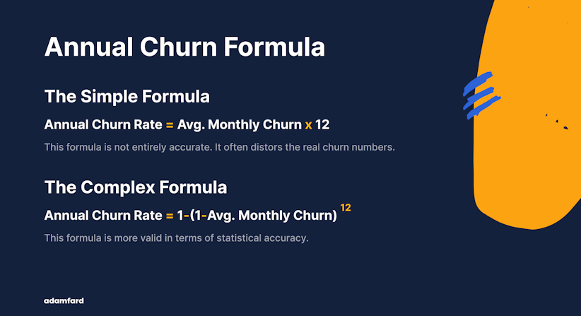
A bit of advice. Go out of your way to talk to churned users at every opportunity. They hold a wealth of insights and could potentially unlock that “aha moment” your product is striving for.
Conversely, tracking retention will tell you which parts of the customer journey are successfully communicating the value of your product. Understanding where your product is performing well and where customers are dropping off will go a long way to discovering that elusive “aha moment.”
Facilitating the “aha” moment
You know your product is great, but how do you facilitate the “aha moment” for your users? There are 3 ways to really showcase the value of your product to users. Let’s take a closer look.
Onboarding
Eliciting the “aha moment” is quite literally the most essential task of your product onboarding. Time is of the essence, so you have to show what makes your product invaluable within the least possible amount of time.
Time waits for nobody, and neither do your users. With so much market competition, you need to make sure your onboarding spotlights that lightbulb moment straight out of the gate.
Personalization
We’ll admit it. Things get tricky when you start building a product that caters to multiple user groups.
Products with a high level of personalization satisfy a larger audience. But this can make finding the “aha moment” a little bit more complicated.
Naturally, it’s pretty likely that you’d have to work on different “aha moments” depending on the value you provide to that user group.
In a nutshell, the more personalized the product, the more different types of “aha moments” you’re going to need to curate.
Find bottlenecks (remove barriers)
The worst thing you can do at the early stages of the customer journey is to build barricades for the users to climb over.
We’re talking endless onboarding sequences with walls of text, requesting credit card information, etc. Basically, anything that will hinder users from finding the value of your product.
These will create bottlenecks and stop the users from ever experiencing the “aha moment.”
Remember, your goal is to make users’ lives easier. So, don’t make them jump through hoops for your product. The likelihood is that they will just find a similar product with a more effortless user experience.
Examples of “aha moments”
There’s absolutely nothing wrong with standing on the shoulders of giants. In fact, we highly encourage it. So, with that said, here are some real-life “aha moment” success stories. Take note.
Honey
Honey is a browser plugin that searches the internet for promo codes for your shopping. Once installed, you can see the plugin as a widget on the right corner of an eCommerce website.
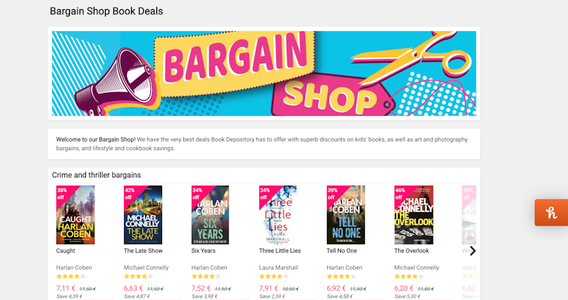
After you click on the widget, the plugin will test the coupon codes.
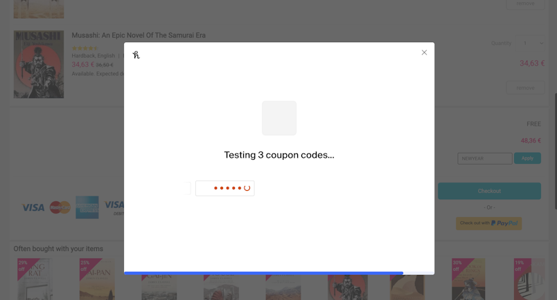
And voila!
You either get a free coupon for a discount on your shopping or peace of mind that you aren’t paying more than you should.
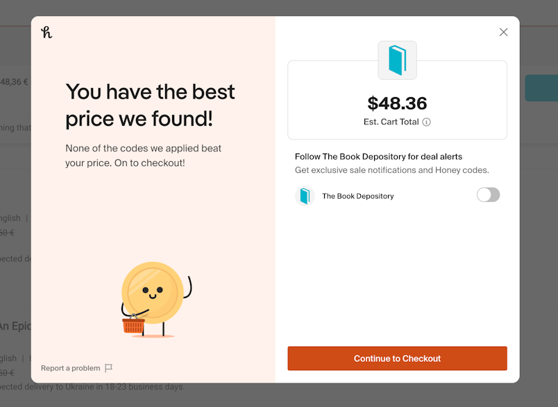
The journey from the first encounter to an “aha moment” here is minutes.
Netflix
The leader in on-demand streaming services, Netflix shows users the “aha moment” right off the bat.
After signing up and completing the onboarding (necessary for personalization), you can start watching a show almost immediately.
This is the “aha moment” for users–they can watch all of their favorite shows with just the click of a button.

We know, we know, some of you may think that streaming services are barely worthy of an “aha.” But remember that different audiences have different “aha moments.” Just see how your grandparents react, and you’ll get what we mean.
Loom
Unfamiliar with Loom? Give it a try. We’re sure you’ll find it useful.
Loom is a desktop app and a browser plugin that allows you to quickly record and share screen recordings. It’s as simple as clicking a button to start recording and sending the link to a colleague.
Is it reinventing the wheel? No. But it’s quick, easy to use, and it fills a very real need. Plus, users get that “aha moment” in next to no time. All they have to do is hit record.
In closing…
Even the best products in the world wouldn’t achieve long-term success without those all-important “aha moments.” When a user chooses your product, you have a small window to show them precisely what makes your product so valuable. Failure to do so will result in high churn rates and low retention.
The “aha moment” is that critical moment when a user first sees what your product is all about and why they need it in their lives. The sooner you lead your user to this realization, the more likely you are to turn a stranger into a brand evangelist.
With that in mind, your product UX is critical. It removes the barriers and creates a seamless user experience that ushers users to the lightbulb moment in the shortest time possible. From high-quality onboarding to personalization, this is how you manufacture quality “aha moments” for your users.

