

UX has entered into a third dimension. And it changes everything.
This blog post will guide you through some tips and considerations for designing 3D apps and integrating the new dimension of spatial UX in consumer design.
Without further ado, let's get into it.


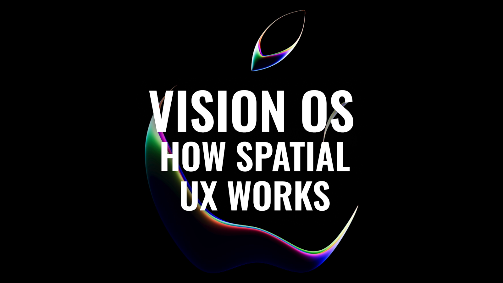
Spatial UX 101: intro to Apple Vision OS
Get your hands on a starter in spatial UX.
Download2D vs 3D in UX
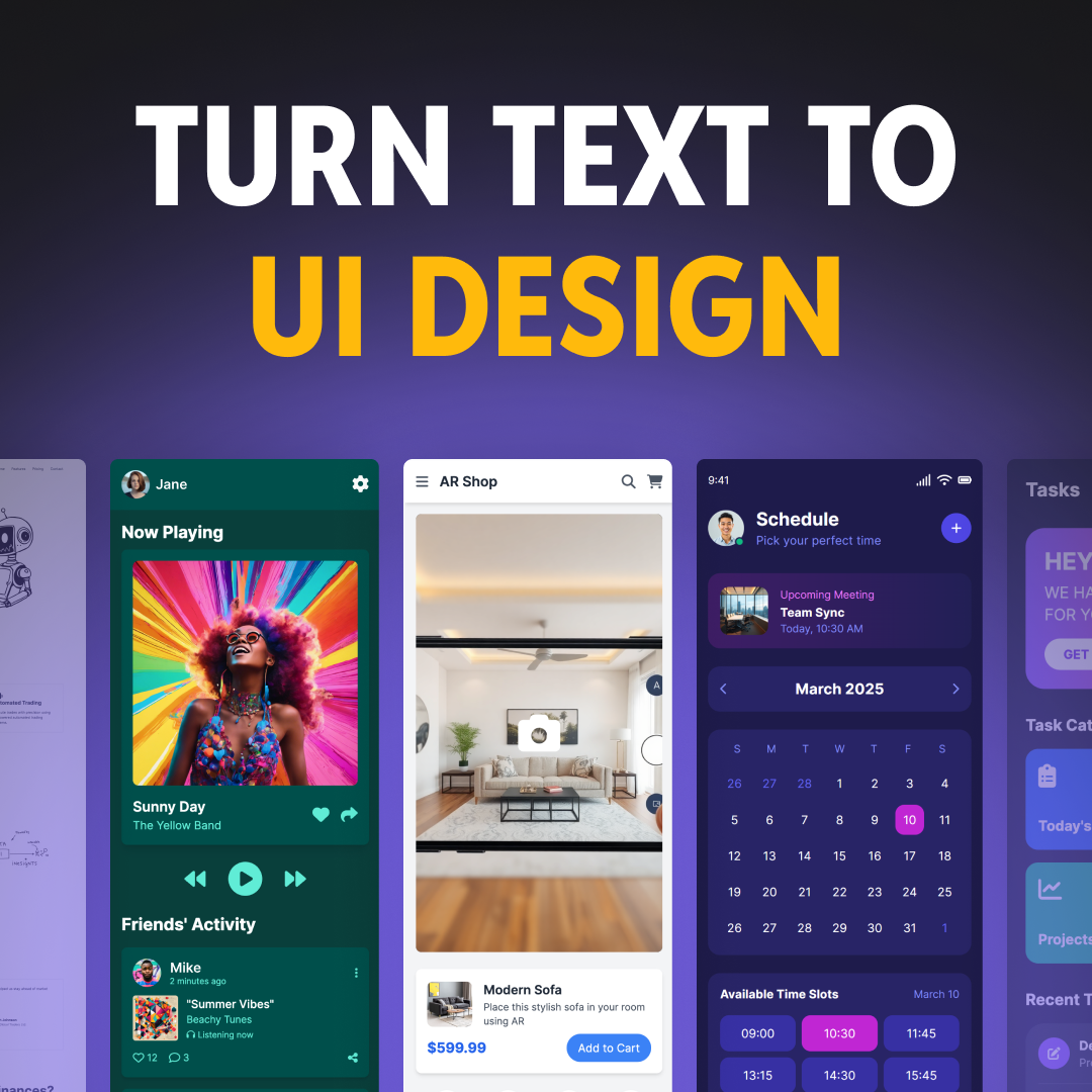
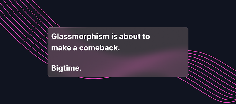
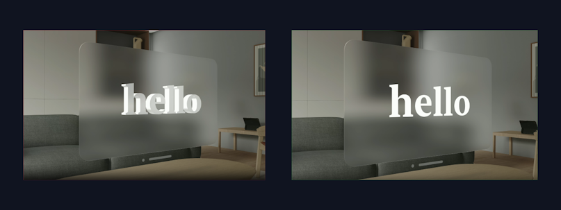
One of the first things you will notice is that in Vision OS, the texture of interfaces is different. It's glassmorphic, i.e. it looks like glass. This trend is about to have a ginormous comeback. The reason this texture would be the default now is so that the user can still see their surroundings with the headset on.


Another important thing to note is that, in 3D design, screens are the basic units of interacting with the system (as opposed to having screens).


It's also likely that 3D apps will allow for less variability in terms of system colors. It is recommended that app developers stick to system colors. Otherwise, users might experience accessibility issues.


Similarly to 2D interfaces, Vision Pro focuses on experience, not movement. People can walk around, but ideally, you want to create stationary experiences requiring minimal movement.
On top of that, Vision OS has an array of new gestures and UI elements. Let's go through those.
Anatomy of a Spatial App
Standard 2D animation in apps typically mostly consists of sheets, alerts, and popovers. Vision OS apps have a few differences:


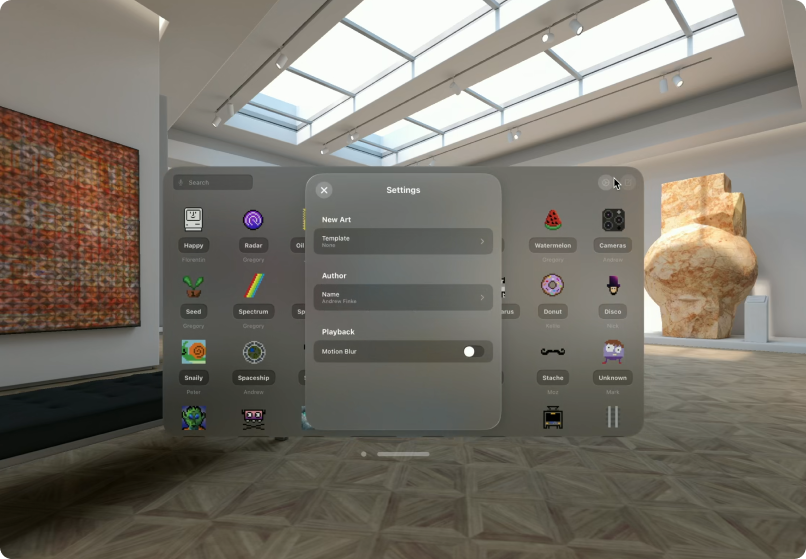
Sheets (settings) push the content and get placed on top while the previous content is still visible. Sheets will not get closed if you tap away.


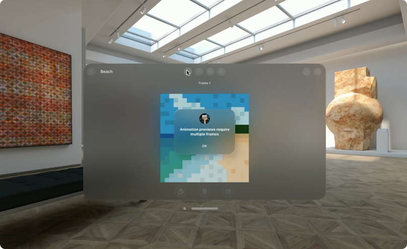
Alerts are displayed on top of existing content.


While popovers can move outside of the main screen.


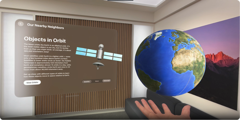
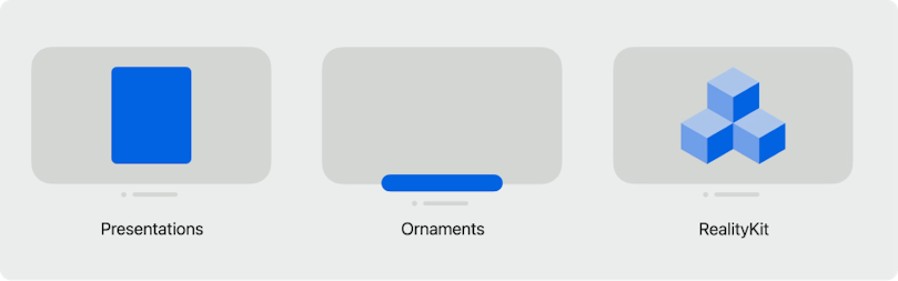
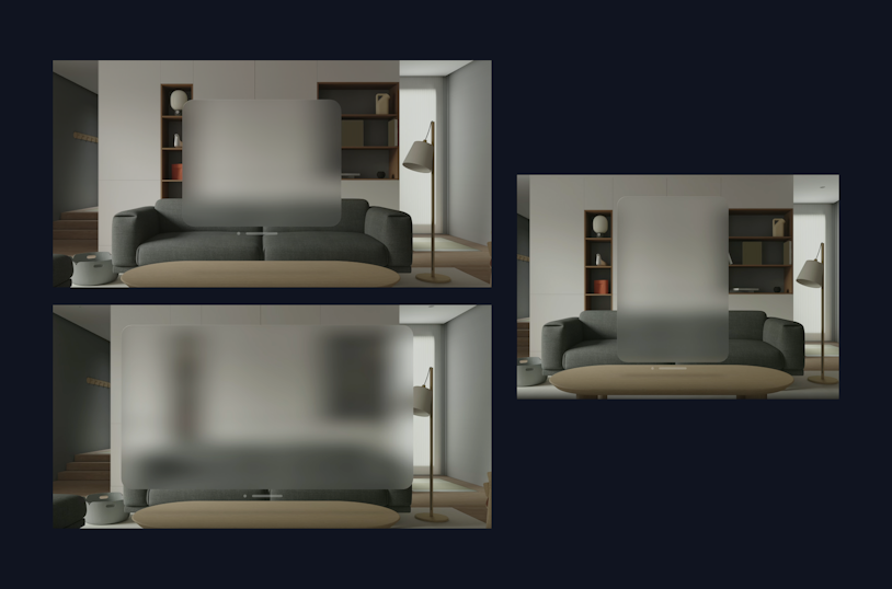
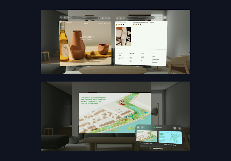
And, lastly, there are also ornaments. You can now place controllers or content outside of the app screen. They are lifted toward the user to add depth (see the example below).


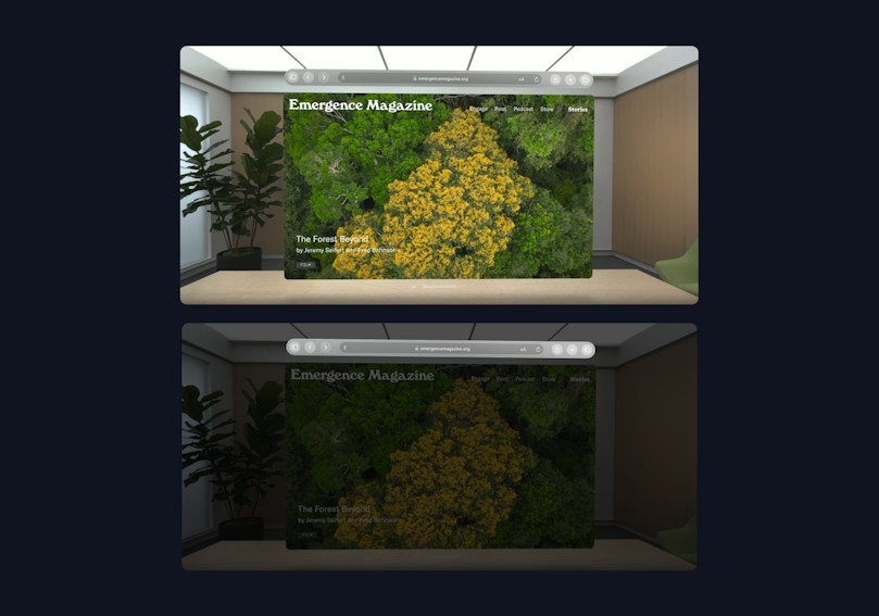
Note the tab bar on the left of the main screen.
Another example you might notice is the Safari navigation bar. Notice how the bar seems closer than the rest of the content.


Inputs and Interactions
The interaction system is brand new. The first thing you'll notice is that the system tracks the eye movements now. Looking at an element, pinching, and releasing your finger is equal to a clicking or tapping gesture. While looking, pinching, moving, and releasing your finger is equivalent to a pan gesture.


if you’re close enough to the app (spatially), you can reach out and touch it to interact. On top of that, you can also use the trackpad.
Voiceover and switch control are also available. There’s a maximum of 2 simultaneous inputs on this platform. For example, for an app requiring 4 finger touch to do an action, you can use an equivalent of 2 touches on Vision OS.
Windows
Depending on their content, windows can have different sizes (not bound to your screen size). But ideally, they need to fit within people’s view.


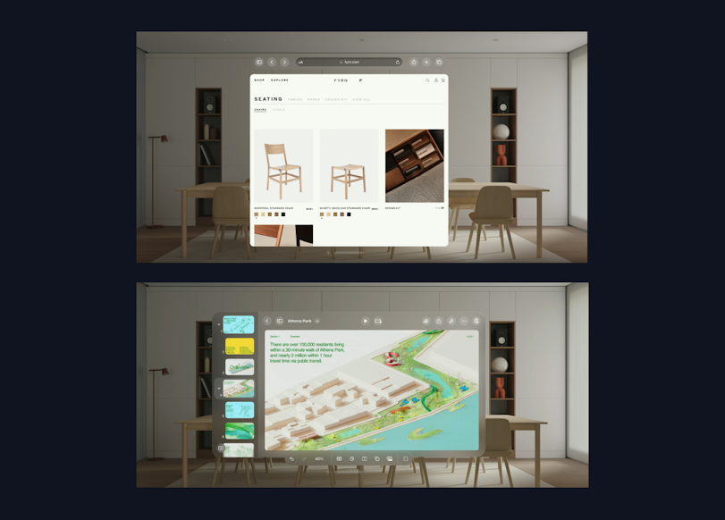
For example, Safari can seem taller so that more of the webpage is visible, while Keynote seems wide.


Apps can also have multiple windows. On top of that, depending on your physical distance from the windows, they can become bigger or smaller.


Depending on your physical distance to the windows, they can become bigger or smaller. To keep distances consistent, use pts in the UI (as opposed to pixels).
Types of Scenes
Since we've added a whole new dimension to the interface, it creates the potential for new ways of displaying information.
The first element of a scene is a window. It's used mainly for content that is 2D. They can be resized. Shown alongside other running apps.


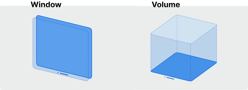
The volume is mainly for content that is 3D. Their size in all 3 dimensions is controlled by the app. The scene is shown alongside other running apps.
The real, physical depth is a new thing in the experience. It helps create hierarchy e.g. control is small (physically) but placed in front / nearby so it’s easier to interact with.
To increase immersion, objects cast shadows or emit light. That said, not everything needs depth. Texts in the UI should be flat.


Each scene can be set as
shared (alongside other scenes) or
immersive (full space).
Certain additional features like ARKit hand tracking (not the same as normal gesture tracking) are available in immersive space.
Immersion
There are three kinds of immersion settings:
Mixed immersion (surrounding is fully visible)
Progressive immersion (adjustable, with passthrough 180deg view)
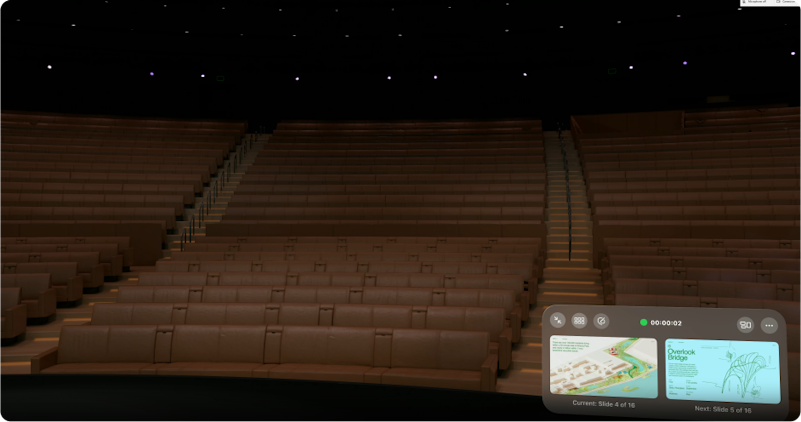
Full immersion (hide passthrough)
Full space within a virtual stage – an example of full immersion.


Ergonomics
By default, windows are placed in a natural line of sight to encourage a healthy posture.


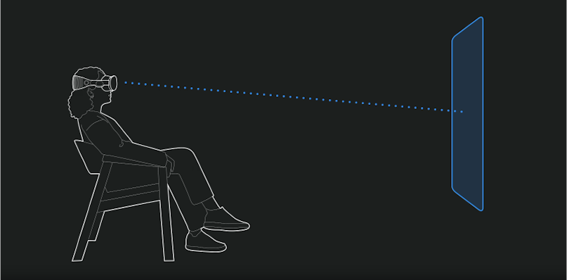
Content should be placed relative to the user’s head – the direction they’re looking in.


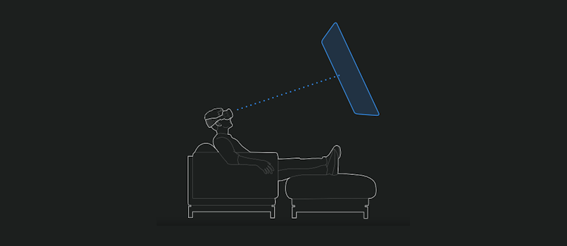
Most of the time content should be placed away from people, i.e. further than an arm’s reach (Unless it’s part of an immersive experience)

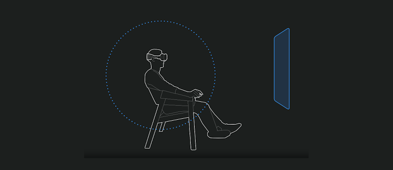
However, you should avoid anchoring content to people’s view (i.e. making it sticky), since it creates a feeling of being stuck. Content should be anchored to the environment and people’s space
Simulator
When creating apps, you can simulate their behavior in the provided simulator. The simulator is now included in the new Xcode (Apple’s development environment)

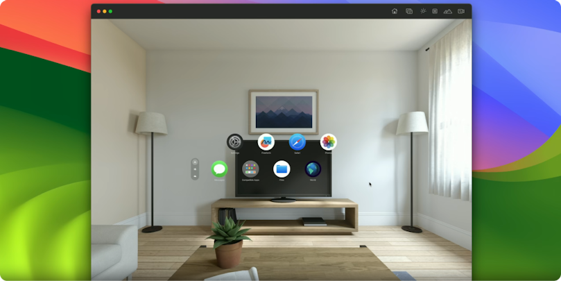
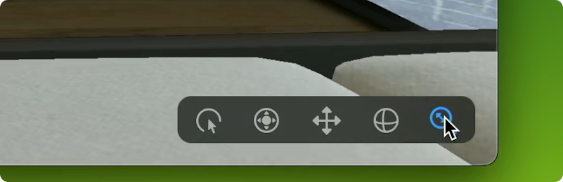
Other than interacting with apps, you can look around, pan, orbit, and move.


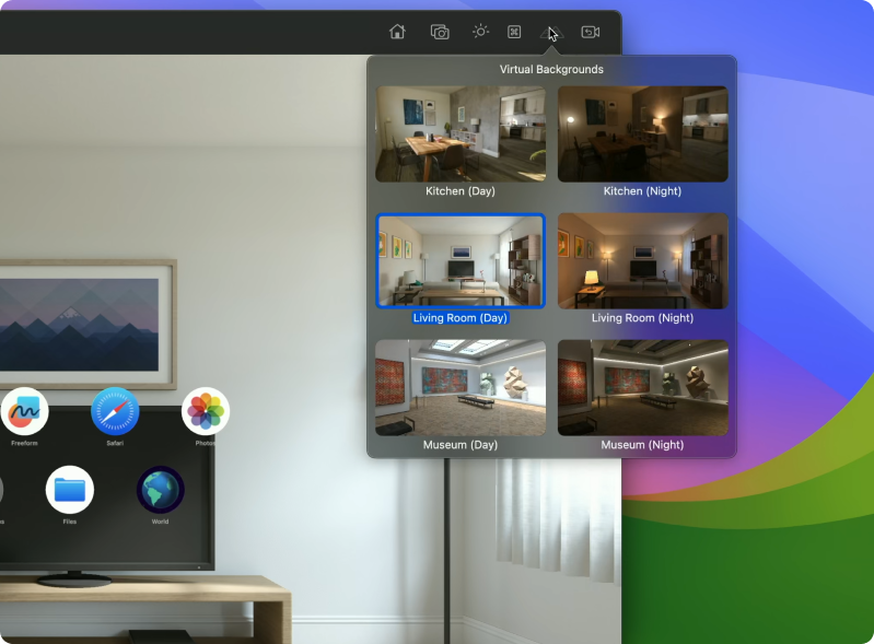
Mixing apps and reality also means being mindful of different surrounding and lighting conditions. And it’s possible to change the background scene to simulate that.


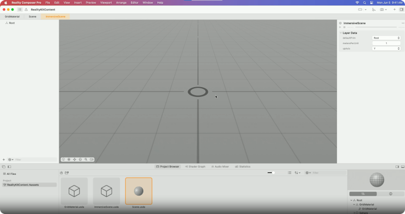
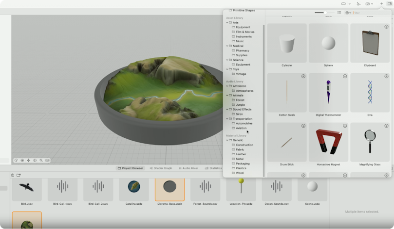
Reality Composer Pro
Another new tool is Reality Composer Pro. While Xcode is mainly for code, the Reality Composer allows editing and previewing of scenes and their 3D content.


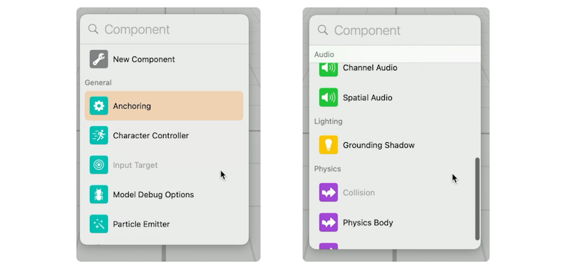
You can add different components using the graphical interface:


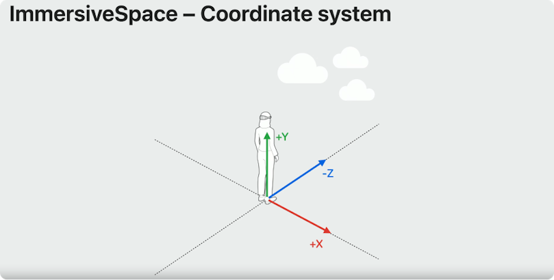
Contrary to 3D apps, the coordinate system here is centered on users. The app can request additional information, like the exact position of your hands while running in full immersion.


You can import your own content, and also use existing/provided content. Some basic knowledge of 3D programs (Blender, C4D) or 3D engines (Unity, Unreal) should help. Adding and placing objects is very intuitive.


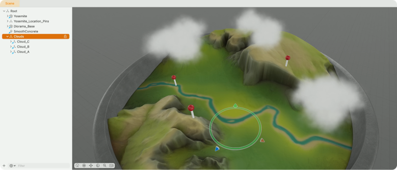
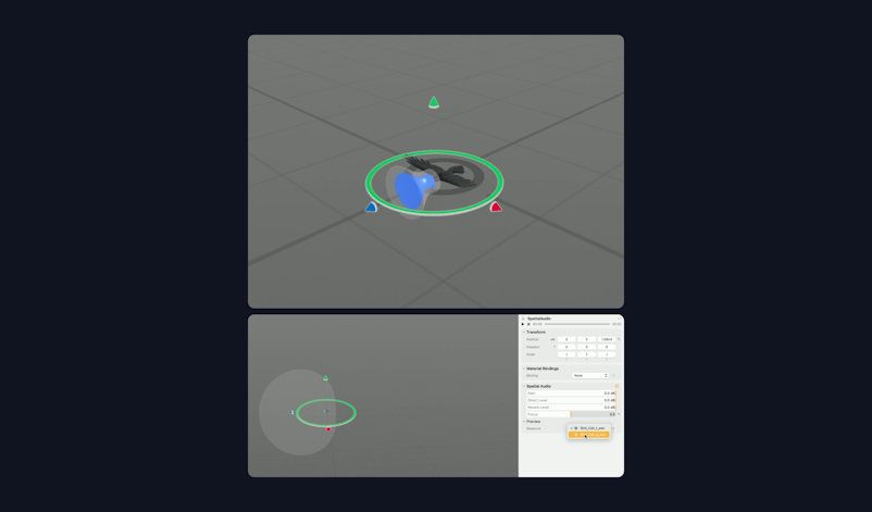
Scenes can also act as reusable objects (like components). You can create a scene for one object, e.g. create a cloud and reuse that across your scene. The cloud scene is used 3 times across the main scene.


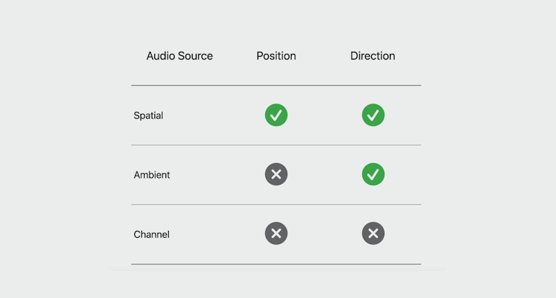
Aside from creating 3D assets, Reality Composer Pro also allows manipulating sound. Here’s an overview of different formats and their properties.


View of composing a spatial audio (bird sound) and the bird object.


Key Moments in App Building
A key moment in an app is a specific point of interaction or engagement that stands out from the rest. An "aha moment" of sorts. It's a moment that can only be experienced spatially, and it's often the highlight of the user's experience.
For instance, in a photo viewing app, the key moment could be the viewing of a single photo in full space. This moment of full immersion allows the user to appreciate the photo in its entirety, without any distractions or limitations.


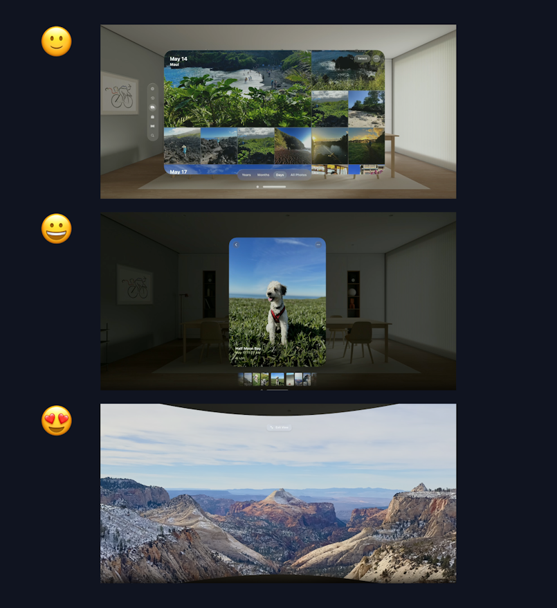
Similarly, in an app that features panoramic views, the key moment could be the viewing of a panorama in full immersion. This moment allows the user to experience the panorama as if they were actually there, enhancing their sense of presence and engagement.
Tips for Enhancing Immersion
There are several ways to enhance the immersive experience in your app. One effective strategy is to guide people's focus through smooth transitions. For example, you can create continuity in the experience by smoothly transitioning between dimming and animation. This can help to guide the user's attention and keep them engaged with the content.
Another tip is to use subtle motion to bring scenes to life. Subtle motion can add a sense of realism and dynamism to your scenes, making them feel more engaging and immersive.
Sound is another powerful tool for enhancing immersion. You can create an atmosphere with sound, especially with spatial audio. Spatial audio refers to sound that changes based on the user's position and orientation, creating a more realistic and immersive audio experience.
Conclusion
Even though the Vision OS headset is yet to enter the mainstream consumer market, Apple released enough documentation for designers to go through. We hope that our guide has been useful in helping you digest this information.