Intro
Any time there’s a major change in our lives we like to do a make-over. A new haircut, a gym membership, a wardrobe update. Apps are no different. Every once in a while the time is ripe for a refresh. Unlike a new haircut though, redesigning an app is easier said than done. It takes a ton of planning, time, and money. This means that such a costly endeavor should only be undertaken when there’s an actual need for it. It’s precisely what this article covers: when should you start thinking about a redesign. Let’s dive right in.
Get an express UX Audit. Done in 24 hours.
Submit designs. Get a review the next day. It's that simple.
Try now1. Outdated design
Take a look at the picture below. That’s how Gmail looked in 2004. Would you consider using a tool that looks like it was designed in 2004? If your answer is “probably not” then you’re among the majority of app users.

Although we designers find ugly designs just painful to look at, most people would simply associate bad design with bad service. It’s a phenomenon known as the halo effect (or horn effect).
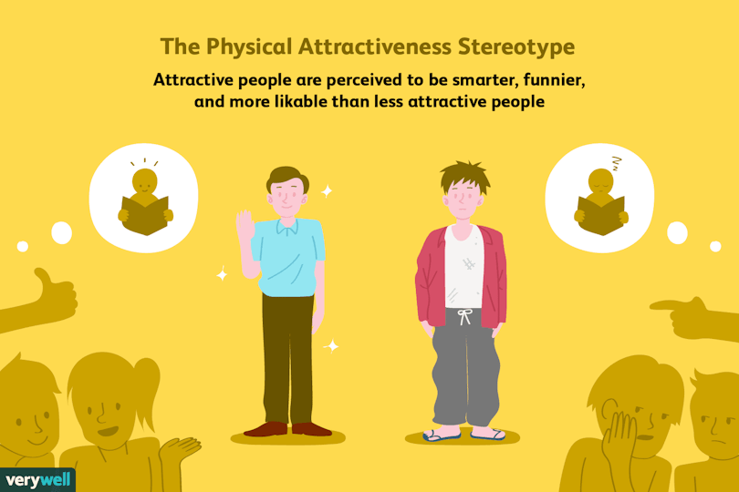
The biases we apply to people are as applicable to digital products | Source
2. Your metrics suck
If your app’s user interface design seems to be at least alright, then we have to dig deeper. Make sure to install a suite of analytics applications, such as google analytics, mixpanel, or firebase. The insights that these tools gather can give you a comprehensive overview of how your users behave.

Here’s a shortlist of UX metrics that can indicate a need for a redesign:
Retention
User Retention is an indicator of how many people keep using your app over some period of time. It’s calculated with the following formula:
(number of users in a given cohort who currently use the app / the number of users in the cohort on day 0)*100%.

Before jumping to conclusions about having a low retention rate, google what are the industry benchmarks for your particular case. If your retention is low, then consider tweaking your app’s design with stickiness principles in mind. Stickiness is what makes people want to come back to your app, again and again, i.e. a prerequisite for great user retention.
Adoption
Adoption is a metric that tells you what percentage of users end up using your product after trying it for the first time. Bad adoption can have numerous reasons that stem from the product-market fit, technical issues, or other non-design-related issues.
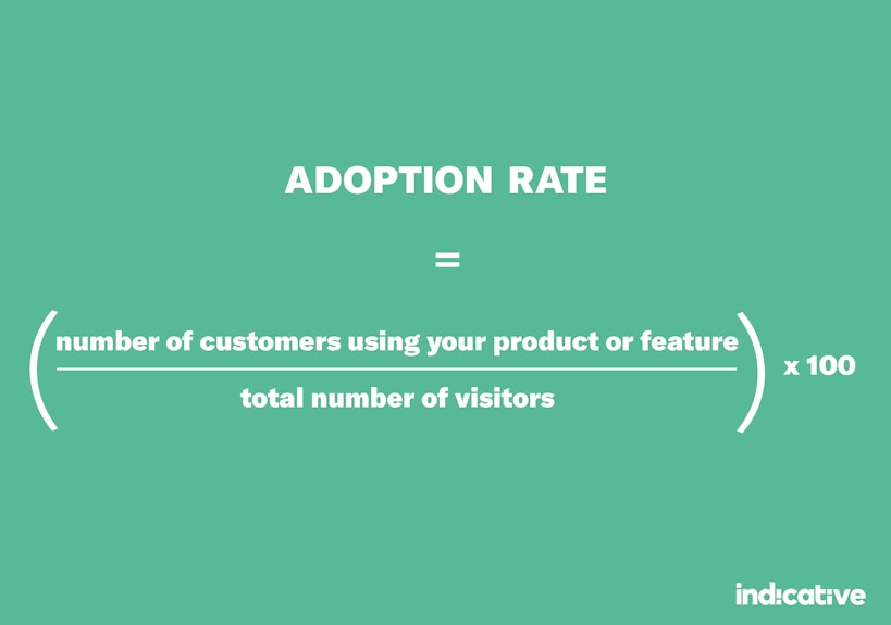
However, in our experience, poor UX is the most common reason users quit using apps. If your adoption rate is low, and you’re not sure what to do with that, consider getting help from a UX expert.
Conversions
If, for instance, users don’t end up buying a premium version of your app, it’s probably due to poor UX. Calculating this metric is pretty simple: divide the number of premium users in a cohort by the number of all non-premium users. If taking a closer look into the user journey doesn’t help, you might want to start thinking about redesigning the flow.
Other Metrics
Please note that this list is by all means not exhaustive. Depending on your product and industry the key metrics change.
3. Pivots
Nailing everything about your product on the first attempt is tough. Business climate changes, you constantly receive new data and uncover new product opportunities. Being responsive to these internal and external changes is what pivoting is. Depending on how drastic these changes are, pivoting also entails redesigning a fair amount, if not all, of your app.
4. Rebranding
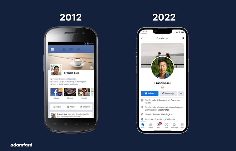
If rebranding is the only thing you’re after then you’d mostly have to deal with updating the user interface and microcopy. Rebranding generally does not involve any structural changes in user flows, so it’s probably the least daunting redesign out of the ones we’ve discussed so far.
5. Major changes in user flow and UX
Judging by our own experience, there are two most common scenarios when you’d need major structural changes in the user flow. It’s either a new feature that reimagines the older ones, or the app had initially been designed by non-designers, who then realized that they actually needed a designer from day one. Alas, such scenarios take a lot of time and effort. Rethinking the app’s core flows is basically getting back to the drawing board. Help from a UX designer is extremely advisable.
6. User Feedback
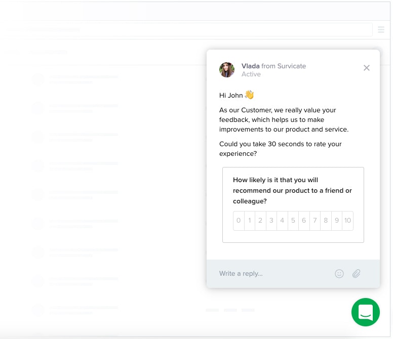
This one is pretty straightforward. Getting consistent feedback about your app being hard to use is a good indicator to start rethinking the UX. Consider sprinkling feedback and customer satisfaction forms throughout the user journey, organizing user interviews, and other qualitative and quantitative user research activities.
7. As a differentiator from the competition
Your UX and UI might be alright. However, if your competitor nailed both the visuals and their app’s flow, your design could be bleak in comparison. If that is the case, make sure to consider doing a product revamp to lead in every aspect. Remember that when doing research a lead will be more likely to remember a better-designed product.
8. You designed your app without proper UX process
Ah, If only every time we heard a story about developing a product without a designer we had a dollar. We’d be plenty richer, that’s for sure. In all seriousness, please don’t shoot yourself in the foot and get a designer on board asap. Because if not, you destine yourself to re-do months upon months of hard work because you thought that common sense would be enough.
We've dedicated a whole page to highlighting what a good UX process looks like. Check it out if you're interested.
Bottom Line
You’ve made it this far, we appreciate that! We hope these eight reasons to start thinking about a redesign have given you food for thought. While redesigning is certainly a daunting task, we hope that these cues and pieces of advice will make your job a tad easier.
FAQ
How much does it cost to redesign an app?
The answer depends on the app's complexity, and the degree to which you're changing things. The cost could range from a couple thousand to millions.
How to redesign an app's UX?
You document everything that the current app doesn't do right. You brainstorm on potential improvements. You test and implement the best ideas. Then you reiterate 😄

