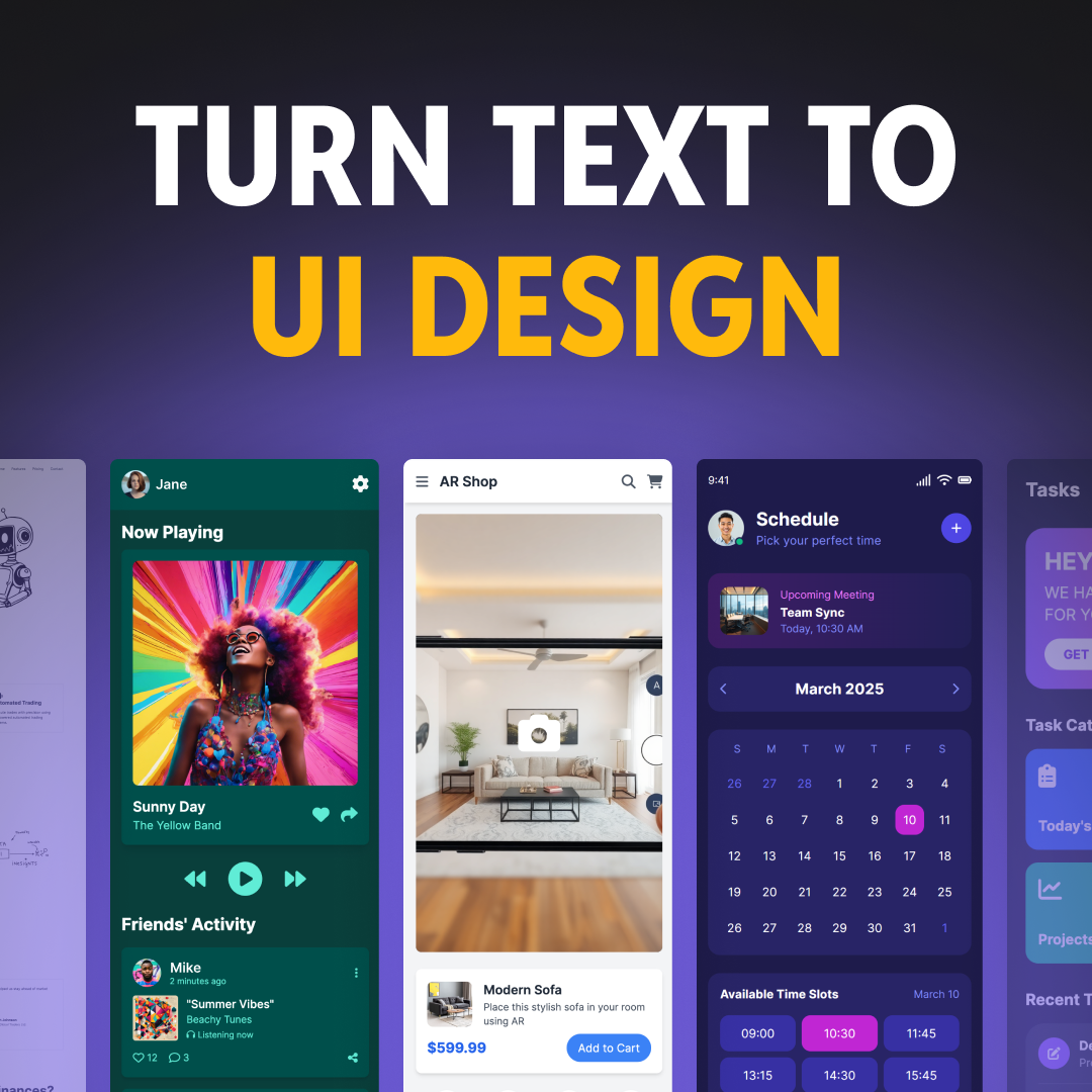
App design no longer requires expensive, complicated, and advanced programs. Now, you have myriad tools, patterns, and best practices to choose from that can help you whip up an app concept in no time.
In the digital era, apps are ubiquitous. There’s an app for nearly everything these days. The most well-designed ones, however, stand out in the sea of millions.
An app’s architecture and usability are all critical to user experience. But if its features and functionality are poor, it won’t perform well. Simply put, the look and feel of your app aren’t the only things you need to consider. You also need to make sure that it meets your niche audience’s needs.
Here, we’ll show you how to plan and design an app from scratch.
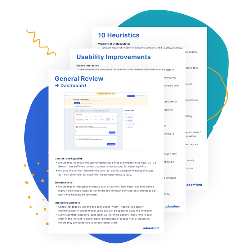
Get an express UX Audit. Done in 24 hours.
Submit designs. Get a review the next day. It's that simple.
Try nowWhy Design Your Own App
DIY mobile app design is a low-cost way for small businesses and startups to showcase early concepts to investors, designers, and developers. Using a design app can cost around $0 to $99 per month. The cost of hiring a professional design service can range from $50 to $150 per hour.
There is a growing number of self-made app designers because DIY planning, design, and conception platforms are now more powerful and user-friendly than ever. Anyone with basic knowledge of computers can design an app. You may not be able to create complex interactions or patterns for your product, but it will still contain all the fundamental elements that a business needs.
How to Design an App
Now that you know the advantages of designing your own app, you need to know how to do it. Here are a few pointers to remember before you get started.
Set realistic goals
Goal setting is important in design. Determine why you want to create an app and what you want to accomplish. Your app should aim to satisfy your audience’s goals, as well as those of your business.
Think of your potential users. How does your app benefit them? Determine a common pain point among your audience that your app can solve.
Next, identify areas of improvement in your business. Figure out how a mobile app can solve that problem. Then, determine the potential result. Will it improve productivity? Cut costs? Or increase brand awareness? Once you have clear, well-defined goals, planning the app gets easier.
Do your research
Whether it’s mobile or web app design, market research is an integral part of the process. It’s essential that you understand the mistakes of your competitors so you can avoid them. Research also lets you identify missed opportunities and gain new ideas that might help your app stand out from the rest.
Given that the app market is incredibly diverse, it also helps to know your app’s niche market. Research will uncover common problems among your target audience so you can then define how your app can solve them.
Data-driven design can lead to improved business outcomes. Use data effectively to determine if your goals are possible. You may pull insights from your own research or look into a third-party source. With data-driven design, you can avoid costly mistakes and more importantly, ensure the success of your app.
Write down ideas
Start brainstorming for app design ideas. You don’t need special tools to do this. All you need is pen and paper. Make sure to write down your ideas so you can revisit them later.
At this point, delve deeper into how you can turn your ideas into a reality. For instance, identify how your app is going to generate money. Do you want to run ads? Do you want to offer in-app purchases? Perhaps both?
Write down the app’s features and functionality on paper. Make two lists. Create one for the features that your app can’t do without. Make another for the less crucial features that can still add value to your app.
A few features you might want to consider include YouTube integration, e-commerce integration, social buttons, and push notifications.
Get inspired
Look for inspiration from existing apps or designs. Find elements that you like and incorporate them into your design. Add a personal touch to make the style your own.
You can find great inspiration in design-heavy platforms such as Behance, Dribble, and Pinterest. Discover designs you like. Do your best to recreate those elements for your app.
Sketch ideas on paper
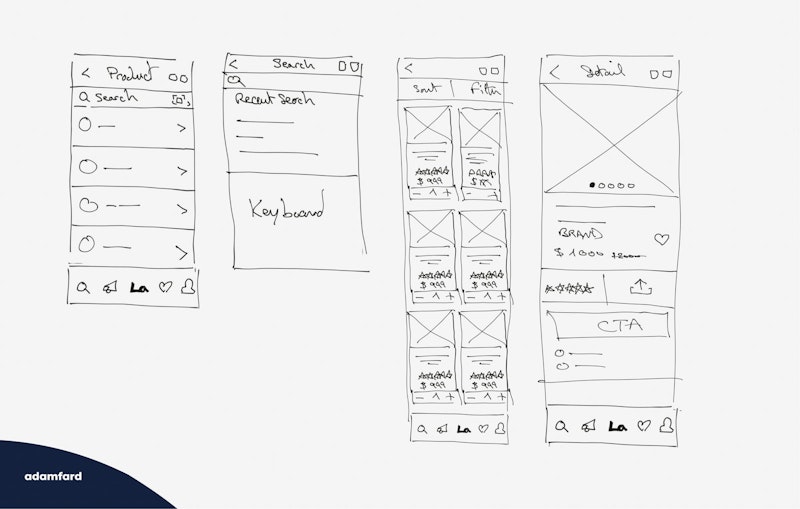
Once you’ve mapped out your app’s objectives and functionalities, sketch a rough mockup. It should show what your app looks like, without all the distracting details. It should include the layout, user interfaces, and flow. It excludes detailed UI elements or their exact positions, as well as complex color schemes and effects.
App Design Tools for Non-designers
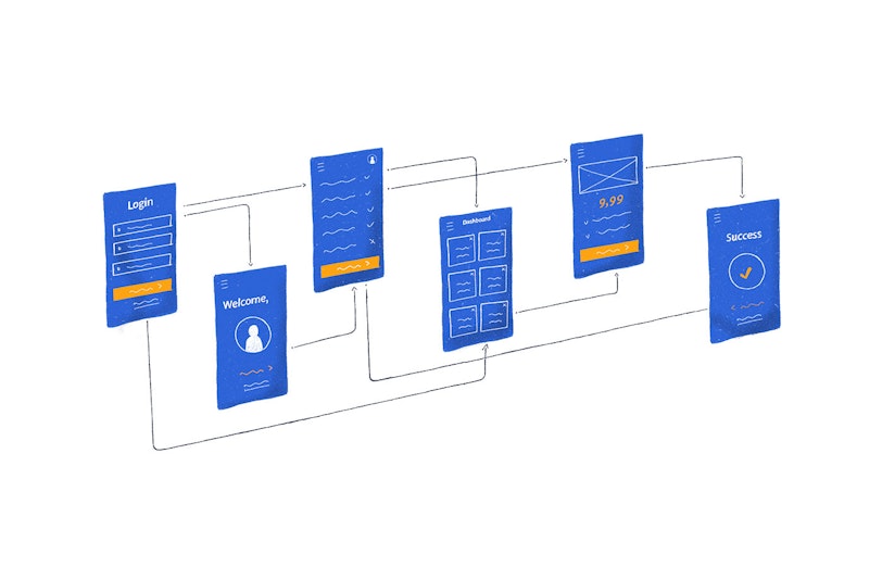
There’s a wide range of design tools that can help you get the job done. Even if you don’t know how to design your own app, these easy-to-use tools make it possible for you to do so in no time.
Figma
Figma is a powerful web-based design tool. It offers unique features that can unleash your creative prowess. It makes it easier for you to breathe life into your ideas with animated prototypes and collaborate with other people in real time. This makes it the first and only tool to deliver multiplayer functionality.
It allows screen design, prototypes, real-time device mirroring, and other common features. But it outshines the rest in terms of design systems and adaptive layouts.
One of the best things about Figma is that it’s compatible with Mac, Windows, Linux, and Chrome systems. It works on nearly every operating system that can run the latest browsers.
Adobe Experience Design (XD)
Another powerful design app is Adobe XD. If you’re familiar with the Adobe ecosystem, you might find this easier to operate and you won’t have to worry about a steep learning curve.
Adobe XD lets you design mobile apps, websites, games, voice interfaces, and more. It has advanced coediting features and allows teams to work on one document simultaneously in real time. It also lets you create elements that you can reuse in multiple designs and documents.
It is available on Mac and Windows.
Sketch
Sketch is one of the leading platforms for digital design. It lets you create, prototype, and collaborate. Its features might be similar to Adobe Photoshop and Illustrator, but they are geared toward UX and UI designers. Its Smart Layout lets you build responsive components that you can easily resize.
If you aren’t quite ready for the paid version, get the free 30-day trial. You can explore all its features, no credit card required. Sketch offers a $99 one-time payment for individuals. Teams can opt for a subscription plan that costs $9 per user monthly.
Sketch runs on macOS Mojave or newer iterations.
InVision Studio
One of the most comprehensive design collaboration suites on the market is InVision Studio. It is great for making prototypes, though it is exceptional for making transitions and animations. Its advanced features enable you to make a truly interactive design. It also promotes collaboration by allowing users to comment or draw on the project.
InVision Studio is a free macOS-only design tool.
How to Maintain Your Design Focus
How do you eliminate the inefficiencies in the design process? Which is a good app design practice? Listed below are important reminders that you need to focus on throughout the design process.
Focus on the problem, not the solution
Many people tend to gloss over problems and jump right into the solution. It’s time to unlearn that habit. Remember that solutions are meaningless if they don’t address the right problem.
Instead of focusing on solutions, identify and define the problem. Think about what you want to solve and remember why you need it solved. When you define the problem, you can start the ideation process on the right path.
Apple, for instance, identifies what users want to do. Then, they take a closer look at the obstacles in their way. That is the problem. Only once a problem is identified will they start to brainstorm for potential solutions.
Never assume. If you don’t identify the right problem, then the entire process is flawed from the beginning.
Identify possible solutions
Once you know the problem you need to solve, brainstorm potential solutions. Ideally, there should be a good mix of members to expand the idea space. Together, you can cover the entire problem from all imaginable angles, which should lead you to the most effective solutions.
When you brainstorm with your team, appoint someone to be the facilitator. Set a time limit for every session. It should range from 15 to 60 minutes. The harder the problem is, the longer the time.
Brief participants about the problem before every session. Once members make suggestions, refrain from criticism. Embrace all ideas — even the weird ones. Encourage everyone to blurt out their ideas, given that they stay on topic. For now, aim for quantity. Later on, the sifting process will ensure quality.
Build on the ideas of others. It should lead to new insights. Perhaps it might even trigger your own ideas. Moreover, use visual elements, such as post-its and diagrams, when you brainstorm. It might help everyone see the setup in a new light.
Test and iterate
Prioritize rapid prototyping so you can make better products. First, make your solutions into a mockup. Let your users review it once done. Then, use the feedback you’ve gained to refine it.
Take the guesswork out of your design. Rather than assume your consumers’ pain points or needs, use real data to make a prototype. If you focus on real people instead of personas, it will be way more effective. It will be much faster as well.
With valuable feedback, you can optimize the design before you launch the app. You won’t have to scramble to fix issues when it hits the market.
Make the app functional and then beautiful
Focus on your app’s functionality before you focus on its looks. As mentioned, visual aspects are important to customer experience. But functionality always comes first. Think about it: If you pay for a product to perform a function, you want it to actually work. If it doesn’t, then no matter how good it looks, you will most likely want your money back.
This doesn’t mean that form is unimportant. If your product doesn’t look good, you’re less likely to select it over other options that offer the same functionality.
But in design, form follows function.
Avoid design libraries
Design libraries can make your life so much easier. They contain a set of stylistic guidelines such as typography, color schemes, and grids. The same goes for UI kits. They can make design a breeze, as they consist of components like icons, fonts, and other design files. While they do have benefits, they also have disadvantages.
One good reason to avoid design libraries is that they offer too much structure. Although convenient, the look and feel of the designs won’t always be aligned with your brand. On top of that, several other people turn to popular libraries. So, your app could look too much like that of another company.
If you want your app to stand out, it’s best to avoid design libraries and UI kits. You’re better off designing your own.
The Bottom Line

Modern app design tools no longer entail expensive programs or extensive design knowledge. They can give small businesses and startups a leg up, as they cost far less than hiring a professional design service.
No matter how user-friendly, however, tools are only as good as their users. Embracing good design practices is just as important. In any design endeavor, always set goals and do your research. Write down your ideas before they’re gone forever.
More importantly, if you want to make your app stand out, don’t simply rely on design libraries. A little inspiration can fuel your creativity and innovation.


