

A fast-paced life and a dwindling attention span are changing the ways we consume entertainment. After months of anticipation, Quibi was finally released to the public. Throughout its first week on the market, the new streaming platform has garnered a variety of reviews.
Quibi chose an innovative and somewhat daring approach—it's the first mobile-only streaming service. While this differentiation helps the app stand out among its competitors, it may end up being a hard way to pave.
In this article, we'll take a deep dive into the user experience of Quibi, along with its strengths and weaknesses.
What sets Quibi apart
The so-called “streaming wars” are a good reflection of the business environment surrounding streaming services. Every platform has to come with a fair share of innovation to outcompete its counterparts. It’s also safe to say that it’s tough to enter this market… unless you have something exciting to offer.
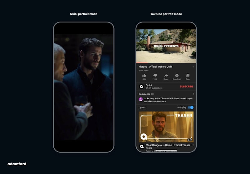
Content in Portrait mode — why?


The app's creators are trying to explore a more pragmatic approach to streaming content.
One of the things that make Quibi special is the ability to watch movies in both Portrait and Landscape mode. All the content on the platform is optimized to ensure a captivating experience while holding your phone vertically.


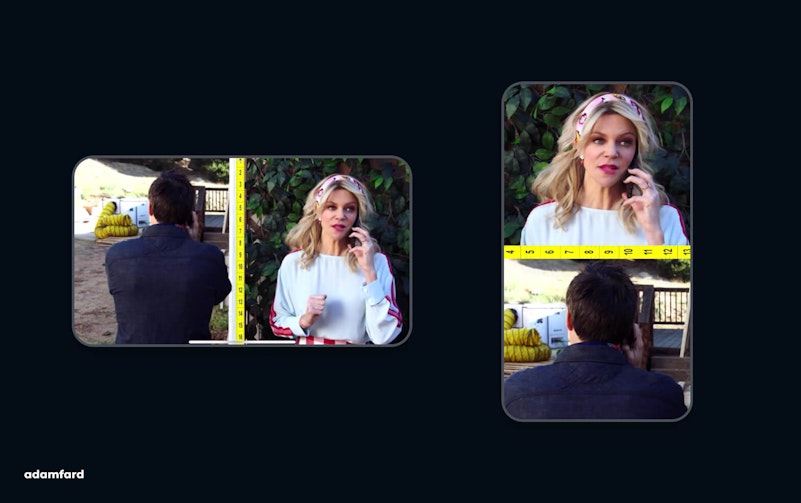
This approach makes a lot of sense since a large part of the world has already become mobile-first. Furthermore, research indicates that 82.5% of people that use their phones to watch video content do it in Portrait mode anyway.
So the native vertical format and the short length of videos answer a big pain point in video consumption. This solution addresses a significant problem from a user experience standpoint. When watching videos, users choose Landscape mode because it's the better way to watch a video, and not because that's how they want it.


Ten minutes or less
Since it's a mobile-only streaming platform, Quibi can't afford to put out long-form content. It focuses on bite-sized shows that are under 10 minutes in length. Even the app's name is a portmanteau of "quick" and "bites," which makes a clear allusion to the type of videos it offers.
Putting things into perspective
While the concept sounds great on paper, there is lots of space for improvement, especially in the realm of user experience. I experimented with the app for a while, and here are some of my UX-related findings:
The main screen
The app features quite a few interesting design decisions, especially when it comes to UI. At first glance, the main screen looks similar to the Apple App Store's Today tab.
It features large cards in a carousel scroll format. Like Netflix, Quibi plays a preview video, in case the user doesn't interact with a card for a second or two. This approach provides users with enough time to study each card for a while, but also de-risk the user's choice. As a result, users can make safer and more satisfying choices, which translates into higher engagement.
Yet, this approach might come with its own challenges once the number of shows increases. How will Quibi accommodate 400 shows in its interface? Navigating the library by simply swiping might be somewhat redundant and annoying.
While Quibi has a personalization algorithm in place, it’s only useful for existing users since their preferences can be predicted. The important question is whether the app will be able to make evidence-based suggestions to new or unregistered users once their library expands.
Player UI and navigation
While watching a show in Portrait mode, you'll see all the standard interface buttons, along with a vertical timeline. The latter is an interesting decision from a "real-estate" standpoint. The logic behind it is somewhat similar to a chat window: recent is at the bottom, old is at the top.
However, this logic is destroyed by the skip and play buttons, which point to the left and right rather than up and down.

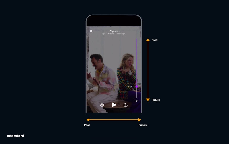
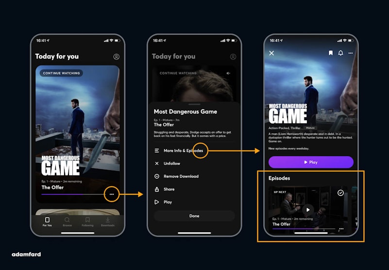
Furthermore, you can't just skip to the next or previous episode. To do that, you have to either scroll your timeline till the end of the episode, or exit watch mode and then pick an episode.

Watching experience
The watching experience in Portrait is a pleasant and seamless experience. After seeing four episodes of "Flipped," nothing seemed to be out of place. It didn't feel at all gimmicky or incomplete.
However, Quibi should consider providing its users with tips on how to use the service better. At first, it doesn't even seem like the user even has the option to watch shows in Landscape mode. I learned about it while reading reviews of the app, after having watched some episodes.
A somewhat confusing autoplay
Another slightly frustrating aspect of the app's user experience is the autoplay queue. After watching six episodes of "Most Dangerous Game," I was under the impression that the series was over.
The app fails to communicate how many episodes a show has and how many are still available. More importantly, it fails to tell you if you've reached the end of a season or that you've seen all the episodes of a show.

Plus, Quibi adds unfinished episodes to the end of your queue, which further complements this confusion. Not to mention that users can't see the queue list in watch mode. All these things combined cause a lot of unnecessary friction and frustration.
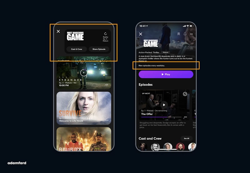
Quibi's release schedule indicates that they publish a new episode every weekday for most of their shows. A poor sense of navigation may stop users from coming back for more every day.
If the service indicated the total number of episodes, it would be able to trigger this pattern successfully. Also, a more visible message about their release schedule would motivate users to return for more the next day.
Update: Quibi indicates now the total number of episodes.


Screenshots
While testing the app, I decided to share some screenshots with my friends who work in the media and broadcasting industry. Here's what it looked like:

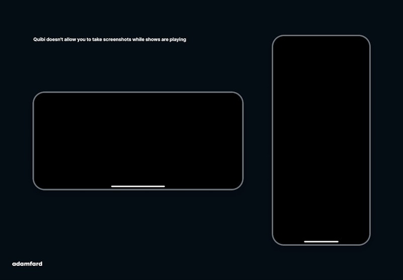
Quibi made a very odd decision to block the screenshot function. Chances are that this will end up being a disservice to the platform’s programming. A TechCrunch article written by Josh Constine sums this idea up very cleverly:
Screenshots of Quibi appear as a blank black screen. That means no memes. If people can't turn Quibi scenes into jokes they'll share elsewhere, its shows won't ever become fixtures of the cultural zeitgeist like Netflix's Tiger King has.
However, it's important to underline that you can still send links with a preview image or take screenshots before playing the movie. But that won’t make a sizable contribution to the memetic value of their content.
Timing
The timing of Quibi's release can be a double-edged sword. Considering that we're at the beginning of a long-term quarantine, people can find the service interesting. We all feel bored during social distancing, don’t we?
The problem, however, is that the app is designed for "regular" weekdays. The days you spend an hour of your day commuting to and from work.
Quibi's "long-form" counterparts like Hulu and Netflix might have a competitive edge during lockdown, due to the format of their content.
Conclusion
Quibi is a great idea. Like most innovators, they'll have to go through a long process of meticulous refinement. While the app's interface appears to have quite a few usability issues, Quibi is definitely on to a good start.
One of the biggest pushbacks the platform will have to deal with is how unusual their format is. To convert consumers to this idea, the app needs to ensure great usability.