Whether you’re a burgeoning UX specialist or an aspiring UI designer, the laws of Gestalt are a crucial tool that will help you understand the intricacies of user-centric design. They are critical when it comes to understanding how people perceive shapes and how you can leverage that to create better and more intuitive products and services.
This article is an exploration of one of the fundamental Gestalt laws—the law of Prägnanz. We’ll take a closer look at what this law is and, more importantly, why designers should care about it.
Let’s jump into it.
What is the law of Prägnanz?
The Law of Prägnanz (or Pragnanz) suggests that when people are presented with complex shapes or a set of ambiguous elements, their brains choose to interpret them in the easiest manner possible.

This law is also referred to as the law of “good figure.” A classic example of this law in action is how people perceive the Olympic logo. Actually, before we tell you about how people interpret it, what do you think of it? How would you describe it to someone?

If you said that it’s a set of five overlapping circles, most people would agree with you. Since interpreting it as a combination of connected lines would be unnecessarily taxing on our minds.
And suppose you think that it isn’t really “that” complicated to think of it as connected lines. In that case, it’s fair to assume that thinking of an object in its simplest possible form will help us recall things much quicker by demanding fewer cognitive resources.
What are Gestalt laws, and where do they come from?
Gestalt is a school of thought in psychology that looks at human behavior and the mind as an indivisible whole. We spend a substantial part of our lives trying to make sense of the world we live in, and Gestalt psychologists think that in doing so, we don’t just look at every detail of our environment separately—we see the world as a greater whole.
This school of thought originated in Austria and Germany in the early twentieth century, and it has played a central role in shaping the modern understanding of human sensation and perception.
In 1910, Max Wertheimer, an Austro-Hungarian psychologist, discovered the illusion of optical movement, also known as the “Phi phenomenon.” It eventually became the foundation of Gestalt psychology—the branch that would attempt to explain how our minds organize and interpret visual input.

Why should you bother about Gestalt laws?
You may be thinking, “Okay, but what does this have to do with anything?”. The truth is that these laws are at the foundation of visual design, which is an immutable part of UX design. Here are a few things that Gestalt can help you achieve:
Define the most effective design elements: By tapping into Gestalt, you can learn about the intricacies of human perception. As a result, this will help you find the most suitable and effective elements in your designs to make them intuitive;
Change how users behave: By applying Gestalt in the visual side of things, you’ll be able to help users navigate your product more effortlessly and improve their experience in doing so;
Satisfy user needs: The principles will help you design websites and apps that meet the users’ requirements, allowing you to create products that are beautiful, intuitive, and usable.
Applying the Law of Prägnanz in UX design
Now that we’ve swiftly gone over the theoretical side of Prägnanz, let’s take a quick look at how it can be applied practically in your designs.
1. Opt for simple shapes
As we mentioned previously, this Gestalt law suggests that people typically find it easier to remember and interpret shapes in a way that demands less cognitive effort.
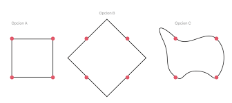
Fundamentally, it implies that people find it less demanding to identify and remember a square compared to an abstract figure. Here’s a quick example:
Which one of these shapes would you find easiest to remember? People will typically find A the less demanding shape to recall, which is why UX design leverages forms that are easy to digest and recollect.

2. Simplicity is the answer
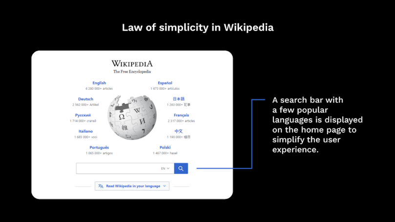
Given that our brains choose not to get overloaded with information, it’s essential to reflect this quality in design. Creating products with simplicity in mind will provide your users with an intuitive and fundamentally satisfying experience.

Above is an awesome little example from Wikipedia. Notice how you can switch between languages within the encyclopedia’s search bar. This very small but extremely useful touch of simplicity undoubtedly makes searching and browsing much more efficient and pleasing.
3. Prägnanz in wireframing
Prägnanz is a very useful law to keep in mind during wireframing. Given that our eyes assemble the blocks of elements into a single page, we should aim to make the shapes and forms accessible to the human brain that’s constantly trying to reduce cognitive load. Fundamentally, we should create designs that are easily perceivable at first glance.

Implementing this law should start early in the design process, preferably when sketching out low-fi wireframes. This stage should help ensure that everything that needs to be visible is visible before you add all the necessary “clutter.” During this phase, we can use Prägnanz to focus on design essentials such as clear navigation, calls to action, page titles, etc.
This law can also be applied from an information architecture perspective. Will the architecture make sense to your users? Will they be able to quickly grasp the categories and the structure of your product or service?
The bottom line
User experience design is a broad, multidisciplinary, and exciting field. It inherited much of its principles from a wide array of sciences like anthropology, HCI (Human-Computer Interaction), engineering, and many other fields.
Gestalt psychology, however, is one of the most intriguing contributors to user experience design. The principles and laws laid out by the people that first set the foundations of human perception are both fascinating and insightful.
While other Gestalt laws often overshadow Prägnanz, it remains one of the more valuable principles to be applied in modern design.
Meta: In this article, we explore the intricacies of Prägnanz, a fundamental Gestalt law, and how modern-day UX designers should use it to create better experiences for their users.


