If you’re keeping up with the world of UI / UX design at least a little, you would have heard that Figma launched FigJam – their new whiteboarding tool. As a team of designers, we couldn’t miss this release. We use tools like Miro and Whimsical on a daily basis, which, of course, implies having two more tools and extra expenses. Therefore, the prospect of moving to Figma not only for UI design but whiteboarding as well is certainly attractive.
Would FigJam be able to replace the other whiteboarding tools on the market? We asked this very question to our team of designers. Without further ado, let’s dive into what they had to say.
FigJam Pros
We’ve divided this article into pros and cons, so we can decide whether moving to this tool would be worthwhile. Let’s start with the pros.
1. Limited features
Having few features might not seem like a pro at the first glance. However, tools like Miro and Whimsical can take a lot of getting used to for first-time users. Therefore, simplicity is certainly a good thing when it comes to working with new clients.
Let’s see what our designers have to say.

– The whole interface is extremely simple yet powerful. All the critical features are there (great job with defining MVP scope)! The bottom panel with tools is extremely user-friendly. Because of the limited number of options to choose from (and hierarchy) it's so easy to find exactly what you need. All interactions work as expected (Miro seems to be a bit random/unexpected sometimes).

– For the most part, the design is nothing short of intuitive.
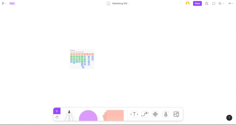
All of the essential tools are at the bottom panel.
Based on the designers’ comments, it seems that FigJam made life easier not only for clients but also for Figma users as well.
2. The aesthetics
While the visual aspect of FigJam isn’t the most important, we still had a couple of remarks.

– The dotted grid is so beautiful, so are the small interaction details. It is so fast, much faster than Miro.

– Dotted grid isn’t too imposing or attention-grabbing, just the right level of opacity to work with.
3. Personality
Allowing the users to channel their personality usually isn’t a make or break feature. However, things like these go a long way from good to great.

– Personalization - Love the stickers with avatars! Fun - FigJam is even more informal than Miro - with all the stickers and components it looks like it's a perfect tool to "break the ice" and make the workshops more fun and enjoyable.
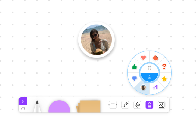
Here's how the avatar stamps look in-app.

– Quick reactions. In the online world, it could be quite hard sometimes to understand the emotion of your coworker. This is where the stamp tool comes in. The ability to share emotions seems quite fancy, however, this idea is not new to the digital world.
Here's how quick reactions work.

– Animated responses during button press on the canvas allow for a real-time overview of the approach, stance, or opinion one might hold, or to communicate the need to take action, say something, or direct attention.
4. Workshops
Internal purposes aside, workshops are the most important practical application of FigJam we will have. Therefore, it’s a really big deal whether it’s actually usable in the workshop environment.

– The arbitrary way of tagging information by using stickers, emotes, stamps is a great way to add different dimensions to feedback, voting, and other activities. Animated cursor responses can facilitate icebreakers - there is potential for use. Additionally, authorship indication for sticky notes is a great QoL feature for recall, summary, etc.
Here's how you can tag the sticky notes.
5. Performance
The last thing you want during a workshop is a slow loading speed and other technical hiccups. Miro, for example, definitely has a tendency to slow down the pace of a workshop due to technical issues.

– Unlike heavy Miro boards, this seems to be working smoothly.

– The system feels robust, more so than Miro, which is prone to hiccups when using VoIP, video calls, etc.
To summarize, it seems fair to conclude that FigJam does a good job of running smoothly.
6. Figma compatibility
Alongside with Sketch and Adobe products, Figma is among the most used design tools out there. We use Figma for the overwhelming majority of our design projects. Therefore, having whiteboards and design files work together is a big deal for us.

– I like how easy and simple you can copy/paste designs from Figma. It's much easier to arrange objects than in other apps.
Here's how you can paste images from Figma to FigJam.

– A consistent working environment might be around the corner! - Let's be honest, who likes exporting/writing up things after a workshop? Being able to simply copy/paste things from Figjam to a regular Figma file is a great advantage.

– The ability to transfer created documents to Figma design files simply by pressing Ctrl-C is a huge time saver.
7. Adaptive colors / Accessibility

– The available colors are limited. But they are slightly different depending on their context. The yellow used for the cards and for the text is the same in the picker but looks different when applied. The light yellow becomes darker to make the text readable, which is a good design choice since it enhances the contrast.
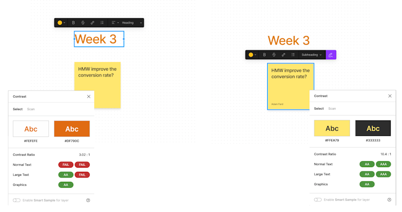
You can see the stats on the contrast here.
FigJam Cons
That we went through the pros we managed to identify, let’s go over the mishaps.
1. Navigation
The thing with workshop boards is that they get really big really fast. Take a look at a Miro board we use internally to keep track of our professional development.
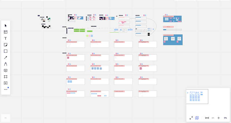
Here's an example of a Miro board we use internally.
Good thing there’s a map in the bottom right corner because otherwise, it’d be a lot harder to navigate around.
Does FigJam offer the same level of convenience? Unfortunately, it doesn’t.

– There is no way to quickly find your notes when zoomed out. Therefore, it takes effort to get around the board.

Lack of map when rescaling canvas, which isn’t optimal for larger, more detailed boards.
2. Cost

– You can have one Miro license and still share the board with other guests, so they can edit it.
However, similar to Figma, in order to use (edit) a FigJam board as a team (in a team project) you have to purchase one license per editor.
There is no “everyone with the link can edit it” option. This might become pricey especially when it comes to conducting workshops with clients or bigger groups.

Here's a screenshot from the Figma/FigJam pricing page.
3. Performance hiccups
Yes, we did mention how smooth FigJam worked, especially in the comparison with Miro. However, it isn’t perfect. Here are a few slight issues we’ve noticed.

There is a slight input lag for the hand tool after reactivating it with the spacebar (after the first release and pressing it again).
Load time is slower for the first canvas initialization in comparison to subsequent ones.
4. Confusing patterns

– The cursor chat feature is a little bit odd - Quite counterintuitive to use.

– The color selection for sticky notes isn't too intuitive (before laying them on the canvas);
The drawing tool has palette options after selection, while sticky notes do not;
Shape selector can be mistaken for color palette at first.
5. Missing QoL features

– It would be great to copy the link to the note/shape.

– There's currently no in-built timer. Many workshop activities require a time restriction, and using a third-party app isn't ideal.
Other notes

– Templates explanation: Templates are not entirely "static" which means that for each one you have additional examples and explanations on how it's supposed to be used.
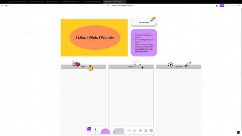

– Interesting fact: In FigJam, there are elements of skeuomorphism for tools. Designers gave a second chance to a trend that was popular on dribbble, however, it wasn’t quite so popular for real products.

The pencil tool seems to utilize the skeuomorphic design approach.

– It's great that you have the ability to report bugs and issues quickly. Hopefully, the FigJam team will be quick with the fixes. Additionally, I like that connector attached to the shape when moving it.
To conclude
FigJam made quite an entrance in the design world. We’re happy to say that the hype has the substance behind it. Even though the app isn’t perfect (yet), it surely is useable in its current form. Is FigJam ready to replace Miro or Whimsical? It depends. If you're a Figma user already, there are few reasons not to switch. If you use Sketch or Adobe products, you might want to test things for yourself first.

