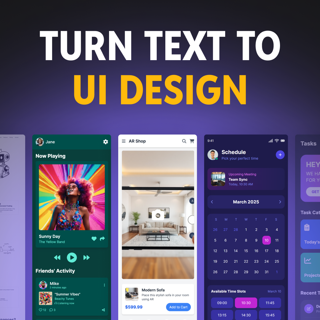


Examples of B2B SaaS Designs: Creating Effective User Experiences
Designing B2B SaaS applications requires a solid knowledge of user needs and business goals. You need to create interfaces that are both functional and user-friendly. Let's explore some key aspects of effective B2B SaaS design and look at real-world examples.
4 Core Principles for Designing Effective B2B SaaS UX
Core Principles for Designing Effective B2B SaaS UX
1. Know Your Users
Before getting to design, you must know your target audience. Ask yourself:
Who will use your B2B SaaS application daily?
What are their primary goals and pain points?
What information do they need quick access to?
By answering these questions, you'll create a SaaS product that truly meets user needs.
2. Keep Your Business Objectives in Mind
Your design should support your company's goals. Consider:
What's the main objective of your SaaS application?
How will you generate revenue?
What metrics will define success?
Keeping these factors in mind ensures your design drives business results.
3. Focus on User Experience
A great user experience (UX) is crucial for B2B SaaS success. Here are some key principles to follow:
Intuitive Navigation: Users should easily find what they need.
Clear Hierarchy: Organize information logically.
Consistent Design: Use familiar patterns across your application.
Responsive Layout: Ensure your design works on various devices
Key Takeaways for B2B SaaS Design
When creating your B2B SaaS application, remember:
Prioritize User Needs: Design with your specific users in mind.
Support Business Goals: Align your design with key objectives and metrics.
Keep It Simple: Avoid clutter and focus on core functionality.
Use Familiar Patterns: Don't reinvent the wheel – leverage established design conventions.
Provide Clear Onboarding: Help new users quickly understand your product.
By following these principles and drawing inspiration from successful examples, you'll be well on your way to creating an effective B2B SaaS design that delights users and drives business growth.
Top B2B SaaS Designs: Learning from the Best
Let's explore some standout B2B SaaS websites and uncover the design strategies that make them effective. These examples showcase how to balance user experience with visual appeal to create engaging and functional designs.
1. MailChimp: Setting the Standard for Marketing SaaS Design


MailChimp's website stands out with its minimalist yet vibrant approach:
Clean Design: The site uses a simple layout with bold colors to grab attention.
Clear Messaging: Their slogan changes regularly but always conveys a consistent message.
Focused Conversion: The homepage features two clear paths for visitors, with prominent sign-up CTAs.
Key Takeaways from MailChimp:
Inject personality into your messaging to stand out.
Use unique colors to differentiate your brand.
Create an intuitive navigation experience that encourages exploration.
2. BambooHR: Mastering Human Resources Software Design


BambooHR's website excels in several key areas:
Engaging Headers: The homepage features eye-catching headers that keep visitors scrolling.
Smart Navigation: A color-changing navigation bar stays visible as you explore the site.
Comprehensive Resources: They offer a variety of content, including guides, calculators, and podcasts.
Key Takeaways from BambooHR:
Use video to explain complex features and tell your brand story.
Create a clear "Why Us" section with an intuitive navigation.
Develop diverse resources to cater to different user preferences.
Showcase real customer stories in your case studies.
3. Dropbox: Mastering Simplicity in File Sharing Software


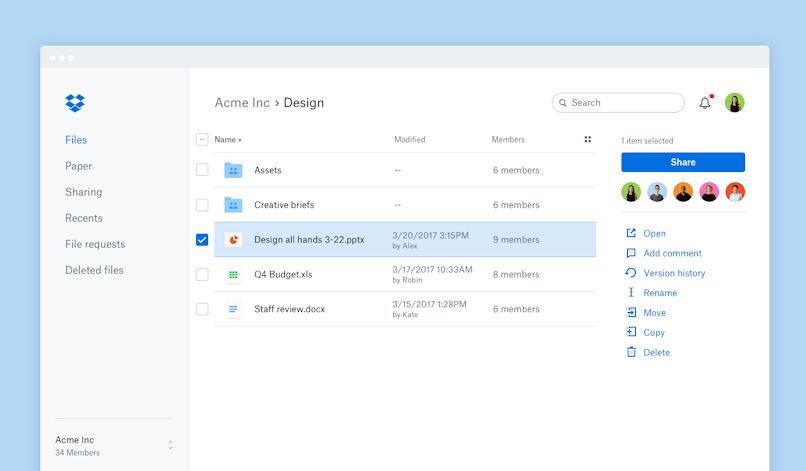
Dropbox's website is a prime example of minimalist design:
Simplicity First: The homepage features minimal clutter, allowing visitors to focus on core messaging.
Quick Action: With less information to process, users can make decisions faster.
Strategic Information Display: Every element on the homepage serves a purpose.
Key Takeaways from Dropbox:
Embrace simplicity in your design to highlight key features and actions.
Carefully choose what information to showcase on the homepage.
Make it simple and quick for your visitors to take action quickly.
4. Adyen: Streamlining B2B Payment Software Design


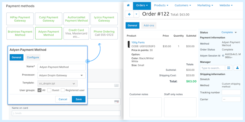
Adyen's website stands out for its focused approach:
Addressing Pain Points: The homepage immediately tackles the main challenge for B2B buyers - convenient payment collection.
Clean Design: A clutter-free layout helps visitors focus on key information.
Easy Navigation: Users can quickly find the information they need.
Key Takeaways from Adyen:
Address your users' main pain points right away on your homepage.
Keep your design clean to avoid overwhelming visitors.
Ensure your navigation is intuitive and straightforward.
5. Alteryx: Simplifying B2B Analytics Software Presentation

Alteryx's website excels in several key areas:
Clear Value Proposition: Visitors immediately understand that Alteryx offers self-service data analytics.
Targeted Messaging: The site speaks directly to businesses needing capabilities beyond standard tools like Excel.
Visual Explanation: Complex analytics concepts are conveyed through clear visuals and concise text.
Key Takeaways from Alteryx:
Communicate your core offering clearly and quickly on your homepage.
Identify and address your target audience's specific needs.
Use visuals to explain complex concepts or features.
6. Flow: Mastering Project Management SaaS Design


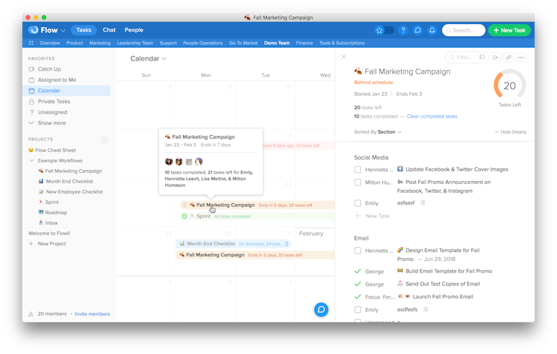
Flow's website stands out with its focused approach:
Differentiation: The homepage succinctly highlights what sets Flow apart from competitors.
Concise Messaging: Text is brief yet informative, avoiding information overload.
Clean Layout: A well-organized design helps visitors absorb key information easily.
Key Takeaways from Flow:
Clearly articulate your unique selling points on the homepage.
Keep your messaging concise and impactful.
Use a clean, organized layout to guide visitors through your content.
7. Lambda Test: Showcasing Browser Testing Services


Lambda Test's website stands out with its focused approach:
Descriptive Journey: The homepage guides visitors through the company's services as they scroll.
Visual Explanation: Complex testing concepts are presented with clear visuals and concise text.
Service Showcase: Key features and benefits are highlighted effectively.
Key Takeaways from Lambda Test:
Use scrolling to create a narrative about your services.
Explain technical concepts with a combination of visuals and brief text.
Highlight key features and benefits prominently on your homepage.
8. Evernote: Simplifying Note Organization Software


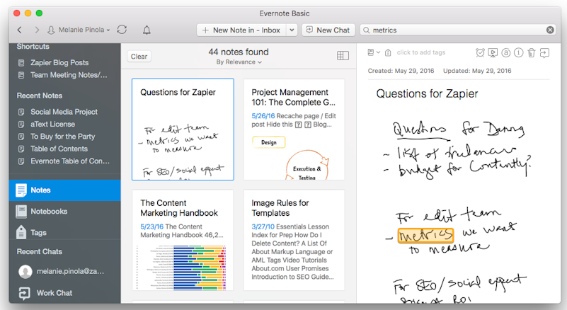
Evernote's website excels in several key areas:
Clear Purpose: Visitors immediately understand Evernote's function as a note-taking app.
Dynamic Design: The site balances simplicity with engaging visuals.
Direct User Guidance: The homepage clearly shows users where to go next.
Key Takeaways from Evernote:
Communicate your product's purpose clearly and quickly.
Use a clean, dynamic design to engage visitors without overwhelming them.
Provide clear pathways for users to take action or learn more.
9. Litmus: Sleek Design for Email Testing


Litmus impresses with its approach:
Sleek Design: The homepage is visually appealing and professionally crafted.
Conversion-Focused: The layout and content are optimized to convert leads effectively.
Clear Value Proposition: Visitors quickly understand Litmus's analytics and email testing offerings.
Key Takeaways from Litmus:
Invest in a polished, professional design that reflects your brand.
Optimize your homepage for conversions.
Clearly communicate your value proposition upfront.
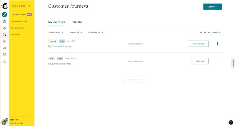
10. Retool: Integration Made Easy


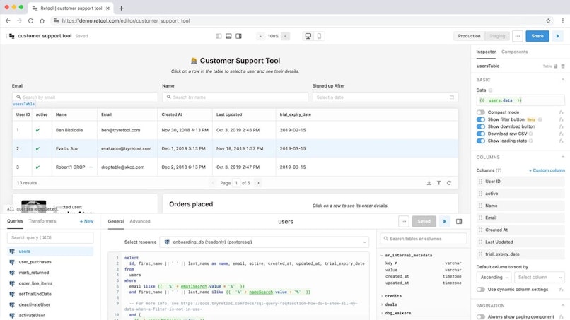
Retool's integrations page stands out for several reasons:
User-Friendly Layout: The page is designed for easy navigation, allowing users to quickly find desired integrations.
Comprehensive Search: A robust search function and clear categorization enhance user experience.
Visual Recognition: Integration partners are represented by their logos, aiding quick identification.
Streamlined User Flow: The page guides users effortlessly through the process of finding and implementing integrations.
Key Takeaways from Retool:
Prioritize a clean, intuitive layout for complex information.
Implement powerful search and categorization features to enhance usability.
Use visual elements like logos to make options instantly recognizable.
Design with the user journey in mind, ensuring a smooth flow from selection to implementation.
Key Features of Great B2B SaaS Website Designs
Now, let's take a look at some special features that make B2B SaaS websites stand out:
1. Interactive Content:
Engage users with interactive demos or product tours.
Use calculators or assessment tools to provide personalized insights.
2. Clear Conversion Paths:
Guide users towards key actions (sign up, request demo, start trial).
Use strategically placed, attention-grabbing call-to-action buttons.
3. Responsive Design:
Ensure your site works flawlessly on all devices and screen sizes.
4. Fast Loading Speed:
Optimize your site for quick loading to retain visitor interest.
5. Personalization:
Tailor content based on user behavior or industry.
Use smart forms to remember returning visitors.
6. Social Proof:
Showcase customer testimonials, case studies, and success stories.
Display logos of well-known clients or industry awards.
7. Educational Content:
Provide valuable resources like whitepapers, webinars, or blog posts.
Use this content to establish thought leadership and build trust.
8. Live Chat or Chatbots:
Offer immediate support and engagement for visitors.
9. Clear Pricing Information:
Be transparent about your pricing structure.
Consider offering a pricing calculator for complex products.
10. Security and Compliance Information:
Highlight your security measures and compliance certifications
Implementing These Features
When incorporating these features into your B2B SaaS website:
Prioritize User Experience: Every feature should enhance, not complicate, the user journey.
Test and Iterate: Continuously gather user feedback and analytics to refine your design.
Balance Aesthetics and Functionality: Ensure your site looks great but also performs well.
Focus on Your Unique Value: Tailor these features to highlight what sets your product apart.
Remember, a great B2B SaaS website design goes beyond aesthetics. It should effectively communicate your value proposition, guide users through the buying process, and provide the information and tools they need to make informed decisions. By implementing these features and learning from successful examples, you can create a website that not only looks impressive but also drives real business results.
Conclusion: Crafting Your Winning B2B SaaS Website Design
The world of B2B SaaS is constantly evolving, and your website needs to keep pace. As we've seen from these exemplary designs, the most effective B2B SaaS websites share some common traits:
They communicate value clearly and quickly
They prioritize user experience with intuitive navigation and clean design
They use visuals effectively to explain complex concepts
They provide interactive elements to engage visitors
They offer clear paths to conversion
Remember, your website is often the first point of contact between your potential customers and your product. It needs to not only look great but also effectively communicate your value proposition, guide users through your offerings, and encourage them to take the next step.
The key to success lies in understanding your audience, showcasing your unique strengths, and continuously optimizing based on user feedback and behavior. By applying the lessons from these top B2B SaaS designs, you can create a website that not only attracts visitors but converts them into loyal customers.
Ready to Transform Your B2B SaaS Website?
Is your current website falling short of these best practices? Are you struggling to effectively communicate your product's value and convert visitors into leads? Our UX Design Agency specializes in creating cutting-edge B2B SaaS websites that drive results.
Let our team of expert designers and AI specialists analyze your current website and provide actionable insights to improve your online presence. We'll help you create a B2B SaaS website that not only looks great but also delivers real business impact.
Don't let a subpar website hold your SaaS product back. Click the button above to get started on your journey to a more effective, conversion-driven B2B SaaS website today!
FAQ’s
1. What does B2B mean in UX design?

In UX design, B2B stands for business-to-business. It typically refers to companies that offer products and services aimed at other businesses rather than individual consumers. However, B2B UX should still prioritize the end user's needs and experiences.
2. How do B2B and B2C UI designs differ?
B2B design focuses on meeting the needs and requirements of other businesses or professionals, while B2C design is tailored towards individual consumers or end-users. The complexity and features of B2B designs often reflect the more specialized needs of businesses.
3. What defines a B2B SaaS website?
A B2B SaaS website represents business-to-business Software-as-a-Service. These sites showcase cloud-based software used by businesses for various tasks such as accounting, office productivity, customer relationship management (CRM), and other work-related activities.
4. What is a SaaS UI framework?
A SaaS UI framework refers to the specific design principles, processes, and strategies used in creating the user interface (UI) and user experience (UX) for Software-as-a-Service products. It guides the development of intuitive, efficient, and consistent interfaces for cloud-based software.
5. How can I enhance my SaaS customer experience?
To improve SaaS customer experience, focus on removing friction from the user journey to boost retention. Deliver personalized onboarding processes based on customer data. Make the customer journey interactive and engaging. Enhance customer support by implementing an in-app resource center. Continuously gather and act on user feedback to refine the experience.