If your goal is to optimize the user experience of your digital products, UX design reviews are a must. A UX review will help you spot product usability issues early on and fuel your creativity with fresh ideas. However, conducting a UX review can be time-consuming and requires a deep understanding of UX principles.
This is where UX Pilot can help. With UX Pilot design review, you can get actionable AI-based UX design reviews for a tiny fraction of the time and cost of conducting an expert review. Not only that, this AI-powered tool can also let you know where your audience is most likely to focus when viewing your content.
If you’re wondering how this tool works, read on. In this article, we’ll go over how to review your designs with UX Pilot and also show you how to identify key placement areas in your design with its predictive heatmap generator. But first, let’s explain what a UX design review is.
What Is a UX Design Review?
A UX design review (or UX review) involves evaluating a digital product from a user’s perspective to identify usability issues, improve user satisfaction, and enhance overall functionality. It typically includes assessing a product’s design, user interaction, and accessibility to ensure it meets user needs and expectations.
One way to conduct a UX review is to evaluate your design for compliance with established design principles, such as Nielsen’s 10 usability heuristics. Another method is to invite a UX expert to inspect the design for possible usability issues. While both approaches can effectively detect potential usability problems early in the design process, they can be time and resource-intensive.
To minimize cost and save time, you can conduct your design review with AI. Here’s how you can do it with UX Pilot AI in a few easy steps.
How To Do a UX Review With UX Pilot AI
1. From your UX Pilot dashboard, select UX Design Review.
2. Next, upload your designs to be reviewed by dragging and dropping the image or clicking the upload area to choose an image from your device.
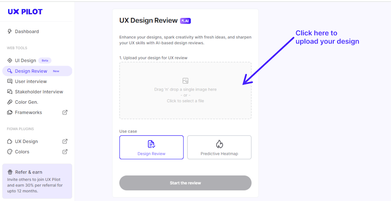
3. After uploading your design, you can guide the AI by outlining the scope and objectives of the review in the space provided.
4. Finally, click ‘Start the review’ and you’ll have a detailed review of your design in seconds.
UX Pilot Design Feedback Examples
To demonstrate how this website feedback tool works, we asked the AI to conduct a UX review on two popular platforms — Otter and Shopify.
Here’s a UX review of Otter’s homepage:
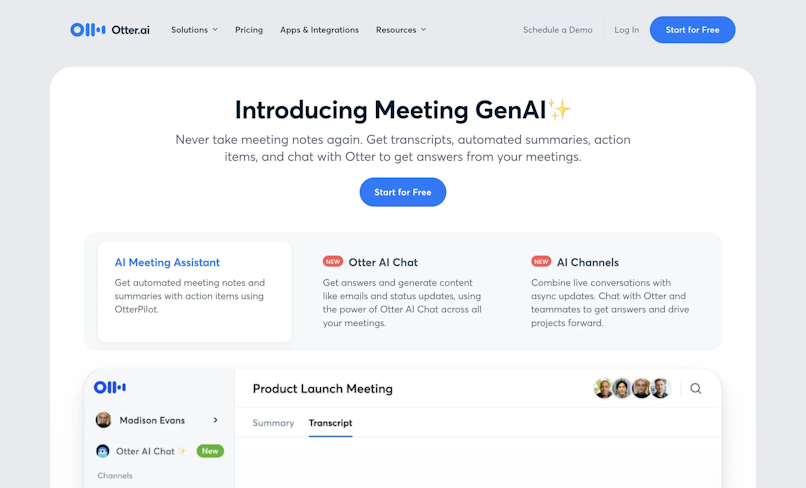
Screenshot of Otter.ai’s homepage
After uploading the design, we entered this text prompt to guide the AI:
“Review the design COPY based on these criteria:
Clarity: Confirm that the text is clear and easy to understand.
Conciseness: Ensure brevity, avoiding unnecessary words or jargon.
Tone and Voice: Check if the copy aligns with the brand’s tone and voice.
Engagement: Assess whether the copy is engaging and likely to keep the user's interest.
If you find any mistakes, please suggest improvements.”
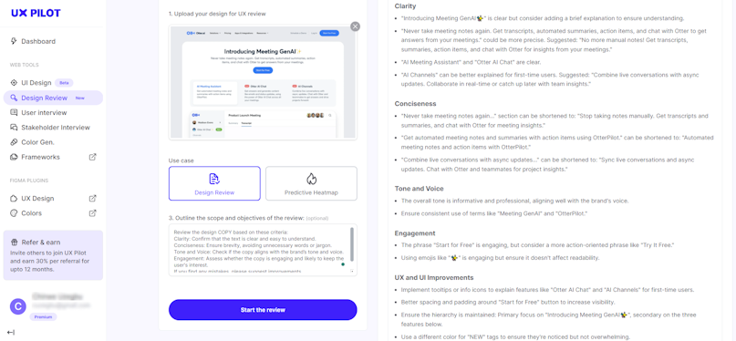
And voila! UX Pilot generated this impressive design review based on our request:
Clarity
"Introducing Meeting GenAI✨" is clear but consider adding a brief explanation to ensure understanding.
"Never take meeting notes again. Get transcripts, automated summaries, action items, and chat with Otter to get answers from your meetings." could be more precise. Suggested: "No more manual notes! Get transcripts, summaries, action items, and chat with Otter for insights from your meetings."
"AI Meeting Assistant" and "Otter AI Chat" are clear.
"AI Channels" can be better explained for first-time users. Suggested: "Combine live conversations with async updates. Collaborate in real-time or catch up later with team insights."
Conciseness
"Never take meeting notes again..." section can be shortened to: "Stop taking notes manually. Get transcripts and summaries, and chat with Otter for meeting insights."
"Get automated meeting notes and summaries with action items using OtterPilot." can be shortened to: "Automated meeting notes and action items with OtterPilot."
"Combine live conversations with async updates..." can be shortened to: "Sync live conversations and async updates. Chat with Otter and teammates for project insights."
Tone and Voice
The overall tone is informative and professional, aligning well with the brand's voice.
Ensure consistent use of terms like "Meeting GenAI" and "OtterPilot."
Engagement
The phrase "Start for Free" is engaging, but consider a more action-oriented phrase like "Try It Free."
Using emojis like "✨" is engaging but ensure it doesn't affect readability.
UX and UI Improvements
Implement tooltips or info icons to explain features like "Otter AI Chat" and "AI Channels" for first-time users.
Better spacing and padding around "Start for Free" button to increase visibility.
Ensure the hierarchy is maintained: Primary focus on "Introducing Meeting GenAI✨", secondary on the three features below.
Use a different color for "NEW" tags to ensure they're noticed but not overwhelming.
Now, let’s see how the AI performed when asked to review Shopify’s homepage.
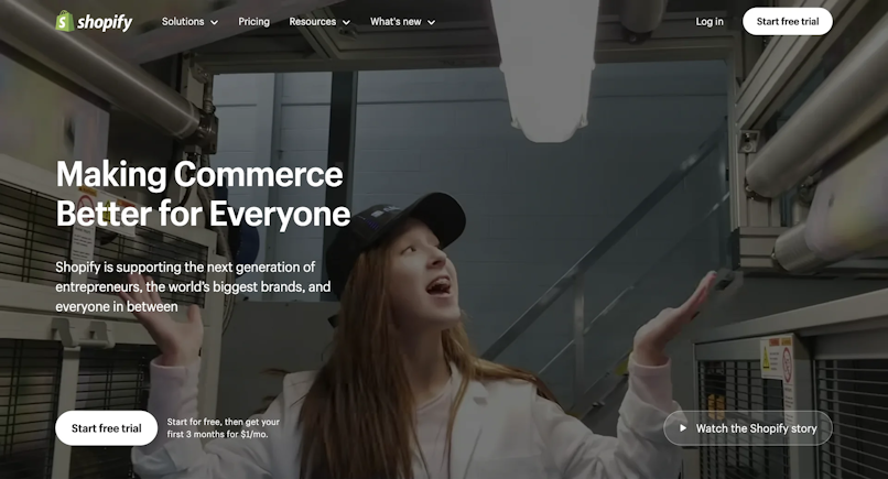
Screenshot of Shopify’s homepage
Text prompt:
“Review the design COPY based on the following criteria:
Call to Action (CTA): Evaluate the effectiveness and clarity of the CTA.
Proofreading: Check for grammatical errors, typos, or awkward phrasing.
Compliance: Verify that the copy meets legal and compliance standards if necessary (e.g., GDPR for EU users).
Accessibility: Check for any accessibility issues with the text colors. Is the color contrast ratio sufficient?
If you find any issues, please suggest improvements.”
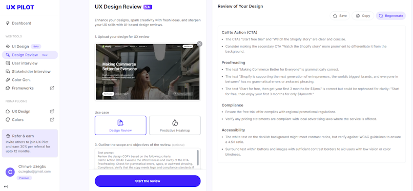
As requested, here is the design review along with recommendations:
Call to Action (CTA)
The CTAs "Start free trial" and "Watch the Shopify story" are clear and concise.
Consider making the secondary CTA "Watch the Shopify story" more prominent to differentiate it from the background.
Proofreading
The text "Making Commerce Better for Everyone" is grammatically correct.
The text "Shopify is supporting the next generation of entrepreneurs, the world’s biggest brands, and everyone in between" has no grammatical errors or awkward phrasing.
The text "Start for free, then get your first 3 months for $1/mo." is correct but could be rephrased for clarity: "Start for free, then enjoy your first 3 months for only $1/month."
Compliance
Ensure the free trial offer complies with regional promotional regulations.
Verify any pricing statements are compliant with local advertising laws where the service is offered.
Accessibility
The white text on the darkish background might meet contrast ratios, but verify against WCAG guidelines to ensure a 4.5:1 ratio.
Surround text within buttons and images with sufficient contrast borders to aid users with low vision or color blindness.
As you may have already noticed, the review addressed every point we highlighted and suggested improvements.
However, if you’re not satisfied with the review, you can ask the AI to generate another one by clicking ‘Regenerate’ at the top right of your screen.
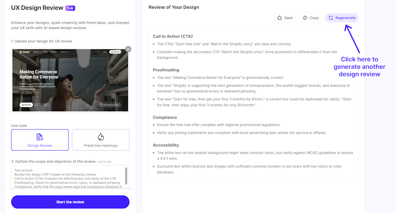
Once you’re happy with the design review and recommendations, you can save them for later by clicking ‘Save’ or copy them to your clipboard by clicking ‘Copy’ at the top right of the interface. Pretty impressive, right?
But that’s not where the wonders of UX Pilot end.
Another impressive feature of UX Pilot’s review tool is its Predictive Heatmap which shows where users are most likely to focus within your design, helping you decide where to place elements.
How to Identify Key Focus Points With UX Pilot
To identify the key focus points in your design, select Predictive Heatmap on the UX Design Review page. Next, upload your designs and click ‘Start the review’.
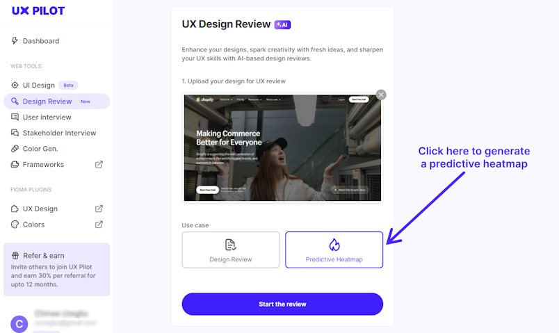
Example of a predictive heatmap generation using a screenshot of Shopify’s homepage
Here’s an example of an UX Pilot generated predictive heatmap:
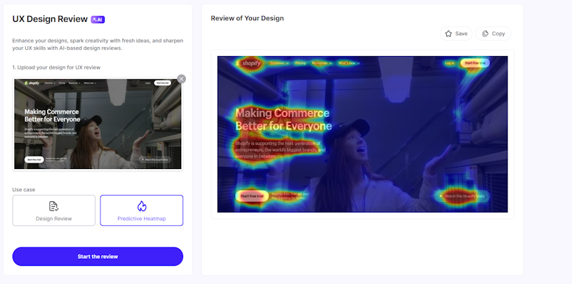
The red areas are the hotspots, where users are most likely to focus their attention, while the yellow and green areas are the regions with moderate attention. The blue areas, on the other hand, are the regions where users are least likely to pay attention.
Knowing this information can help you make informed decisions about element placement to enhance the user experience.
Now that we’ve shown you the features of the UX Pilot design review tool, let’s explore why you need a UX review by looking at the benefits.
Benefits of a UX Review
A UX review offers an array of benefits when it comes to enhancing the overall user experience of your digital product. It helps you gain insights that can boost your product’s value and help you reach your business goals. Now, let’s dive deeper into five ways a UX review can benefit your product.
Improved usability. One major benefit of conducting a UX review is that it helps to identify and address usability issues. This enables the early implementation of design changes that can improve a product’s usability, ultimately leading to better user satisfaction and engagement.
Enhanced accessibility. As we saw in our earlier example, a UX review can help identify accessibility issues, ensuring the product is usable by people with a wide range of abilities.
Informed decision making. A UX review provides insights that help you make informed design and development decisions. This ensures that the changes you make are based on user needs and behavior.
Competitive advantage. To stay ahead of the competition, your product must be intuitive and enjoyable. A UX review can help pinpoint and resolve any issues that could hinder the smooth functioning of your product.
Reduced software development cost. As a UX review can help you spot and fix usability issues early in the development process, it can eliminate the need for costly redesigns after product launch.
Bottom Line
A UX design review is crucial to the product development process. It offers immense benefits to users and helps you meet your business goals. While there are a few approaches to reviewing your designs, AI offers a revolutionary approach.
By using an AI-powered tool like UX Pilot, you can review your designs and get actionable recommendations without the significant financial and time commitments typically required for a review.
If you’re interested in harnessing the power of AI in your UX review process, sign up for a free UX Pilot account and give it a try!


