Good UX revolves around the idea of providing people with interactions that are seamless, enjoyable, and intuitive. To achieve this, a designer should focus on satisfying a user’s needs above everything else. However, UX is but a tool. A tool that could be used for good, or for evil. One such category of evil design is “dark patterns.”
The term “dark patterns” was initially coined by UK–based UX designer Harry Brignull back in 2010. He defined it as “a user interface that has been carefully crafted to trick users into doing things, such as buying insurance with their purchase or signing up for recurring bills.”
This article is a deep dive into dark patterns. Below, you’ll find real-life examples of such patterns from reputable brands and descriptions of the most known deceptive tricks businesses make to lure their users into unwanted behavior.
Let's jump right in.
How do dark patterns work?
There’s something that all UX professionals are well aware of—people don’t read all the text on a page. They tend to scan it.
When people skim over text, they rely on assumptions and visual cues to guide them through an interface. That isn’t bad behavior on the user’s side because they assume that the business that has created the product or service they’re using has their best interests in mind.
Unfortunately, this reality of user-interface interaction provides bad actors with an array of opportunities to deceive their users and take advantage of them.
The bottom line is that dark patterns aren't necessarily illegal. However, they are deceptive and manipulative.
A few real-world cases
Before we look into the theoretical side of dark patterns, let’s take a quick look at a few fun examples of high-profile businesses trying to mislead their users.
A famous example of a popular service getting in trouble for using dark patterns is LinkedIn. The company was sued back in 2013 for deceiving its users during the platform’s onboarding process.
The problem was that when users created a profile on their website, they were invited to import their contacts from their webmail accounts. Little did they know that LinkedIn was sending these contacts emails on the newly-registered person’s account. The company was sued for $13 million as compensation to its users. Yikes.
ZSL London Zoo
Okay, here’s another fairly unpleasant case. Take a careful look at the example below. ZSL London Zoo’s interface invites its users to add something to their baskets, but they can do so with or without adding a donation to their order.
You may have noticed that the green button, which also happens to point to the right (suggesting the continuation of the user journey), is the option that features an extra donation. Whereas the “without donation” button isn’t *just* colorless, it also points to the left, which could theoretically suggest to the user that they will be taken back in their journey. Needless to say, this is an awful example of manipulation.

Classic types of dark patterns
Wouldn’t it be awesome if the list of dark patterns stopped at the examples we’ve looked into above? Well, unfortunately, these patterns come in a whole spectrum of forms. Let’s examine them.
Disguised ads
Disguised ads are a classic example of a dark pattern. Basically, it’s an ad that is presented as useful content, designed to make users click on them to generate traffic.
A famous case of a website using disguised ads is Softpedia—a very popular platform that allows users to download free software. Naturally, a substantial part of the services income revolves around ads.
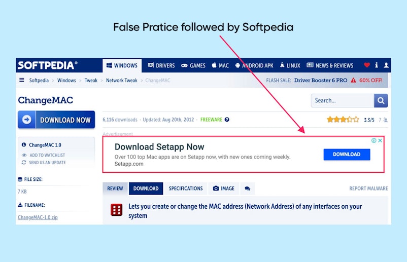
On Softpedia, you’ll often see download buttons that will take people to an advertisement page once clicked, instead of taking them where they intended to go.
If you've ever visited shady websites, we're sure you would have seen these.
Roach Motel
The roach motel design is another fairly widespread pattern that revolves around putting users into a situation that is hard to get out of. For instance, opting out of their mailing list. Websites that employ this technique will often create a seamless experience when it comes to joining the list, but undoing this action becomes more complicated by orders of magnitude.

Above is an example of the roach motel in the checkout process on the livenation.com website. When making a purchase on the entertainment company’s website, users will have to tick a box to NOT buy a Rolling Stone subscription. Yes, you have to do an extra action and read the fine print to not be sold something you don’t need. ¯\_(ツ)_/¯
Forced Continuity
This is an all-time favorite with subscription-based products and services. Typically, these companies offer their users a free trial to give their paid functionalities a test ride. To get the free trial, you have to provide your credit card number.
Once your trial is over, you’re charged. No reminder, no chance to opt-out, no straightforward way of canceling the upcoming charge. This is how forced continuity works.
A company that has received quite a bit of media coverage due to a forced continuity pattern is Affinion Group—an international loyalty program business.
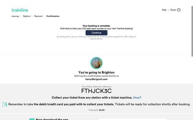
The company’s first step to put this entire operation into motion was partnering with a whole array of reputable e-commerce businesses like thetrainline.com. Now imagine being an unsuspecting user trying to purchase a ticket with The Train Line.
Once you’re done purchasing the ticket, you’ll be taken to a confirmation page. If you look carefully, the screen is separated into two. The top half is a disguised ad. The copy tells you that your booking is good to go, but you could also sign up for a free voucher worth 20 GBP. Free money!
Once you click the “Continue button,” you’ll be taken to a different website that is supposed to be issuing the voucher at hand. The problem is that once you provide your financial information, you’re automatically taken for the proverbial “ride” that costs you 15 GBP per month.
Needless to say, the company had to pay millions over millions of dollars in lawsuits.
Confirmshaming
While confirmshaming won’t necessarily take your money, it’s probably one of the most disrespectful patterns that show you how bad actors treat their users.
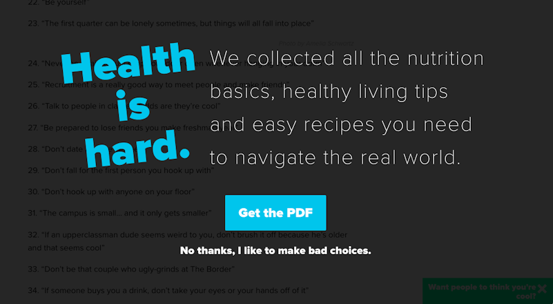
This pattern basically revolves around shaming the user into doing something. Typically, you’ll see a popup offering you something. You have the right to accept or decline the offer. However, the text behind the refusal will be worded in a way resembling this:
“No, thanks. I don’t want this because I hate myself.”
Here’s a real-world example—
Trick questions
This pattern typically revolves around making the user respond to a question or tick a box that is confusing by design. So users end up performing actions they never intended to do.

Here’s a great example of a trick question. Imagine you went to Curry’s website—they’re a major electrical supplier in the United Kingdom. As you move down the page, at the very bottom, you’ll see two boxes. The first one suggests you tick the box to opt out of their email list. The second one, on the contrary, will opt you into a third-party mailing list.
Bait and switch
The bait-and-switch pattern is a fairly widespread one. Basically, the logic behind it is to coerce users into doing something they never intended to do.
This pattern is pretty old and has been around before the internet. A common example of how the bait and switch would be put in action in its early days was a car dealership distributing fliers about some incredibly low prices on incredibly rare cars. This would entice people to come, but when they did, they were told that “all of those cars were sold out, but we have a lot of awesome automobiles we can show you instead."

This is an example of how Microsoft used the bait-and-switch pattern to make their users upgrade to Windows 10. Users would regularly get pop-ups that would recommend they upgrade to the new OS. However, at a certain point, clicking the X button would actually mean that the user agreed to the upgrade.
Hidden costs
The point of this pattern is to charge users previously undisclosed delivery charges, taxes, and so forth. Here’s an example of how ProFlowers, a US flower retailer, did it.
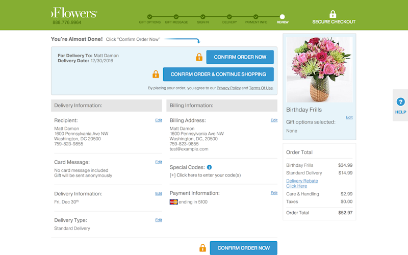
As a customer looking to checkout on their site, you’ll have to go through 6 screens. You invest a lot of effort into this process. You provide your credit card information, names, addresses, and so forth.
At no point do you encounter a $15 delivery fee—until you reach screen 5. Oh, and also a care and handling fee, that’s an extra $3.
Friend spam
This pattern is typically used by online platforms or social media sites. They ask for email or social media permissions, pretending that it’s in the user’s best interest—it may help them connect with their contacts, or whatnot.
However, what actually happens is the website collects your contacts and spams them with messages that are coming from your name. Sound familiar? The LinkedIn example we’ve mentioned at the beginning of the article is a typical example of friend spam.
Privacy zuckering
Yes, this pattern was coined after Mark Zuckerberg, the CEO of Facebook. Back in the earlier days of the social media giant, the website was notorious for making it difficult for its users to have real control over the type of information they wanted to share and coercing them into accepting questionable privacy policies.
Facebook’s strategy back in the day was to get into people’s contact lists. Users would unknowingly agree to share this information with the social media site, which would allow it to create a network of people they would target with push advertisements, providing content that matches interests, and so forth. While the intention isn’t necessarily evil, the way to get there is definitely dubious.
Misdirection
The misdirection pattern typically directs the user’s attention elsewhere from where it’s actually supposed to be to conceal some important information.

Jetstar’s booking process used at a certain point featured a classic example of misdirection. The Australian low-cost airline’s site works as you would expect it to. You select a flight, and you move forward with selecting luggage and other options. The curious thing is that Jetstar will preselect seats for you, which is a paid service.
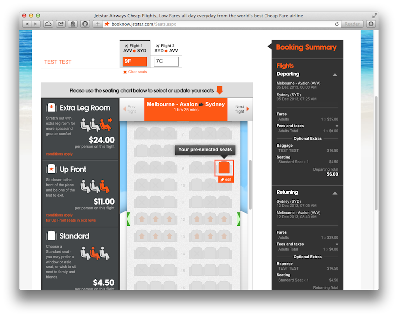
The user is not provided with the opportunity to opt in. The second problem is that due to their confusing journey, users often don’t even choose their seats after being charged for this privilege. So you’re basically scammed out of $4.50 per flight—for nothing.
How do we combat dark patterns?
Know thy foe
To combat dark patterns, you need to know what they are. Learning about them and understanding their mechanics is an essential part of the process—and we’d like to congratulate you for doing this by reading this article.
There’s plenty of awesome content on the internet that will allow you to keep in touch with the ways businesses go out of their way to deceive their user base. Definitely check out darkpattern.org and Tristan Harris’ Center for Humane Technology.
Many of you reading this may be thinking, “I’m not investing a few dozens of hours of my life in learning dark patterns," and that’s totally cool. But bear in mind that if businesses like Facebook are doing it, many others won’t shy away from it either. Being an informed person that demands that companies don’t create deceitful designs isn’t just a right. It’s pretty much a shared responsibility.
Use social media
Social media websites have a variety of hashtags like #darkpattern that help users call out dubious design practices. Simply checking out what these hashtags have to offer will definitely equip you to better understand how dark patterns work. Also, many of the examples you’ll see there are outright hilarious, so you can combine the benefits of learning with the joy of entertainment.
YouTube also has a huge collection of videos that explore real-life dark pattern examples.
Read “terms of service”
I know what you’re thinking—“I’d rather watch paint dry”—and we can’t hold that against you. But by blindly accepting a business’s terms of service, you may be agreeing to something that might undermine your privacy.
Start with the essential things. Maybe don’t read the T&C of every site you go to, but certainly, read your smartphone’s operating system terms. This is something all of your apps will be running on, so consider spending half an hour on doing so. Or look up a guide online that covers the most important parts.
Create awareness
Spread the word. It’s our duty as users to push back against unethical practices by informing the people around us of the things some businesses are opting for. Help other people become aware of the dark patterns so that they don’t get trapped.
There’s a whole array of digital advocacy groups where you can flag dark patterns when you’ve spotted one. A few examples of such groups are The Electronic Frontier Foundation, Consumer Reports, and Access Now.
Closing thoughts
It’s essential for us to keep in mind that when it comes to dark patterns, our only allies are fellow users. Unfortunately, many businesses have entire teams of well-paid and talented professionals with questionable morals constantly looking for ways to lure users into traps that they don’t intend to walk into. The way out is through education and awareness.
The better we understand human cognitive biases and the mechanics of dark patterns, the better equipped we are to combat these manipulations.


