


In today's digital landscape, excellent user experience (UX) stands at the forefront of successful customer engagement strategies. Dashboard UI design, a cornerstone offers outstanding insights and accessibility, crucial for any business aiming to enhance their user interaction.
But, here comes the hard part.
How can you create a dashboard user interface that provides users with simple and swift access to the information they need on a website?
Before we move on to creating the perfect UI dashboard, let’s first answer one highly important question:
Understanding Dashboard UI: A Key to User Engagement
Strategically designed dashboard UIs serve as a pivotal tool in influencing user behavior, significantly boosting retention rates through engaging and actionable data presentation.
By using the data collected through research, designers can create a dashboard that displays actionable and relevant data. All this is made possible through dashboard UI design.


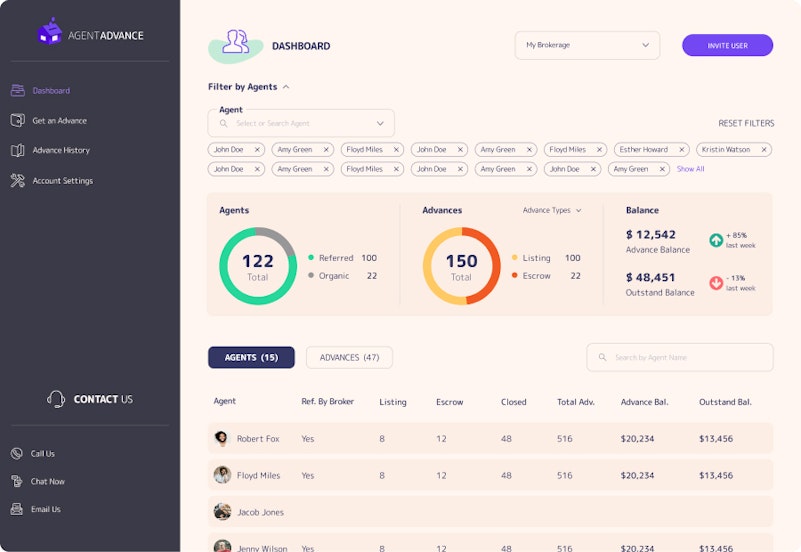
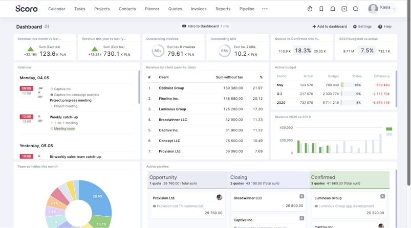
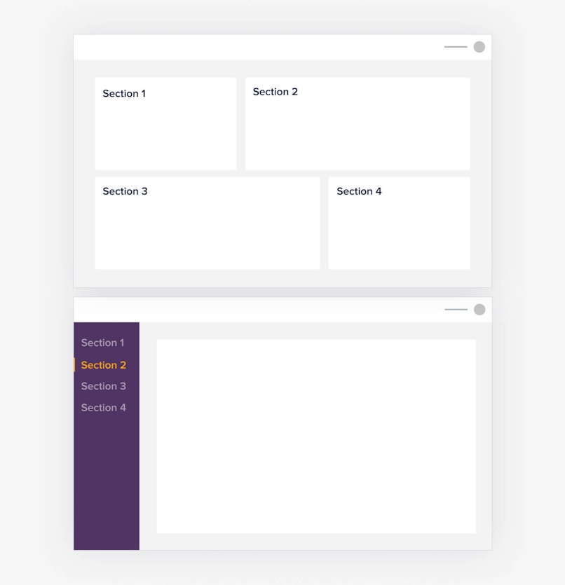
An example of a dashboard we designed | Source
If you design a proper and modern UI dashboard, it will give the users easy access to the information they need. For this to happen, the dashboard information needs to be easy-to-scan and contain only the key information. But, with many tools available, it can be hard to make the right choice or not exaggerate with the use of features.
This is one of the many roles of a UX designer and as such, it demands knowing certain tricks to be handled the right way.
Ready to Elevate Your Dashboard Design? Book Your Free Consultation.
14 Ways to Make an Excellent UI for a Dashboard
Thankfully, for all those who’ve been wondering how to make a Dashboard user interface, here are the top 14 ways that make all this possible.
1. Understand the Needs of the User
The data a designer collects through various user research methods can seriously impact the quality of the design and the user experience.
To create a dashboard UI, you need to perform such research, too. When you research the target audience, you will learn what they want and need. Based on that information, you can determine what the most important data to use in the dashboard is.


Having well-researched assets such as a customer persona allows creating customized solutions.
2. Decide on an End Goal
No matter how creative you are, you can't simply go with the flow and see where your gut takes you. If you want to succeed in your dashboard design, you need to have many end goals in place. Among those end goals, one is deciding what your dashboard will present.


Need help with designing your web app?
We can help you boost key business metrics.
Get a quote3. Pick a Dashboard Type
According to DataPine, there are four main types of dashboards to choose from:

Operational: Dashboards used for business intelligence purposes. Their goal is to measure, monitor, and manage operations with a more immediate or shorter time scale.


Strategic: Unlike operational dashboards, strategic dashboards are used for the long-term strategies of a business. They work by analyzing the most essential information based on trends.


Tactical: Dashboards full with an array of data. This data is being used mostly to help formulate the strategies for growth in mid-management circles.

Analytical: Dashboards with large bits of comprehensive data. Such data is used by analysts to help them create insights that help the business grow at an executive level.
If you aren’t certain which type is for you, the best way to find out is by example. Seek dashboard UI inspiration in your competition.
4. Dashboard storytelling
Because dashboards are so packed with valuable information, we need to help users interpret it. And there’s no better way to do it than by telling a story, whatever type of dashboard you choose to go with.
To create a meaningful narrative, we need to take structure into account.
Think of a dashboard as a place where users can choose their own adventure. It displays surface-level data at the beginning. But when users decide to interact with it — it provides them with more in-depth insight. Unless, of course, this doesn’t go against your primary use cases.
This structure should resemble an inverted pyramid — it starts with a narrow perspective but expands as you move on.
These levels of granularity are essential to making a dashboard informative and the data easy to interpret.


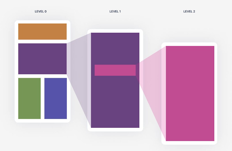
A crowded dashboard will often have little whitespace and can hinder navigation. Therefore, by keeping important information on the surface and not overwhelming the user, we can ensure great UX.
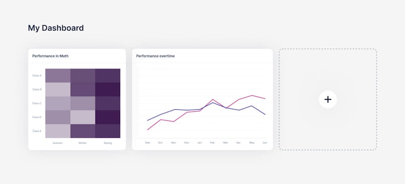
5. Customization is important
To take storytelling to another level, it’s also essential to allow users to customize dashboards. Create their own stories, so to speak.
This flexibility will ensure that your product’s design can serve the needs of a diverse crowd, working in a variety of niches. As a result, you won’t have to target your product to a subsection of your market.
More importantly, a malleable interface helps users prioritize information. This, as a result, will make your UI much more usable and help your customers feel “at home” much quicker.
Here are a few recommendations for a customizable dashboard UI:
Make sure that users can add or remove sections intuitively;
Drag-and-drop is the way to go;
If your palette allows it — consider colour-coding data;


6. Use the Five-Second Rule
Dashboards give users access to relevant information. Their main purpose is to resolve the frequently asked questions within a short timeframe. With that in mind, use the five-second rule.
How can you do this?
Well, keep in mind that a user will be willing to spend five seconds to find the information they need.
Does your dashboard provide this?
If it doesn’t, this might be the reason for the low app retention rate problems you’re facing.
7. Go Minimalistic
You shouldn’t go overboard with a dashboard. Why is this? According to MindInventory, if a dashboard has multiple visualizations, it will be crammed with too much information.
Here is a clue:
Cognitive psychology proves that the human brain can’t process a vast scope of information at the same time. Our scope is rather limited, which makes minimalism your very best option.
While being minimal is important, make sure you don't have too little information. At any given point in time, users should have enough information to complete their tasks. Don't make them switch in between menus more than they have to.
8. Put Emphasis on Information Architecture
Everything from data hierarchy to layout is important for the success of your dashboard. But still, your design needs a balance to function. To achieve a balance, aim for a design that emphasizes the most important elements over the less important ones. This is achieved through a well-thought-through information architecture.
9. Categorize information when needed
The people who have worked on a product for months or years see its interface as something very segmented. It’s a variety of tiny components, each having its purpose and reason to be there.
Whereas users typically perceive dashboards as one whole screen full of widgets, elements, digits, and heaps of other stuff.
A screen that looks like a stock market live news feed can be tiring and dissuasive.
If your dashboard is over-saturated with data or supports too many interactions, it’s best to split it into multiple views. This will significantly boost clarity and usability.


The reason why this is especially important is that attention is a limited resource. Over-stimulating users can have an impact on the rate at which they successfully execute tasks and reach goals.
In the age of the Attention Economy, dwindling attention spans are both a problem and a factor we need to consider.
10. Choose Your KPIs Carefully
A successful dashboard design is a KPI (key performance indicator) dashboard design.
What does this mean?
KPIs are metrics used to display a visual representation of the most relevant data based on different areas of your business or brand. Once again, you can use your audience research to select the best KPIs to use in the dashboard.
11. Provide Context
How are users supposed to get your message if you don’t provide context and comparison values? The numbers on a given dashboard carry no meaning without context. Also, the users won’t know if you require any action on their behalf.


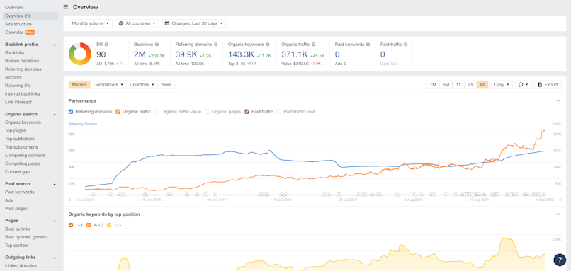
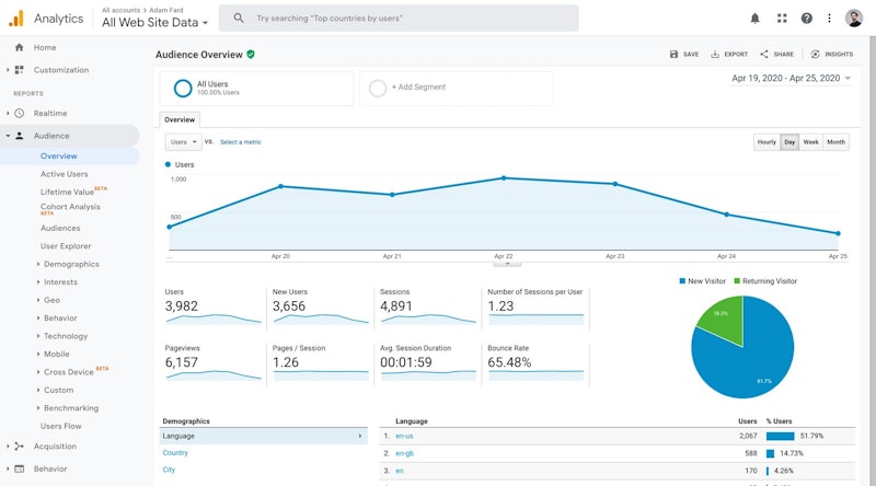
Here's an example of a dashboard that shows context for the information it presents. | The screenshot is taken from ahrefs.
When designing a dashboard, provide maximum information in the provided space. Even if the data seems obvious to you, it can still appear strange to the user. Therefore, provide comparison values and add titles to all of the charts you use.
12. Don’t Forget about Aesthetics
We live in a society that’s highly focused on aesthetics. That’s why every designer needs to treat his dashboard as a publisher would design his book.
Why, you might ask?
As the saying goes, books are judged by their cover. So is a dashboard. It is judged by its appearance. Therefore, when you finish with the data and hierarchy of it, it’s time to move onto the dashboard’s aesthetics. Pick the right colour combination, format, font, and layout.
13. On using colors
Speaking of colors, we all have a wide array of preconceptions regarding colors. Red means bad, green means good, and so forth. Naturally, this has to be taken into account when defining the palette used in graphs and the UI in general.


For instance, if a graph or a chart compares two groups, representing them in green and red can lead to misrepresentation. We might automatically assume that one of them is performing poorly.
We must also strive not to use a variety of colors that can be overwhelming.

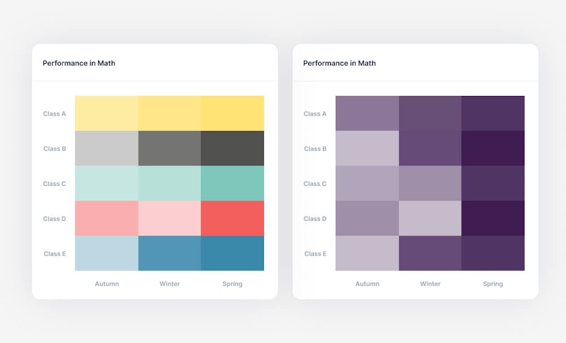
For instance, when comparing multiple dimensions, we’re more interested in outliers and anomalies. Displaying a group of intensely coloured overlapping values can often be redundant and taxing on the users’ senses.
Since we’re speaking of taxing the users’ senses, it’s important to underline that dark themes can reduce eye fatigue significantly. This is especially relevant if people will be using your dashboard for several hours a day.
14. On using the right graphs
Frances Hodgson Burnett once said: “If you look the right way, you can see that the whole world is a garden.” This is a testament to the idea that the way we interpret our data is very important.
The graphs we choose to visualize information can tell meaningful stories from many points of view. So we should always bear in mind that aside from representing information, we also manipulate it.
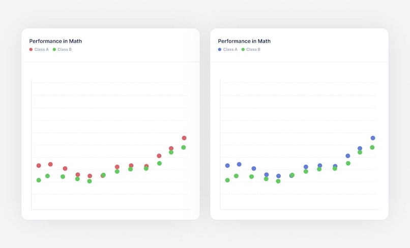
For example, we’ve had the opportunity to work with an EdTech product. An important graph-related issue that we had to tackle was the representation of trends for specific classes.
In order to gather more insight, we sought advice from an educational consultant. They emphasized two central requirements:
Familiarity — we needed to present teachers with graphs that they were accustomed to. Or, alternatively, enhanced versions of familiar graphs;
Perspective — we had to focus on the positive results and highlight positive trends.
Below is an example of how we approached this issue. The graph on the left focuses on the students who performed on or above par. Whereas, the second one primarily informs the user about the students with sub-par performance first.

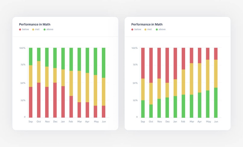
While we’re still dealing with the same data, we can tell a story that empowers people and celebrates their success.
We Will Simplify the Complex With Exceptional Design. Book a call with us.
Final Thoughts
Regardless of your experience in the field, good practices like the ones above will surely make your dashboard UI stand out. When you put your time and creativity into it, you can influence a huge portion of the target audience. Creating a useful and helpful dashboard is only one step in that direction, but an important one.
We should also bear in mind that UIs are a powerful opportunity to influence user behaviour. By empathizing with them, we can create dashboard designs that are conducive to solving problems with a minimal cognitive burden.


